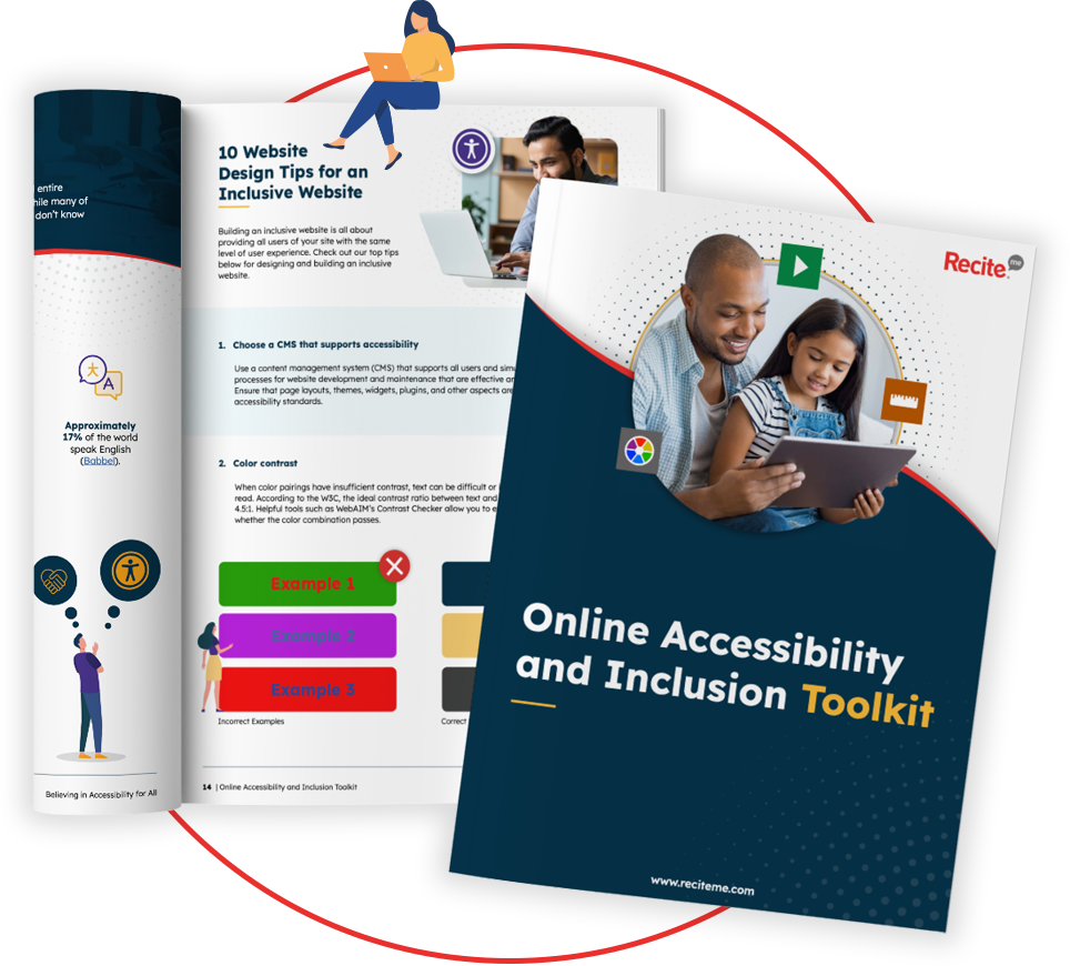
Get Your Free Accessibility & Inclusion Toolkit
Download NowWith more businesses shifting their learning and development programs online, the need for accessible eLearning content has grown significantly. But how can you make sure that every individual, regardless of their abilities, can engage fully with your content? Simply put, it requires thoughtful design and strategy. In this guide, we’ll walk you through how to build an accessible eLearning experience, offering practical tips that will benefit your business and your users alike.
What is accessible eLearning?
Accessibility in eLearning resources refers to the creation of online courses, programs, and resources that have been designed with inclusion in mind. This means that learners of all backgrounds, including those with disabilities, can benefit from the course equally. It ensures that people with visual, auditory, motor, or cognitive impairments can navigate, interact with, and understand digital content effectively, and without accessibility barriers.
Accessible eLearning starts at the very beginning of the design process. It might involve ensuring that screen readers can interpret your content appropriately. It could also mean providing a video captions feature for learners with hearing impairments, or allowing users with visual impairments to customise text sizes and font styles according to their specific needs.
Whatever the means of achieving it, the goal of accessibility in eLearning is always the same: to provide equal learning opportunities for everyone.
Best practices for creating accessible eLearning resources
When it comes to creating accessible eLearning courses, the Web Content Accessibility Guidelines (WCAG), is your best friend. WCAG is a series of best practices set out by the World Wide Web Consortium (W3C) for ensuring that digital content is usable by individuals with disabilities. These guidelines focus on four core elements known as POUR principles:
- Perceivable: Learners must be able to identify content with at least one of their senses. This could mean providing text alternatives for non-text elements, so that users with visual impairments can engage through assistive technologies.
- Operable: eLearning programs and resources should be usable via different input methods, including keyboards and adaptive devices, making it accessible to those who cannot use a mouse.
- Understandable: Content must be easy to digest. This involves using clear language, intuitive layouts, and predictable interactions.
- Robust: Content should be compatible with a variety of devices and assistive technologies, so that learners can access the course regardless of the tool or software they use.
From these principles, WCAG prescribes very specific guidelines, each with its own success criteria. For example, WCAG recommends a minimum colour contrast of 4.5:1 for normal-sized text. By following these best practices, you not only ensure the accessibility of your content, but you also go a long way to ensuring compliance with accessibility laws and regulations.
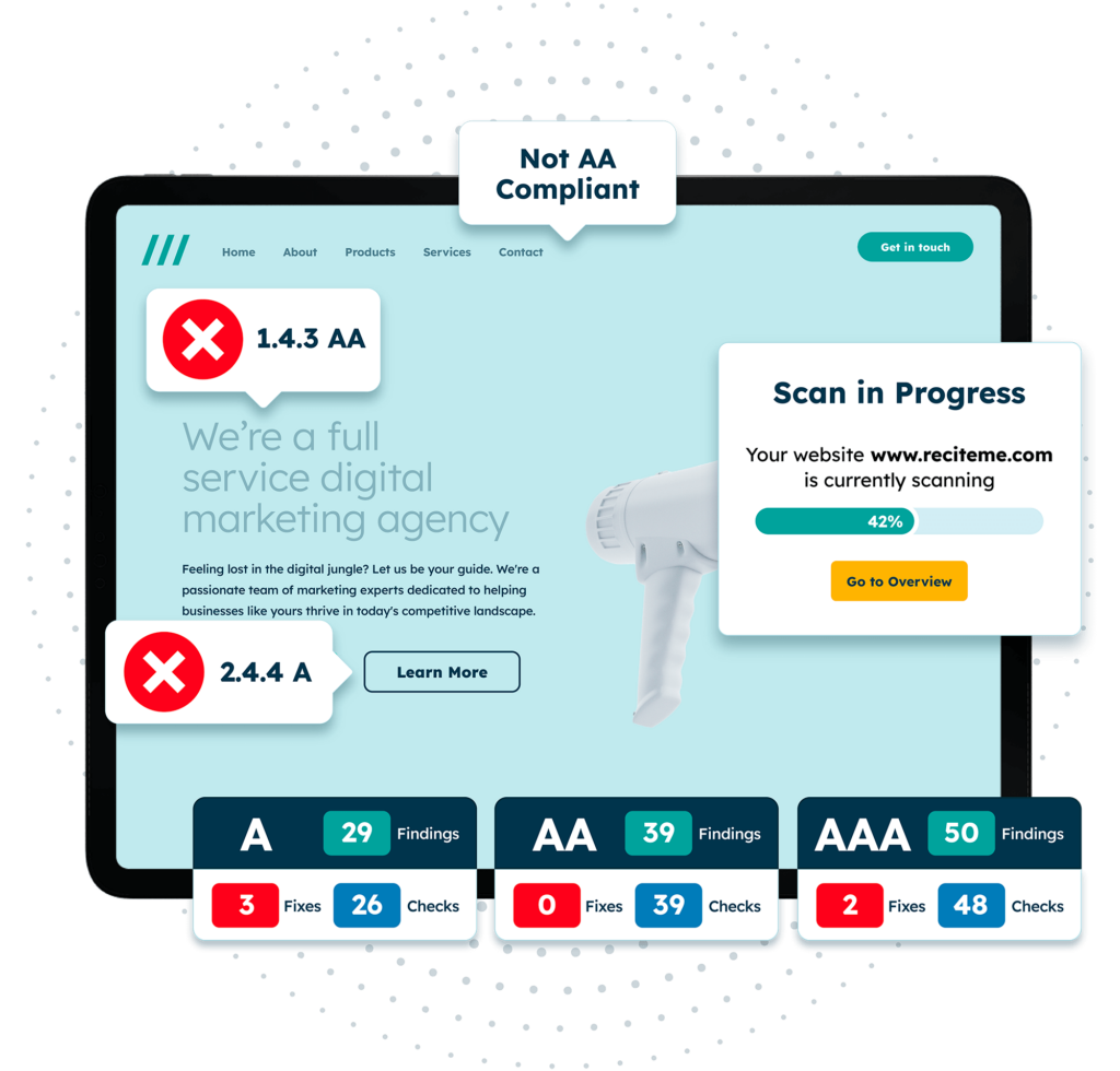
Free Accessibility Check of your Website
Finding accessibility issues is now easier than ever. Recite Me offers a free automated scan of your website’s homepage to highlight non-compliance. You’ll get recommendations on how to fix them, helping to improve your accessibility score.
Strategies for creating accessibility in eLearning
It’s all well and good having a fundamental understanding of WCAG and the POUR principles. But how does this translate to real life? This section outlines some actionable strategies that align with WCAG, which you can begin implementing straight away for more accessible eLearning resources.
Colour Contrast
High colour contrast between text and its background ensures that learners with visual impairments, including colour blindness, can distinguish between various digital elements and read content easily. When designing a course module, use colour contrast checkers to ensure your platform’s palette achieves the WCAG’s minimum ratio of 4.5:1 for normal-sized text. A white background with dark blue or black text is a good starting point.
Video Subtitles
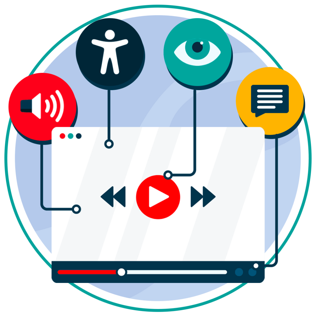
Creating accessible videos is a fundamental part of accessibility. Start by adding subtitles or closed captions to your videos, this ensures that learners with hearing impairments can follow along with the audio. This is crucial for pre-recorded webinars, instructional videos, and any other form of multimedia content. For example, a video tutorial on software usage should include accurate captions to support learners who may have difficulty hearing the voiceover, or even for those wanting to study in excessively noisy or silent environments.
You can learn more actionable strategies with our video accessibility checklist.
Keyboard Navigation
For users with mobility impairments who may not use a mouse, all elements of your course should be operable via keyboard shortcuts. Ensure that learners can navigate through modules, access menus, and complete tasks by using the “Tab” key or other commands. For instance, quizzes in an accessibility-driven eLearning program should allow users to select answers using only the keyboard.
Descriptive Alt Text
Alternative text, or alt text, is a text-based description of an image or graphic. It allows screen readers to convey the meaning of images to visually impaired users who would not otherwise be able to perceive the content. Alt text should be descriptive, but not overwhelming or overcomplicated. If your course includes a diagram of a business process, for example, summarise the key elements in the alt text so that all learners can comprehend the content, but avoid using too many words or any technical jargon.
Accessible Forms and Interactions
If your eLearning course includes interactive forms, such as feedback surveys or assessments, ensure they are accessible by using proper HTML markup. Labels should be clearly associated with form fields, and instructions should be concise and easy to understand. If incorrect data is entered, include a detailed error message instead of just highlighting the field red.
Text-to-Speech Compatibility
Ensure that your text-based resources can be read aloud by text-to-speech software. This is particularly beneficial for learners with cognitive disabilities or those who find it easier to process auditory information. By testing your course with popular screen reader software, you can verify that all the content is accessible.
Adjustable Text Size
Generally speaking, better customisation means better accessibility. Give your e-learners the ability to adjust text size, font styles, and colours, with a software product like Recite Me’s accessibility toolbar. This empowers every user to make accommodations for their own specific needs, and is especially helpful for learners with low vision.
Clear and Simple Language
Using clear, simple language makes your course content more accessible to a wider audience, including those with cognitive disabilities. Avoid jargon or unnecessarily complex terms, and be efficient with your use of words. This can be difficult when explaining highly technical processes, but by breaking such concepts down into bite-sized, digestible chunks, you’re already most of the way there.
Consistent Layouts
Having consistent navigation options and structure across all modules in your online course helps learners know what to expect. This is important because it reduces cognitive load, especially for those with learning disabilities, enhancing usability for everyone as a result.
Benefits of accessible eLearning materials for your organisation and its users
Creating accessible eLearning content is part and parcel of building a fairer society. But investing in accessibility doesn’t just benefit your users, it benefits your business too.
Benefits for Organisations
- Wider audience reach: Making your courses accessible means you can reach a larger, more diverse audience, including individuals with disabilities.
- Compliance with laws and regulations: Ensuring accessibility helps your business avoid costly litigation and potential fines related to non-compliance with accessibility laws.
- Improved brand reputation: Demonstrating a commitment to inclusivity enhances your company’s brand image, showing that you value all learners.
- Increased learner engagement: Accessible courses can lead to better learning outcomes, as learners are able to interact with the materials in ways that suit their needs.
- Future-proof content: Accessible design ensures your content can adapt to new assistive technologies, reducing the need for major redesigns down the line.
Benefits for Users
- Equal Learning Opportunities: Accessibility levels the playing field, allowing all learners to engage with your content equally, regardless of any disabilities.
- Enhanced learning experience: Features like video captions, alt text, and clear navigation improve the overall usability of the course, making learning easier for everyone.
- Reduced frustration: Learners with disabilities don’t have to struggle with inaccessible materials, reducing frustration and enhancing their learning experience.
- Customisable learning environments: By offering options to adjust text size or colour contrast, users can personalise the learning environment to suit their specific needs.
- Increased knowledge retention: Users are more likely to retain information when barriers to learning are removed and accommodations are made.
Our 40-page Digital Accessibility & Inclusion Toolkit helps businesses break down online barriers and make a real impact. It offers practical advice on all aspects of digital accessibility, from writing an accessibility statement to accessible website tips and inclusive hiring.
