

Get Your Free Accessibility & Inclusion Toolkit
Download NowWebsite Accessibility is becoming an increasingly popular talking point for businesses and users around the world. In the UK alone there are around 14.6 million people with a disability, all of who experience difficulties interacting with websites that don’t have the necessary accessibility solutions. Accessibility is made up of many different sub-categories, one of which is Keyboard Accessibility. This article will aim to provide an overview of Keyboard Accessibility, its importance and how you can implement and test features that help Keyboard users with Accessibility.
What is Keyboard Accessibility?
Keyboard accessibility refers to the design and implementation of digital interfaces, websites, software, or applications to ensure that they can be fully operated and navigated using only a keyboard, without the need for a mouse or other pointing device. Users should be able to navigate through all of the website’s elements easily. This includes links, buttons, forms, pop-ups and all other on-page elements.
Why is Keyboard Accessibility Important?
Keyboard Accessibility is an essential aspect of web accessibility and inclusive design, as it allows individuals with physical disabilities, motor impairments, or visual impairments to access and interact with digital content effectively. These users generally rely on alternative input methods or assistive technologies, such as screen reader software. Therefore, it is important to ensure that all interactive elements, menus, buttons, and content can be accessed and activated through keyboard interactions alone. In doing so, developers and designers create a more inclusive and user-friendly experience for a wider range of people.
Additionally, in many countries there are legal requirements and accessibility standards, such as the Web Content Accessibility Guidelines (WCAG), that mandate the inclusion of keyboard accessibility. By complying with these regulations, organisations ensure that their digital products are accessible to a broader audience, avoiding potential legal issues and demonstrating their commitment to inclusivity.

It’s also important to consider the indirect impact this has on your website’s overall user experience. Even users without disabilities may prefer using keyboard over mouse, especially if they are proficient with its use. So, offering a keyboard accessible website that is keyboard friendly offers users with flexibility to choose their preferred method.
Best Practices for Keyboard Accessible Websites
There are a handful of considerations to make when creating web pages with keyboard accessibility in mind. Below we will address some of the most important factors to consider when designing web pages for keyboard navigation.
All Elements should be Findable & Usable on Keyboard
The essence of this statement relates to the fact that all of the interactive elements on your website should be able to be activated using only the keyboard. Interactions with elements using the keyboard should effectively have identical outcomes to if it was through a mouse or touch.
Focusable Interactive Elements
All of your interactive website elements should be focusable when you use a mouse or keyboard. To implement this website owners should add a “tabindex=0” tag to the element. When added this will add the element to the list of focusable elements on the page, making it accessible via the Tab key.

Easy-to-use & Understandable Navigation Order
The order of navigation for users on websites should be both intuitive and logical. Visually this focus order appears as navigation following a flow from left to right, top to bottom. When interacting with actual on page elements this would usually work by pages starting with header first, followed by the main navigation menu, page/content navigation and then navigation through the footer.
Additionally, this can be further optimised by implementing methods of efficiently skimming content so screen readers reach important areas. For example adding a “skip to main content” link on the page and using hierarchical heading structures to allow users to jump to relevant sections. Furthermore, ARIA landmarks can assist with creating easy-to-use keyboard navigation.
Interactive Elements should be Descriptive
In instances whereby an interactive element would lead the user to produce some kind of change within the web page then the element should be descriptive. For example, if interacting with an element would cause the user to be directed to a new web page, then the element should contain descriptive anchor text.
A good example of this would be an element labeled as “accessibility checker” that takes the user to an accessibility checker page. Whereas a bad example would be generic form elements with labels such as “click here” or “visit now”.
How to Test if your Website is Accessible for Keyboards
Navigate Interactive Elements
Test on-site navigation by using the “Tab” key, if successful this should move you forward along the various navigation elements. Additionally, by using “Shift” + “Tab” keys this should allow for backward navigation.
Hyperlink
To test hyperlinks fire correctly use the “Enter” key when focused on the anchor text of the link, if successful this should activate the link and redirect you to the correct page.
Interactive Button
Check interactive buttons on your website by using the “Enter” or “Spacebar” key when hovering over a button.
Interactive Checkbox
The “spacebar” key should be used to check or uncheck boxes on a website.
Radio buttons
When interacting with Radio Buttons, the “Spacebar” key should be used to select a focused element. The four navigational arrows (Up, Down, Left and Right) should be used to move between options. Finally, the “Tab” key should be used to leave the radio buttons.
Select Menu (Dropdown)
When testing this keyboard focus indicator, use the “spacebar” to expand the menu, “enter” to select and “esc” to collapse the menu. The Up and Down arrows on the keypad can be used to navigate through the options.
Autocomplete
When you begin typing keyboard users should see that autocomplete suggestions will begin to show on the screen. Up and Down keypad interactions can be used to navigate through options, with “enter” being used to select.
Dialog
There are two types of Dialog – Modal and Non-modal. Modal dialogs should maintain keyboard focus, while non-modal should close automatically when they lose focus. The “esc” key should be used to facilitate a close.
Slider
The navigational keypad arrow keys should be used to increase and decrease slider values effectively. While the “home” and “end” keys should take the keyboard user to the beginning or end.
Tree Menu
The Up and Down keys should be used to navigate the menu option. While the Left and Right keys can be used to expand and collapse submenus.
Tab panel
Using the “Tab” key should allow the user to navigate into groups of tabs, hitting it for the second time should allow the user to navigate out again. Up, Down, Left and Right can be used to choose and activate previous or next tabs.
Menu Bar
When testing the keyboard focus indicators relating to the Menu Bar, you’ll want to use the “enter” key to expand and select. While the Up and Down keys can be used to navigate the options, Left and Right will expand and collapse submenus.
Scroll
Scrolling is self-explanatory, use the Up and Down keypad buttons to scroll vertically. For horizontal movement use the Left and Right keys. “Spacebar” or “Spacebar”+ “Shift” can be used to scroll the full page.
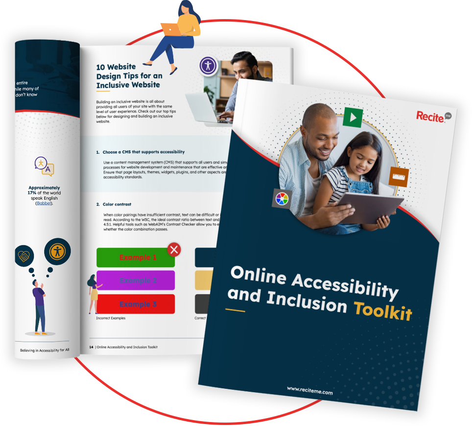
Our 40-page Digital Accessibility & Inclusion Toolkit helps businesses break down online barriers and make a real impact. It offers practical advice on all aspects of digital accessibility, from writing an accessibility statement to accessible website tips and inclusive hiring.
Making your website Keyboard Compatible
If you need a helping hand with making your website more inclusive and accessible, then be sure to reach out and book a demo, to see how Recite Me can help you. From our accessibility plugin to our website accessibility checker.