Download Your Free Website Accessibility Checklist
Download NowAccessibility is not just a technical concern, but a fundamental aspect of inclusive design and user experience. A website accessibility checklist can be your perfect tool to help ensure that your website is accessible to all users, including those with disabilities. Providing your business with a variety of benefits including increased reach, improved brand reputation and mitigating against the likelihood of accessibility non-compliance claims.
This website accessibility checklist will guide you through all of the necessary steps to start knocking down accessibility barriers to your business today.
The role of WCAG and Website Accessibility
This checklist aims to guide web developers, marketing experts, business owners and content creators through the key aspects of web accessibility. To do this it encompasses various guidelines and accessibility best practices that align with the Web Content Accessibility Guidelines (WCAG). By following this checklist, you can identify and address common accessibility issues, making your website more usable for everyone and ensuring compliance with legal and ethical standards.
Your web accessibility checklist
Looking to start implementing accessibility on your website and digital services? Get started today by addressing all of the accessibility concerns listed in this comprehensive website accessibility checklist:
1. Add text alternatives
- Provide text alternatives for non-text content.
- Use alt attributes for images.
- Provide captions and transcripts for audio and video content.
2. Ensure adaptable content
- Create responsive content that can be presented in different ways without losing information or structure.
- Ensure compatibility with screen readers.
3. Create distinguishable content
- Make it easier for users to see and hear content.
- Use sufficient contrast between text and background.
- Do not rely solely on colour to convey information.
- Provide a mechanism to pause, stop, or hide any moving, blinking, or scrolling information.
4. Be keyboard accessible
- Ensure all functionality is available via keyboard.
- Provide keyboard shortcuts for important actions.
5. Ensure clear navigation
- Provide ways to help users navigate, find content, and determine where they are.
- Use clear headings and labels.
- Provide multiple ways to navigate the site.
- Ensure that navigation is consistent.
6. Provide enough time
- Provide users enough time to read and use content.
- Avoid time limits or provide ways to extend time limits if necessary.
7. Make readability a priority
- Make text content readable and understandable.
- Use clear and simple language.
- Use appropriate reading levels for the content.
8. Follow predictable procedures
- Make web pages appear and operate in predictable ways.
- Ensure that navigation is logical and consistent.
- Avoid unexpected changes in content.
- Do not design content in a way that is known to cause seizures.
9. Ensure input assistance
- Help users avoid and correct mistakes.
- Provide clear and helpful error messages.
- Offer suggestions for fixing errors.
10. Be compatible
- Maximise compatibility with current and future user tools.
- Use valid HTML and CSS.
- Ensure ARIA roles and properties are used correctly.
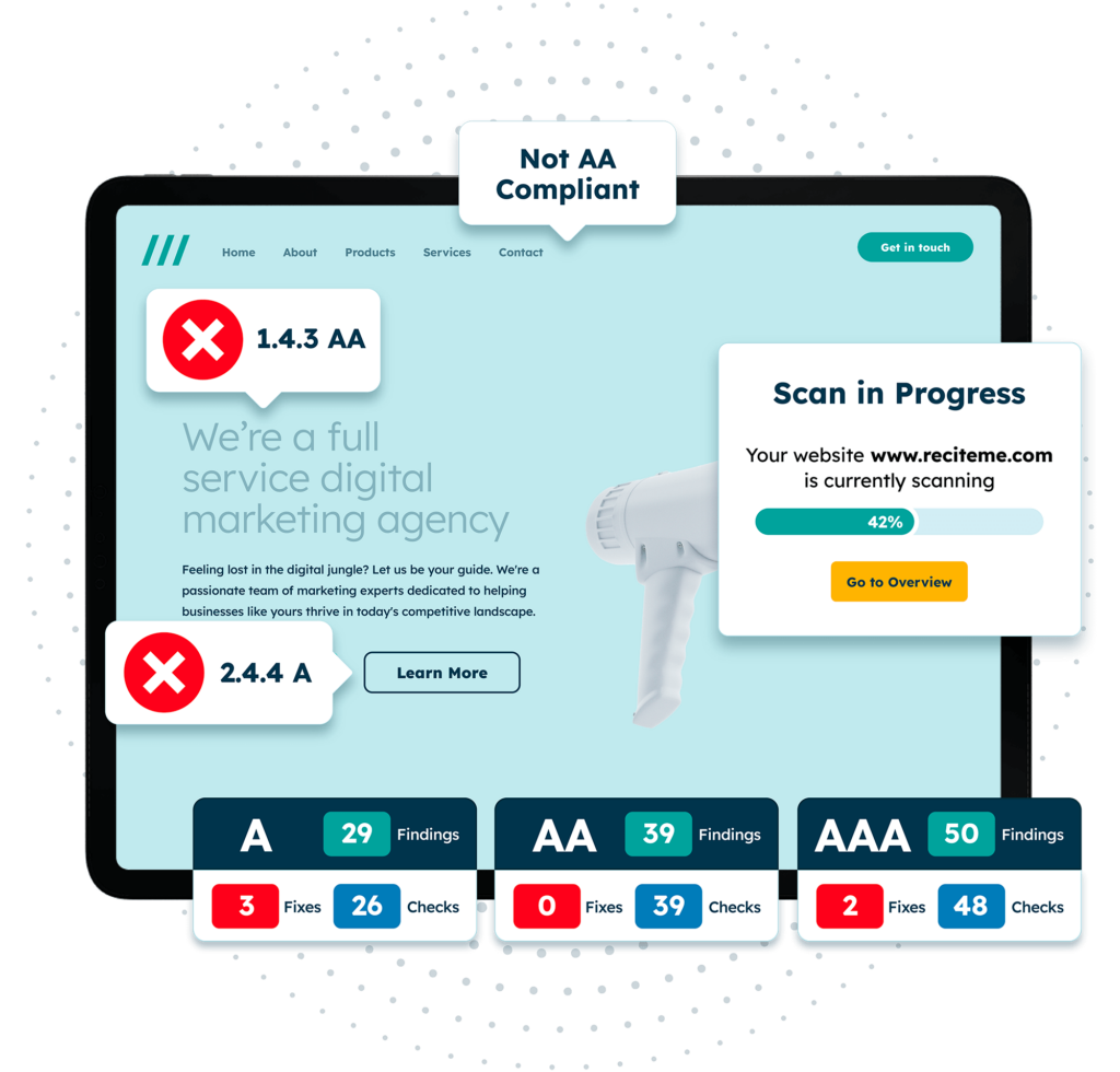
Free Accessibility Check of your Website
Finding accessibility issues is now easier than ever. Recite Me offers a free automated scan of your website’s homepage to highlight non-compliance. You’ll get recommendations on how to fix them, helping to improve your accessibility score.
Actioning changes from the website accessibility checklist
Ensuring your website is accessible involves taking specific actions across various areas. Below is a detailed breakdown of how to implement changes based on the key aspects of the web accessibility checklist. You can also use the following links to jump to different sections:
Text alternatives
Providing text alternatives for non-text content is crucial for accessibility. For images, ensure you use alt attributes that describe the content and purpose of the image. This helps screen readers convey the information to visually impaired users.
An example of good image alt text could be ‘Cristiano Ronaldo scoring a goal for Manchester United in the 2008 champions league final against Chelsea’. Whereas the same image with bad alt text could be something like ‘football player scoring a goal’.
For video accessibility, provide captions and transcripts so that users with hearing impairments can access the content. Transcripts should also be provided for audio content to facilitate access for those who cannot hear, ensuring strong deaf accessibility.
Additionally, icons and buttons should have descriptive aria-labels or alt text to communicate their function to users relying on assistive technologies.
Adaptable content
Creating adaptable content involves ensuring that it can be presented in different ways without losing its meaning or structure. Implement responsive design techniques using CSS media queries to adapt your content to various screen sizes and orientations.
Allow text to be resized up to 200% without any loss of functionality or content, catering to users with visual impairments. Use relative units like em, rem, or percentages for layout properties to create flexible layouts that adapt to different viewing conditions.
Distinguishable content
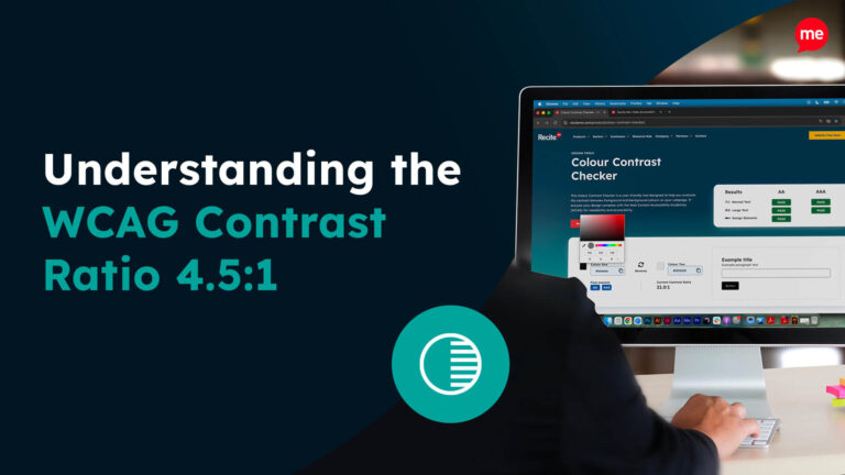
Making content distinguishable ensures that users can easily see and hear it. Maintain a contrast ratio of at least 4.5:1 for normal text and 3:1 for large text to ensure readability for those with low vision or blindness.
Additionally, you should avoid relying solely on colour to convey information; instead, use text labels or patterns. This makes the information more readily available to people with disabilities such as colour blindness.
Keyboard accessibility
All functionality on your website should be accessible via a keyboard. This ensures that all users can navigate through all interactive elements such as links, buttons, and forms using the keyboard alone. This is particularly important for those who struggle with physical disabilities such as Cerebral Palsy.
Additionally, highlight the currently focused element to help users keep track of their position on the page. You can also include skip links to allow keyboard users to bypass repetitive content and jump straight to the main content of the page, improving navigation efficiency.
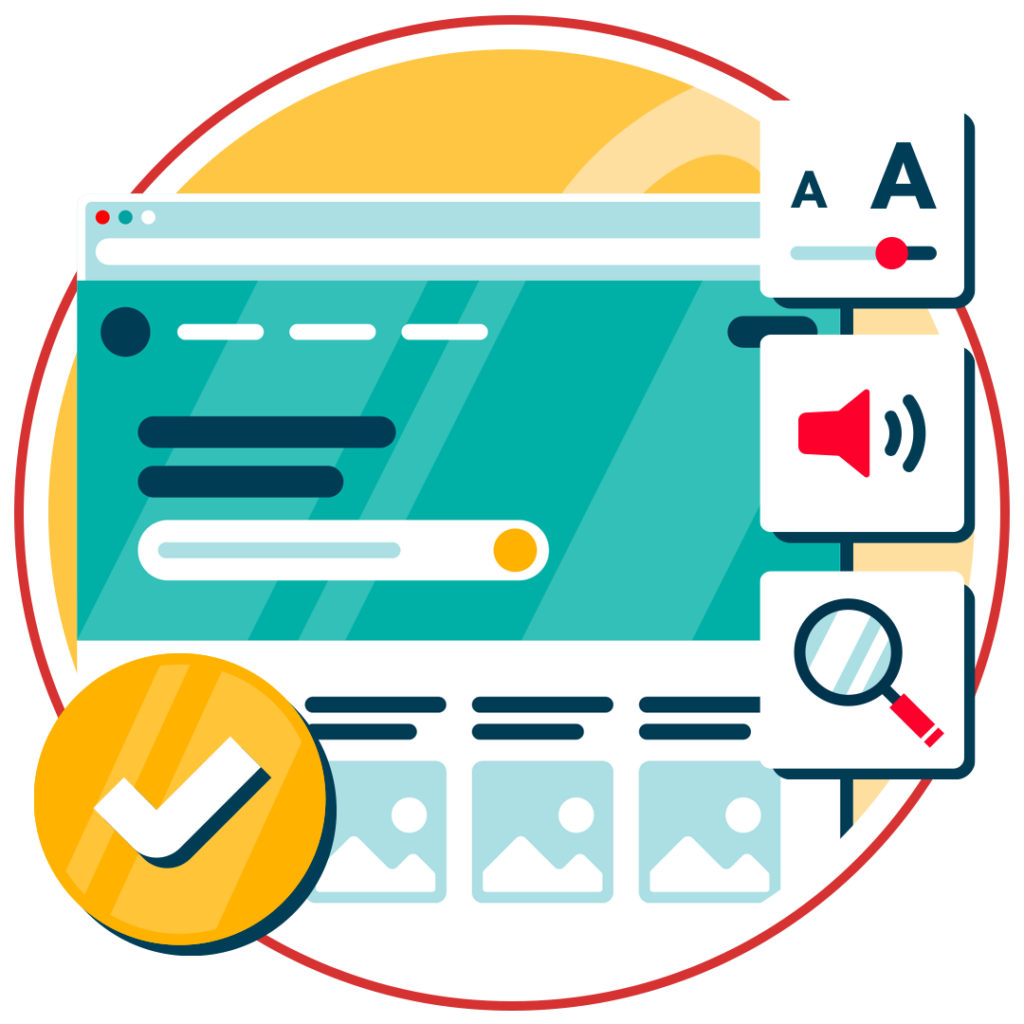
Clear navigation
Clear and consistent navigation ensures your users can find and understand content. To make this possible, you will need to maintain a consistent navigation structure across all pages to make the website predictable and easier to use.
Additionally, use clear and descriptive link text that conveys the purpose and destination of the link without requiring additional context. ‘Click here’ or ‘learn more’ are examples of poor accessibility, as they do not provide any contextual information about the page.
Furthermore, implementing breadcrumb trails to help users understand their location within the website and navigate back through the site’s hierarchy easily. Features such as a sitemap and search bar can also be a useful addition to your website’s navigation.
Time constraints
Users should be given adequate time to read and interact with content, this should not be a limiting factor to their ability to access and digest online content. If your website has time limits, allow users to adjust or disable these limits according to their accessibility needs. This is particularly important for ensuring good cognitive accessibility on your website.
Additionally if your website has any moving, blinking, or scrolling content, provide controls to pause, stop, or hide it, preventing distractions and giving users control over their experience.
Readability
Ensuring readability involves making text content accessible and understandable. You should use plain language and avoid jargon to make content accessible to a wider audience, including those with cognitive disabilities. The WCAG guidelines state that your content should be readable by those at “lower secondary education” levels, which is around age 7 to 9.
Moreover, for more complex content, you should provide summaries or explanations to simplify for the reader. Other adjustments include formatting text with adequate line and paragraph spacing. Finally, be sure to declare the primary language of your web page in the HTML to aid screen readers in providing the correct pronunciation.
Readability is great for improving your accessibility standing, but it also has various additional benefits including improved search engine optimisation.
Predictability
Your web pages should appear and operate in predictable ways to avoid confusing users. You can easily achieve this by using consistent layouts and design elements across the website to create a familiar environment.
Furthermore, make sure that interactive elements like links and buttons behave in predictable ways, such as links opening in the same window unless specified otherwise. You should also provide warnings before actions that could significantly affect the user experience, like opening new windows or submitting forms.
You will also want to ensure your website does not produce any actions that could lead to physical reactions such as seizures. To do this, avoid the use of any flashing imagery or material that would be sensitive to users with seizure-inducing conditions such as epilepsy. The global standard is that no content should flash 3 or more times per second.

Input assistance
Input assistance is critical to help users avoid and correct mistakes. A great way to start implementing this on your website is to clearly identify errors in form fields, using visual and textual cues to highlight issues. You should also offer suggestions for correcting errors, guiding users towards successful completion.
But, the best way to correct a mistake is to simply avoid it entirely. You can make this more likely by using clear and descriptive labels, with instructions for all form fields and interactive elements. This will make it significantly easier for users to understand what is required.
Compatibility
Maximising compatibility is important for making your website work well with various browsers, devices and assistive technologies. There are a few technical adjustments you will need to make such as:
- Use semantic HTML5 elements to provide a clear structure and meaning to your content.
- Use ARIA roles and properties where HTML alone is insufficient.
- Make sure your website is mobile-friendly.
This is not a one and done task. You should regularly test your website with different assistive technologies, browsers and device types to identify and resolve compatibility issues, ensuring a seamless experience for all users.
Our Website Accessibility Checklist guides you through the essential elements of an inclusive website with simple, actionable steps. Whether you’re just getting started or looking to improve your existing site, this checklist will help you create a better experience for all users.
Where to start when improving web accessibility?
If the accessibility of your website is not currently in a good standing it can seem very complex and confusing to find a starting point to begin addressing the issues. However, it’s much simpler than you might have thought.
To start working on the web accessibility checklist you should start addressing the most common accessibility issues. A study by Webaim found the six most common failures of WCAG to be:
- Low contrast text
- Missing image alt text
- Missing form labels
- Empty links
- Empty buttons
- Missing document language
Additional website accessibility considerations
If you’re doing your best to tick the various items on our digital accessibility checklist off, then you’re on the right track. But, implementing WCAG best practices is merely the first step on a long journey to accommodating your disabled users in the online world.
Accessibility testing
Building an accessible platform is just the beginning, you need to be regularly testing for accessibility. This helps you stay up to date with the fast moving technological advancements. Here’s some of the key reasons why accessibility testing is essential:
- Compliance with standards and regulations: Accessibility guidelines are ever-changing, with WCAG 3.0 soon to be a factor and potentially many more future versions. Regular testing ensures you are up to date with the latest versions of these standards and helps address any changes in compliance.
- Technological changes: Web technologies and user devices are constantly evolving. Regular accessibility testing helps ensure your website remains compatible with new browsers, operating systems, and assistive technologies.
- Enhanced user experience: Regular testing ensures that accessibility features are working as intended, making your website more navigable, understandable, and usable for everyone. This not only benefits users with disabilities but also enhances the overall user experience for all visitors.
- Content updates: Websites frequently undergo updates and changes in content, design, and functionality. Each update has the potential to introduce new accessibility issues. Regular testing allows you to catch and address these issues promptly, ensuring that new content and features remain accessible to all users.
- Cost-effectiveness: Addressing accessibility issues early and regularly is more cost-effective than making extensive fixes later. Regular testing helps you identify and resolve problems incrementally, reducing the need for large-scale overhauls and minimising disruption to your website’s operations.
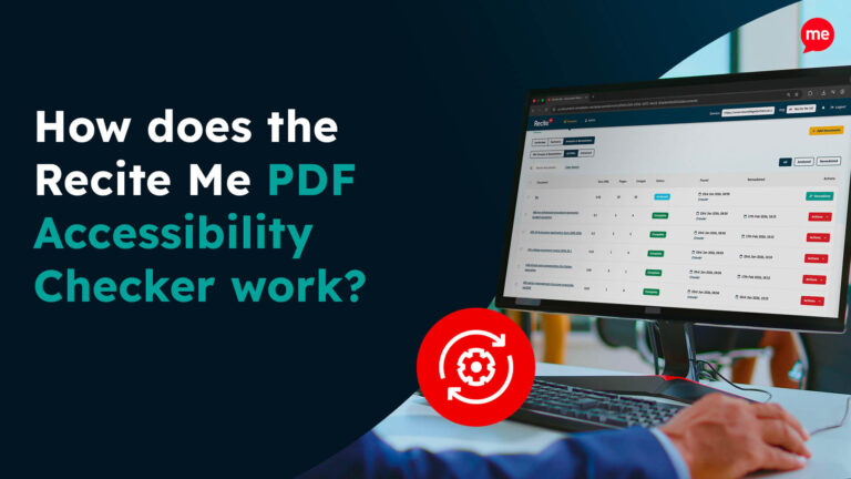
There are a few different methods you can implement for accessibility testing. But, the Recite Me accessibility checker is a great starting point. This is an automated accessibility testing tool that will run an audit of your website to detect and highlight any inaccessibility based on the different levels of WCAG.
Another option is manual testing, which involves evaluating the website’s accessibility through hands-on examination. This includes using the site with a keyboard alone, navigating with screen readers, and checking for logical focus order and clear navigation paths. Manual testing is essential for catching issues that automated tools may miss. But, using the two tools together can provide the perfect solution.
Accessibility training
Ensuring that a website is accessible requires more than just implementing technical solutions; it also involves creating a culture of accessibility in your organisation. It ensures that all team members understand the importance of accessibility and how to implement it effectively.
Training should be delivered company wide for awareness building, with additional training offered to specialised roles within the organisation. This can be seen in these key areas of accessibility training:
- Awareness training: Educate all staff members about the importance of web accessibility, the impact it has on users with disabilities, and the legal and ethical reasons for maintaining an accessible website.
- Technical training for developers: Provide in-depth training on coding practices that promote accessibility, including the correct use of semantic HTML, ARIA roles and attributes, and techniques for creating keyboard-accessible interactions.
- Design training for designers: Offer training on designing with accessibility in mind, covering topics such as colour contrast, typography, responsive design, and creating accessible forms and controls.
- Content training for writers and editors: Train content creators on writing in plain language, using headings and lists to structure content, providing text alternatives for images and multimedia, and creating accessible PDFs.
- Testing training for QA teams: Teach quality assurance teams how to use both automated and manual testing tools to identify accessibility issues and ensure that new features and content are accessible before they go live.
- User experience training: Educate UX designers and researchers on conducting usability testing with people with disabilities and interpreting feedback to improve the accessibility of your website.
You can find accessibility training here at Recite Me – the perfect introduction to digital accessibility for your organisation. Setting you and your team on the path to online inclusion and accessibility best practices.
Accessibility Documentation
Creating thorough accessibility documentation is essential for maintaining and improving website accessibility over time. This documentation should outline the accessibility standards and guidelines your organisation follows, such as the Web Content Accessibility Guidelines. It should provide detailed instructions and best practices for developers, designers, and content creators to ensure that all new content and features meet these standards.
Key components of accessibility documentation include:
- Accessibility policy: A clear statement of your organisation’s commitment to accessibility, outlining the goals and standards you aim to achieve.
- Roles and responsibilities: Definitions of who is responsible for various aspects of accessibility within your organisation, from developers to content managers.
- Design guidelines: Specific instructions for designing accessible user interfaces, including colour contrast ratios, text sizes, and layout considerations.
- Development guidelines: Best practices for coding accessible web applications, such as proper use of HTML, ARIA (Accessible Rich Internet Applications) attributes, and JavaScript.
- Content creation guidelines: Tips for writing accessible content, including the use of plain language, text alternatives for multimedia, and structuring content for easy navigation.
- Testing procedures: Methods and tools for testing website accessibility, including automated testing tools, manual testing procedures, and user testing with people with disabilities.
- Maintenance and updates: Processes for regularly reviewing and updating the website to address new accessibility challenges and ensure ongoing compliance.

Kickstart your accessibility journey with Recite Me
Act today to ensure your website is accessible and compliant with the latest WCAG standards. Get started on your website accessibility strategy by working through the following action points:
- Contact our team for more advice about WCAG standards and Accessibility best practices.
- Find out more about the Recite Me Web Accessibility Checker.
- Schedule a free demonstration to learn how our technology can help you.
- Run a free scan of your website for WCAG 2.1 AA compliance.
- Try our assistive toolbar on your website.
