Get Free Tourism & Leisure Accessibility Guide
Download NowAs travel gets easier and cheaper, more people have taken to the skies, dedicating their hard-earned spare income to exploring the world. But as more people travel, including a significant portion of the 1.3 billion disabled people worldwide, accessibility becomes an increasingly important topic for the tourism industry.
Despite growing awareness, many businesses still fall short of meeting the needs of their disabled customers. Accessibility in tourism is not just about following rules – it’s about levelling the playing field and ensuring that everyone, regardless of their abilities, can enjoy travel experiences.
Types of Accessibility in Tourism
Accessibility in tourism generally falls into three categories, with each type of accessibility focussing on different aspects of the user experience. Efforts to cover all three should leave your business barrier-free and open to everyone, whether a tour operator, bed and breakfast, museum, or other.
Physical accessibility
The ability of people with mobility challenges to access buildings, attractions, and services (e.g., ramps, accessible toilets).
Digital accessibility
Websites, apps, and booking systems are usable for everyone, including those with visual, hearing, or cognitive impairments.
Communication accessibility
Clear and inclusive communication, such as offering information in multiple formats (e.g., audio guides, sign language interpreters).
Strategies for improving Web Accessibility in Tourism
For customers, a lot of the travel experience starts online. This could be booking flights, searching for the best deal on hotels, or comparing tour operators. Therefore, ensuring web accessibility is crucial in the tourism industry, and a great place to start.
Accessible booking forms
In the tourism industry, booking forms are often needed for things like enquiries or room reservations. Ensure your booking forms are accessible by adding relevant labels to fields, ensuring keyboard accessibility, and using large, readable fonts. Provide appropriate placeholder text that gives examples or instructions, and make sure error messages are prescriptive and clear.
Accessible checkouts
Design your checkout process such that it is easy to navigate and can be easily read by screen readers. To do this, streamline the amount of steps required to complete the checkout process, avoid overwhelming users with too many elements, and label all fields clearly so that screen readers can interpret them accurately. An accessible checkout process reduces the risk of your customers abandoning their order at the last minute and improves customer satisfaction.
Clear colour contrasts
High colour contrast between text and background makes online content much easier to read for those with visual impairments. For instance, using dark text on a light background (or vice versa) makes it easier to distinguish between elements. This small change can make a world of difference for people with low vision.
Consider offering your website users a full suite of customisation options by adopting software, such as Recite Me’s accessibility toolbar, which allows anyone to tailor your site and its content to their own specific needs.

Image alt text
Every image on your website should have descriptive alternative text, otherwise known as ‘alt text’. This helps visually impaired users who rely on screen readers to understand the content of the image. For example, a photo of a seaside resort could have the alt text: “A sunny day at a beachfront hotel with palm trees and clear blue water”. Note that alt text should be descriptive enough for the user to understand exactly what the image represents, but not so descriptive that it becomes overwhelming or confusing. Keep it clear and to the point.
Accessible Navigation
Many users with motor impairments are unable to use a mouse effectively. As such, they rely on moving through your site and consuming your content using a keyboard only. However, this can only work if you have set up your site accordingly.
Test your web pages to make sure buttons, links, and other elements can be accessed using keyboard functions, like the ‘tab’ key. Add clear focus indicators, such as a visible outline, to help users know where they are on the page.
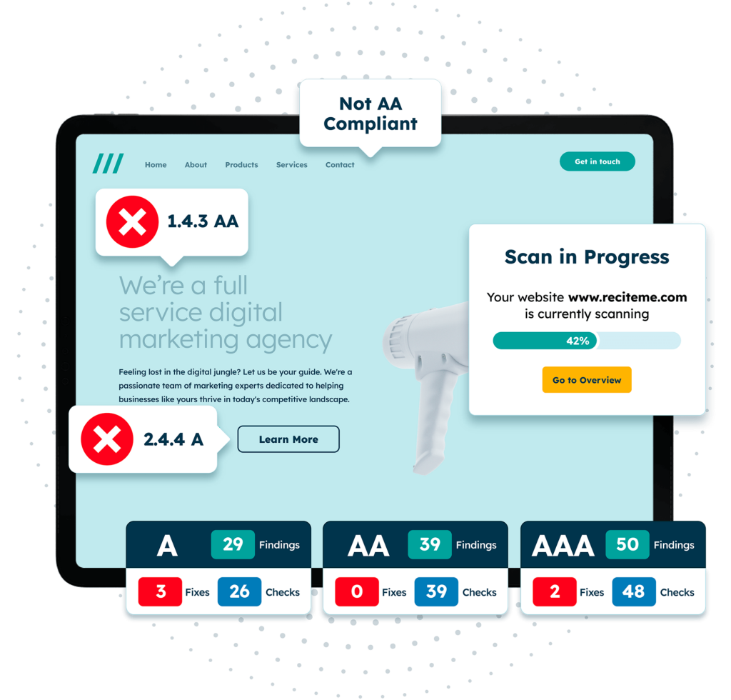
Detect Web Accessibility issues on your Website
Finding accessibility issues is now easier than ever. Recite Me offers a free automated scan of your website’s homepage to highlight non-compliance. You’ll get recommendations on how to fix them, helping to improve your accessibility score.
Strategies for improving Physical Accessibility in Tourism
Once your customers have accessed your online resources, made their reservations, or booked their transport, the next step is to visit your business and its facilities. This is where physical accessibility comes into play. Improving physical accessibility ensures that everyone, regardless of their mobility challenges, has full access to things like buildings, transport, facilities, etc.
Ramps and Lifts
Installing ramps or lifts as an alternative to stairs allows wheelchair users and individuals with mobility issues to access all areas of your premises. A resort, for instance, can ensure that all facilities—dining areas, rooms, and swimming pools—are reachable by those who have difficulty walking.
Accessible Toilets
Accessible toilets with proper handrails, wider entrances, and enough space for wheelchairs are essential. Hotels and tourist attractions should ensure accessible facilities are available in multiple locations, granting guests easier access without excessive detours.
Accessible Parking Spaces
Dedicated parking spaces for disabled guests should be close to entrances and wide enough to allow for wheelchairs or similar assistive devices to be unloaded within the bay. Thoughtful planning like this ensures visitors can enjoy your venue without stressing about where to park, how to unload, or the walks to and from the car.
Accessible Room Design
In hotels, accessible rooms should feature wider doors, roll-in showers, and lower bed heights to accommodate guests with mobility issues. Providing rooms with visual and auditory alarms for fire safety also ensures a comfortable and safe stay for those with disabilities.

Strategies for improving Communication Accessibility in Tourism
Much of the tourism industry is about conveying the right information at the right time. This means communicating around bookings, itineraries, directions, etc, as clearly and concisely as possible to people that may face some form of impairment or who don’t necessarily speak English as their first language. In this way, communication accessibility is just as important as its physical and digital counterparts.
Offer Audio Guides
Many museums, historical sites, and tour companies offer audio guides alongside their tours. These guides allow customers with visual impairments to partake in and consume information about sites and exhibits that they may not otherwise be able to. Audio guides even serve as a complementary add-on for non-disabled users, enhancing the user experience for everyone, even those without visual impairments.
Use Simple Language
Using simple, clear language in all written and verbal communications helps convey key information accurately to those with cognitive disabilities, as well as non-native speakers. Simplified language means avoiding technical jargon or unnecessarily complex words. It means being efficient with your use of words and avoiding excessive sentences. Doing so ensures that everyone can understand directions, instructions, or anything else pertinent to their travels.
Translate Important Information Into Different Languages
Tourists come from all over the world, and, as such, speak an abundance of different languages. While it may not be possible to translate your materials into every language, focussing on a few key languages can go a long way to serving your customer base.
Try to figure out which are the primary languages spoken by most of your customer base and start with those. For example, a guided tour of a historic landmark in Europe might choose to provide brochures in English, Spanish, German, and French. The likelihood is that most tourists will be familiar with at least one of these languages.
Sign Language Interpreters
For customers who are deaf or hard of hearing, having sign language interpreters available can make a significant difference. Tourist attractions, theatres, and tours can hire interpreters for specific events or provide video interpretations to enhance accessibility. This is particularly worth investing in if you are aware of a significant deaf contingent in your customer base.
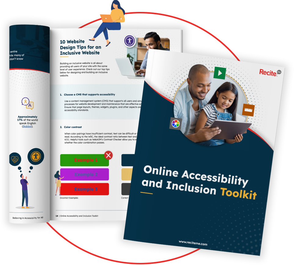
Our 40-page Digital Accessibility & Inclusion Toolkit helps businesses break down online barriers and make a real impact. It offers practical advice on all aspects of digital accessibility, from writing an accessibility statement to accessible website tips and inclusive hiring.
Legislation to be aware of as an Accessible Tourism provider
In Europe and the UK, accessibility is a legal requirement. In some ways this is good because it removes the ambiguity, prescribing you specific guidelines and criteria that must be met in order to stay compliant.
However, if caught resting on your laurels, you could be in for a hefty fine, costly legal battle, or even a barrage of negative press. In this section, we break down some key accessibility laws and regulations that tourism providers in the UK and Europe need to be aware of.

Web Content Accessibility Guidelines (WCAG)
The Web Content Accessibility Guidelines (WCAG) is a set of international standards for web accessibility. It provides a series of recommendations to website owners and producers of digital content based on four key principles: perceivable, operable, understandable, and robust.
While not legally binding in itself, WCAG forms the basis of, and is referenced across, many regional accessibility laws, such as the European Accessibility Act (EAA). By adhering to the guidance outlined in WCAG, Tourism providers can therefore go a long way to complying with broader regional accessibility laws, especially when it comes to digital accessibility.
European Accessibility Act (EAA)
The European Accessibility Act mandates that businesses operating in Europe make their products and services accessible to those with disabilities. For tourism providers, this means everything from your tour information pages to your customer service lines needs to be accessible. While the EAA applies to the majority of European businesses, there is a small exception made for microenterprises — companies that have less than 10 employees or turnover less than 2 million euros per year.
Regulation on Rights of People with Reduced Mobility – Air Travel
This regulation applies specifically to airlines and airports, mandating that they ensure passengers with reduced mobility have equal rights to air travel. Typically, this means providing support, or ‘special assistance’, free of charge to customers travelling by air. The Civil Aviation Authority (CAA) works with industry to promote special assistance and ensure fair access to travel for all.
Benefits of building an Accessible Tourism business
Making your tourism business accessible is part of playing your role in contributing to a fairer society. However, that doesn’t mean your business can’t benefit at the same time. This section outlines some of the most compelling business benefits when it comes to investing in accessibility in the tourism industry.
- Increased customer base: Cater to the 1 billion people globally with disabilities, expanding your market reach.
- Enhanced customer satisfaction: Accessible services lead to happier customers, generating positive reviews and repeat business.
- Improved brand reputation: Demonstrating commitment to accessibility enhances your brand image, appealing to socially conscious travellers.
- Legal compliance: Adhering to accessibility laws reduces the risk of costly legal issues and fines.
- Competitive advantage: Making your business accessible is one way to stand out from the crowd, offering services that competitors may overlook.

