Get A Free Accessibility Test Of Your Website
Run Test NowResearch has found that only 3% of the web is considered accessible, meaning the vast majority of online content is still out of reach for disabled users. But this isn’t just an issue for individuals with disabilities; it’s a concern for businesses, too, who are missing out on a substantial audience.
In fact, this situation calls for the implementation of more comprehensive accessibility strategies, with accessibility testing as the essential first step. Testing allows you to identify accessibility barriers, giving you a clear framework for improvement and tangible goals to work toward.
This checklist serves as your instruction manual, providing a step-by-step guide to setting up an effective accessibility testing system within your organisation, helping you create a more inclusive digital presence for all users.
What is website accessibility testing?
Accessibility tests are audits of websites against recognised accessibility standards. These audits can be conducted via several methods, and a combination of each should be used to achieve the desired result.
- Automated testing: Uses software tools to scan websites for accessibility issues, quickly identifying areas that don’t meet accessibility standards.
- Manual testing: Involves designers or developers manually checking elements like colour contrast, keyboard navigation, and screen reader compatibility to ensure a user-friendly experience.
- User testing: Engages disabled users to test the site first-hand, providing feedback on real-life accessibility and usability challenges.
The aim of accessibility testing is to help you uncover any hidden barriers that might prevent disabled users from interacting with your website or accessing your products and services. To achieve this, audits are carried out against established accessibility standards and laws, such as Web Content Accessibility Guidelines (WCAG), to reveal any areas of non-compliance.
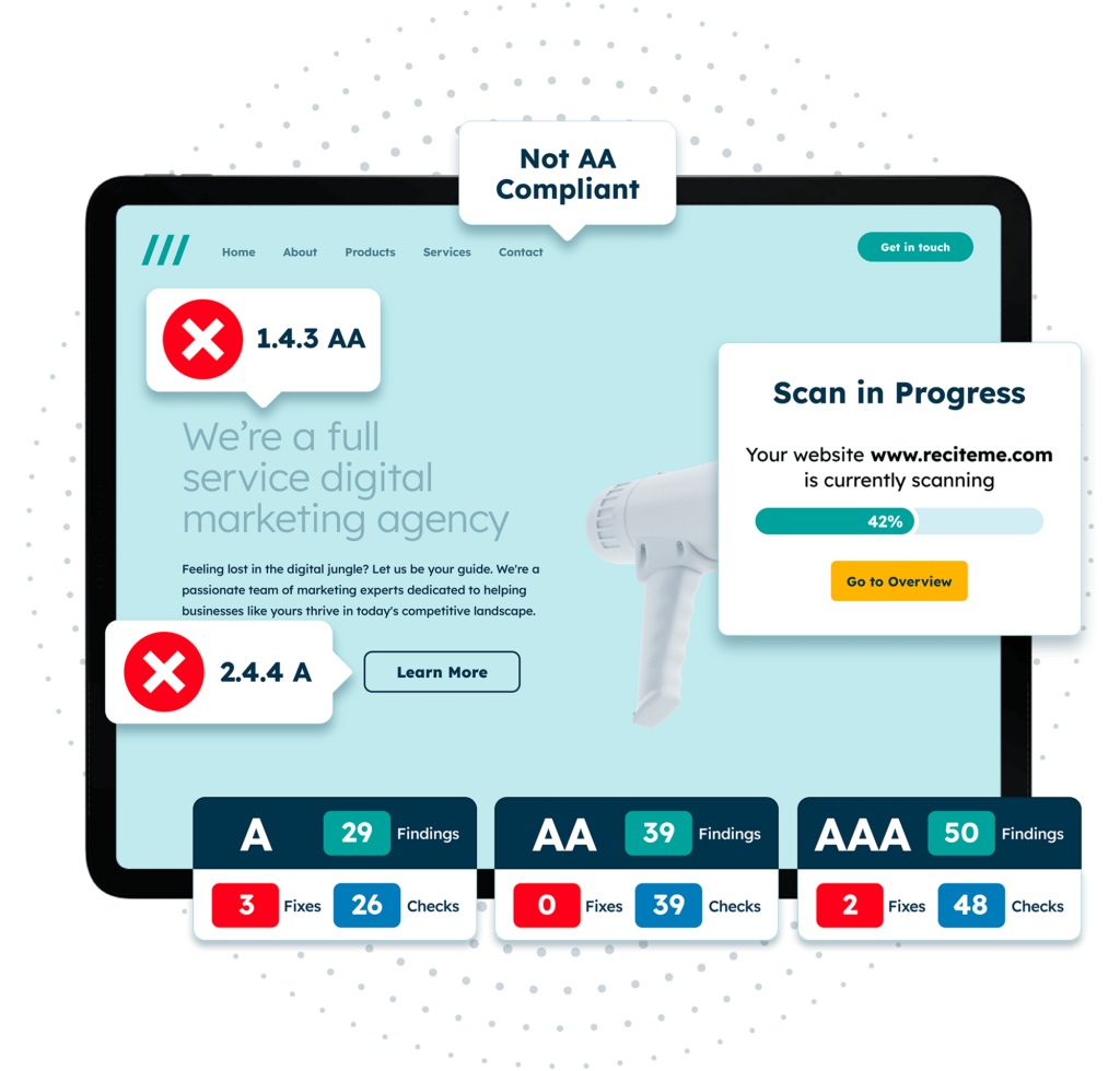
Automated testing tools like the Recite Me accessibility checker scan websites for WCAG issues, such as missing alt text and poor colour contrast, offering suggestions for improvement. Manual accessibility testing then builds on this by ensuring the nuance of certain features, like the descriptiveness of alt text or the clarity of button labels.
Free Accessibility Test of your Website
Finding accessibility issues is now easier than ever. Recite Me offers a free automated scan of your website’s homepage to highlight non-compliance. You’ll get recommendations on how to fix them, helping to improve your accessibility score.
Your all-in-one accessibility testing checklist
While it is important to audit every aspect of your website, there are a few areas where WCAG failures are common. Typically, these failures can be easily identified and fixes are rather straightforward, offering a big return for little time and effort investment:
1. Text alternatives (alt text)
- Add descriptive alt text to all images, charts, and non-text elements.
- Ensure alt text describes the purpose of the image.
- Avoid redundant phrases like “image of” in alt descriptions.
2. Forms and input accessibility
- Provide clear labels and instructions for all form fields.
- Ensure error messages are easy to locate and informative.
- Use logical tab order to guide users through form completion.
3. Multimedia accessibility
- Provide captions and transcripts for video and audio content.
- Offer audio descriptions for visual content in videos where relevant.
- Ensure media controls are accessible and usable via keyboard.
4. Accessible links
- Use descriptive link text that gives context to the link’s destination.
- Avoid using vague phrases like “click here” or “learn more”.
- Ensure all links are identifiable and distinguishable from surrounding text.
5. Keyboard accessibility
- Ensure all interactive elements (links, buttons, forms) are usable via keyboard alone.
- Confirm that focus indicators are visible and clear across the site.
- Test navigation without a mouse to ensure smooth progression across elements.
6. Colour contrast and legibility
- Use high contrast between text and background colours to improve readability.
- Test text colour against background with a contrast ratio of at least 4.5:1.
- Avoid colour-only indicators for important information.
7. Screen reader compatibility
- Use ARIA labels to enhance navigation for screen reader users.
- Ensure headings and landmarks are structured logically for screen readers.
- Test site navigation and content readability on popular screen readers.
Tips for actioning the checklist for accessibility testing
The above checklist provides a clear guidance on what you should be testing for when conducting your accessibility audits. But the checklist alone might not provide the detail you need to start actioning change. This section offers a bit more context to each checklist item, so that you not only understand what you are looking for, but how to fix it once you find it.
You can use any of the links below to jump to different sections of the testing checklist:
1. Text alternatives (alt text)
Consider an online store which displays images of all its products. As long as each image is tagged with alt text, blind or visually impaired users will be able to perceive the contents of the image and make an informed purchasing decision. When writing alt text descriptions, always consider whether you could recreate the image from the description alone. If yes, you’re probably on the right lines
2. Forms and input accessibility
Inaccessible forms can result in users abandoning the form and leaving frustrated. To prevent this, each form field should be clearly labelled, so that users know exactly what information is required. If form fields are filled out incorrectly, error messages should instruct the user very clearly how to fix the mistake. Error messages should not only be easy to understand, but easy to locate as well.
Ultimately, accessible forms cater to a range of disabilities. Clear, well-labelled fields ensure that those with dyslexia can easily follow form instructions, while logical form structure ensures those with limited hand movement can smoothly progress through the form without confusion.
3. Multimedia accessibility
Videos and audio should include captions and transcripts for those with hearing impairments, while visual content in videos may require audio descriptions for blind users. Accessible media controls ensure that multimedia is not just visible but also easy to pause, play, or adjust using a keyboard.

4. Accessible links
Descriptive link text helps users, including those with screen readers, understand where the link will take them. Avoid vague phrases like “click here”, and instead, opt for specific wording, such as “download our accessibility guide”. Distinguishing links with underlines or different colours is another good practice for accessibility.
5. Keyboard Accessibility
Individuals with motor disabilities tend to rely on keyboard navigation instead of a mouse, so every clickable or interactive element on your site should be accessible with a keyboard only. This means that users should be able to use the Tab, Enter, and Arrow keys to move through and select options without requiring a mouse.
A visible focus indicator (often a coloured outline) shows users where they are on the page as they tab through elements. Ensure this focus is easy to see and consistent, so users can clearly identify the selected item.
A person can manually test for keyboard accessibility by using the Tab key to check the functionality of interactive elements, like buttons, links, and form fields. They can also test interactions—such as activating buttons with Enter or Space and closing pop-ups—to confirm smooth, keyboard-only navigation.
6. Colour Contrast and Legibility
Ensuring a significant enough colour contrast between text and its background is essential for the readability of digital content, especially for users with low vision or colour blindness.
For a visually accessible design, ensure your website follows the WCAG best practices for colour contrast, which recommends a minimum ratio of 4.5:1 for normal text. But don’t rely solely on colour to convey meaning, as this can exclude those who suffer from colour blindness. Incorporate additional indicators like icons, text labels, or patterns to improve clarity.
7. Screen Reader Compatibility
Use ARIA (Accessible Rich Internet Applications) labels to help describe content for screen readers. ARIA labels provide additional context to elements, like buttons, forms, and links, which help screen readers describe these components to users. For example, an ARIA label might clarify that a “close” button will close a modal window.
Automated testing for screen reader compatibility would identify code-related issues (like lack of ARIA labels or image alt text), whereas manual testing for screen reader compatibility would involve testers trying out the site with popular screen readers to determine whether the output makes sense to a human or not.
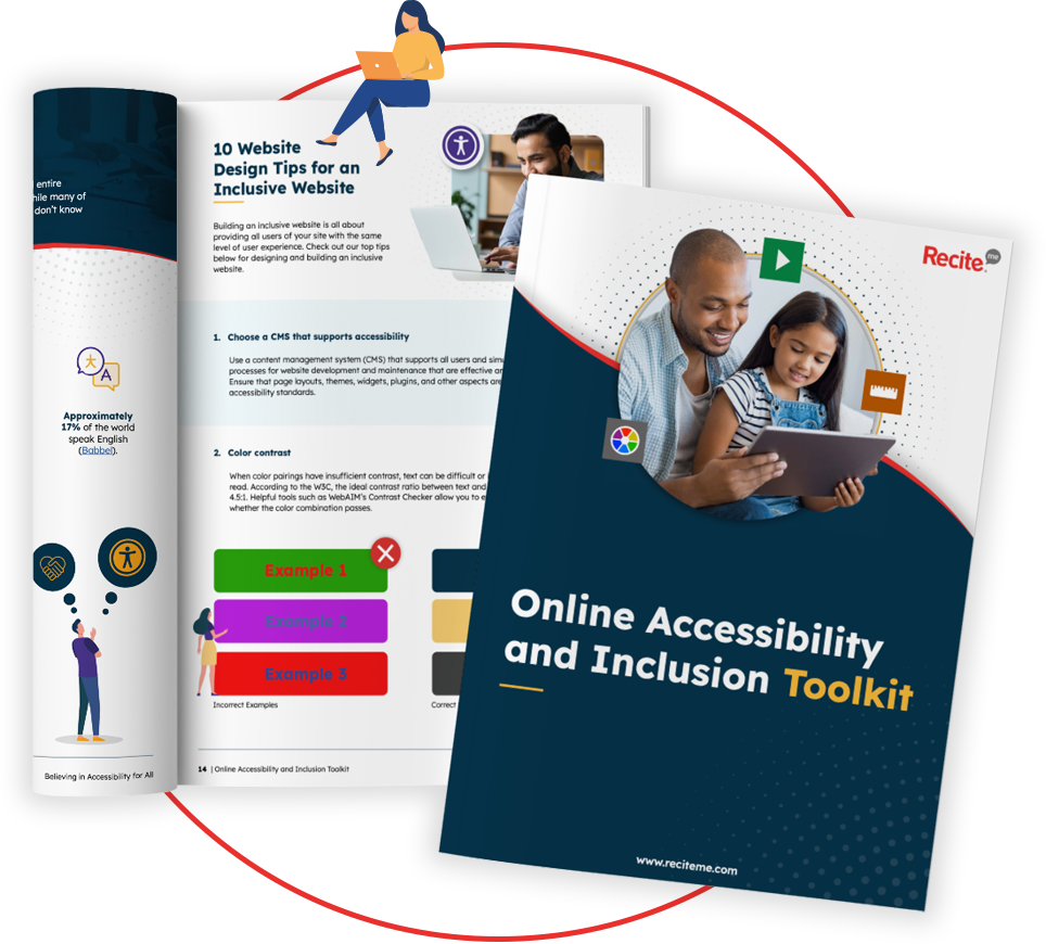
Our 40-page Digital Accessibility & Inclusion Toolkit helps businesses break down online barriers and make a real impact. It offers practical advice on all aspects of digital accessibility, from writing an accessibility statement to accessible website tips and inclusive hiring.
The importance of creating an accessible website through testing
An accessible website is vital in today’s digital landscape, not only because it fosters inclusivity, but because it makes good business sense. By ensuring your website is accessible, you’re supporting individuals with disabilities, who represent a significant portion of the population, and no doubt a significant portion of your audience too.
Furthermore, research shows that consumers are more likely to support businesses that demonstrate a public commitment to diversity and inclusion. While the return on investment (ROI) for accessibility differs across companies, a recent report estimated that improvements in accessibility and user experience yield a return of $100 for every $1 invested.
The business case for accessibility testing and why you should do it
Regulatory compliance and ethical business practice aside, there are some pretty compelling business reasons to invest in accessibility testing. It is the first and most important step in creating an accessible website. In this way, testing and accessibility are very much intertwined. An accessible website broadens your audience, improves user satisfaction, and can even boost your search engine ranking.
Here are some of the most significant business benefits of accessibility testing:
- Future proofing: Regular and sustained testing future proofs your business by keeping your website up to date with ever-changing accessibility standards.
- Improved user experience: Accessibility often enhances overall usability, making your site more enjoyable for all users.
- Optimised development workflow: Regular accessibility testing encourages developers to follow best practices consistently, leading to a smoother and more efficient development workflow.
- Increased audience reach: Around 15% of the global population lives with some form of disability, so accessibility broadens your potential customer base.
- Better SEO: Search engines reward sites with clear structures and alt text, which also improve accessibility.
- Higher quality assurance: By integrating accessibility testing into QA processes, teams produce more reliable and resilient products, with fewer bugs and errors impacting end users.
- Reduced legal risk: By adhering to accessibility standards, you reduce the risk of facing lawsuits over digital inaccessibility.
- Enhanced brand image: Demonstrating commitment to inclusivity can enhance your brand’s reputation, building loyalty and trust among customers


