Get A Free Accessibility Test Of Your Website
Run Test NowWhen it comes to accessibility testing, it can be tempting to replace manual methods with flashy new automated testing tools. After all, automation means efficiency and accuracy, right? Well, yes, but it doesn’t necessarily provide a comprehensive evaluation of your site. Automated tools can only detect about 30% of accessibility barriers. While this is a great start point, it is manual testing where you dive into the nitty-gritty and uncover accessibility barriers that might otherwise go unnoticed. So, before throwing the baby out with the bath water, let’s take a closer look at what manual testing has to offer; what it is and how it can be implemented across your organisation.
What is manual accessibility testing?
Manual accessibility testing is a hands-on process where testers – typically web designers, consultants, or accessibility experts – crawl through a website in search of accessibility barriers that automated tools might miss. The job of the tester is to simulate the browsing experience of a disabled user. Backed with the knowledge of accessible design, testers are able to apply a level of expert human judgement to aspects of web accessibility, where automated tests might not be able too.
The aim of manual testing is simple: to evaluate whether real-world users with disabilities can effectively use the website, and to provide recommendations for improvement.

Pros and cons of manual accessibility testing
As with anything, manual accessibility testing has its own unique set of benefits and challenges. You should assess each with a view to your own organisation’s resources and capabilities before making a decision on when, how, and the extent to which you will implement manual accessibility testing.
Pros
- Captures human-centred insights: Captures usability nuances that machines miss.
- Offers specificity: Testing scenarios can be adapted to reflect real users’ needs more accurately.
- Provides immediate feedback: Testers can make adjustments in real-time, providing actionable insights faster.
- Increases accuracy: Contextual understanding allows testers to provide more accurate details of accessibility barriers and how to remove them.
Cons
- Time-consuming: Requires more time than automated scans, especially for large websites.
- Subject to human error: Depth of the results can depend on the tester’s skills and experience level.
- Limited scalability: Not practical to manually test every element on very large websites.
- Higher costs: Manual testing can be more expensive due to the time and expertise required.
Free Accessibility Test of your Website
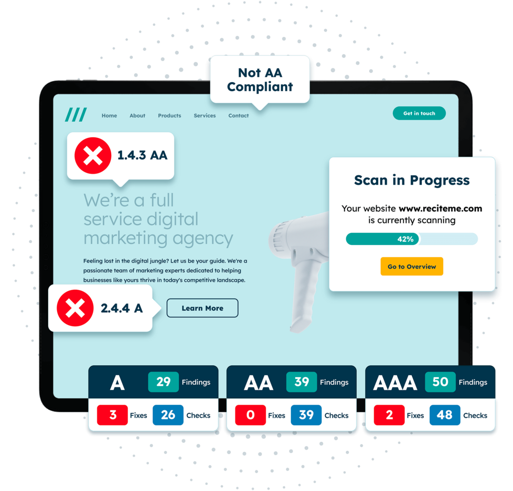
Finding accessibility issues is now easier than ever. Recite Me offers a free automated scan of your website’s homepage to highlight non-compliance. You’ll get recommendations on how to fix them, helping to improve your accessibility score.
What makes a good accessibility tester?
An effective accessibility tester should possess a keen understanding of both web development and the specific needs of users with disabilities. The latter helps testers identify specific accessibility issues, and the former helps testers recommend appropriate fixes.
Testers should be detail-oriented, empathetic, and have experience using various assistive technologies, like screen readers or speech recognition software. But perhaps the most important factor in being a good accessibility tester is familiarity with accessibility standards, such as the Web Content Accessibility Guidelines (WCAG). Without an expert understanding of WCAG, testers don’t know what to look for; they are unable to identify regulatory failures or recommend fixes to a client’s desired level of regulatory compliance.
Technical skills aside, a good accessibility tester should demonstrate adaptability and a willingness to put themselves in the shoes of the end user. Thorough testing requires one to navigate a website in the same way a disabled user would, but with the benefit of expert insight. To achieve this, the tester really needs to understand the frustrations of disabled web users, and be able to adapt their audit accordingly.
Accessibility issues you should look for when manual testing
Accessibility issues can be broken down into three main groups: keyboard accessibility, visual accessibility, and content accessibility. This section unpacks each of these main groups, revealing exactly what you should be on the lookout for when conducting manual tests of your own.
Keyboard accessibility issues
Keyboard accessibility issues occur when users with motor impairments, who rely solely on keyboard navigation to browse a site’s web pages, encounter obstacles. These issues come in a range of different forms.
- Tab order problems: Interactive elements should be accessible in a logical order of that which aligns with the visual layout.
- Keyboard traps: Ensure users can navigate through, and exit, all interactive elements using keyboard functions.
- Skip to main content: Provide a “skip” option for users to bypass repetitive navigation.
- Focus visibility: Visible indicators (like a highlighted border) on the active element help users see where they are on the page.
Content accessibility issues
Content accessibility issues involve barriers that come about from written content or multimedia. This could be the way the content is written, how it is structured, or the features, or lack thereof, that are offered alongside it. Typically, these kinds of issues hinder understanding for people with cognitive, visual, or auditory disabilities.
- Complex language: Users with cognitive disabilities rely on simple language that is easy to understand.
- Uncaptioned videos: Captions and transcripts ensure that those with hearing impairments can still follow video content.
- Inconsistent headings: Structured headings help screen readers interpret content structure.
- Non-descriptive link text: Links like “click here” lack context and can confuse both users and assistive technologies like screen readers.
Visual accessibility issues
Visual accessibility issues impact people with visual impairments, and the extent of visual impairments that exist is quite broad. Users with low vision might experience different frustrations to users with colour blindness or total blindness. Addressing these issues involves adjusting the site’s visual presentation, which is often best achieved through the offer of customisation tools, like Recite Me’s accessibility toolbar.
- Insufficient colour contrast: Text should stand out against its background to ensure readability and a clear colour contrast.
- Images without alt text: Screen readers rely on descriptive text to convey the contents of an image to its users.
- Text resizing issues: Users should be able to enlarge text to a visible size without compromising layout or readability.
- Non-standard fonts: Highly decorative fonts can be difficult to read; sans-serif fonts are generally preferred.

Pair manual testing with automation to get the best possible results
Running manual tests without first conducting automated tests is like proofreading a document that you haven’t yet written. But doing automated testing without manual tests afterward is like failing to proofread a document you have written. In this sense, the two compliment each other, and by combining them you can achieve comprehensive accessibility.
Automated tools are a great place to start. They are able to quickly scan websites of any size, identifying common coding errors and compliance gaps by referring to standards like the WCAG. Certain tools, like Recite Me’s accessibility checker, can even synthesise results into a concise report with actionable tips for improvement.
However, automation alone can miss some of the more subtle usability elements of accessibility that require human judgement to notice, such as readability, intuitiveness, and real-world interactions with assistive technology. For instance, automated tools may flag missing alt text but lack the capacity to assess whether descriptions are meaningful. Manual testers can verify if alt text genuinely describes the image and is not overcomplicated, offering context to those with visual impairments. Similarly, an automated scan might miss poor tab order, which manual testers would experience the effects of first hand. By blending both approaches, businesses can ensure a more accessible, user-friendly website.
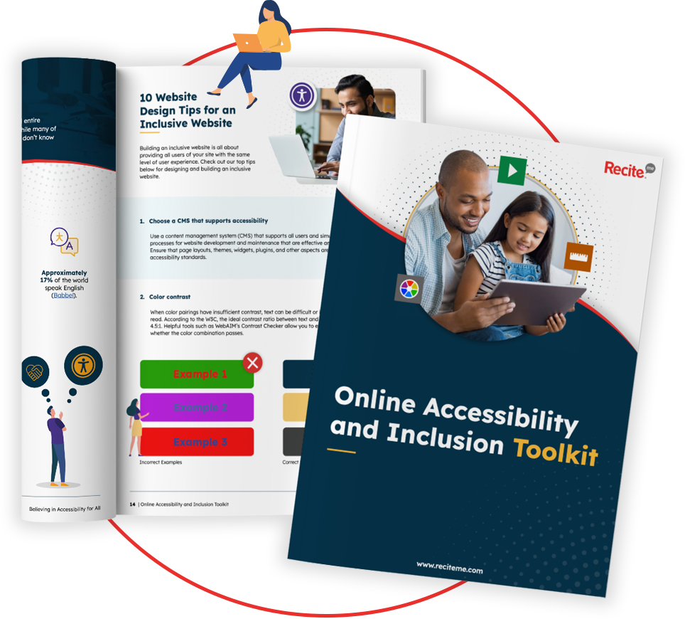
Our 40-page Digital Accessibility & Inclusion Toolkit helps businesses break down online barriers and make a real impact. It offers practical advice on all aspects of digital accessibility, from writing an accessibility statement to accessible website tips and inclusive hiring.
The benefits of testing for website accessibility
Investing in accessibility testing best practices doesn’t just help businesses stay compliant, it also has a proven return on investment. A Forrester report found that for every dollar invested in accessibility improvements, businesses see a $100 return. This ROI comes from better user experiences, reduced redesign costs, and increased reach.
Here are some of the main business cases for accessibility:
- Cost savings on future redesigns: Addressing accessibility issues early means fewer large-scale changes later, saving both time and money in the long run.
- Broader audience reach: An accessible website opens your doors to the millions of disabled internet users who may not otherwise have been able to access your products and services.
- Enhanced usability for everyone: Accessibility improvements such as clearer navigation, improved readability, and keyboard accessibility – benefit all users, not just those with disabilities.
- Improved brand image: Demonstrating a commitment to accessibility builds a positive brand image and positions your business as inclusive and forward-thinking.
- Increased customer loyalty: A website that is easy to use and navigate leads to greater levels of customer satisfaction and user engagement.
- Legal compliance and risk reduction: Proactively addressing accessibility reduces the risk of legal issues, which are increasingly common as accessibility standards evolve.

