



















This guide looks at an ideal way to build expandable accordion sections for web pages and keep them accessible for all users whilst also not relying on javascript.
Accordions are a great way to provide lots of detailed content on a page without visually overloading the user by having everything be visible at the same time. There are many ways to achieve this expandable/collapsible content, but a lot of these solutions can leave content inaccessible for some users. If some users cannot interact with the toggle, then they cannot reach the hidden content. Javascript can introduce a lot of these issues, triggering on actions that not all users can perform, meaning some people cannot see the content contained within. If we can achieve something using only HTML and CSS, the chances are this will be better supported by assistive technologies than something which relies on Javascript.
Identifying the problems
While auditing websites, we see a number of common issues with accordion components, such as:
- Toggle controls which do not receive keyboard focus.
- Unannounced opening or closing of the hidden content for screen reader users.
- Unhelpfully marked up toggles which don’t indicate their expandable nature to screen reader users.
Building accessible accordions
Structuring the component
So, how do we overcome these issues and make sure everyone can use an accordion component equally well? First of all, in a lot of cases these expandable items are often included in a list on a page, so list markup is a great way to start this component:
<h2 id="faqTitle">FAQs</h2>
<ul aria-labelledby="faqTitle">
  …
</ul>
We have a list markup now, which is also labelled by referencing a nearby visual heading. This helps screen reader users quickly understand the purpose of the list.
The basic expandable markup
Next, we can start building each of the expandable sections themselves. For this, the main elements we’ll be using are <details> and <summary>. These element types were widely adopted by all browsers back in 2020, but in our experience still don’t see much use. Their intent here is precisely what we need them for; a details section which is not always shown in full, with a summary that is both only always present and which triggers the show/hide of the full content. At its most basic level, the markup for an accordion using these elements would look like this:
<h2 id="faqTitle">FAQs</h2>
<ul aria-labelledby="faqTitle">
  <li>
    <details>
      <summary>...</summary>
      ...
    </details>
  </li>
</ul>
This gives us somewhere to put the always-present summary and somewhere to put the full text. The browser handles everything else in terms of showing/hiding the full details and announcing the opening or closing to screen reader users. This is exactly what these elements were designed to do.
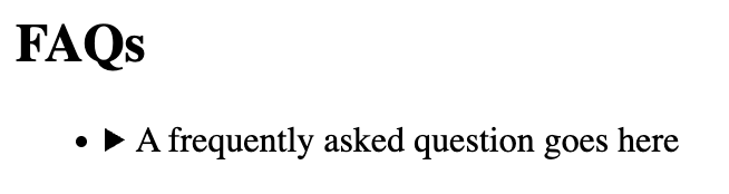
Based on browser default styling in Chrome, what we have above looks like this when collapsed:
And it looks like this when expanded:
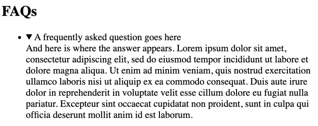
Arguably this isn’t the prettiest at this stage, but there’s a lot we can do with styling. Importantly, at this stage, the accordion control is accessible to all; the <summary> element receives both keyboard and screen reader focus, and using spacebar or enter on this element expands and collapses the full content. This is all done through the native HTML elements, too, so no need to write a potentially buggy or incomplete JS snippet to handle the open/close. Also, the expanding and collapsing is announced to screen reader users, meaning non-sighted users are aware that content has been revealed or hidden.
Styling the component
The <summary> element behaves very much like a button here, and can be styled accordingly either as a button as a whole, or as a button for just the ::marker, although it may be more productive to hide the ::marker and use a more customisable ::before pseudo element.
Once we’ve added some styling to these elements, we can get a list of accordion items that look like this:
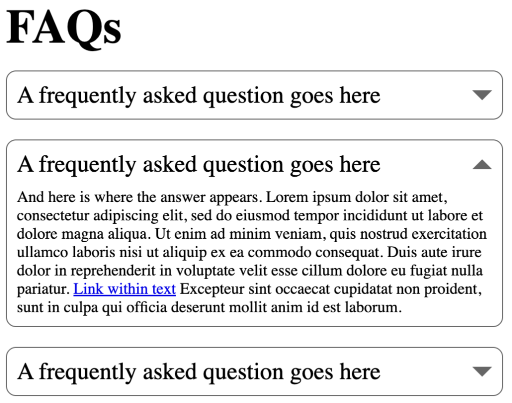
We’ve now got a custom marker using a ::before pseudo element which is currently styled like an arrow using the CSS border trick. This can also be altered when the accordion area expands by targeting details[open] summary::before selector without having to add any additional markup. The browser automatically adds the open attribute when the <details> element opens.
The full CSS for this implementation is as below:
.accordion-list {
    list-style: none;
}
.accordion-list li {
    margin: 0;
}
details {
    padding: 10px;
    border: 1px solid #666;
    border-radius: 10px;
}
details[open] summary {
    margin-bottom: 10px;
}
summary {
    font-size: 1.5em;
    position: relative;
    display: block;
    cursor: pointer;
}
summary::marker {
    display: none;
}
summary::before {
    content: '';
    position: absolute;
    top: calc(50% - 5px);
    right: 0;
    width: 0px;
    height: 0px;
    border-left: 10px solid transparent;
    border-right: 10px solid transparent;
    border-top: 10px solid #666;
}
details[open] summary::before {
    transform: rotate(180deg);
}
Closing thoughts
The <details> and <summary> elements are powerful ones, specifically designed for just this kind of use, and native HTML elements will almost always win out when it comes to accessibility. From our experience, the main reason their use is not more widespread is because of a lack of awareness among developers. If you’ve read this article, you are now aware of them and the good they can do. They are simple, powerful and flexible – our developers have even been looking at building mega-menus with them. They make the life of a web developer considerably easier, so go and spread the good news!
This has been a discussion of their most basic use, however. Any content which is designed to appear/disappear on screen can make use of these elements to handle this functionality better. We may well see them again in the future reviewing an implementation of them to handle a mega-menu – we will have to see!