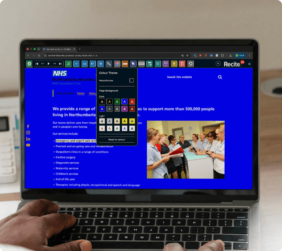
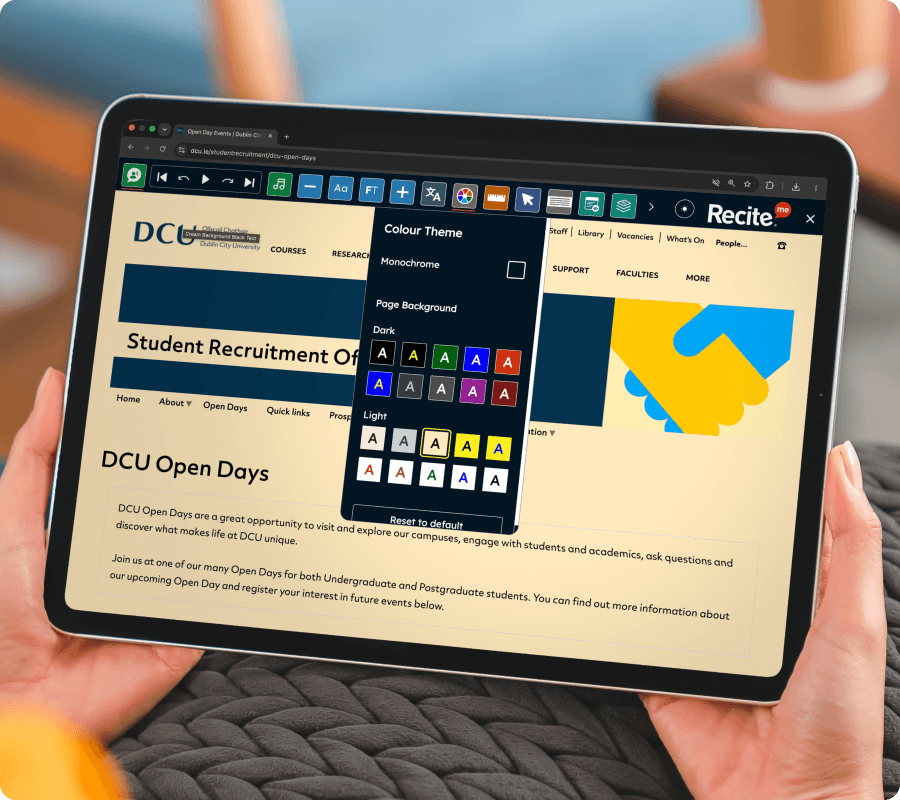
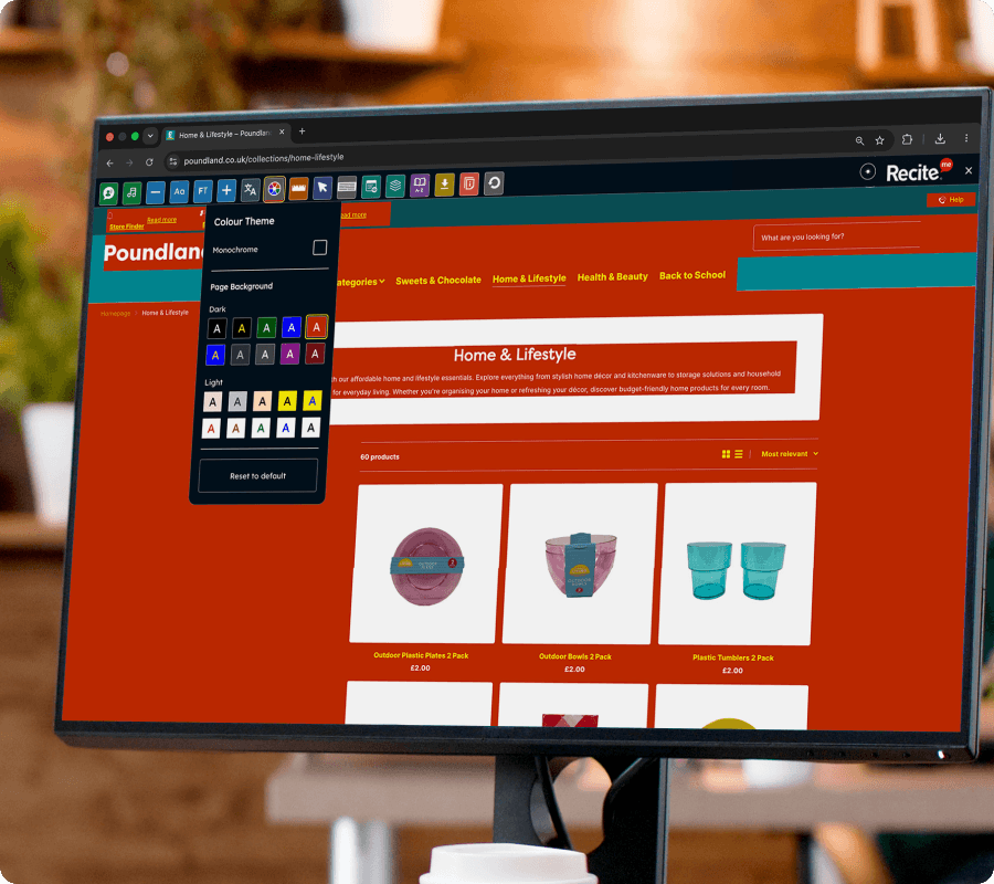
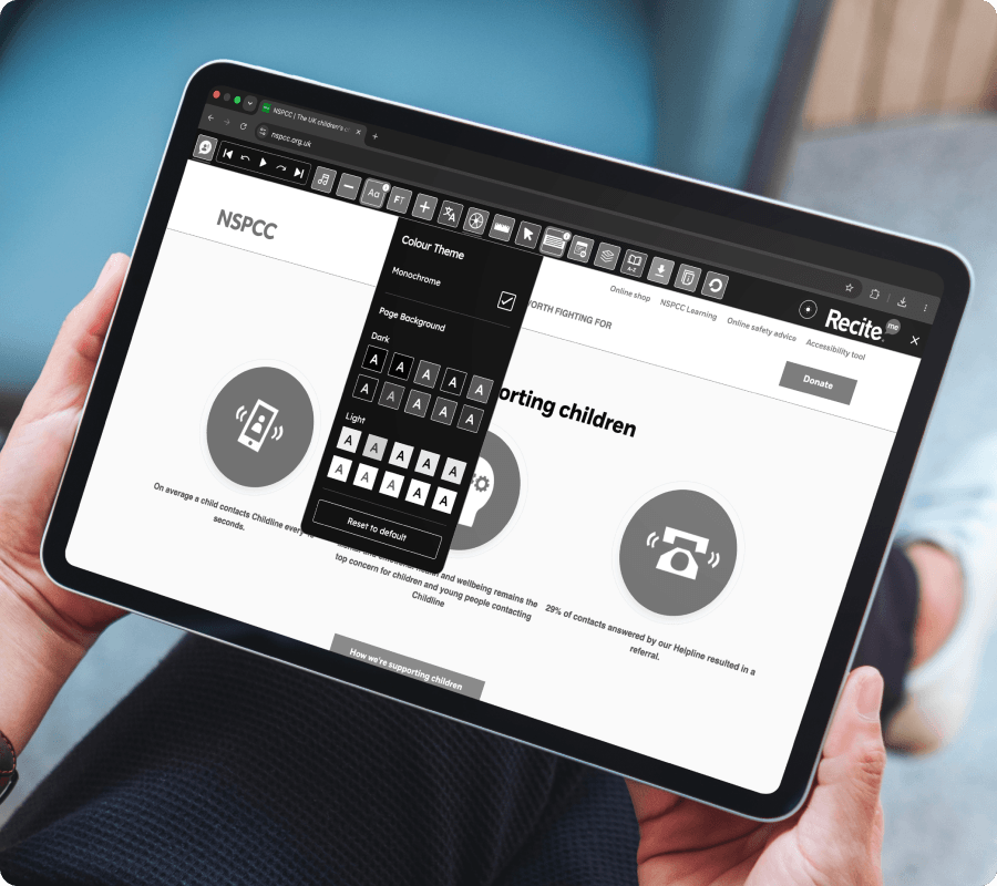
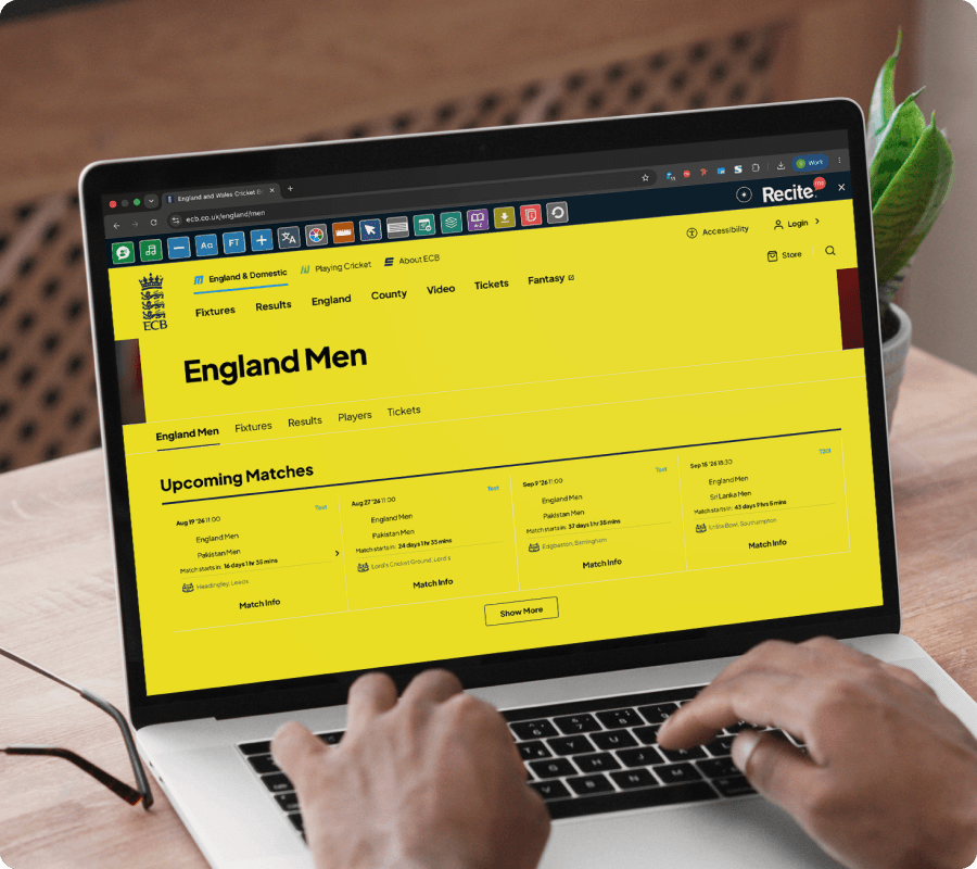
Let visitors use the Recite Me Assistive Toolbar to adjust colour settings for improved readability. The Colour Themes feature allows users to change page colours and contrast levels, helping make website content easier to see and navigate.
CUSTOMISE YOUR VIEW
Colour Themes on the Recite Me Toolbar
The Colour Themes feature on the Recite Me Toolbar allows website visitors to modify colour contrast and background settings to suit their visual preferences.
No downloads or installation required for website visitors.
Make your website accessible in more ways
See how Colour Themes on the Recite Me Assistive Toolbar helps break down accessibility barriers and support diverse audiences across your website.
Use colour settings alongside other toolbar features
Access the feature across desktop, tablet, and mobile
WHO IT HELPS
Who benefits from Colour Themes on the Recite Me Toolbar?
Colour customisation supports:
People with visual impairments
Users with colour vision deficiency (colour blindness)
People with dyslexia
Users experiencing visual sensitivity or eye strain
Neurodivergent users
Anyone who benefits from improved colour contrast
What our
customers say
Organisations around the world use the Recite Me Assistive Toolbar to create more inclusive experiences for their visitors.
“I personally use the Recite Me tool on a daily basis. I find the option to turn the website to monochrome really useful when dealing with brain fog, migraines or fatigue associated with my disabilities.”
Maisy Gordon, 20 Stories High
“Being able to change the background to black is a real bonus for me – I get dry eyes, so this extends the amount of time I can stay online.”
Yes. The Recite Me Toolbar allows visitors to adjust colour themes, including contrast settings, background colours, and dark mode options to improve readability.
Adjusting colour contrast and background settings can make content easier to read for people with visual impairments, colour vision deficiency, and users who experience visual fatigue when reading online.