If you work for a law firm or insurance company, managing risk is part of your job. But, what if we told you that you might already be taking an unnecessary risk?
By not making your website accessible, you risk missing out on 25% of your target market. On average, 1 in 5 people has a disability that can prevent them from accessing information online. Inequality in accessing information leads to inequality in access to products and services, creating even more disparity for people who already feel marginalised and vulnerable.
We’ve chosen to discuss insurance and legal firms together because of the many synergies between the two sectors:
Both services involve complex language that can be challenging for anyone to read, let alone vulnerable customers facing online access barriers.
Both services are typically required in times of immense stress or hardship.
Choosing the right policy or service is an emotional purchase because customers are looking to protect their lives, livelihoods, homes, health, and family.
Vulnerable Customers Explained
“Nobody should be at a disadvantage just because they read and understand information differently.”
Ross Linnett, Recite Me Founder and CEO
There is a general expectation that buying insurance or legal cover can be done in seconds within just a few clicks. But for those who face online access barriers, it’s not that straightforward. People with disabilities have to spend way more time, effort, and energy purchasing cover or getting an accurate quote. Why? Because the way many websites are designed and presented makes them inaccessible.
It’s worth remembering that not all disabilities are physical. Many hidden and temporary disabilities also affect website accessibility. Here are just a few examples of conditions that can make accessing information online challenging:
Visual impairments
Deafblindness
Colour blindness
Dyslexia
Hyperlexia
Dyspraxia
ADHD
Epilepsy
Autism
Temporary or permanent physical impairments
Speaking and reading English as a second language
It’s incredibly difficult for these customers to feel that they’re in control and getting the best advice and deals because it’s so much harder to access and absorb information when they are researching their options.
Online Access Barriers
By excluding vulnerable customers from accessing the information on your website, you are doing them an injustice. You’re also actively blocking up to 20% of the population from accessing your services. Here’s how:
Some website functions are unavailable to customers using screen readers to compensate for vision deficits
Those with hearing loss cannot follow demonstration or explainer videos.
Colourblind people cannot read text on websites with poor colour contrasts between the background and foreground.
Websites using certain fonts and pages with lots of underlining or italics are impossible for people with dyslexia to read.
Flashing content and distracting image carousels are not welcoming to people with epilepsy or cognitive/neurological disabilities.
People with mobility issues rely on keyboard navigation as they are unable to use a tablet or mouse.
Those not confident reading in English are afraid to make purchases because they don’t understand the long sentences and complicated terminology.
In many cases where insurance and legal assistance is required, customers are already under significant pressure. For example, in stressful situations such as bereavement or divorce, people become overwhelmed and struggle to understand information – regardless of whether they have a pre-existing condition or not. So, the clearer and easier your information is to access, the better it is for everyone.
“Failure to communicate with vulnerable consumers in ways they can understand may result in an increased risk. Consumers may not be able to understand the information they are sent or may struggle to communicate their needs.”
The Financial Conduct Authority Report, July 2020
Equal Support for Everyone
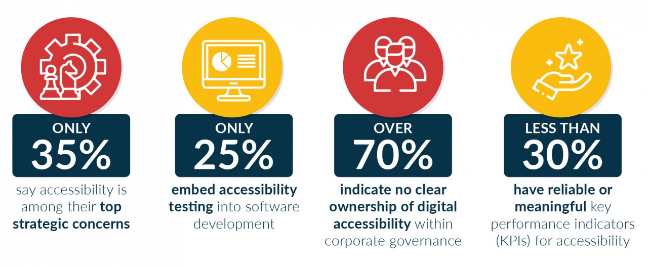
Everybody should have the right to protect their loved ones and belongings and access legal advice and support when they need it. Yet, we continue to see access barriers across the legal, insurance, and finance sectors. Research by QA Vector revealed that:
Only 35% say accessibility is among their top strategic concerns.
Only 25% embed accessibility testing into software development.
Over 70% indicate no clear ownership of digital accessibility within corporate governance.
Less than 30% have reliable or meaningful key performance indicators (KPIs) for accessibility.
Attention to accessibility is usually only driven by legal action or complaints.
That last point is particularly disheartening. There are several reasons why making your website accessible is the right thing to do, and – spoiler alert – the law is one of them! It’s pretty crazy to think that so many firms don’t make reasonable adjustments themselves when so much of their core daily business revolves around handling legalities on behalf of other entities.
Companies Leading the Way
We are delighted to welcome firms committed to providing inclusive online journeys and we’re proud to work with several organisations in the law and insurance sectors already. Our current client list includes:
Cura
Cura offers accessible insurance services to people who have difficulty buying policies that cover life insurance, critical illness, and income protection. With diversity and inclusion as a focal point, the team at Cura is passionate about driving inclusive insurance forward to help as many people as possible.
“Improving accessibility to your organisation shouldn’t be a side project or something that you’ll eventually get around to. It is simply the right thing to do.”
Kathryn Knowles, Founder
Keystone Law
Keystone Law brings a particularly modern attitude to the legal marketplace. Their motto is “Where innovation delivers results”, and the firm prides itself on doing things differently. Their unique approach includes using bespoke technology and contemporary working practices to revolutionise the industry.
“There’s a real element of loyalty and trust that comes with making content more accessible. We don’t want clients to visit our website for 30 seconds and not get what they need. We want them to be engaged and genuinely read what’s available.”
Georgiana Foster, PR and Communications Manager
Lindsays
Lindsays is a Scottish law firm with offices in Edinburgh, Glasgow, and Dundee. They offer advice and guidance to businesses and individuals, and have already been listed in The Legal 500 and Chambers UK guides to the best law firms for 2022.
“Given that a large majority of legal services are often of a sensitive or personal nature, it’s important for clients to feel that Lindsays is approachable and accessible. 11% of the people who opened the launch email for our latest online publication used the Recite Me assistive toolbar to view it. This reinforces the importance of making it as easy as possible for everyone to access information that they want.”
FLiP
FLiP is a London-based law firm specialising in family law. They promise exceptional legal expertise, integrity, and specialist emotional and practical support. FLiP was named as a leader for client service by Legal Business in 2020 and was ranked as one of the best law firms by The Times in 2019, 2020, and 2021.
“The Recite Me toolbar reinforces both our commitment to diversity and inclusion in all its forms, and our commitment to ensuring that we deliver the very best service to our clients.”
How Does Recite Me Help?
Once the Recite Me assistive toolbar is installed on a website, access barriers can be broken down. By making single or multiple adjustments to create a uniquely customised experience, users can:
Personalise font size, type, and colour options to make each web page easier to read. Recite Me provides a wide variety of accessible fonts for visually impaired people.
Download content as an audio file as an alternative to reading.
Access text to speak functions in 35 different languages.
Have text read aloud at varying speeds.
Utilise a screen mask and ruler for better focus.
Convert text into over 100 different on-screen languages.
Make use of the toolbar’s built-in dictionary and thesaurus.
Switch to “text-only” mode to strip away graphics and page clutter.
Additionally, Recite Me now offer a website WCAG checker. This tool allows users to check their website accessibility score and see how they can make their website more accessible.
Recite Me Data
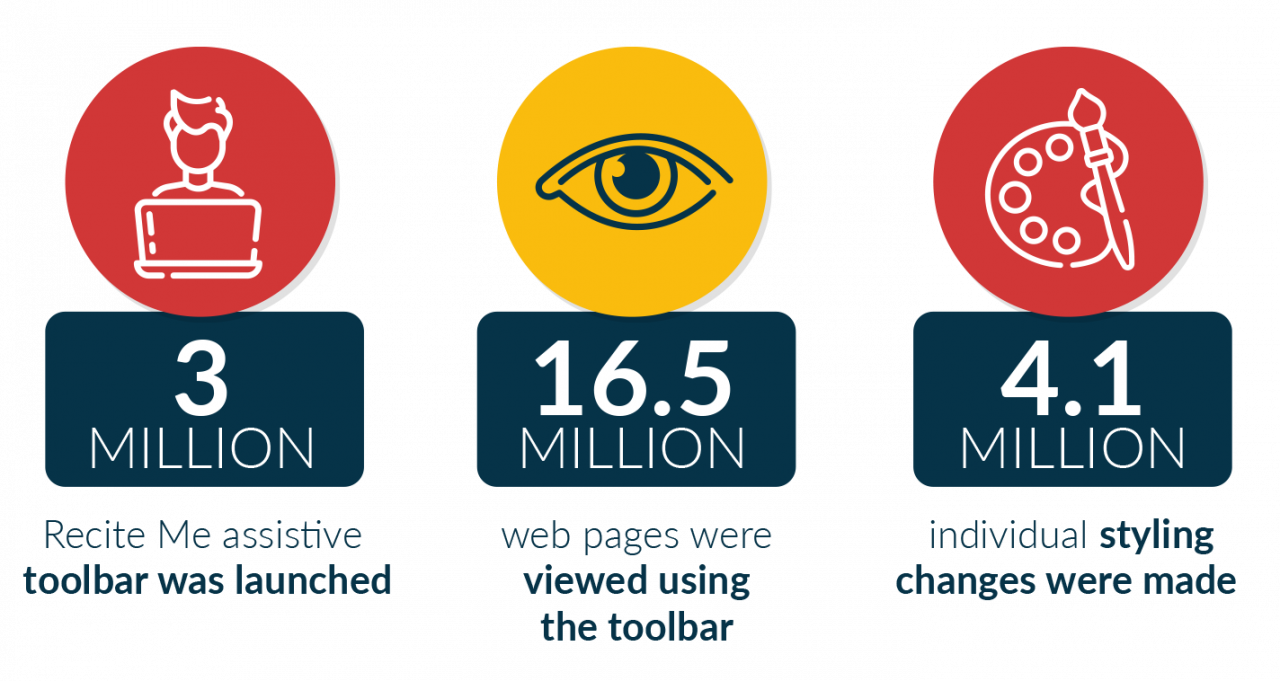
Recite me is now installed on over 3,500 websites, and over the last 12 months, our data shows that:
The Recite Me assistive toolbar was launched over 3 million times
Over 16.5 million web pages were viewed using the toolbar
Over 4.1 million individual styling changes were made
12.3 million pieces of content were translated into different languages
31 million pieces of content were read aloud
4 Steps to an Inclusive Online World
If you’re an insurance broker or law firm looking to make your website more inclusive, these are the recommended steps to follow:
Test your website against Web Content Accessibility Guidelines (WCAG). These are internationally recognised and are required by law for certain sectors and public-facing entities.
Rectify any site errors that are not level A or AA compliant.
Update your website build to meet best practices for an inclusive experience.
Invest in assistive technology to provide a truly customisable and inclusive online journey.
Recite Me is quick and easy to implement on your website and can usually be installed in under an hour. If you’d like to know more or join the hundreds of companies that have already adopted our inclusive, please contact our team or request a demonstration.
