
Get Your Free Accessibility & Inclusion Toolkit
Download NowChoosing an accessible font size for your website is just as important as style and colour options. Disabled people, particularly those with vision or learning differences, may struggle to read small fonts.
Making the right choice can mean the difference between someone using your website, or clicking away for good. So, what do you need to keep in mind when selecting an accessible font size? Let’s take a look.
What is considered an accessible font size?
The minimum recommended font size for body text is 16px. However, this will vary depending on your website and the audiences you’re targeting.
Businesses should also familiarise themselves with the Web Content Accessibility Guidelines (WCAG). This consensus standard was produced by the World Wide Web Consortium (W3C), and provides useful guidelines for digital accessibility. It’s widely considered as an accessibility benchmark for websites and applications.
WCAG does not include specific guidelines for accessible font size. However, there are relevant recommendations under Success Criterion 1.4.12: Text Spacing. This section recommends that your website content and functionality should remain in tact with these specific standards:
- Line spacing at least 1.5x the font size
- Spacing after paragraphs at least 2x the font size
- Letter spacing at least 0.12x the font size
- Word spacing at least 0.16x the font size
In other words, if users wish to change the text spacing for easy reading, their experience of your website should not be affected.
Why is it important to use a font size that is accessible to people with disabilities?
According to the House of Commons Library, there are around 16.1 million disabled people in the UK. That’s nearly 1 in 4 people across the total population. That includes over 2 million people with sight loss, and 6.3 million with dyslexia.

If your business or organisation ignores the needs of these web users, you will be missing out on a significant audience base. Beyond that, you’ll also be jeopardising your reputation and the ethical standing of your company.
Outside of this, there are also legal ramifications to consider. Whether your company is a private or public sector organisation, laws are in place to protect disabled web users. In particular, inaccessible websites can be a breach of the Equality Act 2010. The Equality and Human Rights Commission can also step in against both public and private UK companies that infringe on accessibility requirements.
Case study: Real-world legal action
One example of legal action occurred in 2023. This case involved a blind man, Stephen Campbell, who used a screen reader for accessibility. He was unable to use his screen reader within the online application process for a promotion on the Health and Social Care Northern Ireland (HSCNI) website. He also could not find information on the reasonable adjustments required. This discriminated against him, as it meant he was unable to apply for the promotion as a sighted person could. He was awarded a settlement of £3,000.
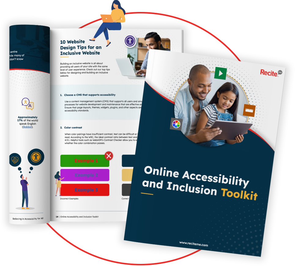
Our 40-page Digital Accessibility & Inclusion Toolkit helps businesses break down online barriers and make a real impact. It offers practical advice on all aspects of digital accessibility, from writing an accessibility statement to accessible website tips and inclusive hiring.
Best practices for choosing accessible font sizes
Fortunately, implementing accessible font sizes into your website is relatively easy. Below are a few simple steps you can implement to ensure your business is compliant.
Set body text to at least 16 px
Generally speaking, you should aim to set your body text to 16px at a minimum. Whilst there is no official minimum font size specified in the WCAG, 16px is widely accepted as an accessible size for body text. That’s because it’s easy for most people to read across different devices.
You’ll also need to keep in mind that some fonts are easier to read than others. So, you should tailor your approach to the font. Cursive fonts, for example, may be more ornate and require a larger size to be legible. Headings will also typically be larger.
Use relative units like em, rem, or % instead of fixed px
This advice might initially seem contradictory to the point above, so let’s delve in further. 16px is a recommended minimum font size for websites, as it’s typically easy to read across devices. However, it’s only a basic guideline. If you want to be more inclusive, you should aim to express font sizes using relative units.
Relative units such as “rem”, “em” or “%” enable web users to adjust text size on your website using their browser. This makes it very easy for users to pick an accessible font size that meets their needs, as they can adjust the sizing themselves. So, if they’ve set a default font size for their browser or visit your website on a mobile device, your website layout and text will adjust automatically.
Headings should follow a logical size hierarchy
In HTML, headings are recorded with the H1 to H6 tags. Make sure that you implement these in the create order to create a clear size hierarchy for your webpages. That means starting off with H1 – you should only use one of these on a webpage, for a title. Then move onto H2s, followed by H3s, and so on.
Switching the order around, e.g., with a H3 immediately following a H1, would be confusing for readers. It’s also less accessible for those who use screen readers, as they require accurate HTML code (including for heading tags) to make sense of the page.

Ensure sufficient line spacing
For line spacing, you should aim for at least 1.5x. Keep in mind the WCAG best practices here. They recommend you ensure your website remains functional when spacing is adjusted to 1.5x the font size at a minimum. This ensures that the website retains its functionality if the user adjusts their text spacing.
Use accessible font on every content type
It’s not just your website that should feature an accessible font size. Think of the images, documents, and videos you have on your website. Not to mention your marketing and communications emails. Accessibility shouldn’t be a tick-box exercise. It needs to be implemented with care across all materials and content types.
Train your web development team in web accessibility
Whilst small fixes can make a difference, nothing replaces a clear grasp of accessibility issues. Make sure your web development and content teams are up-to-date with website accessibility training.
This ensures they understand the fundamentals of inclusive web design, including legal compliance and assistive technology. That way, they can implement small fixes and big changes with a clear grasp of why these adjustments are essential. Recite Me offers free accessibility training to introduce you to Web Accessibility and WCAG.

What other factors affect font accessibility?
Size isn’t everything. There are other factors you should aim to explore when addressing font accessibility.
Contrast and colour combinations
Disabilities, including low vision and dyslexia, can make it difficult to read text with high or low colour contrast. According to the WCAG guidelines, you should aim for a minimum contrast of 4.5:1 for average-sized text (including images of text). Large-scale text (including images of large-scale text) should have contrast of at least 3:1.
There are some exceptions with no minimum requirements, such as if the text is purely decorative and doesn’t impact on the functionality or experience of the website at all.
Many website platforms have built-in accessibility features to help you get the right contrast. Recite Me also has a free online colour contrast checker that you can use to make your content readable for all.
Font familiarity and readability
That ornate font you found might look beautiful, but sadly, it’s not likely to be an accessible font for many disabled web users. And yes, that applies to headings.
Aim to choose accessible fonts that are familiar and easy to read. That means simple and clear fonts without excessive decoration. Some popular, easy-read fonts include:
- Arial
- Times New Roman
- Calibri
- Verdana
- Helvetica
- Tahoma

Device and screen resolution differences
Fonts display differently depending on the screen resolution and the device being used. This can also make an impact on their readability.

For example, high screen resolutions enable more detailed rendering. This means that fonts are typically clear on these screens, and even more complex fonts are easier to read. Meanwhile, lower resolution screens can’t meet these standards. So, fonts may appear distorted or difficult to read.
This can be further complicated by the smaller screens on mobile devices. So, whilst something may appear legible on a high resolution computer screen, it may become very difficult to read on a different device. To remove these accessibility barriers, your fonts should be accessible across devices.
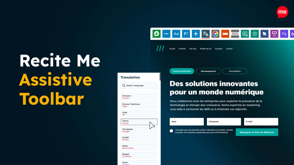
How the Recite Me toolbar can help with font accessibility
Resolving font accessibility issues can be time-consuming. It can also be difficult to make adjustments that suit all users. For example, people with low vision will typically need a higher contrast for text, whereas some autistic or dyslexic people may prefer a lower colour contrast.
The Recite Me assistive toolbar makes the process simple by handing control over to your website visitors. It allows users to customise your web content, so they can tailor it to their needs. That includes several styling options, which allow users to:
- Change the font size
- Adjust colour schemes (e.g. to improve contrast)
- Choose font style, character spacing, and line height
- Zoom in and out of the webpage
Additional tools to improve readability include screen masks and reading rulers, which can make reading more accessible for people with dyslexia and other cognitive or visual disabilities.
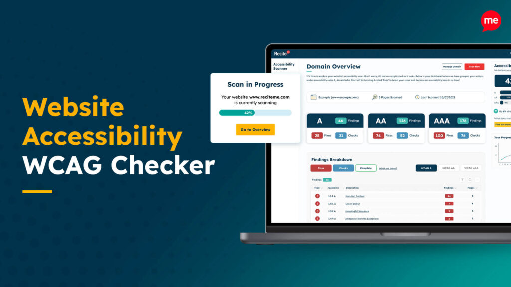
Get a Free Accessibility Check of your Website
Run a scan to identify WCAG issues on your website's homepage. Then, use our recommended changes to achieve compliance with the latest accessibility standard.
Conclusion: Ensure your business utilises accessible font size
Accessible font sizes will make your website functional for all audiences, including people with disabilities. From dyslexia to vision impairments, small differences can make a big impact on web users with disabilities. It’s also important for ensuring your business is compliant and builds a strong ethical reputation.
If you’re ready to make a change, why not start with a free accessibility check of your website for compliance issues? Alternatively, you could give disabled web users support to enjoy your website with our assistive toolbar.
Font size accessibility FAQs
Looking for a recap or quick summary? Here are a few of our most frequently asked questions to help you get to grips with the essentials:
What font size is considered accessible?
The minimum accessible font size is generally considered to be 16px, as most people find it readable across different device types. However, to be more inclusive, it’s best to use relative units, like “rem” or “%” instead of “px”. This allows website visitors to change the text size via their browser.
What fonts should be avoided for accessibility?
Wherever possible, you should aim to avoid fonts that are difficult to read. For people with visual or cognitive disabilities, serif fonts can be less legible. So, sans-serif fonts are typically more accessible for digital content. You should also aim to avoid very small, elaborate or italic fonts.
What makes a font inaccessible?
Factors that make a font inaccessible vary between disabilities. However, they are typically difficult to read or to distinguish between letters. This may be because they are too small or ornate.
What is the rule for font size?
In terms of accessible font size, there are a number of guidelines to keep in mind. These include sticking to a minimum of 16px, using relative units, and developing a clear size hierarchy for headings. However, most are not strict rules, and will depend on your website and audience.
What counts as large text in accessibility?
According to the WCAG, large scale text is 18pt and above, or 14pt and above when written in bold.
Check out our Products & Services
Ready to take your first steps towards digital accessibility compliance? Then see how we can support your journey with our accessibility solutions:
Web Accessibility Checker
Scan, detect, fix, and maintain accessibility compliance standards on your website.
Assistive Toolbar
Make your website an inclusive and customisable experience for people with disabilities.
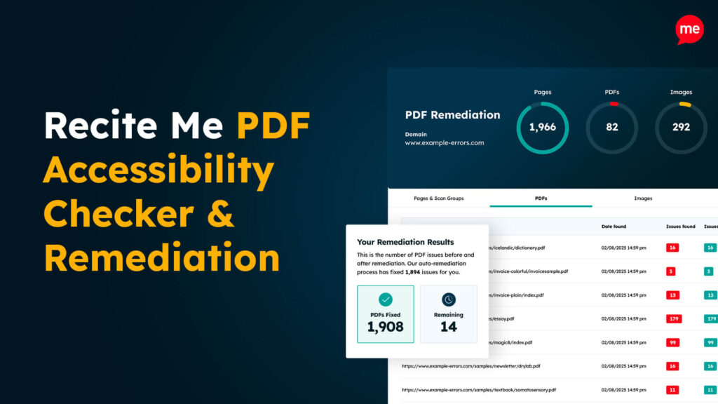
PDF Accessibility Checker
Check your PDFs are compliant with accessibility standards and run automated fixes.