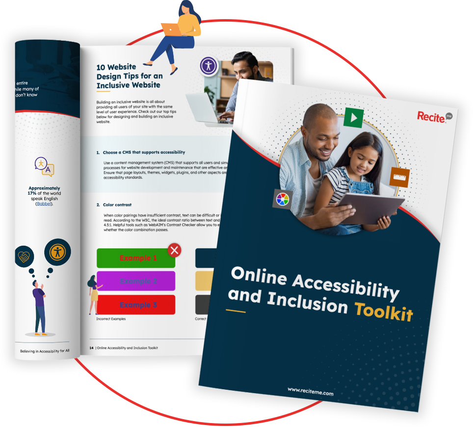
Get Your Free Accessibility & Inclusion Toolkit
Download NowThese days, every organisation needs to consider digital accessibility when creating any kind of online content. These efforts should be guided by the Web Content Accessibility Guidelines (WCAG), which are recognised as the international standard for making web content accessible to everybody.
WCAG covers many areas of digital accessibility, but one of the most important accessibility guidelines involves colour contrast. It is essential that there is a strong contrast between the text and background colours so that users with visual impairments can read and understand the content. WCAG establishes the minimum contrast ratio of 4.5:1.
This post will tell you everything you need to know about the WCAG contrast ratio so that you can tick this box off when creating new online content.
What is the WCAG contrast ratio 4.5:1
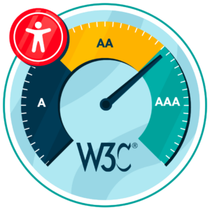
WCAG outlines three levels of conformance; Level A, Level AA, and Level AAA. Level A is the lowest level of conformance, which is why Level AA is generally considered to be the benchmark.
Under Level AA, normal-sized text and images possess a minimum colour contrast ratio of 4.5:1, while large text (headers of font size 18pt or 14pt bold) should have a ratio of at least 3:1. The contrast ratio measures the difference in brightness between the background colour and the text, so 4.5:1 refers to the difference between these.
Essentially, a contrast ratio of 4.5:1 means that the foreground text colour should be at least 4.5 times brighter (or darker) than the background. A contrast of this level will make it easier for users with visual impairments, including colour blindness, to read and understand the content.
Get a free automated accessibility check of your websites homepage. This will identify and highlight any compliance issues on your website. Followed by recommendations on how to implement the necessary changes to make your website more accessible.
Why WCAG 4.5:1 is important for accessibility
WCAG 4.5:1 is important in terms of making online content accessible to all users. Around 2.2 billion people around the world have some kind of visual impairment, and many of these will rely on accessible web design to navigate online.

Inclusion & reaching a wider audience
Every organisation wants to be inclusive and spread its message as far as possible. Therefore, it is important to consider those with visual impairments when creating any kind of online content. The WCAG 4.5:1 ratio will prevent exclusion, which means you are maximising reach, improving the user experience, and boosting your chances of achieving your online goals.
Compliance with accessibility laws
Of course, organisations must also comply with accessibility laws. WCAG is widely referenced by legislation around the world as the global benchmark. Therefore, aligning content with WCAG, including a colour contrast ratio of 4.5:1, can help organisations avoid costly non-compliance issues, including legal action and settlements.

Where the 4.5:1 contrast requirement applies
Organisations must also understand where the contrast requirement applies. The ratio mainly applies to standard body text on websites and digital platforms. Therefore, most standard written content should meet these contrast requirements, including paragraph text, form instructions, and navigation labels. It also applies to text that is placed on coloured backgrounds, images, and anywhere readability could be impacted by contrast issues.

The only places where you do not need to worry about the 4.5:1 contrast are any decorative elements or inactive interface elements, such as logos and brand names. However, it is best to adopt a “better safe than sorry” approach to online accessibility, so it is wise to ensure all online content meets the 4.5:1 contrast requirements. As mentioned above, this prevents alienation and ensures that your content reaches a wider audience.
When different contrast ratios apply to WCAG
WCAG also outlines different contrast requirements based on the level of accessibility compliance. As established Level AA is the minimum level that organisations should be striving to achieve, and this level requires a contrast ratio of at least 4.5:1 for normal text and at least 3:1 for large text and design elements. Large text is considered as 18 pt or 14pt in bold or larger. Larger text is easier to read, so contrast requirements are not as strong.
For organisations looking to achieve WCAG Level AAA (the highest level), a contrast ratio of at least 7:1 for normal text and 4.5:1 for large text should be used.
How colour contrast checker tools can support WCAG compliance
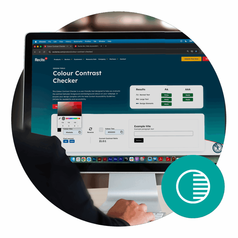
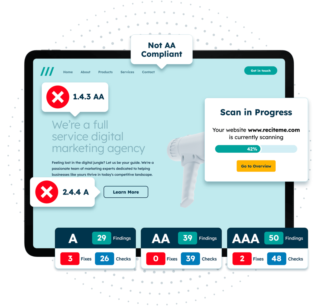
It is clear why colour contrast is so important for online accessibility, but it is not immediately obvious how to check the colour contrast of your online text, as tools are not readily available. The Recite Me Colour Contrast Checker is a fast and effective way to test the colour contrast requirement of your website and online content to determine if it meets the WCAG 4.5:1 colour contrast requirements.
The tool evaluates the contrast between background colour and foreground text on your website and displays the results immediately, helping you quickly determine whether you are compliant or not. If your chosen colours do not meet the 4.5:1 colour contrast requirements, you can find the closest colours that will help you achieve compliance with Level AA (or Level AAA if you are aiming for a higher level of online accessibility).
Design tips for meeting WCAG 4.5:1 colour contrast requirements
Following on from this, there are a few useful tips for the design stage that will help you meet WCAG 4.5:1 colour contrast requirements so that you do not have to go back and make changes later on. These include:
- Use dark text on light backgrounds and vice versa.
- Do not place text over images or patterns.
- Use a contrast checker to test colour combinations during the design stage.
- Try not to use colour to communicate information – there is nothing wrong with the classic black font on a white background.
- Make sure hyperlinks and interactive elements are easy to distinguish.
By following these tips during the design process, you can avoid colour contrast issues and create content that is easy to read for all users.
The importance of WCAG for accessibility compliance laws
As mentioned before, WCAG is important in terms of accessibility compliance laws. Many accessibility laws from around the world reference WCAG Level AA as the minimum requirement. These include:
Failure to comply with WCAG Level AA can lead to complaints, lawsuits, financial penalties, and reputation damage. All of these issues can be hugely costly and in more ways than one. Lawsuits can cost organisations thousands of pounds in legal fees, settlements, and penalties, while the reputational damage can have a significant impact on revenue over the long term. This is why all organisations should be prioritising online accessibility and ensuring content aligns with at least WCAG Level AA.
Our 40-page Digital Accessibility & Inclusion Toolkit helps businesses break down online barriers and make a real impact. It offers practical advice on all aspects of digital accessibility, from writing an accessibility statement to accessible website tips and inclusive hiring.
Make sure your content is WCAG 4.5:1 compliant
The WCAG 4.5:1 contrast ratio should be a priority for all organisations in 2026. With billions of people around the world having visual impairments, you want to make sure that your content is easy to read and understand. This will help you maximise your reach, communicate effectively, and avoid alienating a large percentage of users. Additionally, the 4.5:1 colour contrast ratio can help you comply with relevant accessibility laws in your area, helping you avoid costly non-compliance issues.
You can start today by using our colour contrast tool, or reach out to a member of our team to learn more about accessibility and how we can help.
WCAG 4.5:1 contrast ratio FAQs
Looking for a recap or quick summary? Here are a few of our most frequently asked questions to help you get to grips with the essentials:
Does WCAG Level A outline colour contrast requirements?
WCAG Level A does not outline colour contrast requirements. Instead, Level A focuses on fundamental accessibility barriers, while Level AA introduces stricter and broader requirements to improve accessibility standards. This is why it is best to align online content with at least Level AA.
Does the WCAG 4.5:1 rule apply to all text?
No. The 4.5:1 ratio applies to normal body text.
- Large text (18pt or 14pt bold and larger) only needs 3:1 contrast.
- Decorative text or logos are not required to meet this threshold.
What counts as “large text” in WCAG?
According to WCAG:
- 18pt (about 24px) regular text
- 14pt (about 18.66px) bold text
Text at these sizes can meet the lower 3:1 contrast ratio requirement.
Is WCAG 4.5:1 enough for everyone?
4.5:1 is the minimum requirement for WCAG Level AA, but higher contrast can be more comfortable for many people.
WCAG Level AAA recommends 7:1 for normal text.
What WCAG success criterion covers the 4.5:1 requirement?
The requirement comes from Success Criterion 1.4.3 – Contrast (Minimum) in WCAG Level AA.
Does WCAG require black text on a white background?
No. WCAG does not mandate specific colours. It only requires that the contrast ratio between colours meets the required threshold.
How is WCAG contrast ratio calculated?
Contrast is calculated using the relative luminance of foreground and background colours. The difference between these values produces a ratio ranging from 1:1 (no contrast) to 21:1 (maximum contrast).
Check out our Products & Services
Ready to take your first steps towards digital accessibility compliance? Then see how we can support your journey with our accessibility solutions:
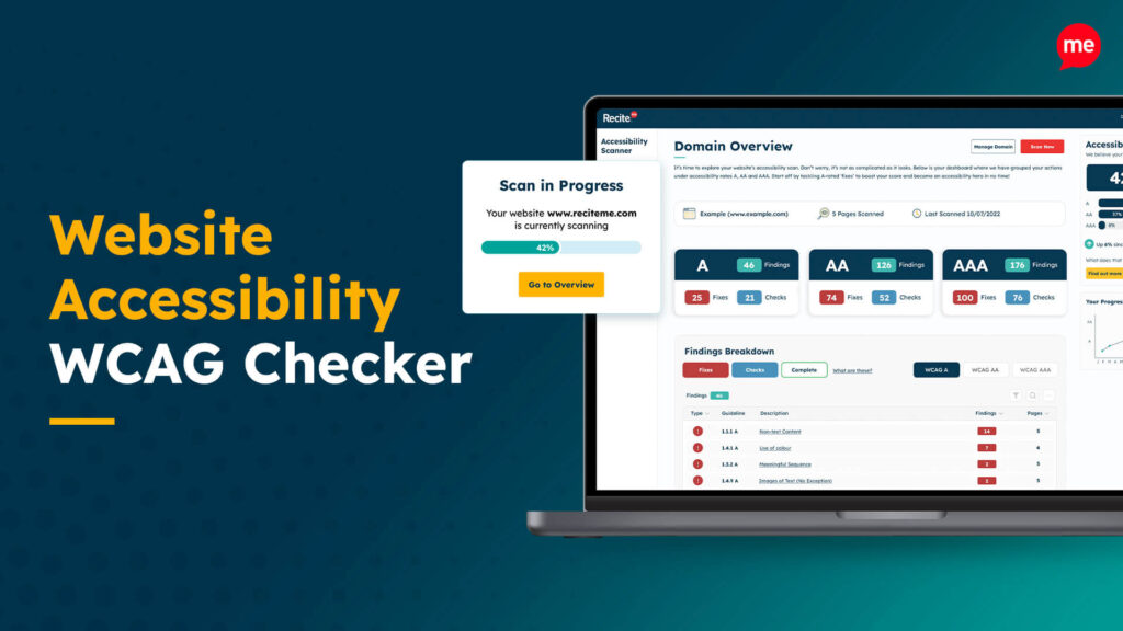
Web Accessibility Checker
Scan, detect, fix, and maintain accessibility compliance standards on your website.
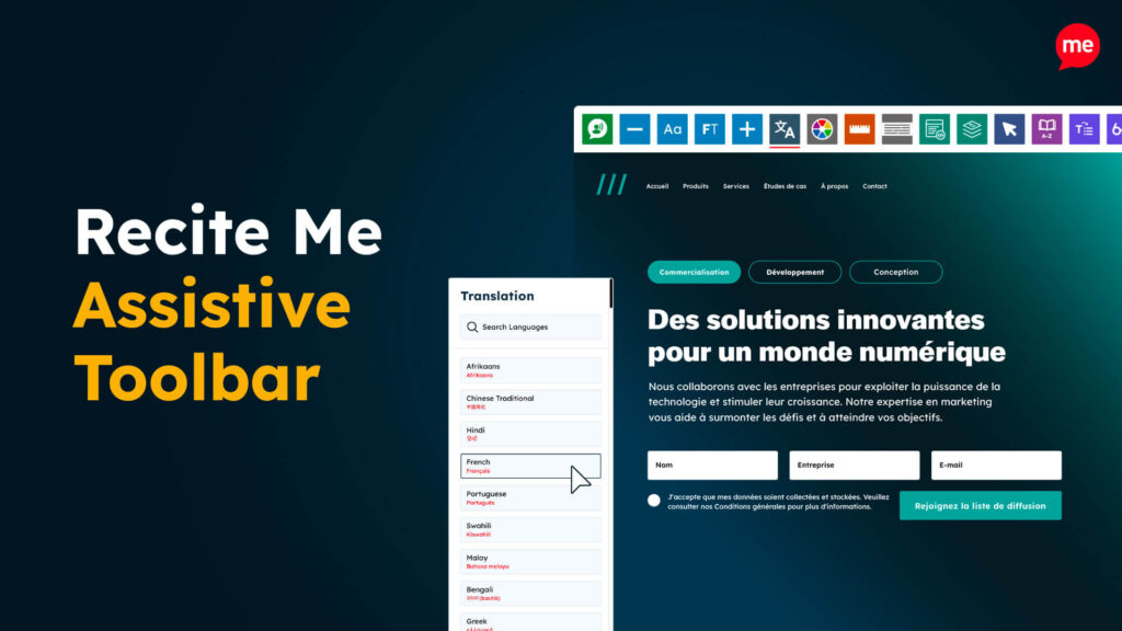
Assistive Toolbar
Make your website an inclusive and customisable experience for people with disabilities.
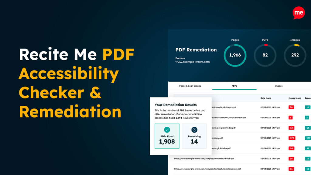
PDF Accessibility Checker
Check your PDFs are compliant with accessibility standards and run automated fixes.