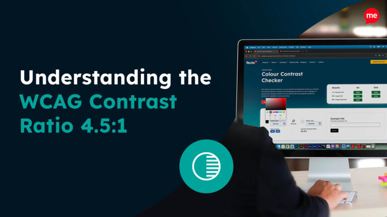
Use The Free Colour Contrast Checker
Use Contrast CheckerColour contrast is an overlooked aspect of web design. Beyond mere aesthetics, getting colour contrast right is what makes your content readable, removing accessibility barriers for disabled users, especially for those with visual impairments. It could be, and often is, the difference between a customer churning in favour of a competitor with more accessible content, and the same customer sticking around to become one of your core followers. If you have a sneaky suspicion that your brand’s palette is not as accessible as it should be, or even if you just want to familiarise yourself with the laws around colour contrast, then this article is for you.
What is colour contrast?
Simply put, colour contrast refers to the difference in brightness and hue between text or other visual elements, and their background. It follows that the greater the contrast, the easier it is to distinguish text from its background, making it more legible to readers.
Put another way, colour contrast is a measure of how different two colours are from one another. Consider black and white, for example. We all know black text reads well on a white background and vice versa, but why is that? It’s because black and white exist on complete opposite ends of the colour spectrum, exhibiting a stark contrast that stands out to the human eye when superimposed or even placed next to each other.
It is important to note that colour contrast is typically given as a ratio, whereby the higher the ratio, the higher the contrast. For example, black text on a white background yields a colour contrast of approximately 21:1, whereas yellow text on a white background returns 1.07:1. This is crucial to understand as accessibility regulations, such as the Web Content Accessibility Guidelines (WCAG), often stipulate their colour contrast requirements in terms of ratios.
Detect Colour Contrast and Accessibility issues on your Website
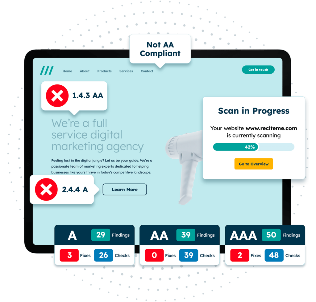
Detecting accessibility issues has never been easier than it is now. At Recite Me we offer a free automated scan of your websites homepage. This will identify and highlight any non-compliance on your website including colour contrast issues. Followed by recommendations on how to implement the necessary changes to improve your websites accessibility score and standing.
Why is colour contrast accessibility important?
There are a seemingly endless number of reasons why you would want to implement accessible colour contrasts throughout your website or digital platform. Perhaps the most obvious is the need to comply with accessibility laws, which we’ll come on to later. But beyond mere compliance, ensuring colour contrast accessibility goes a long way towards tearing down barriers to inclusion for disabled individuals. It is how you go about building an online space that is revered by your customers and competitors alike.
To put this in terms of numbers, globally, approximately 2.2 billion people have a vision impairment of some kind. The vast majority of these individuals rely on assistive technologies and accessible web design in order to navigate web pages and carry out day-to-day tasks. By ignoring colour contrast best practices, you risk alienating this portion of your audience, driving users away from your digital products or services towards those flaunted by your more accessible competitors. After all, why would anyone stay somewhere where they feel unwelcome?
But ultimately, there are a whole host of different accessibility strategies you could implement, so why focus on colour contrast? Well, for one, making your website’s colour contrast accessible is an easy way to address a problem that 295 million people, who live with mild vision loss, face — struggling to accurately distinguish between various web page elements.
Even for well-sighted users, this can sometimes be a challenge. So, prioritising your time and resources on this one, easy-to-implement strategy, is a good place to start. It allows you to have a meaningful impact on your business’s overall accessibility.
European accessibility laws on colour contrast
In the UK and Europe, there are various accessibility laws and standards that you should look out for relating to colour contrast accessibility. The most prominent laws include the Web Content Accessibility Guidelines and the European Accessibility Act. Let’s take a closer look at each standard:
Web Content Accessibility Guidelines (WCAG)
The Web Content Accessibility Guidelines (WCAG) were developed by the World Wide Web Consortium (W3C) to ensure that websites and other digital platforms are accessible to people with disabilities. These guidelines serve as the benchmark for web accessibility and are referenced by many accessibility laws worldwide, including those in Europe.

WCAG refers to four accessibility principles, known as the POUR principles — perceivable, operable, understandable, and robust. These are guiding notions, which, if adhered to properly and implemented across all aspects of web design, should guarantee a certain level of accessibility throughout your website.
Under its “perceivable” principle, WCAG addresses colour contrast, stating that content should be presented in ways which users can easily perceive. As such, the goal of colour accessibility is to make information clear to all users, whether they have visual impairments, are browsing in bright sunlight, or simply have difficulty distinguishing between certain colours. WCAG offers specific standards (which we’ll cover in more detail later) to ensure that the contrast between text and background colours is sufficient for readability.
European Accessibility Act (EAA)
The European Accessibility Act (EAA) aims to create a more inclusive environment across the European Union by establishing accessibility requirements for a wide range of digital and physical products and services.
Broadly speaking, the EAA applies to any business that trades within the EU, including multinational corporations who have their headquarters based in the EU. Only microenterprises are exempt from EAA requirements, which are classed as organisations with fewer than 10 employees or an annual turnover of less than €2 million.
The link between WCAG and the EAA is crucial to understand for businesses operating in Europe. You can think of it as the WCAG being what defines the technical specifications, and the EAA being what enforces them. So, by aligning your business with WCAG best practices, you can go a long way toward meeting the digital requirements for EAA. Businesses that fail to meet these standards may face legal penalties and risk excluding a significant portion of their potential customer base.

What are the required WCAG standards for colour contrast?
The WCAG outlines three different levels of conformance, Level A, AA, and AAA, where A is the lowest level of conformance and AAA is the highest. Each level has its own requirements for the different aspects of accessibility. The requirements for colour accessibility are as follows:
- Level A: Level A conformance requires that colours are not used as the only visual means of conveying information. For example, to indicate an action or to prompt a response, the colour red should be used alongside a text pop-up explaining what to do.
- Level AA: Level AA conformance states that normal-sized text and images should possess a minimum colour contrast ratio of 4.5:1, while large text (headers of font size 18pt or 14pt bold) should have a ratio of at least 3:1.
- Level AAA: Level AAA conformance requires a significantly higher standard of colour contrast — at least 7:1 for normal text and images, and 4.5:1 for large text.
For most accessibility laws, businesses are required to achieve a minimum of Level AA conformance. Those who wish to go above and beyond can strive for Level AAA conformance, which is especially recommended if your target audience is elderly or is known to have low vision.
Actionable tips to help with website colour accessibility
Knowing you need to follow guidelines is one thing, but knowing how to follow said guidelines is another thing altogether. This section takes the WCAG’s colour contrast requirements and translates them into actionable steps that you can start implementing immediately.
Test with real users
One of the most effective ways to ensure that your brand’s palette is accessible is by testing it with real users who have visual impairments. This involves forming user groups and allowing them to explore the full functionality of your website, where they note down any areas that give them trouble, and return this feedback to you in a constructive way. This is different to testing for technical compliance, as it gives an insight into how your website performs under real-world conditions, in spite of laws and regulations.

Underline any hyperlinked text
Underlining hyperlinks is a simple yet effective way to ensure that users can easily identify clickable text. While some web designs use colour alone to distinguish links, adding an underline provides that extra layer of accessibility, making it clear to those who may not perceive the colour difference.
Avoid relying solely on colour to convey information
Colour should never be the only means of distinguishing important information from standard information. If a form entry is highlighted in red, it is not immediately clear that there is an error. Include a text-based alert or error message alongside the incorrect form entry, such as “Please fill in this field”. This not only clarifies any ambiguity, it ensures that users with colour blindness, who may not be able to see the colour red, can still perceive that there is an issue with their form entry.
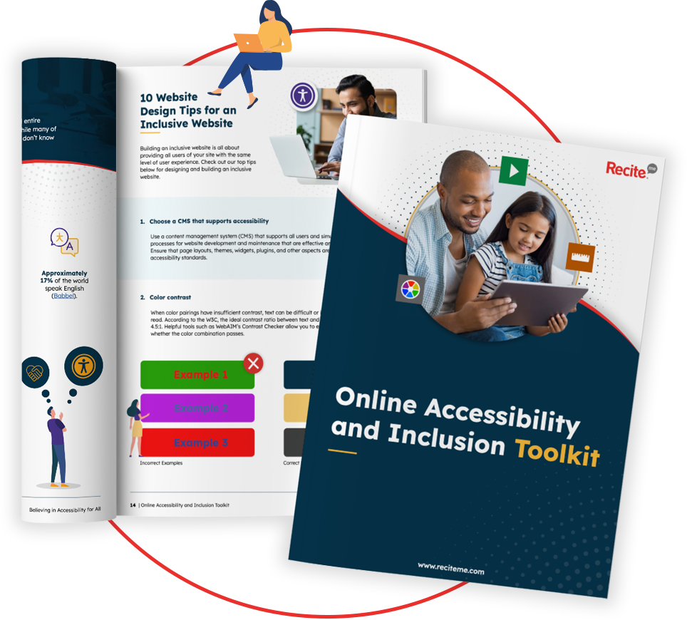
Our 40-page Digital Accessibility & Inclusion Toolkit helps businesses break down online barriers and make a real impact. It offers practical advice on all aspects of digital accessibility, from writing an accessibility statement to accessible website tips and inclusive hiring.
Tools to help your website be more colour accessible
At this point, you have all our best tips for implementing accessible colours and you’re equipped with the regulatory knowledge to avoid any mishaps. But just before you start rallying the troops, it’s worth considering some of the tools that are available on the market today and the role they could play in making your website more accessible for those with visual impairments. Among other things, tools are how you make sure the colours you are implementing are actually accessible.
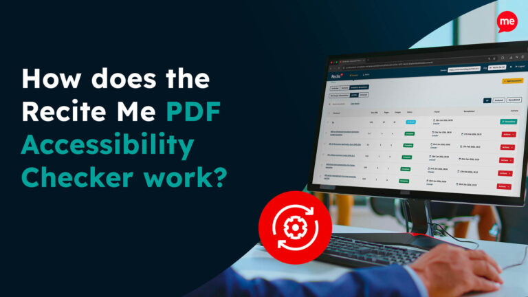
Some tools, like Recite Me’s accessibility checker, provide automated auditing, where they scan your website for any inaccessible or non-compliant features. This helps you identify which areas need addressing and where to focus your time or resources. As such, if you or your web designer inadvertently uses an inaccessible colour combination across any of your web pages and their elements, this will get flagged by the software.
Colour contrast checkers are another type of tool that can be used to achieve a similar thing. They are used to manually check the contrast ratio of individual elements should you have suspicions about a particular web page section or image.
Alternatively, you can opt for an all-in-one accessibility tool, like Recite Me’s accessibility toolbar, which, among many other things, offers users the ability to customise website colours as they see fit. This option gives users ultimate control over their browsing experience, allowing them to change text colours, background colours, and even tint the screen to make certain elements stand out.