Did you know that we are all born colour blind?
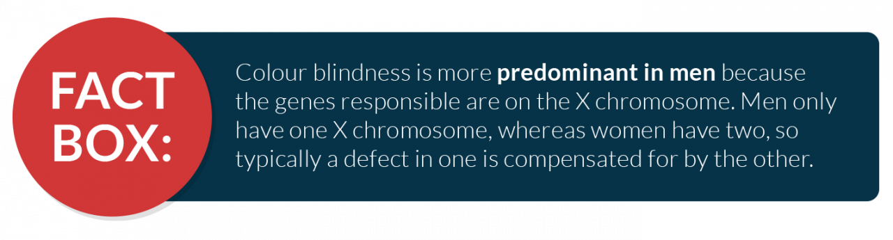
Our vision slowly improves from birth, and most of us can see the full colour spectrum by the time we reach six months of age. However, 1 in 12 men and 1 in 200 women remain colour blind throughout their lives. That’s an average population percentage of around 4.5%, accounting for over 300 million people worldwide.
What Is Colour Blindness?
Colour Blindness is also known as Colour Vision Deficiency, and is defined as the decreased ability to see colours or differences in colours. The condition is mostly genetic and is incurable. However, some people develop colour blindness later in life due to old age, head injuries, or diseases such as diabetes and multiple sclerosis.
Colour Blindness is Different for Everyone
The most common form of colour blindness involves reds and greens. Blue/yellow colour blindness and total colour blindness are much rarer. But regardless of the type, everyone experiences colour blindness differently.
For example, being red/green colour blind doesn’t necessarily mean people will only confuse reds and greens. Any colour containing red or green pigments can be problematic, which means people may also confuse blue with purple because they can’t distinguish the red hues within a purple object.
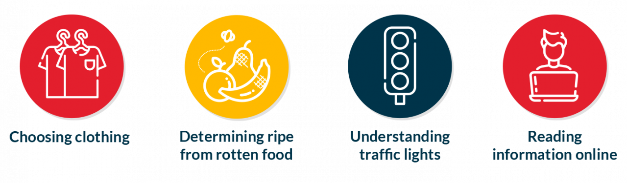
The effects of colour blindness also vary in severity. Research reveals that around 40% of colour blind people leave secondary school still unaware of their condition. However, around 60% experience problems in everyday life such as:
Choosing clothing
Determining ripe from rotten food
Understanding traffic lights
Reading information online
How Does Colour Blindness Affect Internet Use?
Any visual impairment can make online reading difficult because text size, font, and spacing all affect readability. But for those who are colour blind, the most significant factor tends to be colour contrast. Low-quality monitors, bad lighting, and screen glare can influence the clarity of some colours, but even without these, some websites simply do not use combinations that are colour blind friendly.
Poor Colour Contrasts
Colour combinations to avoid include:
green/red
green/brown
blue/purple
green/blue
light green/yellow
blue/grey
green/grey
green/black
The picture below shows how a regular sighted person would view these colours compared to someone with Protanopia (red colour blindness).
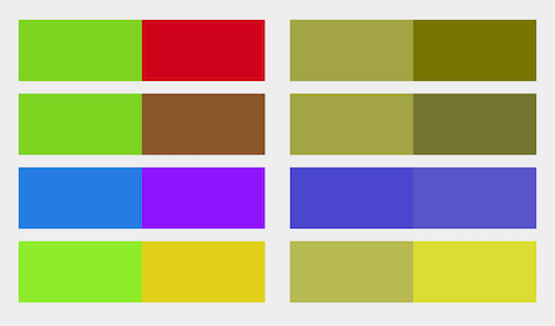
Image Source: Smashing Magazine
The Perils of Grey Scaling
Grey scaling makes websites incredibly difficult to use for people with vision problems. It tends to cause headaches and eye strain because all elements on the page look the same. Plus, usability is impacted because:
Calls to action look disabled
Links are indiscernible
The hierarchy of information is lost
Earlier this year in the UK, Network Rail and National Rail hit the headlines when they switched to a black and white version of their website to mark the death of Prince Phillip. However, this gesture backfired as many customers with vision deficits could no longer use the site. You can read the full article here.
Colour Blind Inclusive Website Design
When making accessibility adjustments to accommodate colour blind readers, web designers should consider the following action points:
- Text – To be readable, text should be based on accepted text colour, background colour, and text size combinations. The newest Web Content Accessibility Guidelines (WCAG) require a contrast ratio of 4.5:1 for normal text (14 point) and 3:1 for large text (18 point +).
- Images – Where text is overlaid onto images, the opacity of the image often needs to be increased to make the text readable.
- Links – Links should be easy to identify without relying on colour or hovering over the text with a cursor. Underlining links is a good way to make links easier to spot.
- Swatches – Use labels or descriptive text, as it is often impossible to differentiate between options on colour picker charts based on visuals alone.
- Required fields – Some people may not see the difference when colour is used to signify mandatory fields on online forms. Using asterisks or clearly labelling some fields as ‘required’ are better options.
- Placeholder text – Placeholder text usually has insufficient contrasts, but increasing the contrast causes confusion between placeholder text and user input text. So it’s much better to use labels than placeholder text on forms and login pages.
- Buttons – Don’t use colour alone to identify primary buttons. The right solutions depend on branding preferences, but alternatives include utilising boldness, icons, borders, and sizing.
- Graphs – Using patterns rather than single blocks of colour to denote different sections makes visual displays much easier to understand.
Helpful Tools
WebAim Contrast Checker – Allows you to check any two colours against each other to gauge contrast suitability.
Colour Oracle Colour Blindness Simulator – Provides demonstrations and examples of how people with vision deficits view things differently.
Toptal Webpage Filter – Previews what web pages look like to people with various forms of colour blindness.
How Can Website Accessibility Technology Help?
To support those with colour blindness and other visual impairments, the Recite Me toolbar provides a wide range of customizable options to enable website visitors to tailor their experience. This includes background, text and link colours, remove pictures from pages to minimise styling distractions, and have content read aloud. Users can:
Change the colour of HTML coded attributes, including text, background, links, and buttons.
Experiment with unlimited combinations, allowing complete control over the colour spectrum to account for all preferences.
Choose from 35 text-to-speech languages.
What Recite Me technology cannot do is change colours within images. Nor does our technology promise to make your website instantly ‘accessible’ in the form of how a website is built or compliant with Web Content Accessibility Guidelines (WCAG). Our software is built with WCAG principles at its core, but the onus is on business owners to make their websites as accessible as possible to begin with. Then, with Recite Me software integrated, you can provide your online visitors with as many choices as possible. Not dictating how someone should view a website creating a unique inclusive experience.
“The range of styling features on the Recite Me assistive toolbar massively supports my content reading. Mostly the font size increase button, the colour contrast, and font options”.
Martin Lea, Recite Me Sales Executive
Is Your Website Colour Inclusive?
Inaccessible websites and apps create barriers to use. No matter what sector of business your organisation sits in, this is simply not good for business. Here’s our 5 step process for ensuring your website is accommodating of colour blind users:
Take some time to reflect on the difference being inclusive will mean for your target market. By making your products, services, and information accessible to more of the population, you stand to increase traffic flow, sales, and revenue.
Check that your web design conforms to best practices and principles for accessibility.
Familiarise yourself with the WCAG and ensure your website meets the minimum requirements.
Check the disability legislation that applies to websites in your location, and make a plan to complete any necessary updates. Here in the UK, we follow the Equality Act. However, if your business operates further afield in the USA or Australia, you will also need to be familiar with the Americans with Disabilities Act (ADA) and the Disability Discrimination Act (DDA).
Look into assistive technology software to add further layers of usability to your website, making it truly inclusive.
Recite Me is quick and easy to implement on your website and can usually be installed in under an hour. Our software is already active on over 3500 websites, and every year we help millions of people to enjoy inclusive journeys online.
Contact our team today to learn more or book a live demo of our toolbar. You can also try our wcag 2.1 scanner for free at Recite Me.
Article Sources: Enchroma, Colour Blind Awareness.