Use The Free Colour Contrast Checker
Use Contrast CheckerWhen designing a website, colour is often used to grab attention, differentiate content, or guide users through a task. But for a significant portion of the global population, colour perception doesn’t work the same way. An estimated 300 million people worldwide live with some form of colour-blindness. That translates to around 1 in 12 men and 1 in 200 women. Being colour-blind can make websites confusing, frustrating, or even unusable when colour is the sole method of conveying information.
This article highlights the common challenges faced by users with colour-blindness and provides practical tips to address them. You’ll learn how to design a website that’s inclusive, user-friendly, and aligned with accessibility standards.
What is colour-blindness and how does it impact web visitors?
Colour-blindness happens when the cone cells in the eye (nerve cells responsible for detecting colour) don’t work properly or are missing altogether. These cone cells are sensitive to specific wavelengths of light, typically associated with red, green, or blue.
Most colour-blind people can still see some colours. In fact, total colour-blindness, known as monochromacy, is very rare. The vast majority of cases fall under the category of colour vision deficiency (CVD), where individuals struggle to distinguish between specific colours.
The most common types include:
- Deutan types (the most common) affect green perception, causing confusion between reds, greens, and browns.
- Protan types affect red perception, making reds appear darker or hard to distinguish from other colours.
- Tritan types affect blue perception, leading to difficulty distinguishing blues from greens and yellows.

To a colour-blind web user, reds and greens might appear indistinguishable, or colour distinctions may be subtler or washed out.
On a website, this can result in:
- Buttons blending into the background
- Error messages going unnoticed
- Data visualisations becoming meaningless
- Confusing form fields and icons
If key functionality or information is only conveyed using colour, colour-blind users might miss it entirely. That’s why designing with inclusive colour usage is essential.
Get a free automated accessibility check of your websites homepage. This will identify and highlight any compliance issues on your website. Followed by recommendations on how to implement the necessary changes to make your website more accessible.
WCAG guidelines relevant to colour-blind accessibility
The Web Content Accessibility Guidelines (WCAG) provide the international standard for accessible website design. Colour accessibility plays a key role in these standards, ensuring that colour is used in ways all users can perceive and understand. Applying WCAG guidelines helps you create digital content that’s inclusive, accessible, and usable for everyone, regardless of how they see colour.

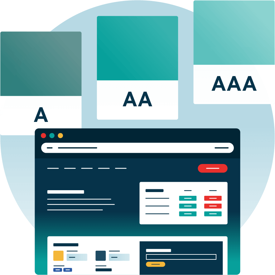
The WCAG is organised into three levels of accessibility: A, AA, and AAA. Each level builds on the last, with A being the most basic and AAA the most comprehensive. As you move up the levels, the requirements become more rigorous, offering greater accessibility for a wider range of users. Meeting WCAG 2.1 Level AA is the current best practice and a legal requirement in many regions.
For colour-blind accessibility, these three checkpoints are most critical:
This guideline requires that colour is not the only method used to convey information, indicate an action, prompt a response, or distinguish a visual element.
To ensure text is readable, there must be a minimum contrast ratio of 4.5:1 between the text and its background.
This guideline applies to non-text elements like buttons, form fields, icons, and graphs. These must have a contrast ratio of at least 3:1 against surrounding elements or backgrounds.
How to ensure UI components are accessible to colour-blind users
Let’s dive into how to design common UI elements with colour-blind users in mind.
Buttons, links, and controls
Colour by itself isn’t enough to indicate an interactive element. To make interactions clear for everyone, follow these best practices.
- Visible focus indicators: Make sure users navigating with a keyboard can see which element is selected by using clear outlines or borders, not just a change in colour.
- High-contrast visual cues: Use borders, outlines, or shadows with strong contrast so they remain visible to users with any type of colour vision.
- Clear and descriptive text: Instead of vague link text like “Click here,” use specific labels such as “Download Report” or “View Pricing” to help all users understand the purpose of the link.

Do: Use a coloured button with a dark outline and clear label like “Submit”
Don’t: Rely on a colour change from blue to green to show a hover or active state.

Forms, error messages, and validation
Website form errors are often only indicated in red, which may be invisible to red-green colour-blind users. To make them accessible:
- Use both colour and icon/text: Pair red text with an icon like an exclamation mark, and a clear message such as “This field is required.”
- Field labels should be persistent: Never use placeholder text alone. Place labels above or beside fields for clarity.
- Highlight fields with borders or icons: Use a bold border, underline, or icon to indicate an error state.
Do: Show “Please enter your email address” in red with an alert icon
Don’t: Just highlight the field in red with no text explanation
Data visualisations (charts, graphs, and maps)
Charts are a frequent pitfall for colour-blind accessibility. Relying only on colour to differentiate data can make visuals unusable. Here’s how to improve your charts, graphs, and maps:
- Use distinguishable shades: Avoid using traditional red-green colour scales. Instead, you can use red with a pink tone and green with a bright lime shade to improve clarity. There are also map and chart palettes specifically designed for colour-blind users.
- Use textures or patterns: Differentiate bars, lines, or regions with dashes, cross-hatching, or patterns.
- Label directly: Label lines or data series directly on the chart instead of using a colour-coded legend.
- Provide descriptions and data tables: Include a textual summary or data table for users who can’t interpret the visualisations. For visual accessibility you should also describe every image on your site with image alt text.

Do: Pair a pie chart with a table and use labels and textures
Don’t: Use five similar shades of red and green in a legend
Icons and illustrations
Icons should be easy to understand, even for people who can’t see colours well. Here’s how to make sure your icons are clear and accessible:

- Always add text labels: Don’t rely on the image alone to explain what an icon means. For example, instead of just showing a red trash can to mean “Delete,” also include the word “Delete” next to or under the icon.
- Check the contrast: Make sure your icons stand out clearly from the background. For example, a light grey icon on a white background may be hard to see, choose colours with strong contrast.
- Make icons readable by screen readers: If you’re using icons in code like Scalable Vector Graphics (SVGs), add labels so that people using assistive tools like screen readers know what the icon means.
Do: Pair a yellow warning triangle with the text “Warning” next to it.
Don’t: Use a red circle icon without a label.
What tools can help you test for colour-blind accessibility
Testing for colour-blind accessibility is an essential part of an inclusive design process. Whether you’re a designer, developer, or content creator, there are a variety of ways to evaluate whether your site works for people who see colour differently.
Automated accessibility check of your website
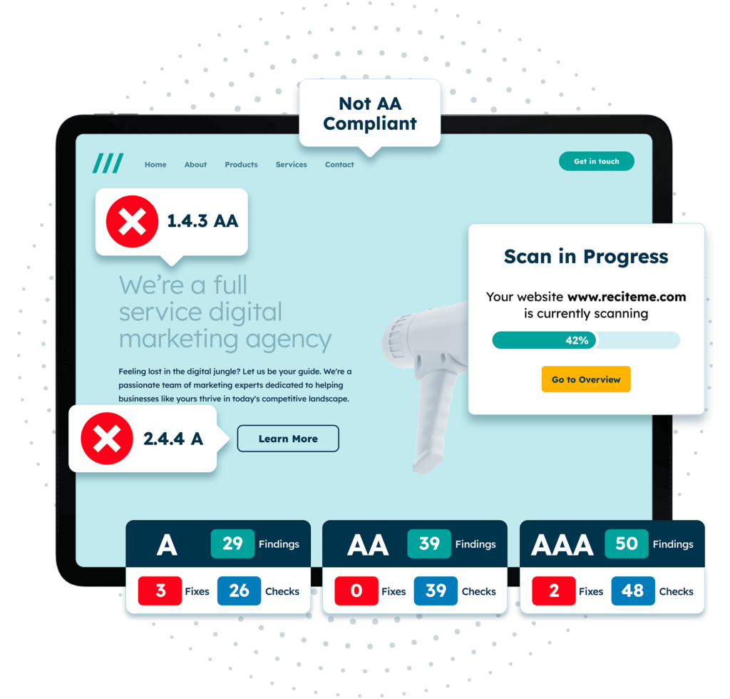
Automated testing tools like an accessibility checker are a fast and efficient way to scan your website for basic issues, including those related to colour. These tools crawl through your site’s code and visual elements to identify instances where colour is used as the only method of conveying meaning or where contrast between text and background doesn’t meet accessibility standards.
Manual testing with colour contrast checkers
Automated tools can’t catch everything when it comes to user experience. That’s where manual testing comes in. This process involves using your judgement along with dedicated tools like our free Colour Contrast Checker, to assess how your colour combinations perform in real-world scenarios.
You can conduct manual testing throughout the design and development process by examining mockups, prototypes, or live pages to verify contrast, clarity, and usability.
A common manual check involves reviewing contrast ratios between foreground and background elements, especially for text, icons, and key UI components like buttons or input fields. These ratios help determine whether there’s enough visual difference for users with different forms of vision, including colour-blindness.
User testing with people who have colour-blindness
One of the most insightful forms of accessibility testing is user testing with people who actually experience colour-blindness. Real users can reveal usability problems that tools and simulated tests can’t catch. They bring personal context, lived experience, and real-world expectations to the table.
In a typical session, you might ask a colour-blind participant to complete tasks such as filling out a form, interpreting a chart, or navigating through your site. You’d observe where confusion arises, for example, they miss a key action because it was only highlighted in red, or struggle to understand a chart where lines are too similar in colour.

This kind of testing not only uncovers accessibility barriers but also provides qualitative feedback on how your design feels to someone with colour-blindness. Even a small number of test users can expose major usability flaws, making this an invaluable step.
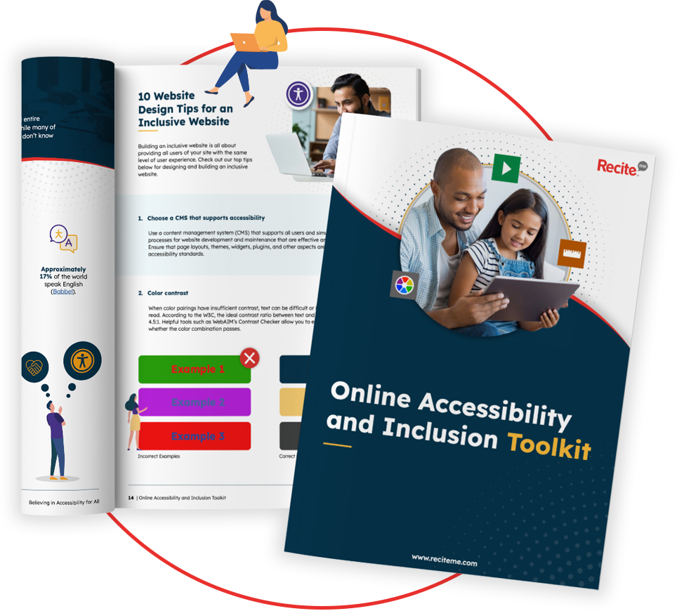
Our 40-page Digital Accessibility & Inclusion Toolkit helps businesses break down online barriers and make a real impact. It offers practical advice on all aspects of digital accessibility, from writing an accessibility statement to accessible website tips and inclusive hiring.
Implementing accessibility fixes to ensure compliance with regional accessibility legislation
Incorporating accessible design practices, especially around colour use, is not just a matter of user experience. It’s also increasingly a matter of legal responsibility. Many countries and regions have brought in accessibility legislation that requires digital content to be usable by people with disabilities, including those with colour vision deficiencies.
A key step toward compliance is ensuring your website meets WCAG 2.1 Level AA standards, which are widely recognised as the benchmark for digital accessibility. These guidelines ensure that all interface elements are perceivable and operable by users with various types of impairments.

Meeting these standards isn’t just best practice, it’s often mandatory. For example:
- In the United Kingdom, the Public Sector Bodies Accessibility Regulations align with WCAG guidelines and apply to all public sector websites and apps.
- The European Accessibility Act (EAA) enforces obligations across the EU to all organisations (public or private) providing goods or services.
- In the United States, the Americans with Disabilities Act (ADA) has been interpreted to apply to websites, particularly those of public-facing businesses and organisations.
- In Canada, the Accessibility for Ontarians with Disabilities Act (AODA) requires organisations to make web content accessible, with WCAG 2.1 Level AA as the official standard.
Improving colour accessibility makes your website more usable and helps you stay legally compliant. Regular testing and accessible design show your commitment to inclusion and ensure your site works for everyone.
Conclusion: Use inclusive colours when designing web content
Designing with colour-blind users in mind is a simple yet powerful step toward a more inclusive web. With millions affected by colour vision deficiency, relying on colour alone to communicate information can create unnecessary barriers.
By using clear labels, strong contrast, and alternative visual cues, you make your site easier to navigate for everyone, not just those with colour-blindness. Testing your site and following WCAG guidelines helps ensure both accessibility and compliance. In the end, inclusive design leads to better experiences for all users.
Colour Blind accessibility FAQs
Looking for a recap or quick summary? Here are a few of our most frequently asked questions to help you get to grips with the essentials:
What is colour blindness and why does it matter for accessibility?
Colour blindness affects how people see certain colours. If designs rely only on colour to share information, some users may miss it completely.
How common is colour blindness?
Around 1 in 12 men and 1 in 200 women have some form of colour blindness. That’s millions of users who need accessible design.
What makes a design hard to use for colour-blind users?
Poor contrast and using colour alone to show meaning (like red for errors or green for success) can confuse or exclude people with colour vision issues.
How can I make content colour-blind accessible?
Use strong contrast, add labels or icons, and don’t rely on colour alone. Additionally, tools and simulators can help test how your design looks to colour-blind users.
Is colour accessibility legally required?
This depends on your location. For examples, the European Accessibility Act requires digital content be accessible to people with disability, including those with colour vision deficiencies. In the US, the Americans with Disabilities Act sets a similar standard.
What are the accessibility guidelines for colour blindness?
The Web Content Accessibility Guidelines (WCAG) provide the leading standards for creating colour-blind-friendly content. They require sufficient contrast between text and background, at least a 4.5:1 ratio for normal text, and recommend using additional visual cues like labels, icons, or patterns to ensure information is clear for users who may not perceive certain colours.
Check out our Products & Services
Ready to take your first steps towards digital accessibility compliance? Then see how we can support your journey with our accessibility solutions:
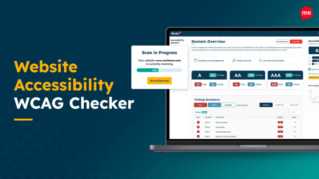
Web Accessibility Checker
Scan, detect, fix, and maintain accessibility compliance standards on your website.
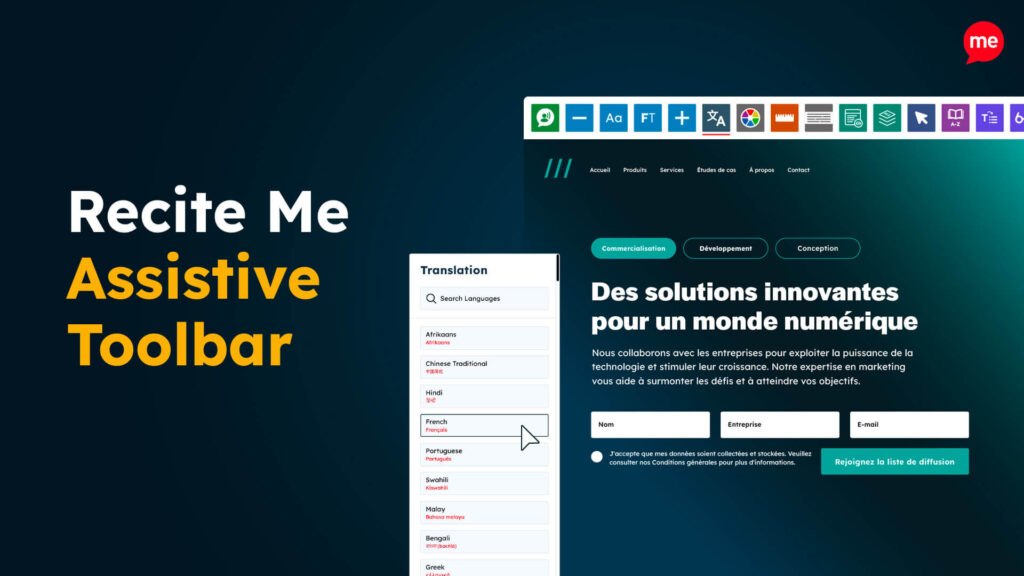
Assistive Toolbar
Make your website an inclusive and customisable experience for people with disabilities.
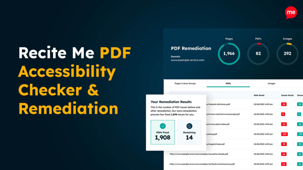
PDF Accessibility Checker
Check your PDFs are compliant with accessibility standards and run automated fixes.