Everyone should have the same opportunities to travel. Yet the needs of disabled passengers are often neglected.
In an era where the aviation industry is embracing automation and artificial intelligence for many processes, proactive steps must be taken to ensure every customer touchpoint is accessible – including airport and airline websites.
Why is an Accessible Airport Website Important?
Accessible airport and airline websites are crucial for several reasons. Not only does it ensure compliance with legal regulations. It also fosters inclusivity, enhances user experiences, and can even lead to increased revenue. Here is a comprehensive list of considerations:
The Legal Aspect
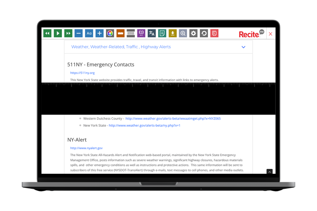
The Americans with Disabilities Act (ADA) requires companies to make adjustments for disabled users and those with additional access needs.
Equal Access
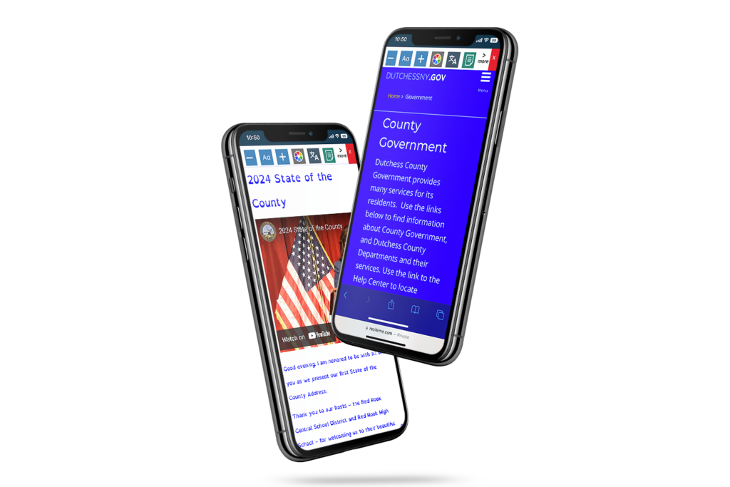
Everyone should have access to the same information and services. For example, a visually impaired traveler should be able to book a flight independently.
Inclusivity
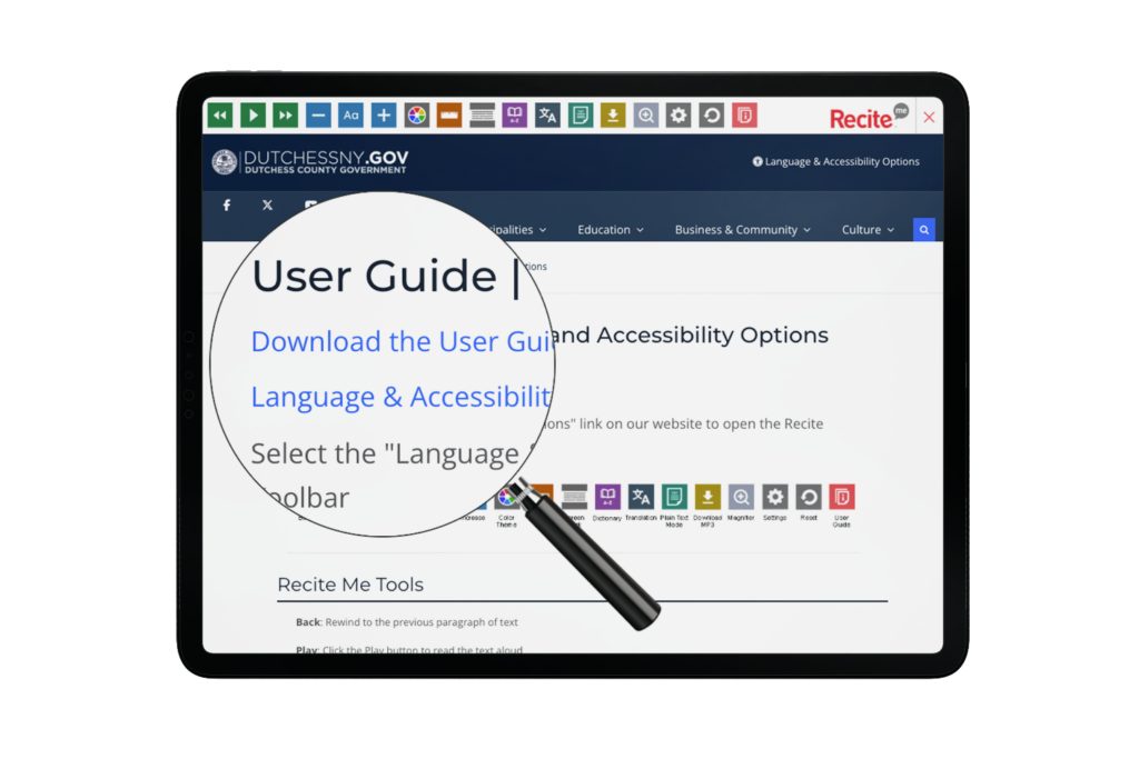
Airports and Airlines serve a diverse customer base. Failing to provide accessibility solutions can alienate potential customers.
Faster Booking
A well-designed website streamlines the booking process, making it faster and more convenient.
Enhanced User Experience
Clear and organized content benefits everyone, not just those with disabilities.
Retention and Loyalty
Airports and airlines that prioritize accessibility build a positive reputation, leading to more repeat business and new bookings from word-of-mouth recommendations.
What is an Accessible Website?
An accessible website is designed and developed to ensure everyone can perceive, navigate, understand, and interact with its content and features, providing an inclusive user experience for all users, regardless of ability or disability.
There are many layers of website accessibility to work through. However, to be considered accessible, a website must meet the following basic criteria:
1. Employ the correct structure, layout, and features to account for the diverse needs of individuals with various access requirements.
2. Comply with the Web Content Accessibility Guidelines (WCAG) 2.1 Level AA.
3. Meet the relevant local and national legal standards and regulations.
Who Needs Help Accessing Airline Websites?
In short, everyone. Of course, one in every four Americans living with disabilities may require additional adjustments. But even people without a disability benefit from airport website accessibility tools. So, it’s not just about enabling access for what you may (incorrectly) assume to be a small minority. It’s about making improvements that benefit every single website visitor.

“It’s not just about disabled users being able to access your website — it’s about everyone being able to access your website.”
Trenton Moss, Webcredible
Additionally, when considering accessibility requirements, it’s essential to remember that not all disabilities are physical. In fact, as many as 80% of all disabilities are hidden, accounting for a multitude of conditions such as:
- Vision impairments like blindness, partial blindness, blurred vision, deaf-blindness, and color blindness.
- Neurodivergent traits like dyslexia, dyspraxia, hyperlexia, and dysgraphia.
- Attention disorders like attention deficit hyperactivity disorder (ADHD).
- Language and literacy problems.
- Learning disabilities.
- Hearing loss.
What Online Access Barriers Do Customers Face?
Online access barriers occur whenever an element of a website’s design or presentation makes it difficult to read or interact with the content. A few examples of problems users may find with airport web accessibility include:
Text – Fonts that are too small or difficult to read make comprehension a struggle. On airport and airline websites, this is a particular issue on-page elements like flight calendars and price comparison tables.
Colors – Insufficient color contrast between text and background can make your web copy and flight availability calendars impossible for some website visitors to read and understand.
Navigation – Cluttered web pages that don’t flow in a logical order are complex to navigate, making it impossible for those using screen readers to purchase tickets or make a reservation without assistance.
Language – Web copy littered with overly complex language and technical terminology makes your content difficult to process for those with literacy issues and travelers who speak and read English as a second language.
Images – When images on your website are missing descriptive alt tags, passengers with impaired vision miss out on receiving additional details and contextual information.
Videos – Deaf passengers cannot follow your airline’s promotional, instructional, or ‘how to’ videos when they’re not presented with closed captions.
Forms – Many booking forms on airport and airline websites feature empty links or missing input labels, making it unclear where to click to get started. Plus, downloadable PDF forms often have insufficient markup.
Accessibility Barrier Examples
Let’s take a look at some real-world examples of accessibility issues that your website visitors could face.
Emily has dyslexia and relies on screen-reading software. She visits your website to check flight schedules and fares but finds the text lacks semantic structure and the layout has no consistency from page to page. This makes it challenging for her screen reader to convey the information accurately. Ultimately, she clicks away to a competitor’s website with better text formatting and accessibility features.
Sarah is deaf, she’s planning a trip with her family using your airline’s website. However, there are no closed captions for important travel videos, making it difficult for her to understand crucial information about destinations, amenities, and safety procedures. Frustrated, she Googles the information she needs filtering by video, and is presented with more accessible media that links directly to another airline’s booking page.

Jake has ADHD and struggles with complex navigation. He’s looking for information about your baggage policies and fees. Unfortunately, the details he needs are scattered across multiple pages with inconsistent headings and unclear organization. He quickly becomes overwhelmed and abandons your site in favor of an airline that presents information in a more straightforward and organized way.
Where Airport and Airline Websites are Falling Short
The Hassel Digital Airline Accessibility Report identified the following key areas where airline and airport website accessibility is currently falling short:
- Insufficient keyboard navigation compatibility.
- Inaccurately labeled buttons and links.
- Lack of awareness of the range of consumer assistive technologies in use.
- Overly complex website components without adequate instructions or guidance on how to use them.
- Unclear processes for customer contact mechanisms.
- Failure to review the accessibility of third-party content.
- Failure to adequately consider the end-to-end consumer journey.
4 Ways to Improve Your Airline Website’s Accessibility Score
To maximize inclusion, bookings, customer satisfaction, and profits, your website must be accessible to everyone. Follow these steps to get started.
1. Get up to Speed with Accessibility Guidelines
“The guidance WCAG provides allows developers and content creators to include people who have historically been excluded from digital experiences.” – Mark Shapiro, President of the Bureau of Internet Accessibility
In addition to ensuring your website complies with the requirements of the Equality Act, you should familiarise yourself with the Web Content Accessibility Guidelines (WCAG). WCAG provides an internationally recognized framework for anyone involved in building and maintaining a website. Version 2.1 Level AA is typically the minimum reference point when discussing ‘making a website accessible.’
2. Audit and Update Your Website
“The majority of business owners still don’t know how to make their websites accessible—some don’t even know they have to.” – David Moradi, Forbes Technology Council Member
Handy website accessibility tools like the Recite Me Accessibility Checker provide an at-a-glance overview of where your content falls short of WCAG 2.1 and what improvements are needed. General best practices for enhanced accessibility include:
- Using a content management system that supports accessibility.
- Ensuring your site is mobile-friendly
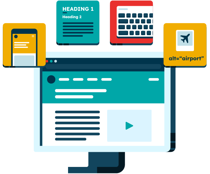
- Applying headings correctly to structure written content.
- Utilizing a logical and consistent layout
- Ensuring PDF booking forms are designed for accessibility.
- Optimizing for keyboard navigation.
- Using a dyslexia-friendly font.
- Including alt text for all images and icons.
- Being mindful of color use and color contrasts.
3. Practice Inclusive Marketing and Communication
“The flexibility needs to be there for customers to communicate in their preferred way. Businesses should be empowering customers by giving them choices, rather than making them ask for alternatives or work harder to get responses.” – Caroline Wells, CEO, Different Petal
To maximize conversions from browsing to booking, you should provide customers with clear direction and make all of your online content and communications as inclusive as possible. Best practices include:
- Displaying an accessibility statement on your website.
- Ensuring your social media accounts also adhere to accessibility best practices.
- Utilizing a variety of communication channels to cater to individual preferences.
4. Gather Customer Feedback – And Act on It!
“The accessibility guidelines are there to guide us in making websites more accessible. But they aren’t the be-all and end-all of accessibility. We can’t just check the box on compliance and think that the work is done. It is quite possible to make a website that technically passes all the accessibility tests, but is still terribly difficult for a person to use.” – Nicolas Steenhout, Accessibility and Inclusion Expert
Your website doesn’t magically become inclusive just because you made it accessible. In fact, it’s all too easy to create a technically accessible website that’s still incredibly difficult for people to use. So, gathering ample feedback from real-world users and continuing to make adjustments is essential.
Get Started Today!
When you embrace website accessibility, it’s easier to cater to a broader customer base, demonstrate your commitment to inclusivity, and create a positive brand image that resonates with your diverse audience.
The Recite Me team is here to support your efforts to provide an inclusive and compliant website. We save you time and money by highlighting what needs to be fixed first for the most effective results and significant return on investment.
Don’t delay. Act today! Run a free scan of your website for WCAG 2.1 AA compliance, or contact our team for more advice about WCAG standards and the web accessibility legislation that applies to your airline.
