

Get Your Free Accessibility & Inclusion Toolkit
Download NowAccessible forms are digital interfaces designed so that everyone, including people with visual, motor, or cognitive impairments, can complete and submit information effectively. By using semantic markup, clear labels, and intuitive navigation, these forms ensure equal access and a better user experience for all.
Beyond ethical considerations, legal standards such as the ADA, and the European Accessibility Act require compliant form design. This guide outlines what accessible forms are and why they matter for both users and organizations.
Importance and benefits of form accessibility
Accessible forms are essential because they ensure that users with disabilities, such as visual, motor, or cognitive impairments, can interact with web content just as efficiently as everyone else. By implementing clear labels, logical navigation, and semantic markup, organizations can meet WCAG 2.1 standards, which are often a requirement for regional accessibility laws.
There are a multitude of different benefits that accessible forms can provide to your organization. However, some of the key factors include:
- Higher Completion Rates: When forms are easy to navigate and understand, users are less likely to abandon them, leading to improved conversion rates.
- Broader Audience Reach: Inclusive design opens the site to customers with disabilities, increasing the volume of potential customers you can find.
- Reduced Legal Risk: Compliance with accessibility standards mitigates the chance of costly lawsuits or fines related to non-compliance.
- Customer Loyalty: Seamless interactions builds trust. Additionally, satisfied users are more likely to return, recommend the site, and engage with services in the future.
In essence, investing in accessible forms is both an ethical responsibility and a strategic advantage, ensuring equal access while positively impacting the organization’s bottom line.
The core principles of accessible form design
Website forms can become accessible to people with disabilities by following the Web Content Accessibility Guidelines (WCAG) and embracing the POUR principles (Perceivable, Operable, Understandable, and Robust).
- Perceivable forms include descriptive labels associated with inputs using label elements, text alternatives for non-text content such as icons, clear field instructions, and sufficient color contrast so that users with low vision or color blindness can detect information.
- Operable forms support keyboard navigation with logical focus order, avoid timed submissions without warning, and ensure interactive controls can be activated via different input methods.
- Understandable forms employ simple language, provide explicit error messages with guidance on how to fix issues, and maintain a consistent layout for users with cognitive impairments.
- Robust forms rely on semantic HTML, appropriate ARIA attributes when necessary, and proper validation to guarantee compatibility with assistive technologies and various browsers.
By integrating these WCAG-based practices, designers can create inclusive forms that allow users with disabilities to interact with content, submit information accurately, and participate fully in digital experiences.
Get a free automated accessibility scan of your websites homepage. This will identify and highlight any compliance issues on your website, including inaccessible forms. Followed by recommendations on how to implement the necessary changes to make your website more accessible.
Building accessible form controls
The accessibility of your website forms often starts with how easy they are to use. This can include factors such as text inputs, checkboxes, select menus, and more. Here’s a close look at some of the key features you’ll need to implement when coding accessible forms on your website:
Associating Labels with Inputs
To ensure that each form control is clearly identified, use the <label> element to link descriptive text to an input via the “for” and “id” attributes. For example:
<label for=”username”>Username:</label>
<input id=”username” type=”text” name=”username” autocomplete=”username”>
This linkage allows screen readers to announce the label when focusing on the input, and clicking the label sets focus to the control, beneficial for users with motor disabilities or small-screen devices. Because each “id” must be unique in the document, an input can only have one explicitly associated.
Alternatively, wrapping the input within its <label> eliminates the need for matching “for” / “id” pairs. For instance:
<label>
Email:
<input type=”email” name=”email” autocomplete=”email”>
</label>
Text areas
Text areas require similar treatment to text inputs but accommodate multi-line input. A <textarea> field must be paired with a <label>:
<label for=”address”>Enter your address:</label><br>
<textarea id=”address” name=”address” autocomplete=”street-address” rows=”4″ cols=”50″></textarea>
By associating the label via for=”address” and id=”address”, screen readers announce “Enter your address:” when the user navigates to the text area. Additionally, providing an autocomplete=”street-address” attribute helps browsers and assistive technologies predict common address formats, streamlining user entry.
Checkboxes and Radio Buttons
When presenting multiple checkboxes or radio buttons that form a logical group, wrap them in a <fieldset> and provide a <legend> to describe the entire set. Example for checkboxes:
<fieldset>
<legend>Select your pizza toppings:</legend>
<input id=”ham” type=”checkbox” name=”toppings” value=”ham”>
<label for=”ham”>Ham</label><br>
<input id=”pepperoni” type=”checkbox” name=”toppings” value=”pepperoni”>
<label for=”pepperoni”>Pepperoni</label><br>
<input id=”mushrooms” type=”checkbox” name=”toppings” value=”mushrooms”>
<label for=”mushrooms”>Mushrooms</label><br>
<input id=”olives” type=”checkbox” name=”toppings” value=”olives”>
<label for=”olives”>Olives</label>
</fieldset>
The <legend> provides a programmatic label for the entire group; screen readers announce the legend for each individual control within the fieldset. Because some assistive technologies may repeat the legend text for each option, keep it concise. For example, “Select your pizza toppings” rather than a lengthy explanation.
Here’s how it works for radio buttons:
<fieldset>
<legend>Choose a shipping method:</legend>
<input id=”overnight” type=”radio” name=”shipping” value=”overnight”>
<label for=”overnight”>Overnight</label><br>
<input id=”twoday” type=”radio” name=”shipping” value=”twoday”>
<label for=”twoday”>Two day</label><br>
<input id=”ground” type=”radio” name=”shipping” value=”ground”>
<label for=”ground”>Ground</label>
</fieldset>
Additionally, you should avoid nesting multiple <fieldset> elements within each other, as this can cause unpredictable behaviour in some screen readers.
Other Input Types
Beyond standard text inputs, there are numerous HTML5 input types, such as password, email, tel, url, number, date, time, color, range, file. These inputs must each have an associated <label>. For example:
<label for=”birthdate”>Date of Birth:</label>
<input id=”birthdate” type=”date” name=”dob” autocomplete=”bday”>
Omitting labels on these specialized inputs prevents screen readers from conveying the purpose of the field, causing confusion for users relying on assistive tech. Always match “for” and “id” or wrap the input in its label, and specify autocomplete values appropriate for the field’s purpose (example: autocomplete=”email” for email inputs) to optimize autofill and assistive tech recognition.
Basic Select Menu
Select menus (<select>) must also have descriptive <label> elements:
<label for=”favcity”>Which is your favorite city?</label>
<select id=”favcity” name=”favcity”>
<option value=”amsterdam”>Amsterdam</option>
<option value=”buenosaires”>Buenos Aires</option>
<!– additional options –>
</select>
When focused, assistive technology reads the label followed by the selected option. Unique id ensures correct association.
Grouping Options with Optgroup
For long lists, group related <option> elements using <optgroup>:
<label for=”favcity2″>Which is your favorite city?</label>
<select id=”favcity2″ name=”favcity2″>
<optgroup label=”Asia”>
<option value=”delhi”>Delhi</option>
<option value=”hongkong”>Hong Kong</option>
<!– additional Asian cities –>
</optgroup>
<optgroup label=”Europe”>
<option value=”amsterdam”>Amsterdam</option>
<option value=”london”>London</option>
<!– additional European cities –>
</optgroup>
<!– further optgroups –>
</select>
Although <optgroup> can help visually organize options, some screen readers may ignore grouping, presenting options linearly. Do not rely on <optgroup> alone for critical context, consider additional grouping headings or aria-describedby to clarify structure if necessary.
Multiple-Select Menus
Although HTML allows <select multiple>, usability concerns limit their accessibility:
<label for=”favcities”>What are your three favorite cities?</label>
<select id=”favcities” name=”favcities” multiple size=”5″>
<option value=”amsterdam”>Amsterdam</option>
<option value=”buenosaires”>Buenos Aires</option>
<!– additional options –>
</select>
Users must know to hold down Control/Command or Shift while selecting, which is not intuitive for many. Because keyboard navigation and multi-selection vary significantly across browsers and operating systems, a group of checkboxes often provides similar functionality in a more universally accessible way.
Form buttons
Buttons must contain visible text, as screen readers announce the nested text of <button> elements or the value attribute of input buttons:
<button type=”submit”>Search</button>
<input type=”reset” value=”Reset”>
<button type=”button”>Activate</button>
Avoid leaving buttons empty; an unlabeled button will be announced simply as “button,” offering no context. You should also avoid reset buttons when possible, as users may click the inadvertently. Unless a reset function is explicitly needed, such as in dynamic forms where users may want to start over, they should be omitted to prevent accidental data loss.
Furthermore, when using an image as a submit button <input type=”image”> it must include equivalent alt text that describes its function:
<input type=”image” src=”search-icon.png” alt=”Search”>
Without alt, assistive technology may only announce “button,” hiding the button’s purpose. For this reason, it is a good idea to keep alt concise, such as “Search” or “Submit”.
JavaScript Jump Menus
Jump menus are <select> elements configured so that changing the selected option immediately navigates to a new page. For example:
<select onchange=”window.location.href=this.value;”>
<option value=””>Select a website</option>
<option value=”https://webaim.org”>WebAIM</option>
<option value=”https://google.com”>Google</option>
<!– additional options –>
</select>
When users navigate options with arrow keys, unintended navigation can occur, disorienting keyboard and screen reader users. Instead, use a standard <select> plus a separate <button> that submits or triggers navigation:
<form action=”/navigate” method=”get”>
<label for=”links”>Go to a website:</label>
<select id=”links” name=”site”>
<option value=”webaim.org”>WebAIM</option>
<option value=”google.com”>Google</option>
<!– additional options –>
</select>
<button type=”submit”>Go</button>
</form>
This approach ensures users can explore options via arrow keys without accidentally triggering navigation, maintaining consistency across browsers and operating systems.
Important Form Attributes
Forms have different attributes that you need to consider, from autocomplete to required fields, and more. Let’s take a closer look:
Autocomplete
The autocomplete attribute informs the user agent about the expected value to assist in autofill. When collecting user-specific information (e.g., name, address, email, phone), use standardized autocomplete tokens so browsers can recognize and autofill fields consistently. Examples include:
- autocomplete=”name”
- autocomplete=”email”
- autocomplete=”street-address”
- autocomplete=”bday”
- autocomplete=”tel”
<label for=”fname”>First Name:</label>
<input id=”fname” type=”text” name=”firstName” autocomplete=”given-name”>
<label for=”email”>Email:</label>
<input id=”email” type=”email” name=”email” autocomplete=”email”>
Proper use of autocomplete improves usability, especially for individuals with cognitive disabilities or limited typing proficiency, by reducing the effort required to enter repetitive information.
In scenarios requiring privacy or security, such as sensitive forms, disable autocomplete using autocomplete=”off” on the <form> or specific <input> elements. However, disabling autofill can impede accessibility, so use sparingly and only when necessary:
<form autocomplete=”off”>
<label for=”creditcard”>Credit Card Number:</label>
<input id=”creditcard” type=”text” name=”cc” autocomplete=”off”>
</form>
Note that some browsers ignore autocomplete=”off” on individual inputs when the overall form suggests user data entry; consult the HTML specification for detailed behaviour.
Required Fields
Identifying required fields only with visual cues (e.g., an asterisk “*”) may not be conveyed to screen reader users. To ensure assistive tech announces the requirement, apply:
- aria-required=”true” when only visual cues indicate a required field. This attribute causes assistive tech to announce “required” alongside the label.
- required (HTML5) to both announce “required” and prevent form submission if left blank. Browsers typically display a dialog or highlight when attempting to submit empty required fields.
When using ARIA, remember that aria-required alone doesn’t enforce validation. You should implement additional client or server-side checks to ensure required fields are not skipped.
Invalid Fields
During validation, marking invalid inputs with aria-invalid=”true” signals that the current value is erroneous, prompting assistive technology announcements like “invalid” when focus lands on the input. For example:
<label for=”username2″>Username:</label>
<input id=”username2″ type=”text” name=”username” aria-invalid=”true” autocomplete=”username”>
Use aria-invalid after form submission or on-the-fly validation to flag issues that may not be visually evident to users with low vision or color-blindness. Keep in mind that aria-invalid does not affect visual styles, you must apply CSS to highlight invalid fields visually and provide accessible error messages via ARIA aria-describedby or live regions.
Our Website Accessibility Checklist guides you through the essential elements of an inclusive website with simple, actionable steps. Whether you’re just getting started or looking to improve your existing site, this checklist will help you create a better experience for all users.

Implementing advanced form labeling strategies
By default, an HTML <label> associates exactly one piece of visible text with exactly one form control via the for=”…” and id=”…” pairing, or by nesting the <input> (or other control) within the <label> element. While this approach works for most simple forms, there are three common limitations:
- One-to-Many Labeling: A single visual text node, such as a table header, needs to label multiple inputs beneath it.
- Many-to-One Labeling: Multiple separate text elements, such as a heading and a subheading, together form the label for a single control.
- Invisible Labels: A control’s purpose is clear visually, such as a search field next to a magnifying-glass icon, but no on-screen text is desired.
ARIA provides three attributes to address these cases while ensuring that screen readers and other assistive technologies announce the correct “accessible name” and/or “accessible description”. This is why you should use native <label> whenever possible. ARIA is intended as a supplement only when HTML semantics cannot satisfy the requirements.
aria-labelledby
Instead of pointing to a <label> element, a form control’s aria-labelledby attribute references the “id” (or multiple “id” values, space-separated) of one or more other elements whose text content provides its label.
Knowing when to use each is important:
- Many-to-One: You have several text nodes (for instance, a main heading and a smaller subheading) that together label a single input.
- One-to-Many: You have, say, a table header (<th>) that logically labels all inputs in that column. Rather than creating duplicate <label> elements, each input’s aria-labelledby can reference the single header cell.
Here is an example of a single header labeling multiple inputs:
<table>
<thead>
<tr>
<th id=”product”>Product</th>
<th id=”qty”>Quantity</th>
<th id=”price”>Price</th>
</tr>
</thead>
<tbody>
<tr>
<td><input type=”text” name=”prod1″ aria-labelledby=”product”></td>
<td><input type=”number” name=”qty1″ aria-labelledby=”qty”></td>
<td><input type=”text” name=”price1″ aria-labelledby=”price”></td>
</tr>
<!– Additional rows –>
</tbody>
</table>
Above, each input under “Product” is labeled by the same <th id=”product”>Product</th> text. A screen reader will announce “Product” when focus enters any of those product fields.
Here is another example for multiple text nodes labeling one input:
<h2 id=”addressLabel”>Mailing Address</h2>
<p id=”addressDesc”>Include street, city, and postal code.</p>
<input type=”text” id=”addressInput” name=”address” aria-labelledby=”addressLabel addressDesc” aria-describedby=”addressDesc”/>
Above, the control’s accessible name is formed by concatenating the texts from #addressLabel and #addressDesc.
Separately, aria-describedby can be used to flag “Include street, city, and postal code.” as a description, which screen readers will typically read after announcing the input’s name and type.
Handling Multiple Labels
Suppose you have a grid where each cell must be labeled by both its column header and its row header (for instance, a table that lets users enter “Office extension” numbers grouped by person). Rather than hard-coding a separate <label> for every cell, use aria-labelledby:
<table>
<thead>
<tr>
<th id=”nameHeader”>Name</th>
<th id=”officeHeader”>Office Extension</th>
<th id=”phoneHeader”>Phone Number</th>
</tr>
</thead>
<tbody>
<tr>
<th id=”alice”>Alice</th>
<td>
<input type=”text” name=”officeAlice” aria-labelledby=”alice officeHeader”>
</td>
<td>
<input type=”text” name=”phoneAlice” aria-labelledby=”alice phoneHeader”>
</td>
</tr>
<tr>
<th id=”bob”>Bob</th>
<td>
<input type=”text” name=”officeBob” aria-labelledby=”bob officeHeader”>
</td>
<td>
<input type=”text” name=”phoneBob” aria-labelledby=”bob phoneHeader”>
</td>
</tr>
<!– More rows as needed –>
</tbody>
</table>
Each input referencing aria-labelledby=”alice officeHeader” results in assistive tech announcing “Alice Office Extension” as the input’s accessible name. Additionally, the row header (<th id=”alice”>Alice</th>) and column header (<th id=”officeHeader”>Office Extension</th>) are both read in sequence.
aria-describedby
This label can be used to attach supplemental descriptive text (instructions, hints, error details) to a form control. Unlike aria-labelledby, which defines the accessible name, aria-describedby defines an accessible description that screen readers typically read after announcing the control’s name and type.
Here are some examples of when this can be used:
- Field-Level Instructions: Password must be 8–15 characters, including uppercase, lowercase, and a digit.
- Error Messages: Must match the previous password.
- Contextual Hints or Examples: Enter dates in MM/DD/YYYY format.
Here is a real world example of building a form with password requirements:
<label for=”newPassword”>New Password:</label>
<input type=”password” id=”newPassword” name=”newPassword” aria-describedby=”pwHint” aria-required=”true” autocomplete=”new-password”>
<span id=”pwHint” role=”note”>
Must be 8–15 characters and include letters and numbers.
</span>
When a screen reader focuses on the password field, it will typically announce:
- “New Password, edit textbox, required”
- “Must be 8–15 characters and include letters and numbers.”
Additionally, aria-describedby can reference multiple id values if you want a combination of descriptions (i.e., hint and error message). Just separate them by a space.
Invisible Labels
Sometimes, designers wish to hide the visible text label, either because the control’s function is already clear, such as a search field next to a magnifying-glass icon or to reduce visual clutter. In those scenarios, you must still provide an accessible label via one (and only one) of the following techniques. Do not combine two or more of these, as assistive tech will often read duplicate text.
1. Hidden <label> (Off-Screen)
You can place a <label> element adjacent to the control, but use CSS to move it off-screen. The label remains visible in the DOM for assistive technologies, and clicking it still focuses the associated control (provided you use for=”…”). Here is an example:
<style>
.sr-only {
position: absolute;
width: 1px;
height: 1px;
margin: -1px;
padding: 0;
border: 0;
clip: rect(0 0 0 0);
overflow: hidden;
}
</style>
<label class=”sr-only” for=”searchField”>Search Site</label>
<input type=”search” id=”searchField” name=”search” placeholder=” ” />
<button type=”submit”>🔍</button>
2. title Attribute
For this one you should omit the <label> entirely, but give the <input> a title=”…”. For example:
<input type=”text” id=”searchField” name=”search” title=”Search Site”/>
<button type=”submit”>🔍</button>
3. aria-label
Assign a string directly to the aria-label attribute on the control. Any assistive technologies reading the page will use that string as the accessible name. Here is an example:
<input type=”text” id=”searchField” name=”search” aria-label=”Search Site”/>
<button type=”submit”>🔍</button>
Get a free automated accessibility scan of your websites homepage. This will identify and highlight any compliance issues on your website, including inaccessible forms. Followed by recommendations on how to implement the necessary changes to make your website more accessible.
Ensuring your form is visually accessible
We’ve covered a lot of the functional aspects of forms and how they should be coded already. But the visually aspect of your website forms are just as important.
Color contrast
Effective visual design in accessible forms begins with ensuring sufficient color contrast between text, form elements, and their backgrounds. Using a contrast ratio of at least 4.5:1 for normal-sized text and 3:1 for larger text helps users with low vision distinguish labels, input fields, and instructions. When choosing color palettes, avoid relying solely on color to convey meaning, for example, indicating required fields or errors, since color-blind users may miss these cues. Instead, combine color with text labels, icons, or patterns to communicate status.
You can use this color contrast checker to help create accessible web forms.
Accessible fonts
You should also use readable font sizes (ideally 16px or larger) and maintain generous line-height to improve readability for users with visual or cognitive impairments. Consistent spacing around inputs and form groups not only creates a cleaner layout but also supports users who rely on screen magnification or have fine-motor challenges. Target interactive elements that are at least 44×44 pixels to make clicking or tapping easier on touch devices.
How can you test your forms are accessible?
Even if a form looks and functions well visually, it may still present significant barriers if it hasn’t been properly tested for accessibility. Thorough testing helps confirm that all users, regardless of ability, can complete, understand, and submit your forms successfully.
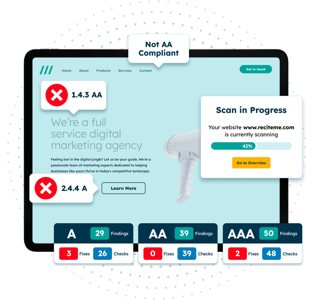
Use an accessibility checker
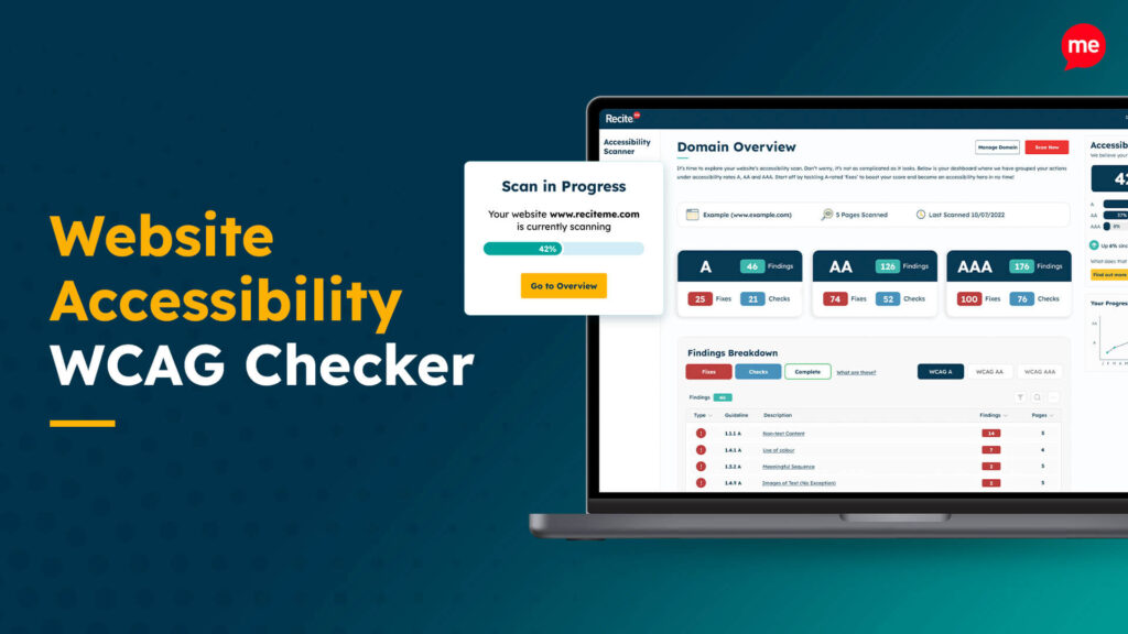
An automated accessibility checker can help identify common issues in form design, such as missing labels, incorrect field associations, or poor contrast. These tools can quickly scan your forms for errors and provide guidance on how to fix them. They can also be used to conduct automated checks on other elements of your website, from image alt text to color contrasts, and more.
Perform manual testing
Manual testing is essential for catching usability issues that automated tools might miss. This includes testing your forms using only a keyboard to ensure all fields are accessible and that focus order is logical. You should also test with screen readers to confirm that field labels, instructions, and error messages are announced properly. Using an accessibility checklist can help you stay organized and ensure that every aspect of your form has been reviewed for compliance with standards like WCAG.

Final verdict: Ensure your website forms are accessible today
The need for digital accessibility is growing and at the heart of this are website forms. If your domain is using any kind of website forms it’s imperative that you make the necessary adjustments to ensure they are accessible to people with disabilities. Not only is this the right thing to do ethically, but it will also protect you against legal risks, help you reach a wider audience, and drive a strong brand image. You can take the first step today by checking the accessibility of your website.
Website form accessibility FAQs
Looking for a recap or quick summary? Here are a few of our most frequently asked questions to help you get to grips with the essentials:
What is an accessible form and why is it important?
An accessible form lets users with disabilities perceive, understand, navigate, and interact with inputs regardless of impairment. It ensures equitable access to services like registration or shopping, avoids legal risks, and broadens user reach by complying with WCAG principles.
Which WCAG criteria directly affect forms?
Key WCAG 2.1 criteria include:
- 1.3.1 Info and Relationships: Requires programmatic associations (e.g., labels) so assistive tech understands form structure.
- 3.3.2 Labels or Instructions: Mandates clear, accessible labels/instructions for each field.
- 4.1.2 Name, Role, Value: Ensures form elements expose accessible names and states
How do I handle from validation and error messages accessibly?
Provide clear instructions before submission, such as format hints via descriptive text. On errors, programmatically associate messages with fields using aria-describedby and set aria-invalid=”true”. Use role=”alert” or an aria-live region so screen readers announce errors immediately.
How do I ensure forms are keyboard accessible?
Use native HTML controls, which are focusable by default. Maintain logical tab order following the visual layout. For custom widgets, add tabindex=”0″ and ARIA roles/states so keyboard users can interact consistently.
Are form CAPTCHAs inaccessible, and what are alternatives?
Traditional image/audio CAPTCHAs often block users with visual/audio impairments. Use accessible alternatives like honeypot fields, simple logic/math questions, or invisible CAPTCHAs that don’t rely on visual challenges.
What’s the difference between placeholders and labels?
Labels provide permanent field descriptions; placeholders offer temporary hints and vanish once typing starts. Always include a visible label and use placeholders only for supplementary examples, not as the sole descriptor.
Check out our Products & Services
Ready to take your first steps towards digital accessibility compliance? Then see how we can support your journey with our accessibility solutions:
Web Accessibility Checker
Scan, detect, fix, and maintain accessibility compliance standards on your website.
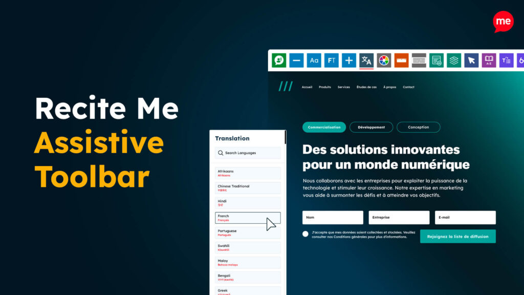
Assistive Toolbar
Make your website an inclusive and customizable experience for people with disabilities.

PDF Accessibility Checker
Check your PDFs are compliant with accessibility standards and run automated fixes.