Over the last decade, the world of commerce has migrated from brick-and-mortar stores to the vast landscape of the internet. E-commerce and online retail stores have become the epicenter of consumer activity, offering unparalleled convenience and an endless array of products and services.
But there’s a problem. Many online stores simply aren’t accessible to people with disabilities. And in modern-day e-commerce, an accessible website isn’t merely a matter of compliance. It is the key to unlocking the full potential of your digital storefront.
Why E-commerce and Online Retail Websites Must be Accessible
People with disabilities make up the largest minority group in the world. This includes people with visual impairments, hearing deficits, cognitive, learning, and neurological disorders, and those who are physically disabled and struggle to use a standard mouse and keypad. And that’s without considering the millions of online consumers with diverse language needs.
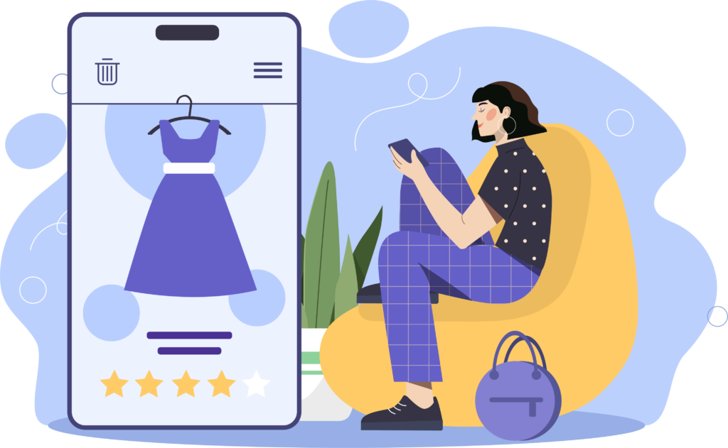
- Vision problems, encompassing blindness, partial blindness, blurred vision, deafblindness, and color blindness, affect 14 million Americans (National Institutes of Health).
- Learning disabilities affect around 4 million people (Healthy Place).
- Language barriers impact accessibility for the 67 million residents who speak a language other than English (Center for Immigration Studies).
- Hearing loss affects one in eight Americans (National Institute for Deafness and Other Communication Disorders).
Not supporting these shoppers would be a huge mistake, given that the spending power of disabled people and their families in the United States alone equates to $490 billion. Plus, in a world where ethically conscious buying habits are becoming the norm, making your products accessible to everyone is simply the right thing to do.
What Accessibility Problems Do People Face on Online Shopping Websites
In the digital realm, the success of your business is defined by your ability to reach and engage with the widest possible audience. Online access barriers can manifest in various ways, but they typically fall into three key categories: readability issues, navigation challenges, and comprehension difficulties. Understanding these barriers is fundamental to creating shopping experiences that are not simply accessible, but welcoming to all. Here are a few examples.Readability Issues
- Font, size, and spacing – Clear, legible text is the foundation of a user-friendly website. Many website visitors will struggle when the font size is too small, the spacing is too cramped, or the typeface difficult to read.
- Screen reader compatibility – Webpage visitors with visual impairments rely on screen reader technology to read the content aloud.
- Color contrast – When there isn’t enough contrast between text and background colors, some readers cannot distinguish the web copy at all.
Navigation Issues
- Logical flow – Many readers become disoriented when a website’s structure isn’t clear or when content lacks a logical flow.
- Formatting – Poorly formatted content makes it challenging for people to effectively find the information they’re looking for, so well-structured and organized web pages are essential.
- Keyboard navigation – Implementing keyboard navigation ensures everyone can effortlessly browse your website, regardless of their motor skills.
Comprehension Issues
- Translation assistance – Not all your customers speak English as their primary language, so providing translation features is often essential.
- Captions – When on-page video content is not presented with captions, deaf website visitors are denied information.
- Alt tags – Descriptive alt tags for images are like windows into your content, providing context and meaning to those who cannot see photos and other images clearly.
Accessibility Barrier Examples
Let’s look at some real-life examples that online shoppers on your website could be experiencing right now if your sales platform isn’t accessible.
Alicia is color blind. She’s searching for the perfect top to go with her new favorite jeans. She knows exactly the style she wants, and she’s clicked on an ad that leads her directly to a product page on your site. But, there’s no descriptive text on the color swatch, so it’s impossible for her to order the right version, so she buys something from a competitor’s website instead.
Chris has attention deficit hyperactivity disorder (ADHD). He’s in the market for a new laptop to enhance his productivity. But your homepage is cluttered with multiple auto-playing videos and animated advertisements. The sensory overload makes it impossible for him to concentrate on comparing laptop models, so he clicks away to a more user-friendly website.
Maria is visually impaired yet still an avid reader. However, the book covers on your website lack descriptive alt text, leaving her unable to discern the titles and authors. Frustrated, she clicks away without making a purchase and even drops a message into her book club chat group, recommending other members avoid shopping on your website.
3 Key Ways to Make Your Online Content More Accessible
Ultimately, technology that benefits people with disabilities helps all consumers, and upping your game on inclusion is not as scary, complicated, or costly as you may think. Here are the first few steps to get you started.
1. Familiarize Yourself with Essential Compliance Criteria
It’s impossible to improve if you don’t know what you’re doing wrong. But there’s so much accessibility information out there, knowing where to begin can be tricky. Your primary sources of guidance are:
- The Web Content Accessibility Guidelines (WCAG) – WCAG are internationally recognized, with WCAG 2.1 Level AA typically being the benchmark criteria for ‘making a website accessible’.
- National and regional legislation – It is illegal to treat people with disabilities less favorably, so ensuring your policies align with the Americans with Disabilities Act and any additional regional legislation is essential.
2. Update Your Website Design
There are several design and development considerations involved in building an inclusive website. The ‘must have’ accessibility features to ensure inclusive online shopping journeys include:
- An accessibility-optimized content management system.
- Properly structured content.
- Alternative text on images.
- Descriptive names on links.
- Captions and transcripts for audio and video content.
- Sufficient color contrast
- Clear and consistent navigation – including keyboard-only navigation.
- Accessible forms and downloads.
- Responsiveness across a range of devices (mobile, tablet, PC).
3. Invest in Assistive Technology
At Recite Me, we understand that your e-commerce website is constantly changing as products are updated, edited, and removed. We also understand that can make the process of becoming inclusive feel overwhelming. That’s why we’ve developed a suite of dedicated accessibility tools to help you navigate the process.
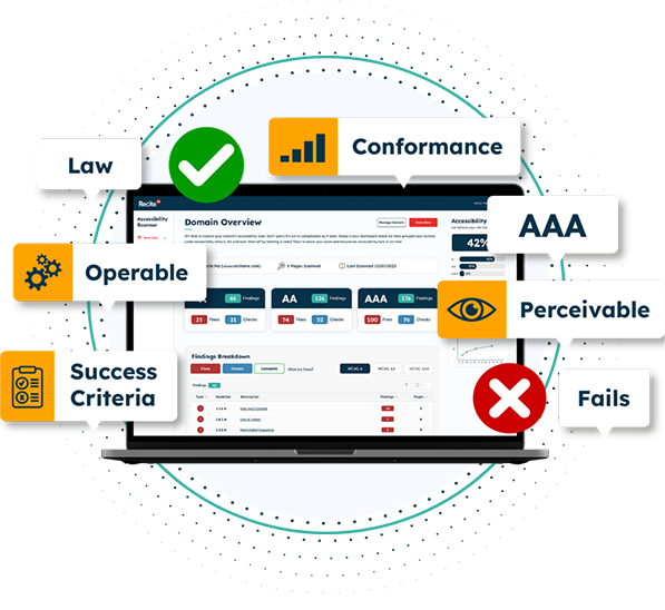
The Recite Me Website Accessibility Checker
The Recite Me Accessibility Checker audits back-end and front-end web development processes by running 396 separate compliance scans in line with WCAG 2.1 and breaking down the issues you should be working to fix.
- Highlight inaccessible features
- Showcases the accessibility issues
- Provides recommendations on how to fix issues
- Manage your accessibility fixes queue
- Track improvements
- Share your accessibility report
The Recite Me Toolbar
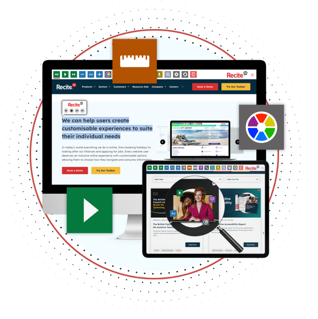
The Recite Me Toolbar promotes inclusivity by allowing end users with sight loss, cognitive impairments, learning difficulties, physical disabilities, and varying linguistic needs to access your website per their individual needs and preferences.
- Dictionary, Thesaurus and Spell Checker
- Zoom functionality for all web pages
- Translate over 100 languages
- Translator & Screen Reader for PDF Documents
- Text-to-speech Screen Reader
- Convert web content to mp3
- Usable Ruler to make reading easier
- Screen Mask tool to isolate sections of a page
- Change color contrasts
- Change Font size, color and type
What the Data Says
Our most recent report demonstrates the need for website customization and the associated real-world benefits for the businesses that offer it. For example, stats over the last 12 months show that:
- Over 41.3 million web pages have been viewed using the Recite Me toolbar.
- On average, website visitors who use the Recite Me toolbar on utility websites viewed 6.81 pages, much higher than the average internet journey depth of just 2.8 pages per visit.
- Nearly 68 million pieces of content were read aloud using the Recite Me screen reader.
- Over 77.5 million pieces of content were translated into different languages.
Become Inclusive Today!
Our team is here to guide you on your mission to provide more inclusive online shopping experiences. Get started on your website accessibility strategy today by working through these action points:
- Contact our team for more advice about WCAG standards, accessibility legislation, and best practices for your e-commerce or online retail website.
- Run a free check of your website for WCAG 2.1 AA compliance.
- Try our toolbar or schedule a free demonstration to see how it can benefit your customers.


