Get Your Free Accessibility & Inclusion Toolkit
Download NowAfter investing time, energy, and money into crafting the perfect website for your business, the last thing you want is to find out that you are unknowingly excluding a significant portion of your audience. Unfortunately, inaccessible websites can prevent the 1 in 6 people worldwide, who have some form of disability, from accessing the same online products and services as their non-disabled peers. And given that over one billion people rely on assistive technology, a figure expected to reach 2 billion by 2050, the need for accessible web design is not expected to slow anytime soon.
Without making accommodations for these individuals, you risk alienating an entire pool of potential customers and missing out on all the benefits this can bring. Want to get started, but don’t know how? This guide has everything you need to know.
What is inclusive web design
Simply put, inclusive web design is about making websites usable by as many people as possible, regardless of their physical or cognitive abilities. This concept extends beyond just disabilities, covering different age groups, tech literacy levels, and even cultural backgrounds. But ultimately, inclusive web design means different things for different groups of people.
Website experiences are inherently visual, which can create significant inclusion barriers for those with visual impairments. Inclusive web design might involve ensuring your website is compatible with screen readers so that blind users, who rely on screen readers to read aloud their digital content, can still browse your website.
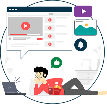
For users with cognitive impairments, who form approximately 1% of the global population, content should be accessible in multiple formats, such as text, audio, and video. All content should be easy to understand, highlight any key information, and be void of any technical jargon or unnecessarily complex terms.
In essence, inclusive web design is all about levelling the playing field, by affording disadvantaged individuals the tools necessary to grant them access to the same products, services, and content as their non-disabled peers. It goes one step further than traditional web design, focussing not just on aesthetics, but equity and fairness too.
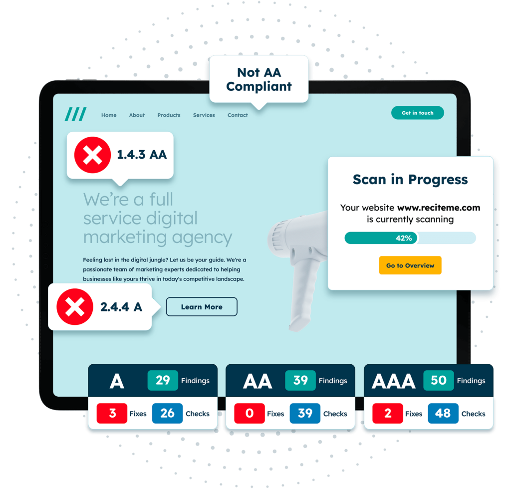
Free Accessibility Check of your Website
Finding accessibility issues is now easier than ever. Recite Me offers a free automated scan of your website’s homepage to highlight non-compliance. You’ll get recommendations on how to fix them, helping to improve your accessibility score.
The role of WCAG in providing standards for inclusive websites
The Web Content Accessibility Guidelines (WCAG) are a set of internationally recognized standards aimed at making web content more accessible to people with disabilities. These guidelines provide recommendations for creating websites that cater to individuals with a range of impairments, such as vision or hearing loss, cognitive limitations, or physical disabilities.
These guidelines focus on improving website functionality through things like clear layouts, large buttons, keyboard navigation, providing captions for multimedia content, etc.
WCAG sets out three levels of conformance:
- Level A: Ensures that the most basic web accessibility features are present.
- Level AA: Addresses common barriers that affect users with disabilities.
- Level AAA: Is the highest standard, ensuring maximum accessibility for a diverse range of impairments.
Although Level A covers basic web accessibility, Level AA conformance is generally the accepted standard for being considered ‘accessible’. In other words, aim for Level AA, or even AAA, and you shouldn’t have anything to worry about.
Strategies for designing an inclusive website
Now that you’re familiar with WCAG best practices, it’s time to explore what this means in terms of practicalities for your business. What strategies can you implement today to ensure your website is accessible long into the future? Some of the most significant include:
Keyboard accessibility
Keyboard accessibility is fundamental for users with motor disabilities who rely on keyboards to navigate. Ensure that every part of your website can be accessed without a mouse. This includes enabling users to tab through menus, forms, and links.
Clear color contrast
Poor color contrast can make your content unreadable, especially for those with visual impairments like color blindness. A strong contrast should be used between text and background colors.
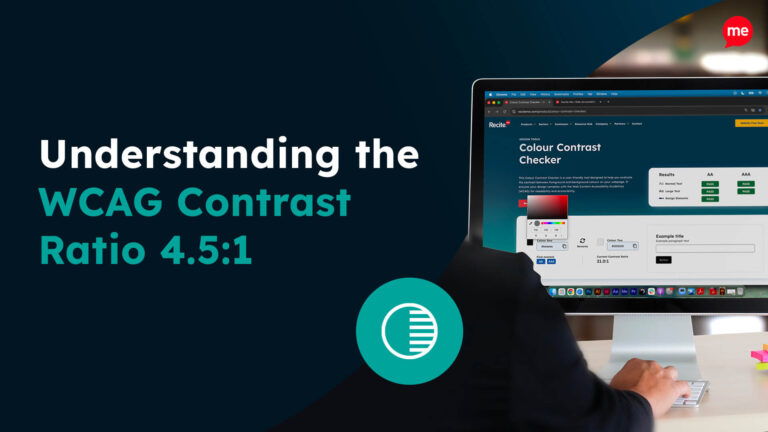
For example, light grey text on a white background can cause difficulties for some users, so aim for a contrast ratio of at least 4.5:1 for standard text and 3:1 for larger text, as recommended by WCAG.
Compatibility with assistive tech
Many users with disabilities rely on different types of assistive technologies such as screen readers. To ensure your content is compatible with such technologies, you should provide proper labels for forms and use clear semantic HTML, for example, like using `<header>` tags for headers.
Inclusive images
Not all users can see images on your websites clearly. This is where alternative text, or alt text, comes into play. Alt text provides descriptions of images for screen readers, enabling visually impaired users to imagine the content of the image without needing to perceive the image itself. Alt text descriptions should provide an appropriate level of context; for example, instead of simply saying “image of a person”, provide more context like “woman reading a book in a park”.
Avoid relying on color alone
Relying solely on color to convey important information is a common mistake. People with color blindness may not be able to distinguish between red and green. Always pair color-coded elements with text or icons. For example, if an error message is displayed in red, make sure it also includes a symbol or text-based description like “Error: Please enter a valid email”.
Content structure
Well-organized content is key to both user experience and accessibility. Headings (H1, H2, etc.) help users, including those using screen readers, understand the hierarchy of your content. Keep sentences and paragraphs short, use bullet points where possible, and avoid jargon that could alienate users with lower tech literacy.
Website customization
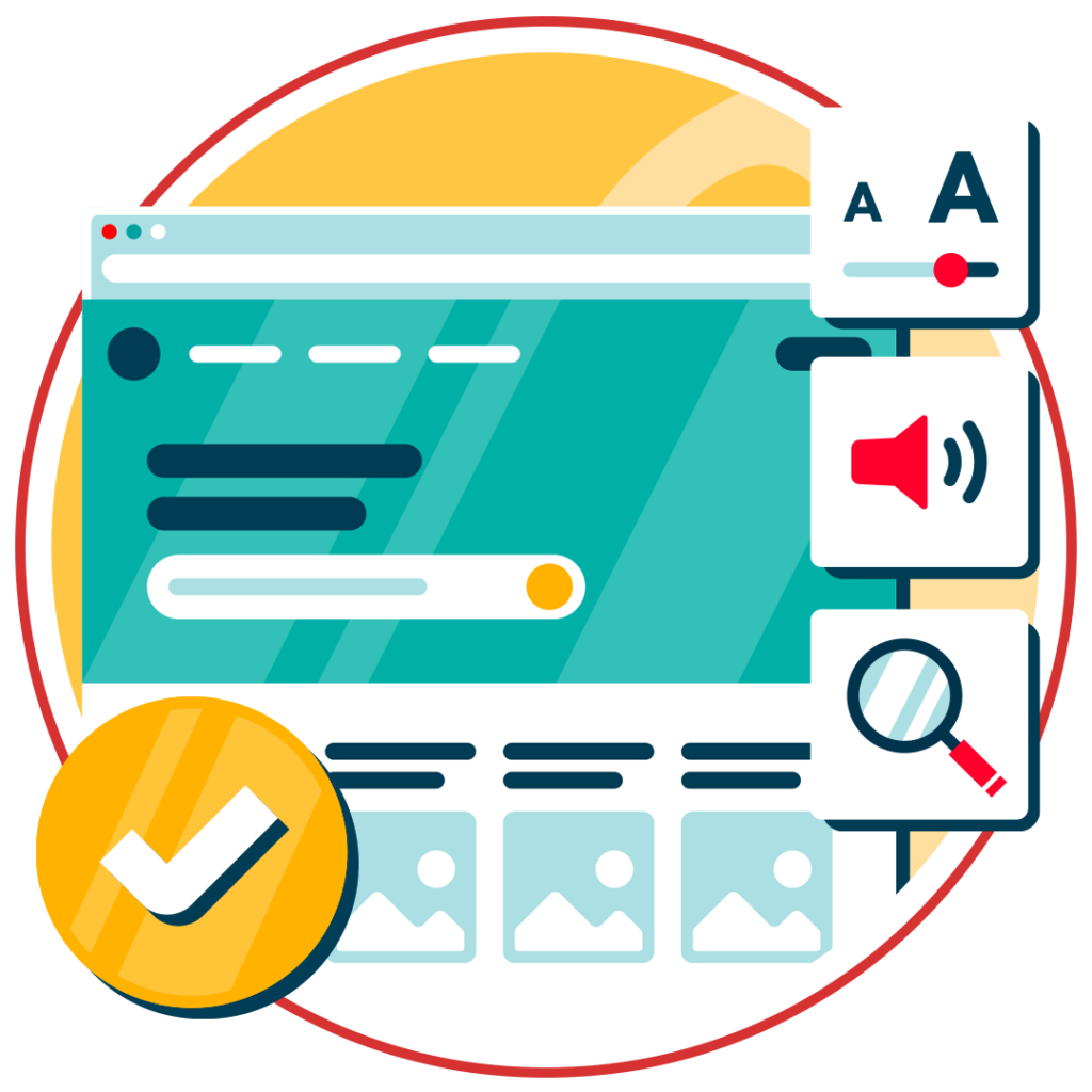
Allowing users to customize your website can significantly enhance accessibility. Features like adjustable text size, font choices, or even changing a website’s color palette, can empower users to interact with your site more comfortably. A great example is our assistive toolbar, that integrates with your website to make it customizable to users with accessibility needs.
Consistent navigation
Users with cognitive disabilities benefit from a predictable layout. Ensure that navigation menus, buttons, and links remain in the same location across all pages, reducing confusion and making it easier for users to find their way around.
Form accessibility
Forms are essential elements on most websites, but they can be a significant barrier if not designed inclusively. Use clear labels for form fields, include instructions, and offer feedback when errors occur. Ensure that all fields are accessible via keyboard, and that users are notified when they’ve missed a required field.
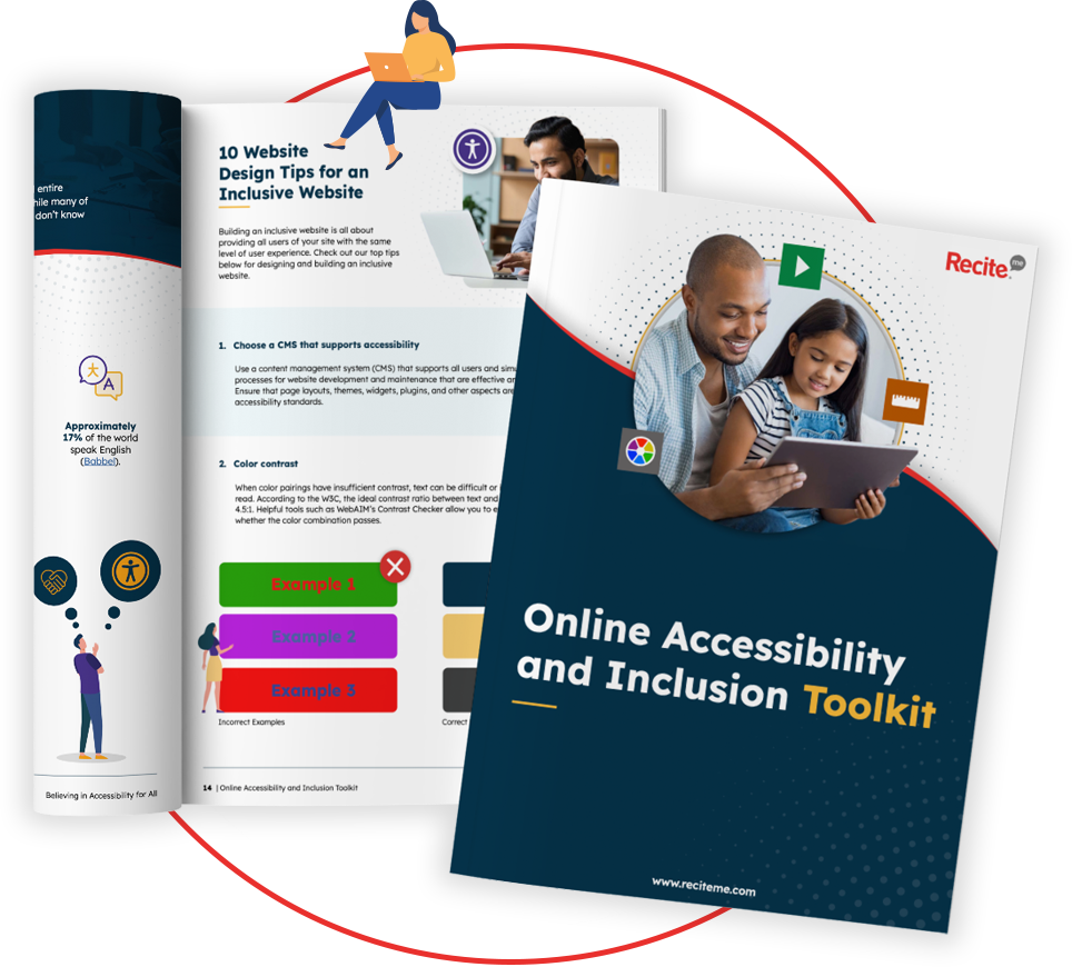
Our 40-page Digital Accessibility & Inclusion Toolkit helps businesses break down online barriers and make a real impact. It offers practical advice on all aspects of digital accessibility, from writing an accessibility statement to accessible website tips and inclusive hiring.
Benefits of prioritising inclusivity through your web design
Beyond the moral imperative of ensuring equal access to online content for all, inclusive web design comes with some rather compelling business benefits. It not only widens your market reach, but does wonders for user satisfaction, search engine optimization (SEO), and, of course, keeps you on the right side of the law.
Here are some of the key benefits of inclusive web design:
- Expanded audience reach: Designing a website inclusively means reaching users with disabilities, older adults, or those with temporary impairments. You’re opening your website to millions of additional visitors who might otherwise have struggled to access your content.
- Improved SEO: Search engines favour websites that are well-structured and accessible. By following WCAG guidelines, you’re not only helping users, but also making your site more discoverable to search engines like Google.
- Enhanced user experience: Accessible design is generally easier for everyone to use. Features like intuitive navigation and readable fonts benefit all users, not just those with disabilities.
- Legal protection: In many countries, accessibility is a legal requirement. By ensuring your website is WCAG-compliant, you reduce the risk of costly legal battles or penalties associated with non-compliance.
- Positive brand perception: Showing that you care about inclusivity can improve your brand’s image. Businesses that prioritize accessibility are often seen as more ethical and socially responsible, which can attract loyal customers and partners.
