Get A Free Accessibility Test Of Your Website
Run Test NowNavigating inaccessible websites is very frustrating for those with disabilities, and it doesn’t take much for this frustration to turn into a lost customer. Extrapolate that over the millions of disabled web users constantly browsing the internet, and the result can be quite shocking. But unless you’re conducting regular tests, you may not even realise your website is inaccessible. In fact, statistically speaking, it probably isn’t.
A 2024 evaluation of the top 1 million websites by WebAIM found that 95.9% of homepages did not fully comply with global accessibility standards. This highlights the pressing need for businesses to introduce accessibility testing as part of standard business practice. Without it, your business could face serious legal consequences, reputational damage, or worse. This is your guide to understanding the what, when, and how of accessibility testing.
Understanding the types of accessibility testing
Accessibility testing uses a combination of different testing methods to achieve the desired result. The three main types are: automated, manual, and user-feedback. Each method addresses specific accessibility challenges, so relying on just one can leave your organization vulnerable to inaccessibility. Instead, use a combination of all three methods and get a comprehensive view of your website’s inclusivity.
Manual testing
Where automated testing falls short, manual testing steps in. This approach involves web designers or developers carrying out checks of key website elements. For instance, testers might review image alt text to ensure it is descriptive but free of jargon and not overwhelming. They might even trawl through webpages using a screen reader to check if all website content makes sense to a human audience when being read aloud.
In essence, manual testing applies a human filter which draws on the human experience to decide not only if a given feature is technically accessible, but if it is practically accessible too. To get started with manual testing, I’d highly recommend checking out our website accessibility testing checklist.
Automated testing
Think of automated testing as your first line of defence. Automated testing uses digital tools and software to scan your website in search of any glaring accessibility barriers. Tools like Recite Me’s accessibility checker can quickly identify issues, such as missing alt text, incorrect heading structures, or color contrast failures. It returns the results in the form of a concise report, complete with recommendations for addressing failures.
But while this makes automated testing a great starting point, it can sometimes overlook the more subtle aspects of accessibility. This is where human judgement and manual testing come into play.
User-feedback testing
Developers and web designers know the ins and outs of websites, meaning they’re able to apply a certain level of knowledge and experience to their audits. But the best feedback comes from the your disabled users who experience the challenges of accessibility issues first-hand.
User-feedback testing involves asking disabled individuals to use your website and provide feedback on its accessibility. This approach uncovers more subtle challenges that automated or manual testing might not have detected, whether it be the faintness of a focus indicator, the comprehensibility of certain interactive elements, or a number of other intricacies.
Free Accessibility Test of your Website
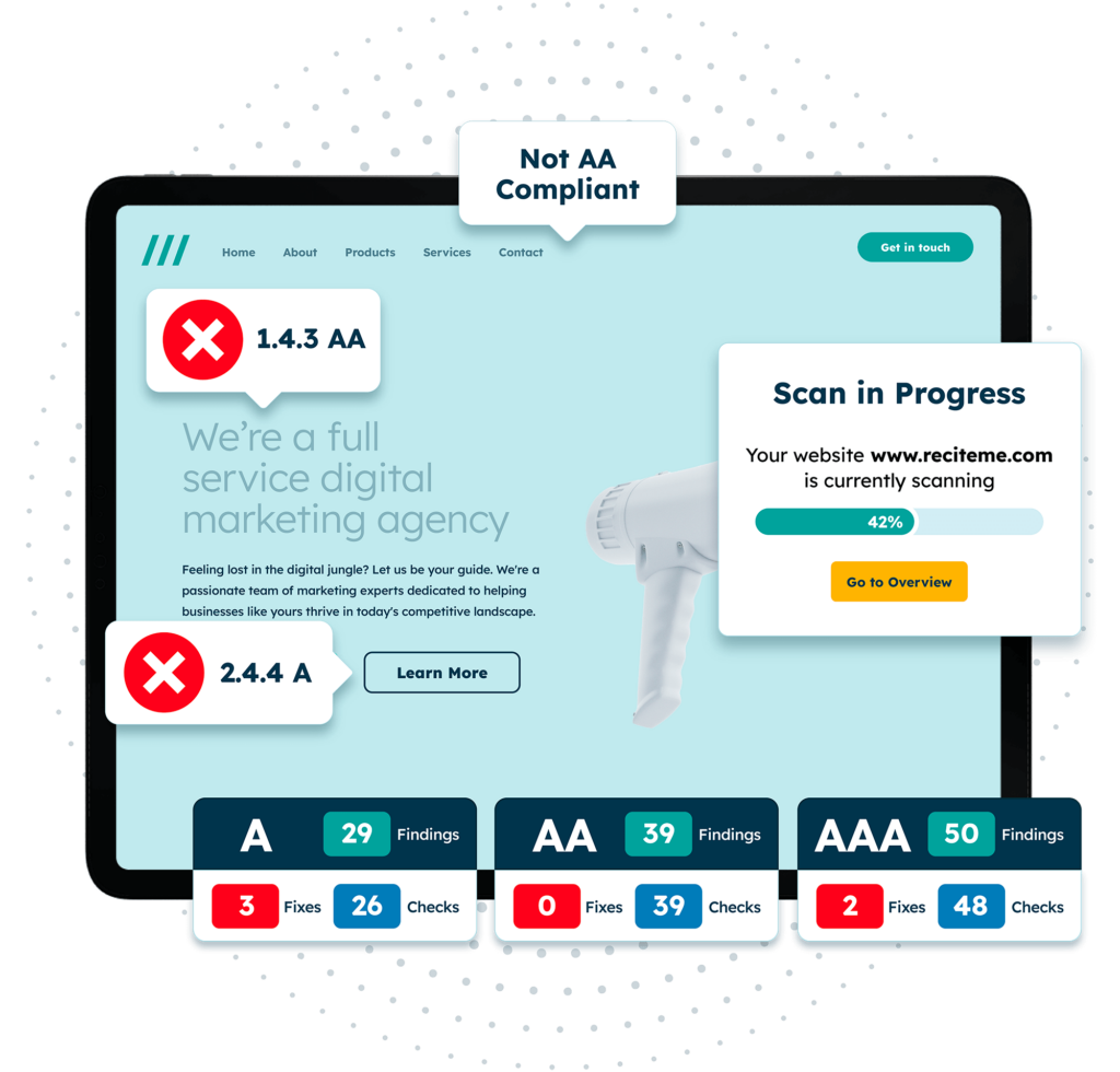
Finding accessibility issues is now easier than ever. Recite Me offers a free automated scan of your website’s homepage to highlight non-compliance. You’ll get recommendations on how to fix them, helping to improve your accessibility score.
The role of WCAG in accessibility testing
The Web Content Accessibility Guidelines (WCAG) are the gold standard for web accessibility. These global standards form the foundation for accessibility laws across the world, including Europe, USA, and Australia. WCAG is based on four key principles, often referred to as POUR: Perceivable, Operable, Understandable, and Robust.
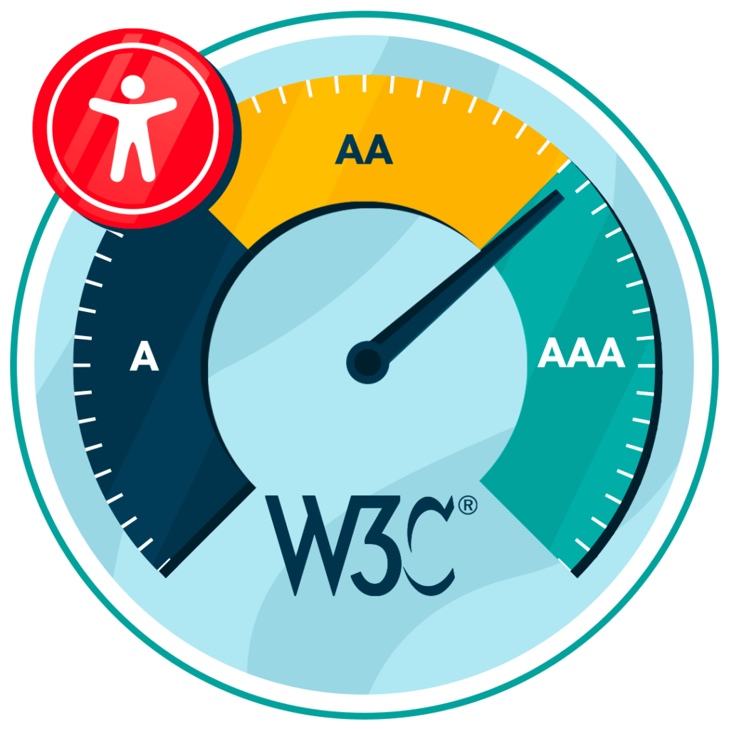
From these principles, WCAG outlines specific success criteria that websites must meet for a range of different website elements, such as color contrast, image alt text, keyboard navigability, etc. These criteria are graded at three levels: A, AA, and AAA. It is often recommended that businesses aim for Level AA compliance in order to be comfortably considered ‘accessible’, but if resources allow, striving for Level AAA compliance is always better.
To give just one example, for keyboard navigation, WCAG Level AA requires all website functions to be accessible via keyboard, ensuring users with motor disabilities can navigate without a mouse. This means that users should be able to tab through links and buttons in a logical order to complete tasks like filling out forms or making purchases.
When conducting accessibility audits, whether automatic or manual, tests are measured against WCAG best practices to see where a website stands. In this way, WCAG acts as a north star guiding businesses along their accessibility journey, giving them targets to set their sights on and a framework within which to act.
Because of WCAG, there is now a global understanding of what accessibility means, removing subjectivity and the element of human error from audits. Without WCAG, your website may pass basic visual tests, but still be inaccessible to those with disabilities if things like an illogical content structure or poor color contrast fly under the radar.
Who is accessibility testing important for?
Given that in the U Salone, roughly 27%, or one in four, of adults live with some form of disability, accessibility testing should be a topic of discussion at every organization’s boardroom meetings. After all, different disabilities present different challenges, and without testing, you may inadvertently exclude a significant portion of your audience.
This section takes a look at some of the key disability groups and why implementing accessibility best practices matters for each.

Visual impairments
Visually impaired users include those with severe conditions like blindness, but also those with more mild impairments like poor vision or color blindness. Testing for visually impaired users should identify issues related to things like text size and color contrast. For example, an audit might confirm whether text can be resized up to 200% without loss of content or functionality. It might also verify whether the color contrast between text and its background meets the WCAG-stipulated contrast ratio of 4.5:1 for standard text.
Deaf and hard of hearing
Hearing problems range from complete deafness to challenges in hearing faint sounds. Accessibility testing ensures that videos are captioned and that audio content has transcripts. Auditing should check that a promotional video is accessible, for example, it should include accurate subtitles or captions so that users with hearing impairments can follow along without losing sense of the general message.
Cognitive Disabilities
Cognitive accessibility is essential as people with developmental disabilities, learning difficulties, and brain injuries can experience challenges when navigating websites. Testing helps ensure that instructions are clear, content is broken up with headings, and that any distracting features, such as auto-playing videos or flashing animations, are disabled. It might do this by identifying any use of technical jargon, unclear instructions, or illogical navigation.
Motor Impairments
A variety of permanent and temporary disabilities can hinder the ability to use a computer mouse effectively. Testing should confirm that all interactive elements, such as forms, buttons, and links, are accessible using keyboard shortcuts. For example, a user should be able to complete an online checkout form by tabbing through fields and pressing enter to submit, without requiring mouse input.
The most common accessibility issues to test for
There are many potential accessibility issues, but focusing on the most common ones can yield the greatest return on investment. This section breaks down some of the most prevalent accessibility issues to keep your eye out for and how to address them.
You can use the following jump links to find our more about the key accessibility issues that will be discussed:
Keyboard accessibility
For users with motor disabilities, using a mouse can be difficult. Often, they rely on keyboards to navigate the web instead. This means your website must be fully navigable from a keyboard alone, using functions like the ‘Tab’ and ‘Enter’ keys to click links, open web pages, and interact with buttons.
Color contrasts
Check that your text and background colors meet the WAG-recommended contrast ratios of 4.5:1 for normal text and 3:1 for large text. This makes your content readable for users with visual impairments, especially those with color blindness or low vision, and can be easily verified using online color contrast checkers.

Missing image alt text
Providing alternative text for images allows screen readers to interpret the contents of an image and describe it vocally to blind users. Alt text should describe the image accurately and without overwhelming the user. This means avoiding the use of technical jargon, overly complex terms, and unnecessary words. Keeping things clear and concise also makes alt text descriptions more accessible to those with cognitive disabilities.
Non-descriptive link text
Too often, links are just copy and pasted at the end of a paragraph with little context or explanation. Not only is this unappealing aesthetically, but it causes assistive technologies, like screen readers, to misinterpret the link, reading it as pasted and therefore confusing the user.
Instead, embed the link within a relevant portion of text which describes the destination of the link. For example, link text that reads “Learn more about accessibility” provides much more context than vague phrases like “Click here”, helping visually impaired users navigate your site more easily.
Inaccessible forms
Forms are critical points of interaction, so they must be accessible to all users. As a starting point, ensure that all form fields are clearly labelled and accessible via keyboard navigation. Provide clear instructions on how form fields should be entered, complete with examples. Mark incorrect entries in red, but don’t rely on the color alone, add symbols and prescriptive error messages which help the user correct their mistakes.
Multi-media accessibility
Make sure that all videos have captions, audio content has transcripts, and media players offer control options like play/pause. This allows users with visual and hearing impairments to still engage with multimedia like anyone else.
Compatibility With Assistive Technology
Different types of assistive technologies, like voice recognition software or screen readers, support disabled individuals in navigating websites. Compatibility with assistive technology can mostly be identified during automated tests and involves looking for things like proper heading structures (H1, H2, H3), clearly labelled buttons or forms, and use of ARIA labels.
PDF accessibility
PDFs are one of the most common forms of online document and a key tool in digital communications. However, PDF accessibility is often overlooked. Luckily, auditing can be applied to PDFs in the exact same way as websites, and the strategies for improving accessibility are generally the same too.
For example, PDFs should display readable fonts, appropriate color contrasts, and a clear content structure, as is true for websites. When auditing your PDFs, consider using our PDF accessibility checklist for ease and efficiency.
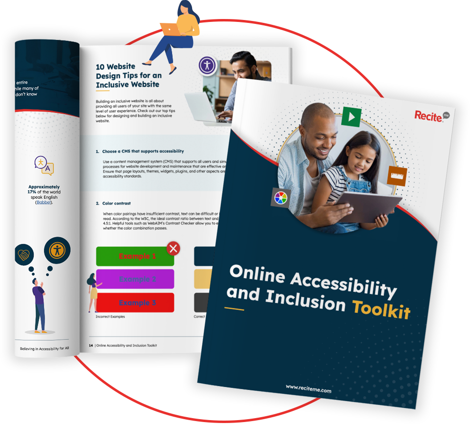
Our 40-page Digital Accessibility & Inclusion Toolkit helps businesses break down online barriers and make a real impact. It offers practical advice on all aspects of digital accessibility, from writing an accessibility statement to accessible website tips and inclusive hiring.
The benefits of using testing to build an accessible website for your business
Accessibility testing doesn’t just benefit users with disabilities; it also benefits your business. Here are some of the most appealing advantages on offer:
- Wider audience reach: By making your site accessible, you open it up to the millions of disabled internet users worldwide.
- Legal compliance: Avoid costly lawsuits and fines by ensuring your site complies with local accessibility regulations.
- Improved SEO: Many accessibility practices, like using alt text for images, also help increase your website’s search rankings, boosting your brand’s visibility as a by-product.
- Better user experience: An accessible site is easier for everyone to use, not just those with disabilities.
- Enhanced reputation: Building an inclusive website shows that you care about all users, which can improve customer trust and loyalty, especially among the growing cohort of ethically-conscious consumers.


