As we’ve discussed in several of our previous articles, there are distinct differences between the terms accessibility, usability, and inclusion.
It’s a common misconception, but your website doesn’t magically become inclusive just because you make it accessible. There are extra steps needed to achieve true inclusion.
Key Takeaways
- Website accessibility and usability are two different factors that combine to make a website inclusive.
- An accessible website is one with content and functionality that is fully available to as many people as possible.
- An inclusive website is one that gives users choices beyond that, so they can customize how they use a website to consume the information.
- Making your website inclusive removes online barriers and allows equal access for everyone to learn about your products and services.
- Various technologies are available to help you on your journey to inclusion, including the Recite Me Checker and the Recite Me Assistive Toolbar.
The Accessibility Coin
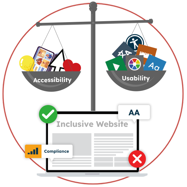
Accessibility and usability are not the same thing. They are more like two sides of the same coin. At Recite Me, we call it the accessibility coin. On one side is how your website is built, and on the other is how people navigate and interact with your website. Together, these two factors combine to create an inclusive website.
All companies should be striving to increase the value of their accessibility coin and create inclusive online journeys. Mainly because it’s the right thing to do, but also because doing so is vital in improving website traffic, sales, conversions, and boosting brand value.
The great thing about accessibility and usability updates is they can be addressed in any order. So you needn’t worry about where to begin or what changes or improvements to make first. But understanding what’s required and making a start is is essential.

 “The emphasis should not be on the user to adapt. The responsibility to be accessible and make everyone feel included rests firmly with your organization.”
Ross Linnett, Founder and CEO
What is Website Accessibility?
An accessible website is one with content and functionality that is fully available to as many people as possible. Traditionally, people think of website accessibility in terms of those with physical disabilities. However, making a website accessible benefits lots of other groups, too – like people with slow network connections, those using mobile devices and tablets, and the 1 in every 5 people who have hidden disabilities like decreased vision, learning difficulties, literacy problems, neurological and cognitive disorders, or language barriers.
Making a website accessible means doing the bare minimum to provide a website that:
- Has the correct structure, layout, and features so that people with disabilities can navigate it and consume the content.
- Complies with the World Content Accessibility Guidelines (WCAG) 2.1 Level AA
- Meets the relevant legal standards and regulations.
Some examples of online barriers people face when your website fails to meet minimum accessibility requirements include:
Navigation issues
- People with cognitive and neurological disorders cannot follow the flow of information if a website isn’t clearly written and doesn’t run in a logical order.
- Website visitors with learning difficulties like ADHD cannot find the information they need on poorly formatted web pages.
- Those with physical disabilities may be unable to navigate a website if keyboard navigation isn’t an option.
Readability issues
- People with vision problems like partial blindness, color blindness, and deafblindness cannot read information online when the font type, sizing, and spacing are unsuitable.
- Those with severe visual impairments need to use a screen reader to have content read aloud.
- Users with learning difficulties like dyslexia, dyspraxia, and hyperlexia struggle with reading due to insufficient color contrasts between the text and background.
Comprehension issues
- Website visitors who speak English as a second language may need translation assistance to comprehend content.
- Deaf patrons are denied information when on-page video content is not presented with captions.
- Visually impaired users may struggle to find context when images are missing suitably descriptive alt tags.
Now that we’ve got the basics down, let’s look at each accessibility requirement in more depth.
1. Your Website Build
Web admins should follow these steps to make websites easier for everyone to read, focus on, and understand.
- Use a content management system that supports accessibility – Be sure to check that your layouts, themes, widgets, and plugins are compatible with WCAG standards.
- Think about the layout – Group relevant topics under separate and fully descriptive labels.
- Use headings correctly to structure your content – Website visitors use headings to scan a page to see if the content is relevant to them.
- Include alt text for all images – Make sure they are suitably descriptive and contextually relevant. Learn how to create accessible alt text here.
- Be mindful of color use and color contrasts – The newest WCAG recommendations require a contrast ratio of 4.5:1 for normal text (14 point) and 3:1 for large text (18 point +).
- Ensure documents are designed for accessibility – Pages that open in a new window and display as a PDF cannot be read using a screen reader.
- Optimise navigation – Websites should be easy to navigate using a mouse, trackpad, keyboard, and, ideally, voice-activated assistive technology.
You can learn more about how to make your website accessible in our Webmaster’s Guide.
2. WGAC Compliance
Worldwide accessibility guidelines are in place to help you make your website more accessible. The Web Content Accessibility Guidelines (WCAG) are the gold standard, and level AA is typically the minimum reference point when discussing ‘making a website accessible.’
The purpose of WCAG is to make websites, apps, PDFs, videos, audio recordings, ePub, and other emerging technologies more accessible for people with disabilities. WCAG ensures that people facing digital access barriers are not excluded from online life. Yet, despite living in an increasingly digital world, many organizations remain unaware of the existence of WCAG, let alone their purpose – or how to implement the necessary changes to improve website accessibility.
You can learn more about WCAG in our Guide to Understanding the Web Content Accessibility Guidelines.
3. Web Accessibility Legislation
Multiple pieces of legislation exist to ensure that disabled people are not treated less favorably online. Website accessibility guidance for your region can typically be found within one or multiple sections of your country’s anti-discrimination laws. Most are built around the core principles of WCAG 2.1 Level AA to ensure that websites are suitably perceivable, operable, understandable, and robust.
You can find more about the laws that apply to your organization in our Guide to Web Accessibility Legislation or at our blog on US website accessibility laws.
What is Website Usability?
Usability is about designing websites that go beyond basic accessibility best practices to provide effective, efficient, and satisfying online journeys for everyone in your intended audience. Depending on your website’s goals and target market, that could mean:
- Designing a clean and simple user interface for ease of use.
- Incorporating support for different languages.
- Adding properly formatted images and videos for increased content and understanding.
It’s essential to remember that usability best practices incorporate aspects that apply equally to all users, rather than focusing on the particular needs of people with disabilities.
 “For people with disabilities, technology makes things possible. For people without disabilities, technology makes things easier.”
IBM Training Manual
Usability Factors and Examples
Inclusion doesn’t come in a ‘one size fits all’ package. Most companies find they need to make a series of changes to create an inclusive experience for as many people as possible.
In today’s modern digital world, finding a web developer who can advise on an accessibility-friendly build (or adjustment to your existing build) is not difficult. Nor is finding the newest WGAC recommendations or researching your company’s legal responsibilities.
For many businesses, the most challenging part is including customization options so website visitors can make their own decisions about how they use your website. For example:
- People with reduced upper-body mobility rely on keyboard-only navigation. So it must be possible to navigate a website’s major features without a mouse.
- A dyslexic user or someone with decreased vision will need to change the font type, size, and spacing, or make alterations so that the text and background colors are a suitable contrast for them.
- Epileptic website visitors want a way to strip away flashing graphics or fast-moving image carrousels that could trigger a seizure.
- Those who speak and read English as a second language need on-page or text-to-speech translation options.
- People with learning difficulties or ADHD require additional tools to help them maintain focus on the section of text they want to read.

Achieving minimum accessibility compliance and adding accessibility features to your website is a significant step forward. But it’s not enough to make your website inclusive. Why? Because accessibility isn’t a checklist, standards aren’t a target, and no uniform solution can account for variations in individual needs.
“Our biggest lesson was learning that simply complying with technical standards is not the same thing as true inclusion. We can’t just check the box on compliance and think that the work is done. It is quite possible to make a website that technically passes all the accessibility tests, but is still terribly difficult for a person to use.”
Vijay Mathew, Cultural Strategist & Co-Founder at HowlRound Theatre Commons
What makes a website truly inclusive is giving people as many choices as possible so they can customize your site and consume the information in a way that is personalized to their individual requirements.
“It is important to provide an inclusive online experience where everyone can use our digital world in a way that best suits their needs. As more organizations provide accessibility tools online, those who face online barriers can access information and services hassle-free. The digital world must be accessible for all.”
Ross Linnett, Founder and CEO, Recite Me
The Solution: Accessibility on Demand
Recite Me’s innovative suite of accessibility on-demand tools makes websites accessible and inclusive for a diverse range of people.
“The technology of consumer engagement is changing, and allall customers have the right to be supported online. Recite Me is calling on businesses to ensure their websites are not just accessible, but inclusive. We look forward to seeing more companies using web accessibility software like Recite Me to safeguard and support customers.”
Ross Linnett, Founder and CEO, Recite Me
The Recite Me Accessibility Checker
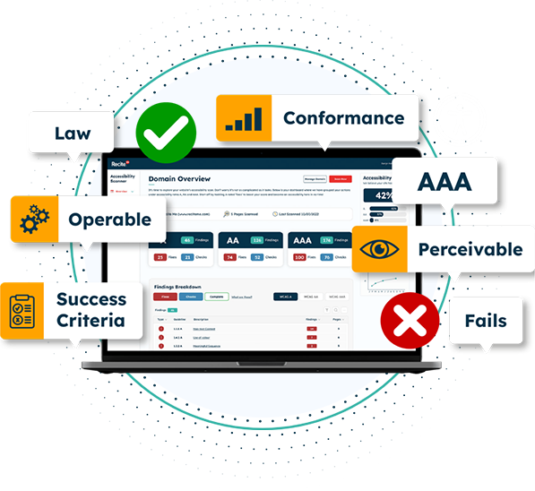
Our checker takes care of accessibility considerations for you, and in doing so, tackles several usability issues. It audits back-end and front-end web development processes by running 396 separate compliance checks in line with WCAG 2.1 and breaks down the issues you should be working to fix. The methodology follows a simple four-step process to help you increase your accessibility score:
- Step 1: Scan Your Domains – Choose between scanning single or multiple pages.
- Step 2: Identify Accessibility Issues – Identify the locations of accessibility issues on your website.
- Step 3: Fix Accessibility Errors – Boost your accessibility score by prioritizing fixes in line with WCAG Levels A, AA, and AAA.
- Step 4: Track Your Progress – Create and share custom reports with your team and roadmap the next WCAG issues in your fix queue.

“Allowing everyone who visits our website to use it the way we intended is a vital part of our mission. That’s why we’ve worked with Recite Me to make our website digitally inclusive. It’s the right thing to do and the best decision for our business.”
Sean Allen, Head of Talent, Very Group
The Recite Me Toolbar

Our accessibility toolbar takes care of the remaining usability issues. It adds user value by removing online barriers for individuals who would otherwise need to provide their own support to access content online. Individual assistive technology solutions are typically very expensive and do not offer the same level of usability or functionality.
As the final part of the usability + accessibility = inclusion equation, our accessibility toolbar promotes online inclusion by allowing end users with sight loss, cognitive impairments, learning difficulties, physical disabilities, and varying linguistic needs to access your website per their individual needs and preferences. Users can:
- Personalise font size, type, and color options to make each web page easier to read.
- Utilize the mask screen tool, which isolates parts of the page to help with focus.
- Use the ruler tool to make reading easier.
- Download content as an audio file as an alternative to reading.
- Convert page content into over 100 different on-screen languages.
- Have the page read aloud in a choice of 65 different languages.
- Customize PDF documents and have them read aloud or translated.

“We are delighted to be launching this market-first technology to boots.com, helping customers to customize the site to suit their own needs. The launch of the Recite Me accessibility tools help those customers who find it more challenging to shop online to browse, shop and manage their accounts hassle-free.”
Paula Bobbett, Director of E-Commerce at Boots UK
Recite Me Data
Thousands of organizations using Recite Me technology are already benefitting from their investment. Results from our 2022 annual report show that during the previous 12 months:
- The Recite Me toolbar was active on over 5,000 websites
- Individual toolbar usage increased by 59% to over 5.5 million users.
- We made 34.4 million pages of web content inclusive.
- On average, Recite Me toolbar users viewed 6.33 web pages per session – more than double the internet average of 2.8 pages per session.
Optimize Your Website for Inclusion Today!
Recite Me makes online inclusion straightforward, so don’t just settle for quick accessibility and usability fixes. Make your website inclusive of everyone using our accessibility-on-demand tools.
Our team is here to help you on your mission to provide more inclusive online experiences. Get started on your online inclusion strategy today by working through these action points:
- Contact our team for more advice about accessible website builds, WCAG standards, and web accessibility legislation.
- Find out more about the Recite Me Web Accessibility Checker.
- Schedule a free demonstration to learn how our technology can help you.
- Run a free check of your website for WCAG 2.1 AA compliance.
- Find out more about the Recite Me Toolbar.
- Schedule a free demonstration of our products to see the difference they can make to your customers, clients, and employees.

