Offering fee-free courses to those seeking to enhance their career prospects through training, retraining, and upskilling is undeniably an awesome endeavour. But, are the learning experiences you offer equitable and accessible to everyone?
The short answer is probably not. And we’re not just talking about making digital materials and online courses available to people with different abilities and learning styles. The first step is making sure your public-facing website is accessible.
The Importance of an Accessible Website
Inaccessible websites result in a two-tiered society where students with significant potential miss out on opportunities to learn about your programs because they can’t read, navigate, or understand the information.
2024 promises to be a big year for TAFE, as the Australian Government has pledged to fund an additional 300,000 fee-free programs delivered in partnership with states and territories. So, TAFE institutions must be proactive in tackling their web accessibility issues to ensure these places are available to everyone, including those with disabilities.
The Natural Link Between TAFE and Digital Inclusion
Providing free education to those who could otherwise not afford it offers opportunities for low-income students to learn and progress. In this respect, by their very existence, TAFE institutions actively work towards equality and inclusion for all – particularly because the target audience is so diverse and varied. So, the shared values between TAFE goals and the benefits of web accessibility are evident.
Which Students Face Problems?
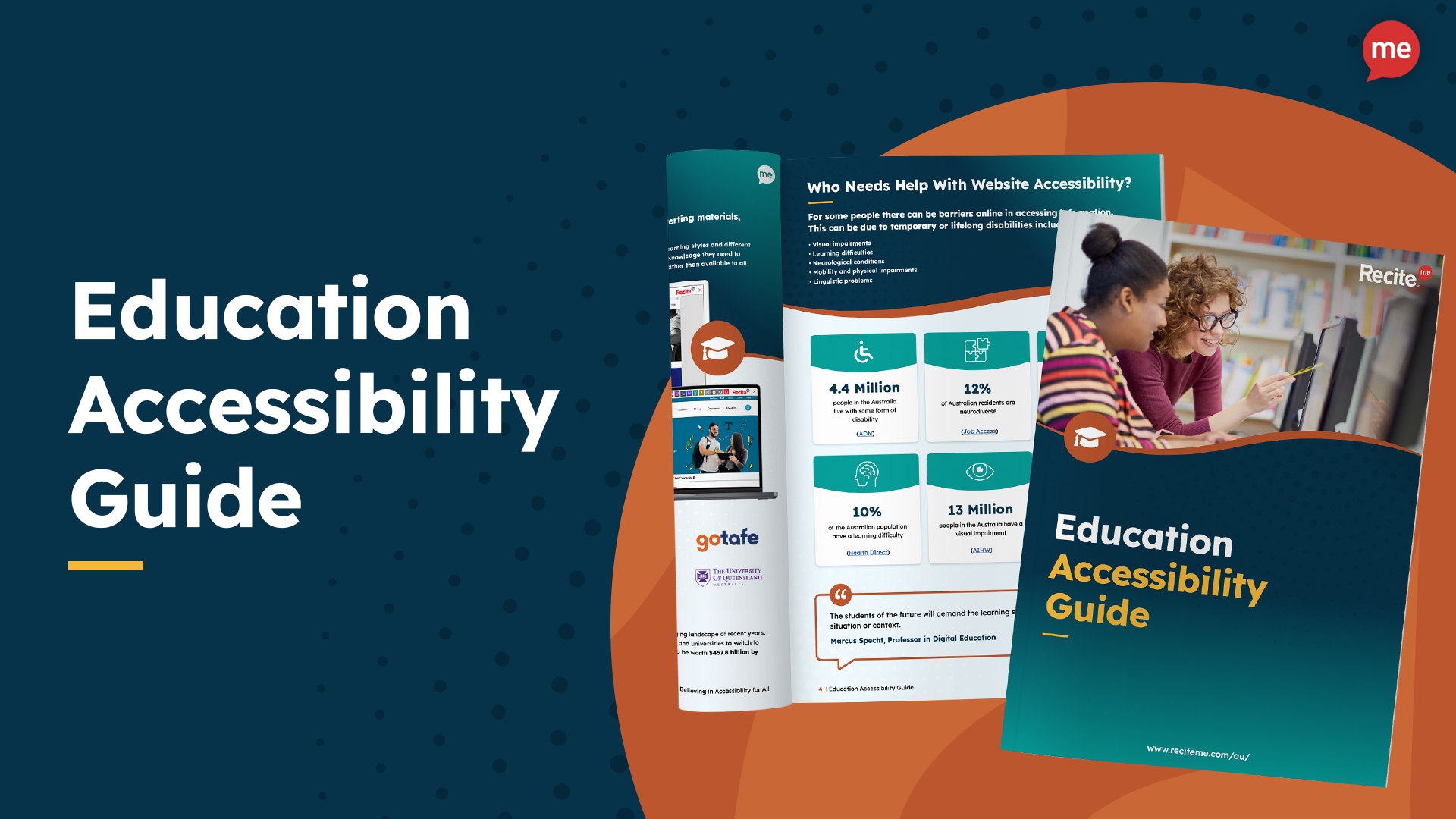
Of the 4.4 million Australians who have a disability, almost 4 million have a limitation affecting the core activities of communication, mobility, self-care, or a schooling or employment restriction.
Of course, most education facilities have already made concerted efforts to ensure physical accessibility on their premises. But often, digital accessibility is neglected. Those with mobility issues often require adjustments online just as much as in the physical realm – as do students with hidden disabilities that impact navigation, reading, and comprehension. A few examples include:
- Dyslexia
- Hyperlexia
- Dyspraxia
- ADHD
- Autism
- Epilepsy
- Deafblindness
- Colour blindness
- Speaking/reading English as a second language
5 Steps to an Inclusive TAFE Website
Most website developers can help with a build/makeover using a content management system that supports accessibility and a layout with correctly structured headings. After that, these are the essential steps to improving your website accessibility rating and providing more inclusive online experiences.
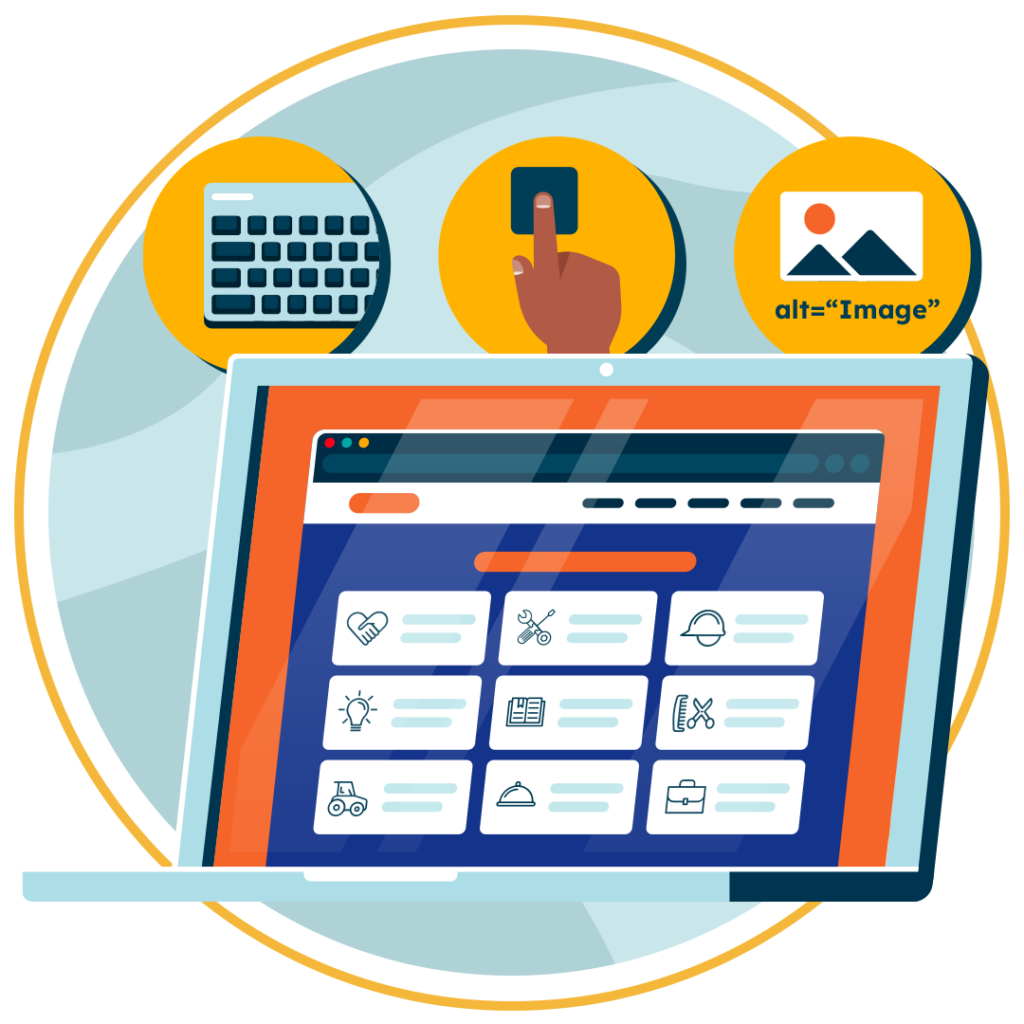
1. Provide Alt Text on All Images and Graphics
Alt text is the textual description for images on your website. This feature is fundamental for individuals with visual impairments who rely on screen readers to interpret and navigate digital content.
Whether it’s a course illustration, charts, or informative graphics, alt text ensures that content is perceivable to everyone. So, not only does alt text need to be present, but the descriptions must be accurate to facilitate maximum comprehension.
2. Ensure Keyboard Accessibility
Keyboard accessibility is a cornerstone of web inclusivity. While many users navigate websites effortlessly with a mouse, individuals with motor impairments and those who rely on alternative input devices primarily use keyboards. To make your website easy to navigate using keyboard-only commands, you’ll need to:
- Optimise tab order.
- Provide focus indicators.
- Avoid reliance on mouse-specific actions.
3. Use Sufficient Colour Contrasts
Adequate colour contrast is vital in ensuring text and graphics are easily distinguishable for those with visual impairments. Plus, choosing the right contrast level also contributes to a more visually appealing and user-friendly design for all site visitors.
Not sure where to start? These tools can help:
- Colour Oracle’s Colour Simulator provides demonstrations of how people with vision deficits view things differently.
- Toptal’s Web Page Filter previews what web pages look like to people with various forms of colour blindness.
- WebAim’s Contrast Checker allows you to check any two colours against each other to gauge suitability.
4. Run Regularly Web Accessibility Audits
As an educational institution, your website will constantly change as content is updated, edited, and removed. So, to maintain ongoing compliance with the Disability Discrimination Act (DDA) and worldwide Web Content Accessibility Guidelines (WCAG), routine checks are essential.
Accessibility tools like the Recite Me Accessibility Checker allow you to identify and address barriers that arise during updates and content additions, ensuring your site remains a reliable and accessible resource for all learners.
5. Utilise Assistive Technology
Assistive software provides straightforward solutions at an individual level for students who would otherwise need to provide their own support to access content online.
Tools like the Recite Me toolbar remove online barriers for individuals with sight loss, cognitive impairments, neurodivergent traits, physical disabilities, etc., by allowing users to make singular or multiple adjustments to adapt the way web content is presented.
Learn More
You can find more information and testimonials from education leaders who already use Recite Me software on our TAFE Landing page.
You can also book a demonstration or try our accessibility checker and assistive toolbar online for free.
Alternatively, if you would like to speak to one of the team about something more specific, please contact us and we’ll be happy to assist you.


