Download Free Inclusive Marketing Checklist
Download NowUse of email strictly as a form of internal business communication only is a thing of the past. In today’s world, emails are used for a range of different marketing purposes, including community newsletters, cold outreach, and product promotions. Quite simply, the importance of email accessibility cannot be overstated. Just imagine distributing a monthly newsletter that you’ve spent hours crafting or key facts about an upcoming event, only to find that your message falls flat for a significant portion of your disabled readers.
This guide will walk you through some simple steps to create emails that everyone can engage with, regardless of ability. Ready to make sure your communication reaches its full potential? Let’s get started.
What is email accessibility?
Email accessibility means designing your email content in a way that ensures people of all abilities can easily read, interact with, and understand it. This includes individuals with visual, hearing, cognitive, or motor impairments. Making an email accessible might involve using readable fonts, writing a descriptive subject line, or tagging visual elements with alt text, among other things.
No matter how you get there, the aim of email accessibility always remains the same: to break down accessibility barriers as much as possible so that everyone, regardless of their disability, can perceive your email content in the same way as their peers.
Your ultimate email accessibility checklist
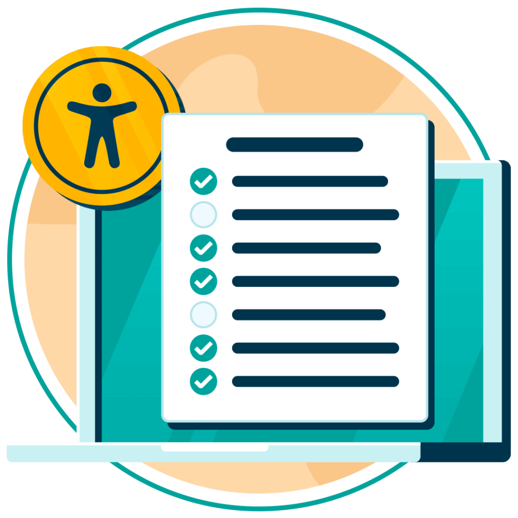
Without email accessibility, you may be preventing a significant part of your audience from fully partaking in your community. But how do you go about ensuring email accessibility? This section provides a checklist with a brief overview of the essential criteria you need to be meeting in order for your emails to be considered accessible. Work through the checklist one by one and you’ll be well on your way to barrier-free communications between you and your customers.
1. Descriptive subject line
- Summarize the content of the email in a few words.
- Avoid jargon, special characters, or overly complex wording.
- Ensure the subject line is compatible with screen readers by keeping it short and informative.
2. Structured and Logical Content Flow
- Break up long paragraphs into shorter, digestible chunks.
- Use headings and subheadings to guide the reader through the email.
- Ensure a logical sequence of information, making the email easy to follow.
3. Alt Text For Images
- Provide alternative text for images so screen readers can describe them to visually impaired users.
- Keep descriptions concise, focusing on the image’s main elements.
- Avoid overloading the email with non-essential images.
4. High Contrast Between Text and Background
- Ensure there’s a clear distinction between your text and background color.
- Avoid using light text on a light background or dark on dark.
- Use online tools to check the contrast ratio and ensure it meets accessibility standards.
5. Language and Tone
- Use clear and concise language to avoid confusion.
- Avoid idioms, jargon, or overly complex sentences that could be difficult for users with cognitive impairments.
- Ensure that content reads smoothly and without slang for translation software, keeping sentences simple and direct.
6. Text Alternatives to Visual Content
- Provide written descriptions beneath any charts, graphs, or infographics.
- Ensure videos have captions or transcripts.
- Replace visual-only instructions with text-based alternatives where possible.
7. Accessible Hyperlinks
- Use descriptive anchor text that explains where the link will take the user.
- Avoid using “click here” or non-informative phrases.
- Ensure the link text is a different color from the regular text, ideally underlined as well.
8. Keyboard Navigation Design
- Ensure that users can navigate the email using only their keyboard.
- Create logical tab orders so that buttons and links are easy to access.
- Test your emails to ensure all elements are reachable via keyboard navigation.
9. Consistent Layout Across Devices
- Make sure your emails are responsive and maintain readability across desktops, tablets, and mobile devices.
- Avoid multi-column layouts that can break on smaller screens.
- Use tools to preview how your email looks across different devices.
10. Readable Fonts
- Stick to simple, sans-serif fonts like Arial or Verdana.
- Avoid using many different fonts or stylized text that can be hard to read.
- Maintain a minimum font size of 14pt to ensure legibility.
Free Accessibility Check of your Website
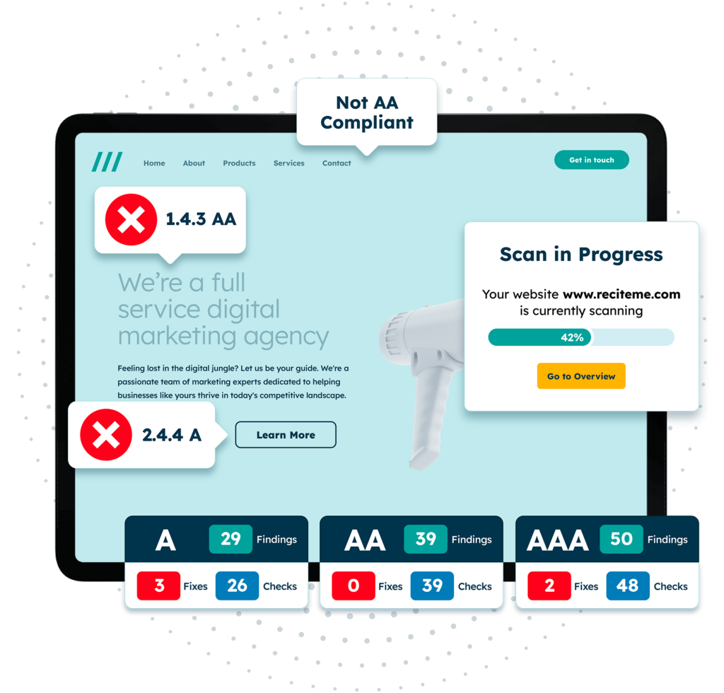
Finding accessibility issues is now easier than ever. Recite Me offers a free automated scan of your website’s homepage to highlight non-compliance. You’ll get recommendations on how to fix them, helping to improve your accessibility score.
Tips for actioning the accessible emailing checklist
Think of the above checklist as a tool to track your progress on email accessibility. But before taking any action, it’s important to get to know how to action these points effectively. You can use the following links to jump to the various sections:
1. Crafting a descriptive subject line
The subject line is the first point of contact with your reader, so clarity is key. Keep it to the point – avoid humour, ambiguity, or slang that could confuse the recipient. Think of it as a preview of the email’s contents, designed to summarize key details of what’s inside in the least amount of words possible.
2. Organizing content with structure
When you break your email into bite-sized sections with clear headings, readers of all abilities benefit. Screen readers will announce the headings properly, helping visually impaired users navigate the email, while providing clarity and structure for non-impaired users. Consider this an opportunity to guide your audience through the story you want to tell.
3. Alt text for visual elements
Images are powerful, but without proper alt text, they may as well be invisible to visually impaired users relying on assistive tech such as screen readers. To combat this, tag your images with a brief, meaningful description of what the image represents or why it’s included. The key is to be efficient with your use of words. Convey the image accurately by providing the necessary context in a way that’s not too wordy or overwhelming.

4. Optimising text contrast and readability
Color contrast may seem like a small detail, but it can make or break the accessibility of your emails for certain users. A low contrast can make your email unreadable for those with visual impairments or color blindness. Stick to a high-contrast color scheme – typically dark text on a light background or vice versa. According to the Web Content Accessibility Guidelines (WCAG), a minimum color contrast ratio of 4.5:1 should be implemented for all normal-sized text. Consider using a color contrast checker to verify you are meeting this standard.
5. Refining language and tone for inclusivity
Although it may not be the first thing that comes into your mind when you think of inclusive communications, language is an accessibility issue too. Avoid using complex phrases or idioms that might confuse readers or translation software. Stick with short, simple sentences and be mindful of cognitive impairments. Always consider if your message is easy to understand for everyone.
6. Providing text alternatives for non-text content
It’s not just images that need text-based descriptions. Any visual data, such as charts or infographics, need a text-based alternative. This ensures users with visual impairments, who may not be able to perceive visual elements, don’t miss out on important information. If your email contains video content, make sure there are captions or transcripts available, so it is accessible to people with hearing impairments.

7. Making hyperlinks descriptive
While it might be tempting to describe your hyperlinks with basic text like “click here”, you should always avoid this where possible. For visually impaired users who rely on screen readers, generic hyperlink text can be misleading, giving them no context about the destination of the link. Screen readers will scan the page for links, and if all they hear is “click here,” the user has no idea where that link will take them. Instead, the link should describe the action or destination, such as “Download the accessibility guide” or “Read more about our services”.
8. Ensuring keyboard navigability
Many users with physical disabilities rely on the keyboard accessibility to navigate the digital world. When designing your emails, ensure that all interactive elements, like buttons and links are reachable via keyboard shortcuts. Test this by navigating the email yourself, using only the Tab and Enter keys to move through the content.
9. Maintaining a consistent layout across devices
As most emails are opened on mobile devices, it’s essential to ensure that your emails are fully responsive. A multi-column layout may look great on a desktop but become unreadable on a mobile screen. Use responsive design templates and test your emails on various screen sizes to maintain consistency.
10. Choosing Accessible Fonts and Sizes
While fancy fonts may look stylish, they can be incredibly hard to read, especially for users with dyslexia or visual impairments. Stick with simple, clean fonts and ensure the size is large enough for everyone, as anything smaller than 14pt may cause strain for readers. Additionally, avoid using all caps, as this can be difficult for many to process.
Our 40-page Digital Accessibility & Inclusion Toolkit helps businesses break down online barriers and make a real impact. It offers practical advice on all aspects of digital accessibility, from writing an accessibility statement to accessible website tips and inclusive hiring.
Who does email accessibility help and why is it so important?
Simply put, email accessibility helps everyone and anyone who uses email to communicate. But it’s particularly crucial for individuals with disabilities, including those with visual impairments, hearing impairments, cognitive disabilities, and motor impairments.
By ensuring your emails are accessible, you are playing your part in cultivating a more inclusive society by ensuring no one in your community is prevented from accessing key information. Not only that, but by adhering to strict email accessibility standards, you set the standard for competitors. This not only benefits you as a business by helping you stand out from the crowd, but it raises the overall accessibility standard of everyone in your industry.
In this way, email accessibility is about more than just compliance with regulations, it’s about treating your audience fairly, with respect, and working to build a better society for everyone.
Benefits of creating accessible email content
Guaranteeing email accessibility is, of course, the right thing to do. But, fortunately for you, there are a whole host of compelling business benefits associated with making your email content accessible.
- Reach a broader audience: Inclusive communications brings your company’s products and services to the attention of the millions of disabled internet users worldwide, expanding your pool of potential customers.
- Enhance user experience: A well-structured, accessible email is easier for everyone to navigate, not just those with disabilities, boosting engagement rates.
- Improve brand reputation: Accessible emails demonstrate your commitment to inclusivity, reflecting positively on your company’s values, and encouraging brand loyalty as a result.
- Boost conversion rates: Accessible emails make your content more engaging and easier to follow, driving higher conversion rates.
- Avoid legal issues: By implementing email accessibility, you put yourself on the right path to complying with accessibility laws and avoiding costly legal battles.

