Get Your Free Accessibility & Inclusion Toolkit
Download NowDyslexia is one of the most prevalent learning disabilities, affecting the lives of around 15-20% of the world’s population. The condition can present itself differently from one individual to the next, displaying a variety of symptoms with each having its own unique challenges. One of which can be digesting written content, so your choice of font matters now more than ever.
With a huge proportion of the population affected by this conditions, it is important that businesses who want to succeed are able to cater their online content to people with Dyslexia. One way this can be done is through the use of dyslexia friendly fonts or using assistive technology that benefits dyslexic users.
What is Dyslexia?
Dyslexia is a neurological condition that affects a person’s ability to read, write, and spell. It is a specific learning disability that has no relation to a person’s intelligence or their level of overall cognitive abilities. Dyslexia is characterized by difficulties in processing and recognising written words, which can result in reading difficulties, slower reading speed, and problems with accurate spelling.
Some common characteristics of dyslexia include:
- Difficulty in recognising and decoding words.
- Reversing or flipping letters or words (e.g., confusing “b” and “d” or “was” and “saw”).
- Poor spelling and writing skills.
- Slower reading speed and difficulty reading fluently.
- Difficulty with phonological awareness (recognising and manipulating the sounds of spoken language).
- Challenges in understanding and remembering sequences of instructions or events.
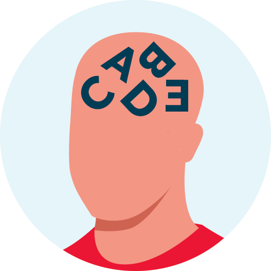
Dyslexia is a lifelong condition, but with appropriate support, individuals with dyslexia can learn to manage their challenges and develop effective reading and writing skills. Early intervention and specific teaching methods tailored to the individual’s needs can be highly beneficial. It’s important to note that dyslexia is not a result of lack of effort or motivation; it is a neurological difference that requires understanding and support.
What are dyslexia friendly fonts?
Dyslexia-friendly fonts are typefaces that are designed to be more readable and accessible for individuals with dyslexia. These fonts incorporate specific features that make it easier for people with dyslexia to recognise and distinguish between letters and words. Some characteristics of dyslexia-friendly fonts include:
- Simplified Letter Shapes: Dyslexia-friendly fonts often have simpler, more straightforward letter shapes that reduce confusion between similar letters, such as “b” and “d.”
- Clear Letter Spacing: Increased spacing between letters and words helps prevent crowding and overlapping, making it easier for readers to discern individual letters and words.
- Clearer Ascenders and Descenders: Ascenders are the parts of letters that rise above the main body, like the top of “b” or “d,” and descenders are the parts that go below the baseline, like the tail of “g” or “y.” Dyslexia-friendly fonts may have more prominent ascenders and descenders to improve letter recognition.
- Uniform Letter Height: Fonts that keep letters at a consistent height can reduce the tendency for letters to be rotated or flipped, which is a common issue for some people with dyslexia.
- Open and Rounded Shapes: Fonts with open and rounded letter shapes can be more easily distinguished from one another, reducing visual confusion.
- Heavier Weight: Bolder, heavier fonts can improve letter recognition as they are more distinctive and stand out more on the page.
Our 40-page Digital Accessibility & Inclusion Toolkit helps businesses break down online barriers and make a real impact. It offers practical advice on all aspects of digital accessibility, from writing an accessibility statement to accessible website tips and inclusive hiring.
Which fonts are dyslexia friendly?
Several fonts have been designed with dyslexia in mind, incorporating features to make reading and comprehension easier for individuals with dyslexia. Here are some fonts that are considered dyslexia-friendly:
1. Lexend
Lexend is designed specifically to be highly readable and accessible for individuals with dyslexia. It incorporates features such as clear letter shapes, consistent spacing, and optimized legibility. At Recite Me we actually use the Lexend font for content that we produce and display on our website.

2. OpenDyslexic
OpenDyslexic is a free to use, open-source font designed with readability for dyslexic individuals in mind. It includes letter shapes with more uniform weighting and spacing.

3. Arial
Arial is a widely available sans-serif font known for its legibility and straightforward design, which can benefit individuals with dyslexia.
This font is readily available on almost every operating system or program around the world, without the need for a license. Making it one of the most popular dyslexia friendly fonts of all time.

4. Helvetica
Helvetica is a widely recognized and used font known for its clear and straightforward design, making it a suitable choice for individuals with dyslexia.

5. Comic Sans
Though not specifically designed for dyslexia, Comic Sans is favored by some individuals with dyslexia for its simple, clear letter shapes. The fact this font does not have any serifs is beneficial to dyslexic users, making it easier to read.

6. Dyslexie
Dyslexie is a font specifically created to address the challenges faced by individuals with dyslexia. It features distinctive letter shapes, clear spacing, and heavier bottoms on characters to reduce letter flipping.

7. Verdana
Verdana is often regarded as one of the most dyslexia-friendly fonts due to its clear and simple letter shapes, generous spacing, and uniformity. This font was originally released back in 1996 by Microsoft and has been a popular preference by many dyslexic readers.

8. Lexie Readable
Lexie Readable is a font designed with dyslexia in mind, similar to Open Dyslexic and Dyslexie. It prioritizes readability with clear letter shapes and spacing. The fact it is built specifically for dyslexic users makes it a favorable option when selecting font types for those with the condition.

9. Calibri
Calibri is a modern sans-serif font with clean, simple letter shapes and clear spacing, making it highly readable for individuals with dyslexia. This typeface has noticeably wider letter spacing than other fonts.

10. Open Sans
Open Sans is a highly readable and versatile sans-serif font with clear letter shapes and spacing, making it accessible for individuals with dyslexia. The font features clear spacing, tall letters and round shapes.

What else can be done to create accessible fonts?
In addition to selecting dyslexia-friendly fonts for your website, there are several additional measures you can implement to create accessible fonts of your site to a broader range of users:
- Use a minimum font size of 12.
- Align all text to the left.
- Write content that is clear and easy to understand.
- Ensure your website is accessible to screen readers and other assistive technologies.
Start Your Digital Inclusion Journey
Our team is here to help you on your mission to provide more inclusive online experiences. Get started on your online inclusion strategy today by trying our toolbar or scheduling a free demonstration to see the difference it can make to your business.
Frequently Asked Questions
What fonts should people with Dyslexia avoid?
People with dyslexia should generally avoid fonts that are highly decorative, overly stylized, or difficult to read due to intricate letter shapes. Serif fonts such as Times New Roman and Garamond should be avoided as their complex designs can make reading more challenging for individuals with dyslexia.
Best font & background colors to use for people with dyslexia?
People with dyslexia have noted a preference for black text on yellow, peach or orange backgrounds. This allows them to read and digest information in a more efficient way.
What font size do dyslexic users prefer?
Anywhere between 12 and 14 pt is optimal for dyslexic readers. Although, in niche instances a larger font type may be required to improve user experience.
