Get Your Free Accessibility & Inclusion Toolkit
Download NowDid you know that accessibility issues could be preventing a significant proportion of your website visitors from becoming customers?
An accessible website ensures everyone can engage with your content independently and without barriers. But accessibility isn’t only about inclusion. Avoiding the most common website accessibility issues also helps you avoid legal risk, because providing accessible digital services aligns with your responsibilities under the Americans with Disabilities Act (ADA).
What are accessibility issues?
Accessibility issues are online access barriers that make it harder for people to read, understand, and interact with your website. They appear in many forms. Here is a list of the most common types and some examples:
- Technology barriers: Browser compatibility errors, nonresponsive layouts, broken scripts.
- Communication barriers: Missing video captions, lack of language support, unclear instructions.
- System barriers: Outdated design patterns, inaccessible templates, legacy CMS restrictions.
- Media format barriers: Hard-to-read fonts, missing image alt text, poor color contrast.
- Physical interaction barriers: No keyboard navigation, inaccessible forms, small clickable areas.
These issues typically arise when websites don’t support assistive technologies or follow recognized standards like the Web Content Accessibility Guidelines (WCAG).
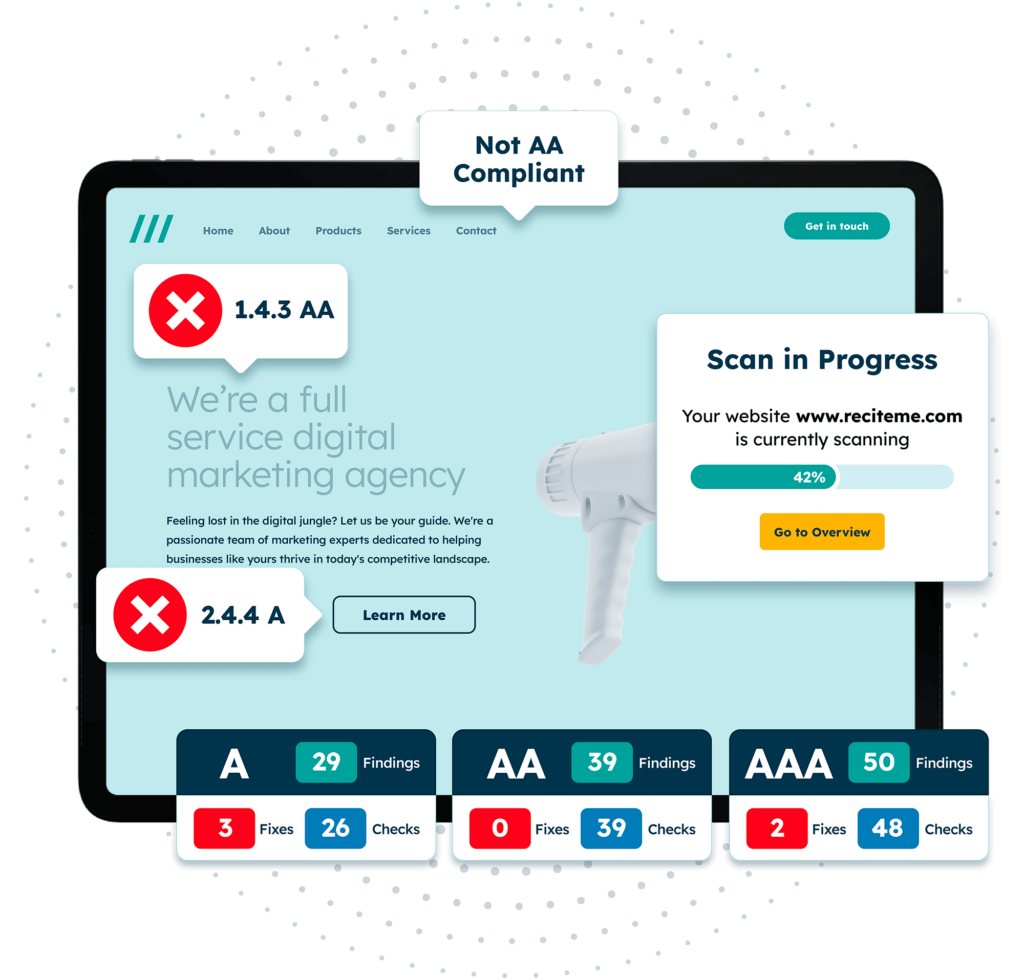
Get a free automated accessibility check of your websites homepage. This will identify and highlight any compliance issues on your website. Followed by recommendations on how to implement the necessary changes to make your website more accessible.
Who is most affected by accessibility issues?
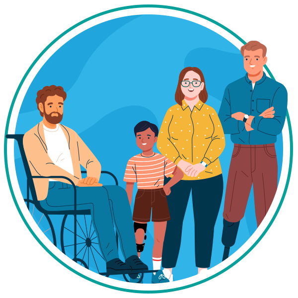
While web accessibility issues can affect anyone, they have a disproportionate impact on individuals with one or more of the following conditions:
- Visual impairments
- Hearing impairments
- Cognitive disabilities
- Motor impairments
- Speech impairments
- Neurological conditions
Assistive technologies like screen readers, magnifiers, and speech recognition tools can help. But only if websites are built to support them.
The 8 most common website accessibility issues
Below are the most widespread accessibility barriers affecting website visitors today. Each can have a significant impact on how well users can perceive, understand, and interact with your content.
1. Insufficient color contrast
Poor color contrast makes text difficult to read, especially for those with low vision or color blindness. If foreground and background colors are too similar and blend together, key information becomes hard to see.
2. Poor anchor text descriptions
Link text must be clear and descriptive. Hyperlinks with anchor text like “Click here” or “Read more” don’t provide enough context, especially for screen reader users who navigate links out of sequence.
3. Missing image alt text
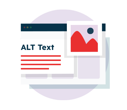
Alt text provides a written description of images for users who rely on screen readers. Missing, vague, or incorrect alt text can cause users to miss important content or context.
4. Inaccessible forms
Missing labels, inaccessible error messages, unclear instructions, or fields that aren’t keyboard-friendly can make online forms difficult or impossible to complete.
5. Inaccessible multi-media
Videos and audio content are often published without captions, transcripts, or audio descriptions, making them inaccessible to users with hearing or vision impairments.
6. Headers and hierarchy
Headings help users, especially those using screen readers, understand the page structure. Skipped heading levels or an inconsistent H-tag hierarchy can make longer pages difficult to follow.
7. Lack of keyboard navigation
Many people rely on keyboard navigation rather than using a mouse or trackpad. If menus, buttons, or form fields can’t be accessed via the keyboard, large parts of your site become unusable.
8. Inaccessible documents
PDFs and downloadable files often lack proper tagging, headings, alt text, or readable text layers. Scanned PDFs are especially problematic because screen readers cannot interpret them.
How to start fixing website accessibility issues?
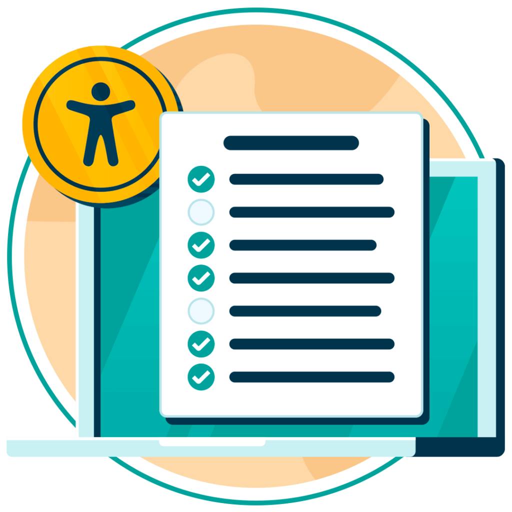
A simple, structured approach helps you prioritise the most common website accessibility issues and tackle them efficiently. Here’s how to get started:
- Run an accessibility audit: Use automated tools like Recite Me’s Accessibility Checker to pinpoint high-impact issues.
- Fix the quick wins first: Adjust colors, update link text, add labels to form fields, and ensure multimedia content includes captions and transcripts.
- Add assistive technology: Software like Recite Me’s Assistive Toolbar allows individual end users to make personalized customizations to suit their unique needs.
- Empower your staff: Provide accessibility training so your team knows how to create accessible content confidently and consistently.
- Document your approach: Build internal guidelines and clear accessibility policies for your teams to follow.
These changes improve usability for every website visitor, not just those with disabilities.
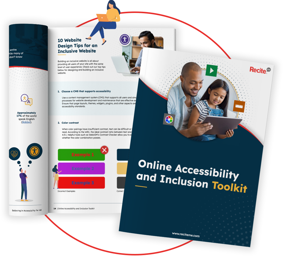
Our 40-page Digital Accessibility & Inclusion Toolkit helps businesses break down online barriers and make a real impact. It offers practical advice on all aspects of digital accessibility, from writing an accessibility statement to accessible website tips and inclusive hiring.
Fix accessibility issues on your website today
Improving your website’s accessibility doesn’t have to be complicated, and fixing common accessibility issues is one of the fastest ways to make your site easier for everyone to use. If you’re unsure where to begin, start with an accessibility audit to catch the easy fixes. Then, continue refining your website to ensure your content remains inclusive and aligned with accessibility best practices.
To get started today, you can request a free accessibility scan of your website or speak to an expert to see how we can help.
Common Website Accessibility Issues FAQs
Looking for a recap or quick summary? Here are a few of our most frequently asked questions to help you get to grips with the essentials:
What is a web accessibility issue?
A web accessibility issue is any barrier that prevents users from accessing, navigating, or engaging with your website.
What are the most common website accessibility issues?
Typical issues include poor color contrast, missing alt text, unclear anchor text, inaccessible forms, lack of keyboard navigation, missing captions or transcripts, and non-accessible documents.
What audience segments are most affected by web accessibility issues?
People with visual, hearing, cognitive, motor, or neurological disabilities are most affected. However, accessibility barriers also impact older users, people with temporary injuries, and anyone browsing on mobile devices, older hardware, or slow internet connections.
Are American websites legally required to be accessible?
Yes. Under the Americans with Disabilities Act, organizations must take reasonable steps to ensure their digital services are accessible and do not discriminate against people with disabilities.
How can I check my website for accessibility issues?
The most effective approach is to combine automated scanning tools (like the Recite Me Accessibility Checker) with manual testing and reviews using assistive technologies.
Check out our Products & Services
Ready to take your first steps towards digital accessibility compliance? Then see how we can support your journey with our accessibility solutions:
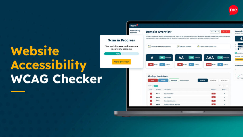
Web Accessibility Checker
Scan, detect, fix, and maintain accessibility compliance standards on your website.
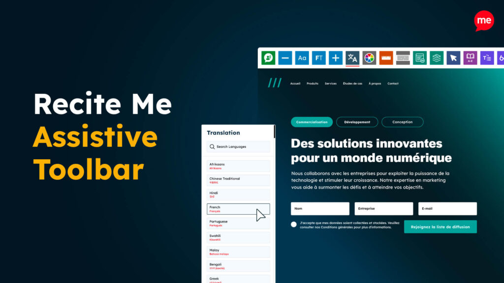
Assistive Toolbar
Make your website an inclusive and customisable experience for people with disabilities.

PDF Accessibility Checker
Check your PDFs are compliant with accessibility standards and run automated fixes.

