Website owners tend to put off choosing a font until they’ve addressed the more ‘pressing’ aspects of web design. But they shouldn’t, and here’s why. Fonts are the first barrier to entry for someone trying to read your content. You can have the most beautifully written, informative blog articles, but if your audience can’t make out a single word, then all that hard work is wasted.
You might be thinking: I’ve never had a problem reading fonts. But becareful falling into this trap. After all, your content isn’t for you, it’s for your audience, and, statistically speaking, a significant portion of your audience will have some kind of disability that impacts their ability to perceive digital text. When you take this into account, the stakes involved in choosing an accessible font are suddenly much higher.
What are the main characteristics of accessible fonts?
In order to choose an accessible font, you must first be able to recognize one. While some fonts are aesthetically appealing, they lack the characteristics which allow users with disabilities to read them effectively. What are those characteristics?
Clear letter shapes: Characters with a similar appearance – like ‘I’, ‘l’, and ‘1’ – should take on slightly difference shapes in order to distinguish themselves from one another.
Consistent weight: Even thickness throughout a font’s strokes reduces strain on the eyes. Generous letter spacing: Adequate spacing between letters prevents visual clutter and improves readability.
Open apertures: Letters like ‘e’ and ‘o’ should have clear, open loops with sufficient negative space inside them, so that they are easily identifiable.
Simple design: Sans-serif fonts, which lack decorative tails, are generally easier to read.
Balanced ascenders and descenders: Letters that extend above (ascenders) or below (descenders) the baseline, like ‘d’ and ‘y’, should not be overexaggerated.
Consistent alignment: Letters and numbers should align cleanly to avoid disrupting the flow of reading.
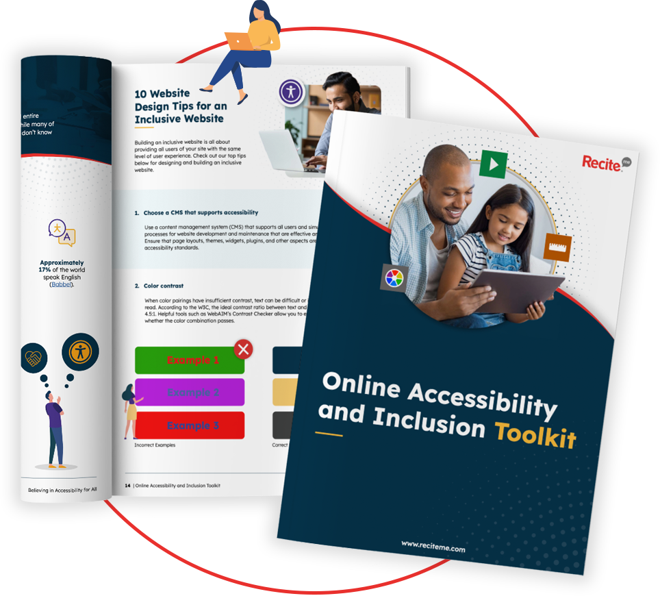
Digital Accessibility and Inclusion Toolkit
Our 40-page Digital Accessibility & Inclusion Toolkit helps businesses break down online barriers and make a real impact. It offers practical advice on all aspects of digital accessibility, from writing an accessibility statement to accessible website tips and inclusive hiring.
So now you know a bit more about accessible fonts and why they matter. But when making your selection, it helps to have a few old faithful’s in the bank that you can rely on if you’re struggling for ideas. For that, you need some examples. Here are our 10 best fonts for accessibility, focussing on simplicity, clarity, and legibility.
1. Lexend
Lexend is an accessible font designed to enhance reading clarity and reduce visual stress. Its optimized letterforms improve readability for individuals with dyslexia, ADHD, or other reading challenges, making it a valuable tool for inclusive websites. Lexend is also the font we have chosen to use on the Recite Me website.
2. Arial
Arial is a widely used sans-serif font known for its simplicity. Its uniform shapes and clean design make it a reliable choice for accessibility.
3. Verdana
Verdana was created for digital screens. Its wide letterforms and generous spacing make it highly legible, even at smaller font sizes.
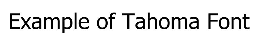
4. Tahoma
Tahoma leverages sharp, clean lines, which make it a favourite for digital content. Although it features slightly more compact letter spacing than verdana, it remains one of the top accessible font choices.
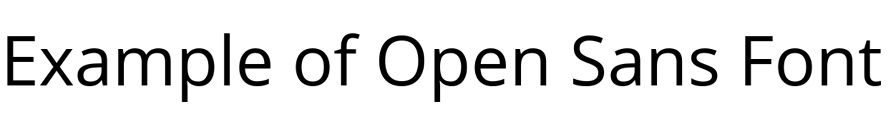
5. Open Sans
Open Sans is a friendly, neutral font with open apertures (the negative space within a character’s shape) and consistent alignment. It’s works well for both print and digital use.
6. Roboto
Roboto offers a modern aesthetic with excellent readability. Its geometric shapes and balanced design ensure clear legibility.
7. Calibri
Calibri is the default font for Microsoft Office. It is smooth and clear, optimized for readability, making it suitable for digital screens.
8. Helvetica
Helvetica is a timeless design and, for that reason, a popular choice. It includes well-proportioned letters that maintain clarity at various sizes.
9. Open Sans
Open Sans is a friendly, neutral font with open apertures (the negative space within a character’s shape) and consistent alignment. It’s works well for both print and digital use.
10. Dyslexie
Dyslexie is unique in that it was specifically designed as a dyslexia-friendly font. Its unique letterforms reduce reader errors, such as flipping or rotating letters, which is common among individuals with dyslexia.
Why are fonts important for website accessibility?
Fonts are important for web accessibility because they are at the customer-facing front of your business and website. The first thing a visitor looks for when they open up your website is information, which comes in the form of written words.
If visitors struggle to perceive these words visually, there is no reason for them to stay on your site. As a result, they go from potential lead to lost opportunity in a matter of seconds. In this way, you can think of your website’s font as the entrance to a shop. And if your font is inaccessible, it’s as good as locking the entrance door.
Accessible fonts impact every website visitor, but especially those with specific needs. Individuals with dyslexia, for example, rely on unique letter forms to help them distinguish one character from the next. It prevents a ‘p’ from being muddled up with a ‘q’, or a ‘b’ from a ‘d’.
Additionally, those with visual impairments benefit from fonts with clear contrast and generous spacing between characters. This prevents words from blending into each other.
Finally, people with ADHD need simple, clean fonts in order to reduce distractions and help them focus. This means avoiding fonts with extra embellishments like serifs (small strokes at the end of letters). Instead, ADHD-friendly fonts require minimalist designs and fonts which have consistent stroke thickness.
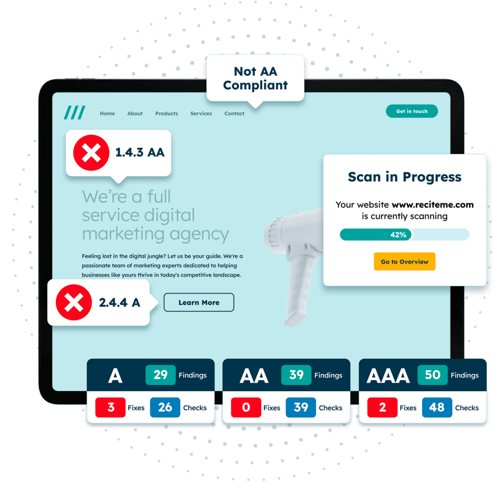
Free Accessibility Check of your Website
Finding accessibility issues is now easier than ever. Recite Me offers a free automated scan of your website’s homepage to highlight non-compliance. You’ll get recommendations on how to fix them, helping to improve your accessibility score.
Fonts aren’t set in stone. Once you’ve decided on an accessible font for your brand, you still have the option to tweak it for enhanced accessibility. This gives you the freedom to completely tailor your font choice to your specific audience.
Line height and text spacing
Poor text spacing and line height can make even the best fonts inaccessible. When letters and lines are packed tightly together, they can appear to overlap or blend into each other, becoming more difficult to differentiate, which puts strain on the eyes. If opting for a slightly more compact font style, like tahoma, consider adjusting text spacing to make up for it.
But what does this look like in practical terms? Here is what the Web Content Accessibility Guidelines (WCAG) – the gold standard for everything web accessibility – recommends:
Line height: At least 1.5 times the font size.
Letter spacing: At least 0.12 times the font size.
Use of text formatting styles
Text formatting styles, like itallics, bold, and all caps, can be a useful way to put emphasis on certain words or phrases. But they should only be used in very rare and specific cases, as their over use can interupt reading flow and signifncalty slow down reading speed.
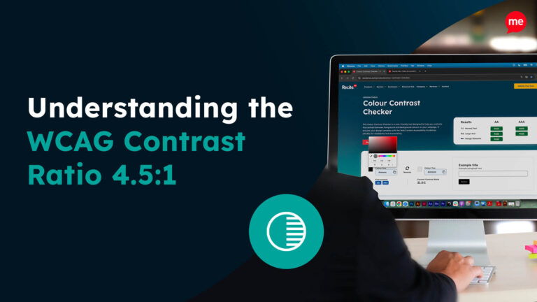
Color contrasts must be clear
Color contrast between text and its background is critical for readability. Low contrast like grey text on a white background is hard to see, particularly for users with visual impairments.
This means that no matter how accessible your font design is, poor contrast can render it unusable. According to the WCAG, websites should aim for a minimum contrast ratio of at least 4.5:1 for normal-sized text and 3:1 for large text.
You might even consider using a customization tool, like an accessibility toolbar, which allows users to modify your website’s palette according to their specific needs.