
Get A Free ADA Compliance Audit Of Your Website
Download NowMany of the 1 in 4 Americans who live with a disability rely on accessible digital experiences to shop, learn, work, and access services online. That’s why the Americans with Disabilities Act (ADA) requires organizations to provide equitable access to online goods and services.
While the government does not publish a specific list of “approved” ADA-compliant fonts, readable typography is a core component of accessible website design. In this guide, we’ll explain what makes fonts accessible, what to prioritize when choosing a typeface, and how to implement typography choices that support ADA compliance and WCAG best practices.
Why font choice matters
For users with low vision, cognitive disabilities, dyslexia, or reading fatigue, styling choices like thin weights, tight spacing, and decorative letterforms often create readability barriers. Choosing an accessible font helps to ensure your website:

- Reduces reading effort and improves comprehension
- Supports people who magnify text or use custom spacing
- Makes content clearer across devices and screen sizes
- Improves overall usability (which benefits everyone, not just users with disabilities)
Accessibility barriers don’t just frustrate users. They can increase bounce rates, reduce conversions, and expose your organization to unnecessary legal risk. The good news is that typography is one of the simplest accessibility improvements to implement. Yet, it’s often overlooked when brand styling takes priority.
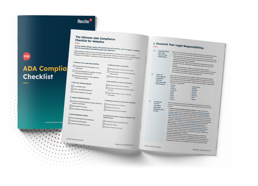
Want to make sure your website is compliant with the Americans with Disabilities Act? Then unlock the ADA compliance checklist now. Discover actionable steps to ensure ADA compliance, helping you avoid lawsuits and any other negative consequences of non-compliance.
Key characteristics of ADA-compliant fonts
Accessibility depends on several characteristics, including size, spacing, contrast, responsiveness, and user flexibility. The following factors align closely with the Web Content Accessibility Guidelines (WCAG), the most widely recognized benchmark for digital accessibility.
Size and scalability
There’s no universal minimum font size in pixels. What matters is that users can resize text up to 200% without losing content or functionality, and that layouts don’t break when zoomed. The key is to:
- Use relative units (like rem/em) so text scales cleanly
- Test zoom and text resizing on desktop and mobile
- Avoid “locking” text with fixed containers that truncate content
A practical baseline starts with using 16px (or equivalent) for body text, though the optimal size may vary depending on the font’s design and x-height.
Clarity and simplicity
Accessible fonts typically:
- Easily distinguishable letterforms featuring clear shapes
- Utilize consistent stroke weight without overly thin sections
- Feature minimal decorative styling that could reduce legibility
Sans-serif fonts are often easier to read on screens, but serif fonts can also be accessible if they’re not overly stylized and are used with good spacing and sizing.

Letter spacing and line height
Content should remain readable and continue to function when users increase spacing values. WCAG text spacing guidelines require content to remain functional and readable when spacing is adjusted to the following values:
- Line height (leading): 1.5
- Space after paragraphs: 2
- Letter spacing (tracking): 0.12em
- Word spacing: 0.16em
In practice, this means avoiding dense blocks of text and ensuring body copy has enough breathing room through thoughtful spacing, shorter paragraphs, and clear headings.
Examples of ADA-Compliant Fonts
The following fonts are widely used, dyslexia-friendly, and typically safe choices for ADA compliance:
- Arial
- Helvetica
- Verdana
- Tahoma
- Calibri
Top tip: When choosing, prioritize screen legibility, strong letter differentiation, and a full set of weights so you don’t wind up relying on “thin” text for design impact.
Fonts to avoid
The following styles often create readability barriers, especially on text-heavy websites and pages with longer passages:
- Script and cursive fonts (e.g., Brush Script, Pacifico, Lobster)
- Decorative or novelty fonts (e.g., Jokerman, Papyrus, Curlz MT)
- Overly thin/lightweight fonts (e.g., Helvetica Neue Ultra Light, Roboto Thin, and any other “Hairline” or “Light” variant used for body text)
If you must use highly stylized fonts, limit them to short, non-essential design elements and ensure the same content is available in a clear, readable format elsewhere.
How to create your own ADA-compliant font
Most organizations don’t design bespoke typefaces from scratch. But if you do, prioritize clarity over aesthetics, as readability should always come first. Use the following principles as your foundation.
1. Start with a clean design
Avoid decorative, script, novelty, or cursive styles for body text. If you’re working with brand typography, consider reserving stylized fonts for short headings only. And even then, only if they remain readable. Remember, while aesthetic design might be considered a bonus, the primary goal is to ensure everyone can access and read your website.
2. Ensure character differentiation
Look closely at ambiguous characters like:
- I / l / 1
- O / 0
- rn / m (in some fonts)

If users could misread important information regarding prices, dates, medical or legal info, or form input instructions, your font choice becomes a usability and accessibility risk.

3. Test for readability
Typography decisions should be validated, not assumed. Test your top picks with real users to assess:
- Zoom behavior
- Mobile readability at typical viewing distance
- Functionality across different browsers and operating systems
If in doubt, start with a well-supported web font. Platforms like Google Fonts offer a wide range of screen-optimized typefaces that load efficiently and render consistently across browsers and devices.
How to Implement ADA compliant fonts on your website
Selecting an accessible font is only part of the equation. It’s how it’s implemented across your website that determines whether it supports or undermines accessibility. The following best practices help ensure consistent, usable font behavior across devices and user settings.
Keep typography consistent
Using too many font families can reduce readability and create visual noise, especially for users with cognitive disabilities who may struggle to orient themselves across pages. The most accessible sites use only one font for body text and an optional complementary font for headings.
Design for zoom and reflow
Your content should render cleanly across devices and browsers. Users shouldn’t be forced into horizontal scrolling just to read a paragraph. Responsive typography and layouts help content “reflow” cleanly on smaller viewports and at higher zoom levels.
Avoid readability traps
Be especially careful with low-contrast text, tight line spacing, and overuse of italics. Avoid using all caps for long headings, as it can reduce word-shaping recognition. Fully justified body text should also be avoided, as it can create uneven spacing between words and make content harder to scan.
Support user controls and preferences
Many people need to personalize how they read. Adding an accessibility toolbar provides user controls for adjusting text size, spacing, and contrast. However, assistive technology should enhance a well-designed experience, not compensate for inaccessible design choices.
Optimize for mobile first
A font that looks clear on a desktop can be difficult to read on a smaller screen. Body text, buttons, navigation labels, and form instructions should remain legible at typical mobile viewing distances. Always test across different screen sizes to ensure readability isn’t compromised where space is limited.
Implement CSS techniques
Appropriate font smoothing, sufficient contrast, and consistent rendering across browsers can enhance readability without relying on visual effects that may reduce legibility. However, in some instances, techniques such as text shadow, outline, and anti-aliasing can enhance text clarity.
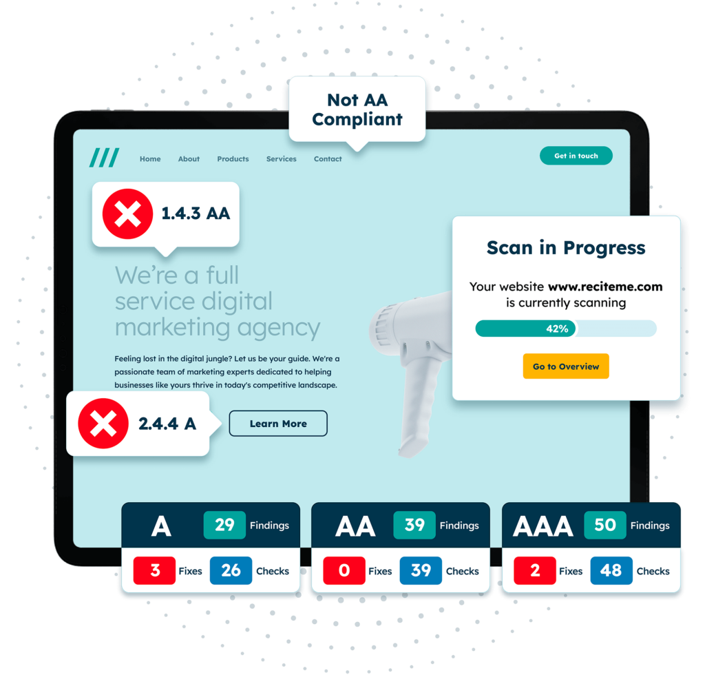
Get a free automated ADA compliance audit of your website. This audit will highlight compliance violations and provide the recommendations needed to meet ADA compliance standards.
Your ADA typography checklist
ADA compliance isn’t about picking one “perfect” typeface. It’s about making sure people can read, understand, and interact with your content comfortably across a variety of devices and user preferences. Use the following checkpoints as a final “sanity check” before publishing:

- Body text starts from a readable baseline and uses relative sizing.
- Text can be resized to 200% without breaking the layout or hiding content.
- Content still works when users increase line height, paragraph spacing, or letter/word spacing.
- No essential information is presented solely as images of text.
- All typography, including buttons, menus, and forms, remains readable on mobile.
- Text contrast meets WCAG accessibility standards.
- No thin or lightweight fonts are used for essential body content.
- Typography remains readable across major browsers and devices without layout breakage.
If you’d like help identifying font and readability issues across your site, an accessibility audit can highlight areas where your font choice may be creating barriers. Download your free accessibility check today to identify potential barriers and prioritize the fixes with the greatest impact.
ADA compliant fonts – FAQs
The questions below address some of the most common concerns organizations have about accessible fonts and typography.
Is there an official ADA-approved font?
No. There is no stand-alone list of ADA-compliant fonts.
What makes a font accessible?
The most accessible fonts are those that are clearly legible, have distinguishable letterforms, maintain consistent stroke weight, and allow for adequate spacing and scalability. Conversely, overly decorative, condensed, or ultra-thin fonts are generally considered inaccessible.
Are sans-serif fonts required for ADA compliance?
No. Sans-serif fonts are often easier to read on screens, but serif fonts can also be accessible, provided they’re clearly legible, appropriately sized, and used with sufficient spacing and contrast.
Will using a Google Font make my site ADA-compliant?
Not automatically, no. Most Google Fonts are designed for screen readability and consistent rendering across browsers. However, ADA compliance depends on implementation, including considerations for size, spacing, contrast, and responsiveness.
What font size is required for ADA compliance?
There is no legally mandated minimum font size. Many websites use 16px (or equivalent) as a practical starting point for body text, but functional accessibility depends on readability and responsive behavior rather than a fixed pixel value.
Can decorative fonts be used on an ADA-compliant website?
Yes, but they should be used sparingly and only for non-essential design elements. Avoid using them for body text, navigation, forms, or critical content.
Need more help becoming ADA compliant?
The following resources are packed full of actionable tips and expert advice for making your digital content compliant with the Americans with Disabilities Act:

Free ADA Accessibility Training
Take the first step to ADA compliance by completing our training course.
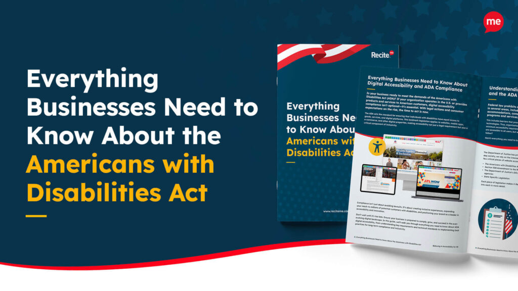
Free ADA Accessibility Guide
Ensure your organization is meeting the requirements for ADA compliance.