
Get A Free ADA Compliance Audit Of Your Website
Download NowColor plays a powerful role in branding, marketing, and user experience. But did you know that color choice also carries legal weight under the Americans with Disabilities Act (ADA)?
Poor color contrast, low-visibility text, or reliance on color alone to convey meaning can create access barriers for users with low vision, color blindness, or other visual impairments. Choosing ADA-compliant colors helps protect usability, strengthen inclusivity, and align your digital presence with recognized accessibility standards.
In this guide, we’ll explore color choice in depth, outline the contrast ratios your website must meet, and explain how to build a color strategy that supports both brand identity and accessibility compliance.
Why color choice matters for accessibility
Color often directly affects whether users can access, understand, and act on your content. Consider the following scenarios:

- Light gray text on a white background: Users with low vision or age-related sight loss may struggle to distinguish the characters from the background.
- Form errors shown only in red: Users with color blindness may not realize there is an issue.
- Low-contrast call-to-action buttons: Users may not recognize them as clickable, reducing engagement and conversions.
- Charts that rely on color to separate categories: Users with color perception deficiencies cannot differentiate between data sets, making key information unclear.
These are not edge cases. Around 1 in 7 Americans lives with a visual impairment, and many more experience temporary limitations such as screen glare or reduced brightness on mobile devices. Designing with accessibility in mind ensures that essential information remains visible, distinguishable, and usable for everyone.
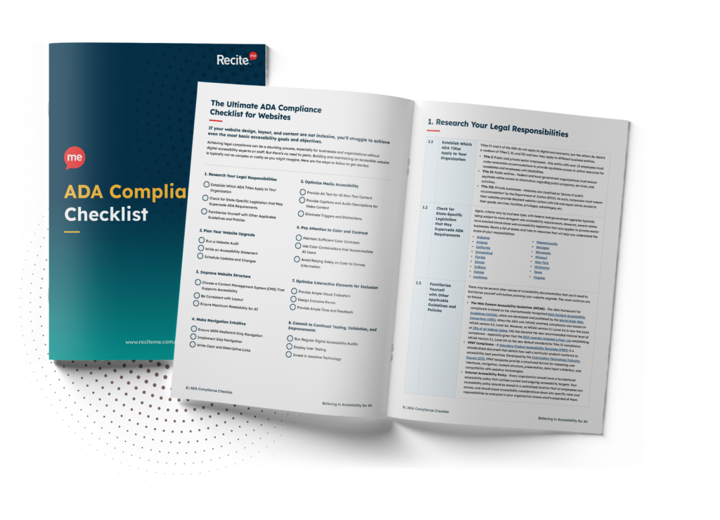
Want to make sure your website is compliant with the Americans with Disabilities Act? Then unlock the ADA compliance checklist now. Discover actionable steps to ensure ADA compliance, helping you avoid lawsuits and any other negative consequences of non-compliance.
What are ADA-compliant colors?
Rather than dictating precise hex codes, the ADA measures compliance against the Web Content Accessibility Guidelines (WCAG), the internationally recognized technical standard for digital accessibility.
There is no official list of approved color palettes or shades. Instead, WCAG defines how color should be used to ensure content remains perceivable and understandable to all. In practice, this means that:
- Text must meet minimum contrast ratios against its background.
- User interface components (buttons, form fields, icons) must have sufficient visual contrast.
- Color cannot be the only means of conveying information, status, or functionality.
To avoid unnecessary risk, U.S. businesses are advised to aim for compliance with WCAG 2.2 Level AA, which requires a contrast ratio of at least 4.5:1 for normal text and at least 3:1 for large text and UI components.
How to choose ADA-compliant colors
ADA-compliant color schemes require intentional design decisions that balance brand identity with measurable accessibility standards. Here’s a list of action points to work through.
1. Evaluate your existing brand colors
- Ensure that body text and background combinations meet the minimum WCAG contrast ratio.
- Adjust shades as needed to improve legibility.
- Create alternate palettes for UI elements to improve accessibility without altering core brand identity.
2. Design for a variety of visual impairments
- Review body text, navigation menus, form labels, buttons, call-to-action elements, status indicators, and error states for sufficient contrast.
- Avoid relying on color alone to signal meaning, and consider how brightness, saturation, and hue affect readability beyond simple contrast ratios.
- Reinforce meaning by using color in conjunction with icons, text labels, underline styles, etc, to communicate status or functionality.
3. Bake accessibility tools into your workflows
- Preview designs using color-blindness simulators to understand how palettes appear to users with different visual conditions.
- Test color pairs to confirm compliance before development.
- Use automated auditing tools, such as Recite Me’s Accessibility Checker, to scan live pages for WCAG compliance.
4. Test, iterate, and validate
- Conduct usability testing with participants who have low vision or color blindness.
- Review your site across devices, zoom levels, brightness settings, and real-world lighting conditions.
- Apply feedback to refine color palettes and interface patterns before and after launch.
Colors to avoid (or use with caution)
The following colors and color combinations often create readability barriers for users with low vision, color blindness, age-related sight loss, migraines, ADHD, and other cognitive or neurological sensitivities:
- Light gray text on white or pale backgrounds
- Pastel-on-pastel combinations
- Red and green pairings
- Neon
- Highly saturated colors like bright lime, hot pink, and electric yellow
It is also recommended to avoid placing text over busy images or patterned backgrounds, and to avoid using subtle tonal differences (e.g., dark blue vs. black) to distinguish content.
Get a free automated ADA compliance audit of your website. This audit will highlight compliance violations and provide the recommendations needed to meet ADA compliance standards.

Future-proof your website with accessible color design
Choosing ADA-compliant colors is not about limiting creativity or abandoning brand identity. When accessibility is embedded into your brand standards and design systems from the outset, compliance becomes sustainable rather than reactive. The result is a digital experience that is inclusive, consistent, and aligned with ADA expectations and resilient against evolving regulatory scrutiny and accessibility lawsuits.
Need help getting started? Request your free accessibility check today and download our ADA Website Compliance Checklist to take the next steps toward a more accessible digital future.

ADA compliant colors – FAQs
The questions below address some of the most common concerns organizations have about accessible colors.
Is there an official ADA-approved color palette?
No. The ADA does not prescribe specific colors, hex codes, or approved palettes. Instead, digital compliance is measured against the Web Content Accessibility Guidelines (WCAG).
What are the ADA color contrast requirements?
WCAG 2.2 Level AA requires a contrast ratio of at least 4.5:1 for normal text and at least 3:1 for large text and UI components.
Are red and green color combinations illegal under the ADA?
No color is illegal. However, red and green pairings frequently create accessibility barriers because red-green color blindness is common.
Can pastel or light gray colors be ADA-compliant?
Yes, but only if they meet minimum WCAG contrast ratios. Many pastel-on-pastel or light gray-on-white combinations fail contrast testing.
Does ADA compliance apply to logos and brand colors?
Brand colors themselves are not restricted. However, when those colors are used in text, buttons, navigation, or interactive elements, they must meet minimum WCAG contrast requirements.
Can decorative fonts be used on an ADA-compliant website?
Yes, but they should be used sparingly and only for non-essential design elements. Avoid using them for body text, navigation, forms, or critical content.
Need more help becoming ADA compliant?
The following resources are packed full of actionable tips and expert advice for making your digital content compliant with the Americans with Disabilities Act:

Free ADA Accessibility Training
Take the first step to ADA compliance by completing our training course.

Free ADA Accessibility Guide
Ensure your organization is meeting the requirements for ADA compliance.