The Web Content Accessibility Guidelines (WCAG) ensure that people facing digital access barriers are not excluded from online life. Yet, despite living in an increasingly digital world, many organizations remain unaware of the existence of WCAG, let alone their purpose – or how to implement the necessary changes to improve website accessibility.
 “The majority of business owners still don’t know how to make their websites accessible—some don’t even know they have to.”
David Moradi, Forbes Councils Member.
If this is a statement you can identify with, you’re not alone. But the good news is you’re in the right place to learn more. In this comprehensive guide, we’ll cover everything you need to know to about the Web Content Accessibility Guidelines, and why and how you should be putting them into practice on your website.
Who Needs Help with Web Accessibility?
On average, one in every five people has some form of physical or hidden disability that makes accessing online content difficult. An access barrier can be any element of website design or formatting that prevents users from reading and understanding the content.
Examples of some of the internet users most likely to face online access barriers include people with:
- Vision impairments, including color blindness and deafblindness.
- Hearing impairments like sensorineural hearing loss, conductive hearing loss, and mixed hearing loss.
- Learning difficulties like Dyslexia, Dyspraxia, and Hyperlexia.
- Attention disorders like ADHD.
- Mental or neurological conditions like epilepsy, dementia, and Parkinson’s disease.
- Autism.
- Language/linguistic problems.
- Physical disabilities.

What is WCAG?
The purpose of WCAG is to make websites, apps, PDFs, videos, audio recordings, ePub, and other emerging technologies more accessible for people with disabilities.
WCAG standards and updates are published by the Worldwide Web Consortium (W3C). Founded in 1994 with the goal of developing a standard set of principles that are effective for all internet users, W3C comprises several member organizations, full-time staff, and industry leaders – including Tim Berners-Lee, the computer scientist credited with the invention of the world wide web.
When the guidelines were first developed, internet use was in its infancy. For example, at the turn of the 22nd century, there were only 413 million internet users worldwide. Flash forward to 2023, and 5.16 billion people are online. That’s nearly 65% of the entire global population. So now, more than ever, a set of standard worldwide guidelines are essential in providing inclusive and equitable online journeys.
Why is WCAG the International Standard?
WCAG is the gold standard in website accessibility standards. By providing specific, technical, and measurable frameworks supported by in-depth documentation for implementation and remediation, WCAG delivers all of the methodology and techniques website owners need to ensure compliance.
The guidelines were developed to be used by anyone involved in building and maintaining a website. This includes web developers, content writers, graphic designers, tool developers, accessibility testers, and anyone else seeking to learn or better understand how to implement accessible online journeys.

 “Rarely does a single document have such a direct impact on people’s lives. The guidance that WCAG provides allows developers and content creators to include people who have historically been excluded from digital experiences.”
Mark Shapiro, President of the Bureau of Internet Accessibility
WCAG FOUR Principles
The key for website owners is to adopt a design and layout that is clear enough that everyone can use it. The POUR principles are designed to help you think about the ways people use web content.
Perceivable
Information and user interface components must be presentable to users in ways they can perceive.
A perceivable website accommodates sensory differences in vision, sound, and touch so that users can comprehend and consume the information in the best way for them. For example, a sighted person will see the content, a blind person may listen to it as synthetic speech, and a deaf-blind person will feel it with their fingertips as electronic Braille.
Operable
User interface components and navigation must be operable.
To make interface components and navigation user-friendly to everyone, you must eliminate general design barriers and functions that limit input methods or result in time constraints. For example, someone with a physical disability may need to use keyboard navigation or voice recognition instead of a mouse or trackpad.
Understandable
Information and the operation of the user interface must be understandable.
People understand content differently. For example, blind website visitors may need their screen readers to speak foreign language content using the correct accent. Likewise, someone who has difficulty reading may want acronyms to be written out in full, and those with learning disabilities will simply prefer all elements to work consistently wherever they find them.
Robust
Content must be robust enough that it can be interpreted by a wide variety of user agents, including assistive technologies.
People use different devices and browsers to access the web, including assistive technologies. Web content needs to be robust enough to work reliably on them all. For example, someone with low vision might use Safari on an iOS device with zoom enabled, whereas someone who is blind might use Firefox on Windows 10 with the NVDA screen reader.
Get a free automated WCAG compliance scan of your websites homepage. This will identify and highlight any compliance issues on your website, including inaccessible forms. Followed by recommendations on how to implement the necessary changes to make your website more accessible.
WCAG Levels of Web Page Compliance
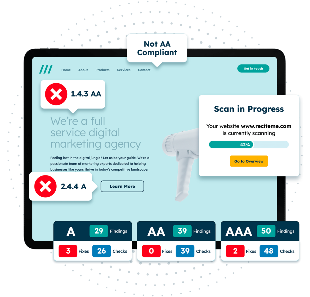
You’ll notice that each of the 78 success criteria listed in the table below has a level assigned to it. The different levels of WCAG compliance represent different levels of comprehensive. Each level is noted and explained below:
Level A – Basic
Level A success criterion is a list of things you must do to provide a basic level of accessibility on your website. Level A compliance is typically easy to achieve with little impact on website design or structure. Of the 78 WCAG success criteria, 30 are Level A.
Level AA – Industry Standard
Level AA criteria include more advanced compliance points, comprising a list of things you and your development teams should do to meet an industry-accepted standard of accessibility. Regardless of region, the globally acceptable level of ‘accessibility’ is Level AA, and you can only achieve Level AA once all 30 success criteria in Level A have been met. Of the 78 WCAG success criteria, 20 are Level AA.
Level AAA – Industry Standard
With even more extensive benchmarks, Level AAA is the most comprehensive standard of accessibility compliance, detailing all of the things you could do to offer enhanced accessibility. You can only achieve Level AAA once all 50 success criteria in Level A and Level AA have been met. Of the 78 WCAG success criteria, 28 are Level AAA.
Using the guiding principle, guidelines, and success criteria, you can measure your conformance with WCAG by building your website or application to meet the requirements at the desired level.
WCAG Guidelines and Success Criteria
Guideline 1.1 Text Alternatives
Provide text alternatives for any non-text content so it can be changed into other forms as people need, such as large print, braille, speech, symbols, or simpler language.
Not everyone is able to see graphical content, but text can be read by people who cannot see images and adapted so people can read it in different ways. For example, a text description of an image can be converted into synthetic speech or electronic Braille using an accessible screen reader.
Success Criteria
Guideline 1.2 Time-based Media
Provide alternatives for time-based media.
Not everyone is able to see or hear time-based media (otherwise known as multi-media), so alternatives are needed. Text alternatives like transcripts and real-time synchronized captions enable people who are deaf or hard of hearing to experience audio content. Text also forms the basis for scripted audio captions that describes video content to people unable to see it.
Success Criteria
1.2.1 Audio-only and Video-only (Pre-recorded) (Level A)
1.2.2 Captions (Pre-recorded) (Level A)
1.2.3 Audio Description or Media Alternative (Pre-recorded) (Level A)
1.2.4 Captions (Live) (Level AA)
1.2.5 Audio Description (Pre-recorded) (Level AA)
1.2.6 Sign Language (Pre-recorded) (Level AAA)
1.2.7 Extended Audio Description (Pre-recorded) (Level AAA)
1.2.8 Media Alternative (Pre-recorded) (Level AAA)
1.2.9 Audio-only (Live) (Level AAA)
Guideline 1.3 Adaptable
Create content that can be presented in different ways (simpler layout, for example) without losing information or structure.
People will adapt the way content is presented based on their needs or preferences. For example, someone with low vision may choose to use their own style sheets because they prefer a particular font, someone with a physical disability may need content to always be in the portrait orientation because their tablet is fixed to their wheelchair in that position, or someone with a cognitive disability may use a browser plug-in that helps them identify the purpose of form fields that ask for their personal data.
Guideline 2.1 Keyboard Accessible
Make all functionality available from a keyboard.
Not everyone uses a mouse or a trackpad and there are different alternatives available. Many people with physical disabilities will use a keyboard, but some will use voice recognition software that is also dependent on the content being keyboard accessible. People who use other assistive technologies like screen readers or screen magnification often use a keyboard too.
Guideline 2.2 Enough Time
Provide users enough time to read and use content.
Not everyone is able to complete a task in a short time limit. For example, someone who finds reading difficult may need more time to get through the instructions, someone with a physical disability or cognitive limitations may take longer to move through the content, and aggressive time limits may put someone with an anxiety disorder under so much pressure they’re unable to complete the task.
Guideline 2.3 Seizures and Physical Reactions
Do not design content in such a way that is known to cause seizures or physical reactions.
Seizures are often serious and sometimes life-threatening, so it is vital that content does not trigger them. For example, a seizure can be triggered in someone with Photo-sensitive Epilepsy if content flashes more than 3 times a second. Other physical reactions like dizziness and nausea can be triggered by moving or animated media content particularly if it uses a parallax effect.
Guideline 2.4 Navigable
Provide ways to help users navigate, find content, and determine where they are.
People can find it difficult to navigate web content or to be sure of where they are. For example, someone with a cognitive disability that affects memory may use the page title to remind themselves where they are, a sighted keyboard user will depend on a visible indicator that tells them where their keyboard is currently focused, and a screen reader user will find links easier to use if the link text makes it clear where the link leads.
Success Criteria
2.4.1 Bypass Blocks (Level A)
2.4.2 Page Titled (Level A)
2.4.3 Focus Order (Level A)
2.4.4 Link Purpose (In Context) (Level A)
2.4.5 Multiple Ways (Level A)
2.4.6 Headings and Labels (Level AA)
2.4.7 Focus Visible (Level AA)
2.4.8 Location (Level AAA)
2.4.9 Link Purpose (Link Only) (Level AAA)
2.4.10 Section Headings (Level AAA)
Guideline 3.1 Readable
Make text content readable and understandable.
Not everyone finds text easy to read and understand. For example, someone who finds reading difficult may find it helpful if the meaning of unusual words is explained, or someone with a learning disability will find simple content easier to understand.
Guideline 3.2 Predictable
Make Web pages appear and operate in predictable ways.
Most people find content easier to use when it looks familiar and behaves consistently. For example, putting things like the logo and navigation in the same place on every web page also helps screen magnification users orient themselves, and using the same labels for links and buttons that do the same thing helps people with cognitive disabilities correctly identify them.
Guideline 3.3 Input Assistance
Help users avoid and correct mistakes.
Nobody wants to make mistakes, but avoiding mistakes or correcting them if they happen can be difficult for some people. For example, letting people review their answers before they submit a form that relates to a financial or legal agreement helps people avoid sending the wrong information, and presenting error messages as text means that people who cannot see warning colors or symbols know the errors are there.
Guideline 4.1 Compatible
Maximise compatibility with current and future user agents, including assistive technologies.
Writing code in ways that support a range of different devices and technologies makes content more reliable. For example, writing HTML that avoids errors known to cause problems for assistive technologies like screen readers and voice recognition software, and making sure that custom components and notifications are created in ways that include all the accessibility information needed by people who use assistive technologies.
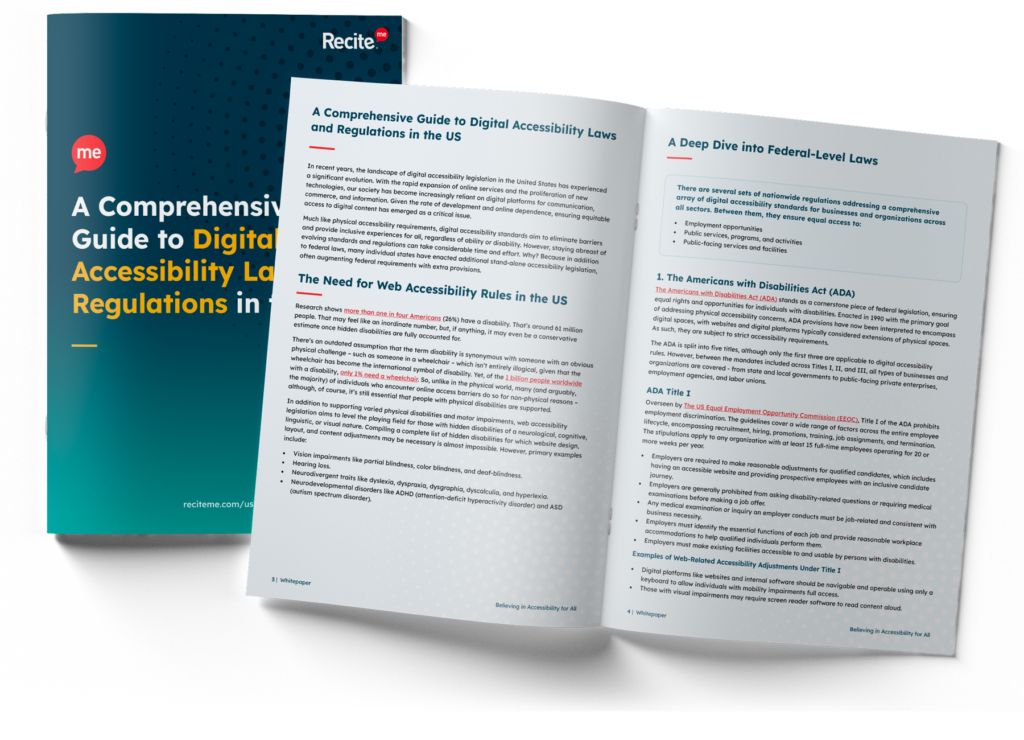
Stay ahead of the game when it comes to Digital Accessibility laws and compliance in the United States. Learn about all the different federal and state-level regulations, see real examples of web accessibility lawsuits in different regions and discover a 7-step action plan for building accessible websites.
Real-World Practical Applications of WCAG
Learning more about WCAG is a great first step in working toward an accessible website. But, what does all the above mean to your organization on a practical level? Here is a list of some of the most common fixes and provisions a web team can make to ensure best practices for WCAG compliance are met.
Principle 1: Perceivable
Make sure users can recognize and use your service with the senses that are available to them:
- Provide text alternatives (‘alt text’) for non-text content.
- Provide transcripts for audio and video.
- Provide captions for video.
- Make sure content is structured logically and can be navigated and read by a screen reader – this also helps if stylesheets are disabled.
- Use the proper markup for every feature (for example, forms and data tables), so the relationships between content are defined properly.
- Avoid using color as the only way to explain or distinguish something.
- Use text colors that show up clearly against the background color.
- Make sure every feature can be used when text size is increased by 200% and that content reflows to a single column when it’s increased by 400%.
- Avoid using images of text.
- Make sure your service is responsive – for example to the user’s device, page orientation, and font size they like to use.
- Make sure your service works well with assistive technologies – for example, important messages are marked up in a way that screen readers know they’re important.
Principle 2: Operable
Ensure users can find and use your content, regardless of how they choose to access it:
- Make sure everything works for keyboard-only users.
- Let people play, pause and stop any moving content.
- Avoid blinking or flashing content – and let the user disable animations.
- Provide a ‘skip to content’ link or equivalent.
- Use descriptive titles for pages and frames.
- Make sure users can move through content in a way that makes sense.
- Use descriptive links so users know where a link will take them, or what downloadable linked content is.
- Use meaningful headings and labels, making sure that any accessible labels match or closely resemble the label you’re using in the interface.
- Make it easy for keyboard users to see the item their keyboard or assistive technology is currently focused on (this is known as ‘active focus’).
- Only utilize functions like mouse events or dynamic interactions (like swiping or pinching) when they’re strictly necessary – or let the user disable them and interact with the interface in a different way.
- Make it easy for users to disable and change shortcut keys.
Principle 3: Understandable
To make sure people can understand your content and how it works.
- Make it clear what language the content is written in, and indicate if this changes.
- Make sure features look consistent and behave in predictable ways.
- Make sure all form fields have visible and meaningful labels – and that they’re marked up properly.
- Make it easy for people to identify and correct errors in forms.
Principle 4: Robust
You must make sure your content can be interpreted reliably by a wide variety of user agents – including reasonably outdated, current, and anticipated browsers and assistive technologies.
- Use HTML so user agents, including assistive technologies, can accurately interpret and parse content.
- Make sure your code lets assistive technologies know what every user interface component is for, what state it’s currently in, and if it changes.
- Make sure important status messages or modal dialogs are marked up in a way that informs users of their presence and purpose and lets them interact with them using their assistive technology.
Accessibility Goals in 2024: WCAG 2.1 Level AA
If you’re just starting out on your website accessibility journey, you should make changes to align with WCAG 2.1 Level A as soon as possible. But bear in mind that WCAG 2.1 Level AA is typically the minimum reference point for organizations looking to make their websites accessible – and is the level of compliance required for many public sector and public-facing organizations.
To be sufficiently perceivable, operable, understandable, and robust across all mobile devices, browsers, smartphones, tablets, and PCs, website owners must adopt a design and layout that is clear enough that everyone can use it. To summarise, WCAG 2.1 Level AA compliance covers:
- 4 WCAG principles
- 78 success criteria with 3 levels of compliance
- 508 testing techniques
- Over 1000 technical tests

Does Your Website Need to Be WCAG Compliant?
Having an inaccessible website means that users with disabilities cannot access your information, goods, and services. Therefore, WCAG principles apply to anyone involved in building and maintaining a website, and also those who produce written, video, and audio content for online audiences.
But, does your website have to behave to be compliant? After all, there’s no global internet police to penalize you for having an inaccessible website build or format. But that doesn’t mean there aren’t several reasons you should do everything you can to ensure accessible online journeys for all of your website visitors.
Regional Legal Requirements
In many countries, legislation does does exist to ensure that disabled people are not treated less favorably. Examples include:
The Accessible Canada Act (Canada)
The European Accessibility Act (European Union)
The Equality Act (UK)
Some legislation refers directly to WCAG 2.1 guidelines. And while others may not point specifically toward WCAG, if your online content complies with the principles of WCAG 2.1, your website will be aligned with the relevant legislative requirements in your region.
Doing the Right Thing
Building an accessible website is the right thing to do. The internet was designed to be used by everyone, and excluding people when it’s relatively straightforward not to is a morally questionable decision – particularly in today’s modern society where there is more focus on equity and inclusion than ever before.
“The power of the Web is in its universality. Access by everyone, regardless of disability, is an essential aspect…The Web is fundamentally designed to work for all people, whatever their hardware, software, language, location, or ability.”
Sir Tim Berners-Lee, Inventor of the world wide web.
Business Benefits
A common organizational objection to WCAG compliance is that if it’s not required by law, then it’s not a necessity – mainly because there’s not always a clear financial gain. However, that’s not the case when you take a deeper look. There’s a long list of benefits for companies that take the lead in becoming accessible ahead of their competitors. Some examples include:
- Reaching a wider audience – By attracting and retaining an additional 20% market share, you can significantly expand your customer base.
- Improved PR – Many customers consciously only buy from companies with inclusive values. Forbes reports that 52% of online consumers consider a company’s values when making a purchase.
- Improved Brand Reputation – Modern consumers favor brands that care about helping others, and if your company isn’t viewed as inclusive, some customers will simply not spend their money with you.
- Minimizing legal risk – Web, app, and video accessibility lawsuits are up almost 25% year-on-year, with around 300 digital accessibility lawsuits filed every month.
- SEO Benefits – Many accessibility best practices are heavily weighted on search engine algorithms, and websites featuring content that follows WCAG are becoming increasingly favored as trusted sources on search queries.
 “There’s a considerable overlap between features that enhance web accessibility initiative and SEO performance. By making your web pages accessible to everyone, you’re also boosting your chances of being found in search.”
Clair Brotherton, Founder of A Clear, Bright Web
How Many Websites are Accessible?
The short answer: not enough. People with disabilities control $8 trillion in spending. Yet despite this, statistics reveal that:
- Only 3% of the internet is accessible to people with disabilities (Forbes).
- 96.8% of home pages have detected WCAG 2 failures (WebAIM).
- Fewer than 10% of businesses have plans in place to access the disability market (Accenture).
- 43% of consumers feel the majority of websites are not designed around end-user needs (Tech Radar).
Introducing the Recite Me Accessibility Checker
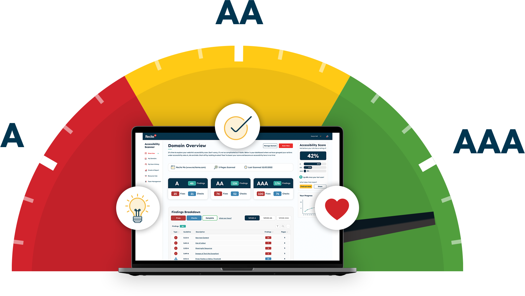
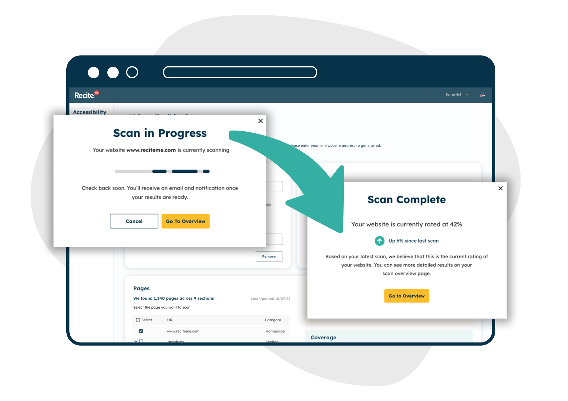
The Recite Me Checker audits both back-end and front-end web development processes by running 390 separate compliance scans in line with WCAG 2.1 and breaking down the issues you should be working to fix, track, and share.
Scan
Your accessibility journey starts here with a scan of your website covering WCAG 2.1 success criteria encompassing:
- Site performance overview
- Accessibility scoring
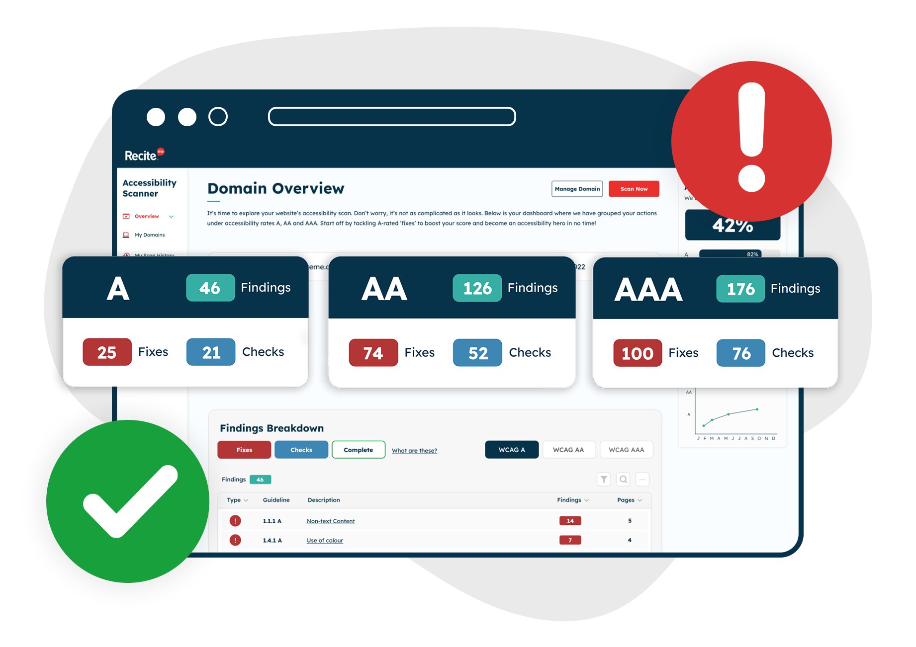
- Findings per rating
- Error breakdown
The scan report includes an overview of errors, the locations of errors, and a comprehensive list of actionable errors to fix and check.
Fix and Check
Our software identifies areas of non-compliance and shows you what to fix and check and in what order for the biggest improvement against your efforts, investment, and time. Fixes are confirmed fails identified via an automated scan and checks are potential errors that a human needs to verify. For example, a computer can identify if an image on a website has an alt-tag attribute or not. However, the human eye is needed to make sure that the alt-tag text describes the image.
Track
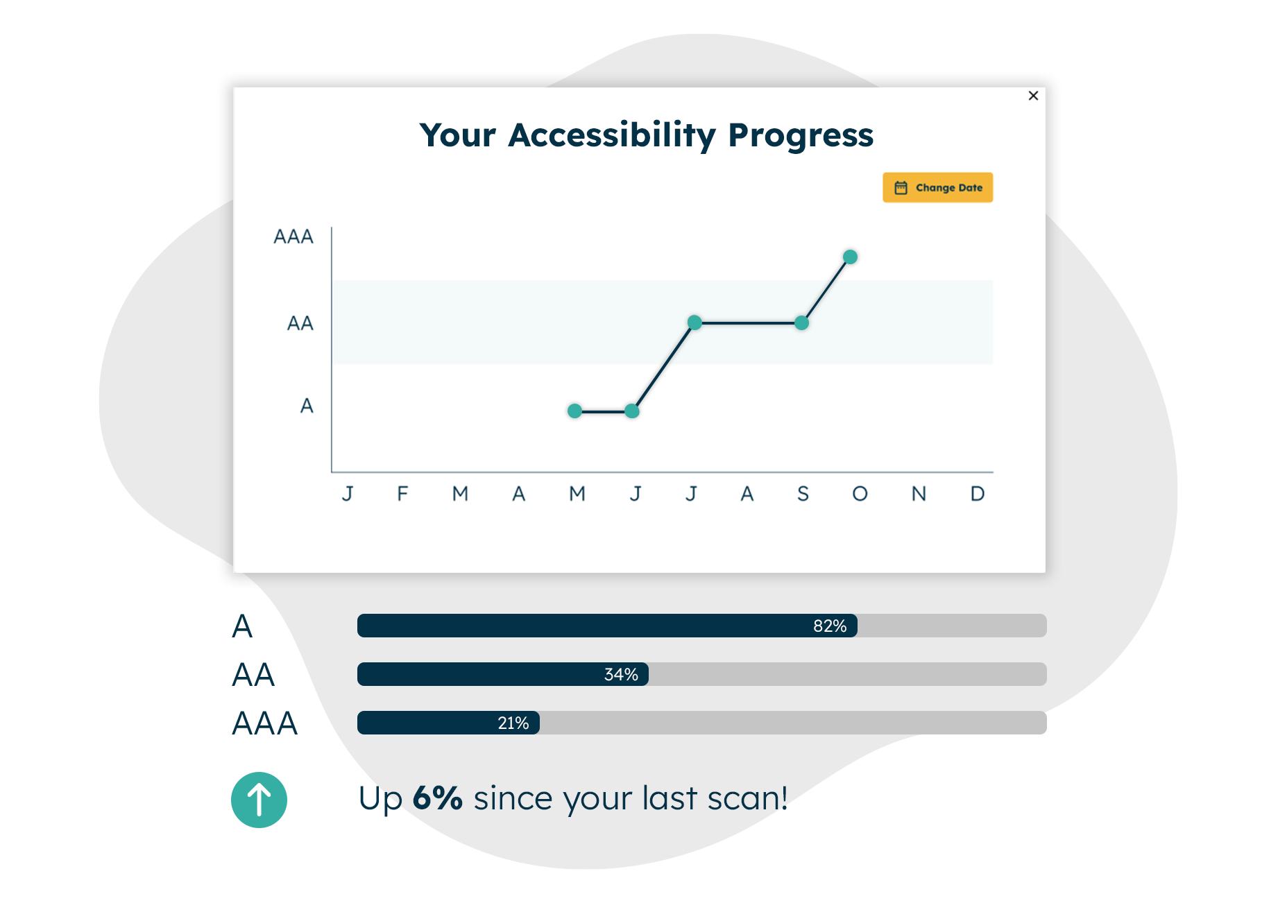
Our compliance tracking service helps you manage your web accessibility improvements over time, make the most effective changes in the right order, and manage your fix queue. You can examine various elements of WCAG compliance by exploring different scans and downloading your website’s scan accessibility score and report to track your positive journey.
Share
We give you all of the tools needed to demonstrate your commitment to developing an accessible website. You can share your accessibility report and score to showcase your digital inclusion goals and achievements via:
- Custom monthly reporting
- Ongoing engagement analysis
- Accessibility scoring
- Downloadable fix lists
- Access to the Recite Me Hub which features materials highlighting the depth of information behind your website’s scan and results. Resources include FAQs, full breakdowns of testing methodologies, and ‘how to’ videos.
Start Your Web Accessibility Compliance Journey Today
Online accessibility is a journey, not a destination. Recite Me is here to help you every step of the way to provide an inclusive and compliant website. We save you time and money by highlighting what needs fixing first for the most effective results and the most significant return on investment.
Get to work on your online inclusion strategy today by running a free check of your website for WCAG 2.1AA compliance.

