Get Your Free Accessibility & Inclusion Toolkit
Download NowAccording to the World Health Organization (WHO), at least 2.2 billion people worldwide have a vision impairment, of which 43 million of them are blind. This is not a small number, and you can be sure that a large percentage of these individuals are internet users, or potential customers, depending on how you look at it.
Designing your website with blind and low vision users in mind is therefore not just a moral imperative, but a smart business decision. This guide unpacks the do’s, don’ts, how’s, and why’s of web accessibility, offering you actionable steps to create an inclusive online environment for your visually impaired customer base.
What is Web Accessibility?
Web accessibility is no different to that of a traditional workplace, classroom, or any other organization. It is all about tearing down barriers to participation, so that people of all abilities and disabilities can digest and navigate your online content. Think of web accessibility in the same way as providing wheelchair ramps for physically disabled customers; it’s all about affording everyone equal access to your facilities, products, and services by helping those who are disadvantaged to overcome any barriers. The same rules apply as for brick and mortar stores, except now it’s online.
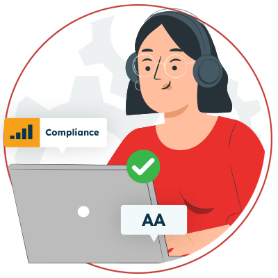
When websites are designed, developed, and edited with accessibility in mind, all users have equal access to information and functionality. For example, a website that uses descriptors and alt text is readable by screen readers (an example of assistive technology that reads aloud text), meaning blind users can navigate the full extent of its media and resources without need for assistance from others.
Ultimately, the goal of web accessibility is to create a digital environment where everyone can interact, understand, and benefit from the same information and services. Often, the best way to achieve inclusion is by leveraging an all–in-one product, like the Recite Me assistive toolbar, which includes a range of features that help address needs specific to those of visually impaired customers.
Implications of WCAG in Ensuring Accessibility for Blind People Online
The Web Content Accessibility Guidelines (WCAG) are a set of international standards created by the World Wide Web Consortium (W3C) to ensure web accessibility. If making your website accessible is your aim, and it should be, then WCAG will become your go-to resource. It outlines the exact criteria your website needs to hit in order to be considered accessible and remain compliant.
WCAG provides a robust framework for achieving varying levels of accessibility, classified as WCAG levels A, AA, and AAA. This offers a scalable approach to improving accessibility, allowing online businesses to progressively enhance their level of compliance. And given that blind and low vision individuals make up such a large portion of internet users today, WCAG has a heavy focus on design elements that support them. Below is a list of some of the best WCAG practices to follow, the non-negotiables if you will:
- Text Alternatives for Non-Text Content: All non-text content like images and multimedia must have text alternatives so that screen readers can describe the visuals to users who are unable to see them.
- Adaptable Content: Content must be adaptable to different devices and user needs so that customers can interact with web content in a way that suits their individual preferences, and without impacting things like text size or font style. Content should be adaptable to mobile devices and tablets, as well as desktop computers.
- Distinguishable Elements: Elements like text and interactive components must be easily distinguishable from one another in order to enhance your website’s readability and usability, especially for users with low vision. This is done by providing sufficient contrast between text and background, and using clear, readable fonts like Arial or Calibri.
- Keyboard Accessibility: Websites must be fully navigable by keyboard to allow visually impaired users, who perhaps cannot use a mouse effectively, to browse all of the site’s content.
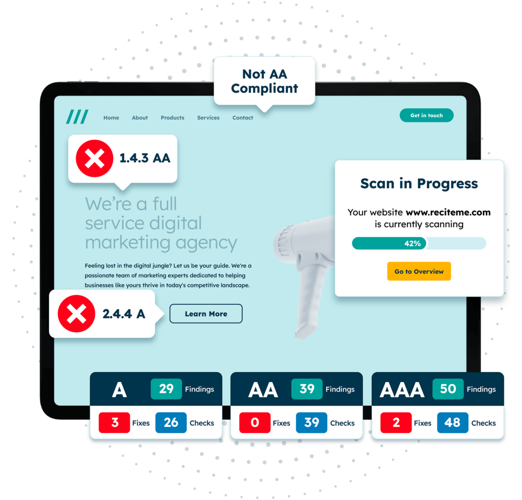
Free WCAG Compliance Check of your Website
Finding WCAG compliance issues is now easier than ever. Recite Me offers a free automated scan of your website’s homepage to highlight non-compliance. You’ll get recommendations on how to fix them, helping to improve your accessibility score.
How to Make your Website Accessible for Blind and Low Vision Users
Understanding the WCAG and what it requires of your business is essential for compliance. It gives you targets to aim at and tells you what an accessible website looks like. But how exactly do you get there? This section offers clear guidance on the changes you need to make and the tools you should offer to ensure your online content, and your business in general, is accessible for blind and low vision users.
Screen Reader Compatibility
Screen readers are a high-tech assistive technology tool, they work by converting digital text into synthesized speech so that website content can be fully understood. Ensuring your website is compatible with screen readers, such as JAWS, NVDA, and VoiceOver, involves structuring your HTML in a logical order and using appropriate semantic tags like ‘<header>’, ‘<main>’, and ‘<footer>’. It also involves key practices, such as providing text alternatives for all non-text content, including descriptive alt text for images, which allows screen readers to convey verbal depictions of images to its users.
You can learn more about the importance of assistive technology tools for the blind and visually impaired here.
Sufficient Color Contrasts
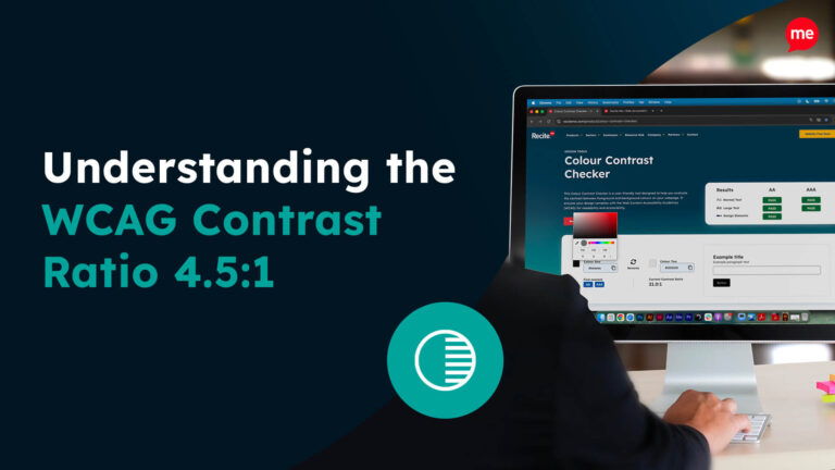
Users with low vision require sufficient color contrast between text and background to be able to read text-based content. According to WCAG’s recommendations, a contrast ratio of at least 4.5:1 for normal text and 3:1 for large text is required for a website to be considered accessible. Luckily, there are tools on the market that give website users this level of freedom and customization. The Recite Me accessibility toolbar, for example, allows users to change color contrasts on websites according to their individual needs, empowering customers to browse the internet with confidence and independence.
Keyboard Accessibility for Navigation
Many blind and low vision users rely on keyboards, instead of mice, to navigate websites. This makes keyboard accessibility an essential part of achieving broader accessibility goals. Ensuring your site is fully navigable using only a keyboard involves making sure that all interactive elements, such as links, buttons, and forms, can be accessed via keyboard commands like tabbing. It also involves providing clear focus indicators to indicate which element is currently selected.
Font Style & Sizing Adjustments
Another way to make your website accessible for blind and low vision customers is to offer options for users to adjust font styles and sizes according to their needs. Use scalable fonts where possible and avoid fixed font sizes that may hinder readability. Sans-serif fonts like Arial or Verdana are typically easier to read than serif fonts. Also, it is highly worthwhile making sure your website’s layout remains functional when users zoom in or increase font size. Doing so keeps your site accessible to users with varying degrees of vision impairment.
It’s not just low vision users who benefit from accessibility in fonts, there are also a range of benefits for those with dyslexia, ADHD and other disabilities.
Descriptive Anchors for Links and Buttons
Links and buttons should have descriptive text that conveys their purpose and destination. Instead of using vague text like “click here”, use specific descriptions like “read our blog on accessibility tips”. This helps screen readers provide blind users with context about where the link leads, making navigation clearer and more intuitive.
This is another example of an accessibility adjustment you can make that has multiple benefits. As descriptive anchors can provide a benefit to your SEO, by highlighting the purpose of a page to search engines. Learn more about accessibility and SEO here.
Descriptive Titles for Every Page
Each page on your website should have a descriptive title that accurately reflects its content. This helps screen readers announce the purpose of each page, aiding users in understanding whereabouts they are on your site and what each page contains. In this way, clear titles enhance navigation for visually impaired users, making for a better browsing experience overall.
Add Image Alt Text to Provide Context
As previously mentioned, alt text is crucial for providing context to images, and learning to write effective alt text is a craft in its own right. This text should be concise yet descriptive enough to convey the image’s purpose or content.
For instance, instead of labelling an image of a library as “image123.jpg”, suitable alt text should read: “interior view of a modern library with rows of bookshelves”. This provides enough context for the user to build up a mental picture of the image without overwhelming them with unnecessary details.
Proper use of Hierarchical Headings
Using hierarchical headings (H1, H2, H3, etc.) correctly allows screen readers to interpret the structure of your content accurately. This is akin to providing a roadmap, enabling users to skim through content and jump to sections that interest them. For example, an article might have an H1 for the page title, H2 for main sections, and H3 for subsections. Structuring your page in this way prevents subsections from being confused with main sections, or vice versa.
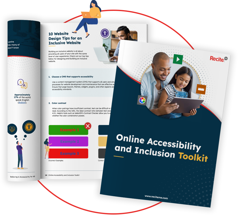
Our 40-page Digital Accessibility & Inclusion Toolkit helps businesses break down online barriers and make a real impact. It offers practical advice on all aspects of digital accessibility, from writing an accessibility statement to accessible website tips and inclusive hiring.
Benefits of Accessibility for Blind & Low Vision Web Visitors
Making your website accessible for blind and low vision users plays a huge role in enhancing their online experience and giving them a greater sense of independence. Below are just some of the benefits brought about by increasing web accessibility for your visually impaired customers.
- Equal Access to Information: Accessibility ensures that all users, regardless of their vision, can obtain the same information, making your website, and thus your business, more inclusive.
- Improved Navigation: Features like keyboard accessibility and descriptive links help users navigate your site more easily, meaning they can get to their desired page, find that contact form, or browse your full range of products.
- Enhanced User Experience: Readable fonts, sufficient color contrast, and properly structured content contribute to a more pleasant browsing experience for your customers.
- Greater Independence: Making your website more accessible for blind and low vision customers empowers them to interact with digital content independently, without having to rely on others for assistance.
- Increased Engagement: Ensuring your website is properly set up for visually impaired users allows them to interact seamlessly with features such as videos, comments, and contact forms, meaning they can enjoy the same perks as the rest of your customers base.
Business Case for Enhancing Blind Accessibility Online
Following the WCAG and making your website accessible for blind individuals does not just benefit your users. And while investing in web accessibility has its roots in ethics and legal compliance, the truth is, your business stands a lot to gain too. This section outlines some of the most significant business benefits of accessibility:
- Expanded Customer Base: Making your site accessible opens your business’s doors to a broader audience, including millions of potential clients with visual impairments.
- Enhanced Brand Image: As consumers increasingly favour socially responsible companies, demonstrating a commitment to inclusivity can enhance your brand reputation and build customer loyalty. It can also bolster your employer brand, making you a more attractive prospect for employees.
- Legal Compliance: Adhering to accessibility standards helps protect your business from potential legal issues related to non-compliance.
- SEO Benefits: Many accessibility practices, such as using alt text and descriptive headings, can also improve your site’s search engine optimization (SEO).
- Increased Revenue: By making your site accessible, you broaden your pool of potential customers, leading to increased sales and greater revenue.
- Customer Satisfaction: Providing an accessible site leads to higher customer satisfaction, which inevitably leads to a series of positive reviews and word-of-mouth referrals.

Become WCAG Compliant with Recite Me
Act today to ensure WCAG compliance and mitigate legal risk. Get started on your website accessibility strategy by working through the following action points:
- Contact our team for more advice about WCAG standards and Accessibility best practices.
- Find out more about the Recite Me web accessibility checker.
- Schedule a free scanner demonstration to learn how our technology can help you.
- Run a free scan of your website for WCAG 2.1 AA compliance.
