Get A Free Accessibility Check Of Your Website
Download NowWhen it comes to making your website accessible, the Web Content Accessibility Guidelines (WCAG) are your go-to resource. However, non-compliance with WCAG can lead to more than just fines and legal battles; your business and its customers may suffer as a result. That’s why it’s important to identify and fix any WCAG failures as soon as they arise. In this article, we’ll explore the six most common WCAG failures and the most effective ways to address them.
Understanding the Web Content Accessibility Guidelines
The Web Content Accessibility Guidelines (WCAG) are a set of standards that were developed by the World Wide Web Consortium (W3C) to ensure web content is made accessible to individuals with disabilities across the globe. It offers specific recommendations to companies on how to improve their online presence, tearing down barriers that may otherwise prevent disabled people from consuming written, audio, or video-based content.
The guidelines are organised around four key principles — Perceivable, Operable, Understandable, and Robust (POUR) — and are divided into three increasing levels of compliance: A, AA, and AAA. Often, businesses are required to achieve a minimum of Level AA compliance to be considered accessible.

So, what is a WCAG failure? A WCAG failure occurs when a website or digital product does not meet one or more of these guidelines. For example, one of the most common WCAG failures is low contrast text. This is where text does not stand out clearly from its background, causing users with visual impairments to have extreme difficulty in reading text-based content. Failures like this lead to accessibility issues for users with visual, auditory, physical, or cognitive disabilities, and can incur violations from a range of different accessibility laws.
What are the 6 most common WCAG failures?
A 2024 study by WebAim found that 96.4% of all WCAG errors and failures fall into one of six categories. It’s worth noting that these failures have remained unchanged for the last 5+ years, highlighting just how important it is that we learn how to address them.
The 6 most frequent WCAG failures can be seen in the table below:
WCAG failure type | % of home pages |
Low contrast text | 81.0% |
Missing alternative text for images | 54.5% |
Missing form input labels | 48.6% |
Empty links | 44.6% |
Empty buttons | 28.2% |
Missing document language | 17.1% |

Free Accessibility Check of your Website
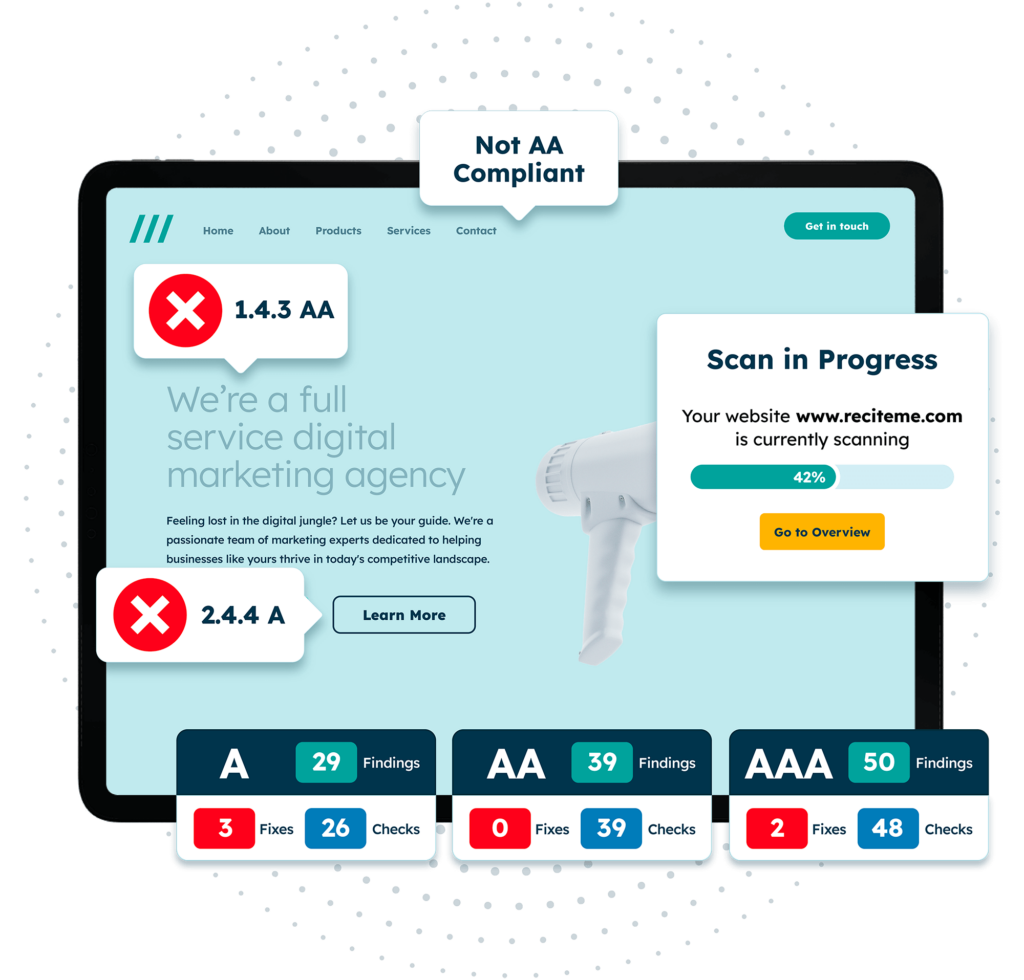
Finding accessibility issues is now easier than ever. Recite Me offers a free automated scan of your website’s homepage to highlight non-compliance. You’ll get recommendations on how to fix them, helping to improve your accessibility score.
How to fix the 6 most common WCAG failures?
Being able to recognise common WCAG failures is extremely useful when it comes to improving your online accessibility. But this is only the first step. Knowing how to fix these failures is when true progress begins.
Low contrast text
Low colour contrast occurs when the colour of the text is too similar to the background, making it difficult for users with visual impairments to read. For example, light grey text on a white background is a common but poor design choice.
To fix low contrast text, use online contrast checker tools to ensure that the text-to-background colour contrast meets the WCAG best practice ratio of 4.5:1 for standard text, or 3:1 for large text. To really go above and beyond, you may even consider offering your users complete colour customisation via tools, such as Recite Me’s assistive toolbar.
Missing alternative text for images
Missing alt text is a major WCAG failure, as it leaves certain users unable to engage with visual content, but, unfortunately, it’s a very common occurrence. According to WebAim, there are 55.6 images per homepage on average, and 21.6% of these are missing alt text. What is alt text? Alt text is a text-based description that is added to images so that screen readers can convey the content of the image to users who are visually impaired.
To fix this, alt text should be added to every image, especially those which convey key information or add context to a story. When adding descriptions, be detailed but efficient with your use of words. Avoid technical jargon or overly complex terms, but ensure the description provides enough detail that the user can fully envisage the image. For purely decorative images, mark them by using an empty alt attribute (alt=””) to prevent screen readers from getting stuck on irrelevant visuals.

Missing form input labels
Form input labels guide users, and screen readers, to understand what information needs to be entered in a form field. This could mean showing an example of the sort of information that needs to be included, or it could mean providing additional context to help the user understand the purpose of the form field. When these labels are missing, it’s unclear what information is required, making forms inaccessible, especially to those with cognitive or visual impairments.
To fix this, create descriptive labels for all form fields. Make sure they inform the users of what type of input is required. Use clear, concise labels placed near the corresponding form fields. Also, these labels should be coded correctly so that screen readers can associate them with the correct field.
Empty links
Empty links are hyperlinks that contain no text or description. These are confusing for everyone, but especially users relying on screen readers, as they are unable to determine the link’s destination.
To prevent this, ensure that every hyperlink includes descriptive text that makes clear its destination or purpose. For example, instead of using generic link text like “click here,” say something like “download our accessibility guide” to provide more context.

Empty buttons
Much like empty links, buttons that do not have clear text or labels are a significant barrier to accessibility. An empty button does not just refer to a lack of text, but a lack of clear text. For example, a button that says “Submit” without context leaves users unsure of what they are actually submitting.
By adding a few additional words or reordering your call to action, you can fix this WCAG failure with relative ease. For instance, instead of just “Submit,” you might use “Submit your application” or “Complete your order”. This small difference goes a long way, especially for those who rely on screen readers to navigate online spaces.
Missing document language
A webpage without a specified document language can cause screen readers to misinterpret the content. This is especially problematic for non-native speakers and those using translation tools.
To fix missing document language, make sure your HTML pages include a “lang” attribute that specifies the primary language of the content. For example, for English-language pages, you would add <html lang=”en”> at the beginning of the document.
The importance of implementing WCAG compliant fixes
Legal compliance aside, failing to fix your WCAG failures can have a detrimental impact on your business, its customers, and your bottom line. The longer these failures are left without being addressed, the more your potential customers come into contact with them, and the more damage they do as a result.
Here are just some of the most compelling reasons for fixing WCAG failures as soon as they arise:
- Increased audience reach: Accessibility opens up your pool of potential customers to millions of disabled users who may not have otherwise been able to access your content.
- Improved SEO performance: Accessibility improvements, such as alt text for images and semantic HTML, can enhance your search engine rankings.
- Reduced legal risks: Many countries have accessibility laws which are partly based on WCAG. Non-compliance could result in fines or legal actions.
- Better user experience for everyone: Accessible design improves usability not just for people with disabilities but for all users, including those on mobile devices.
- Enhanced brand reputation: Demonstrating a commitment to accessibility shows your business values inclusion. This enhances your brand’s reputation and garners loyal support from ethically conscious consumers.
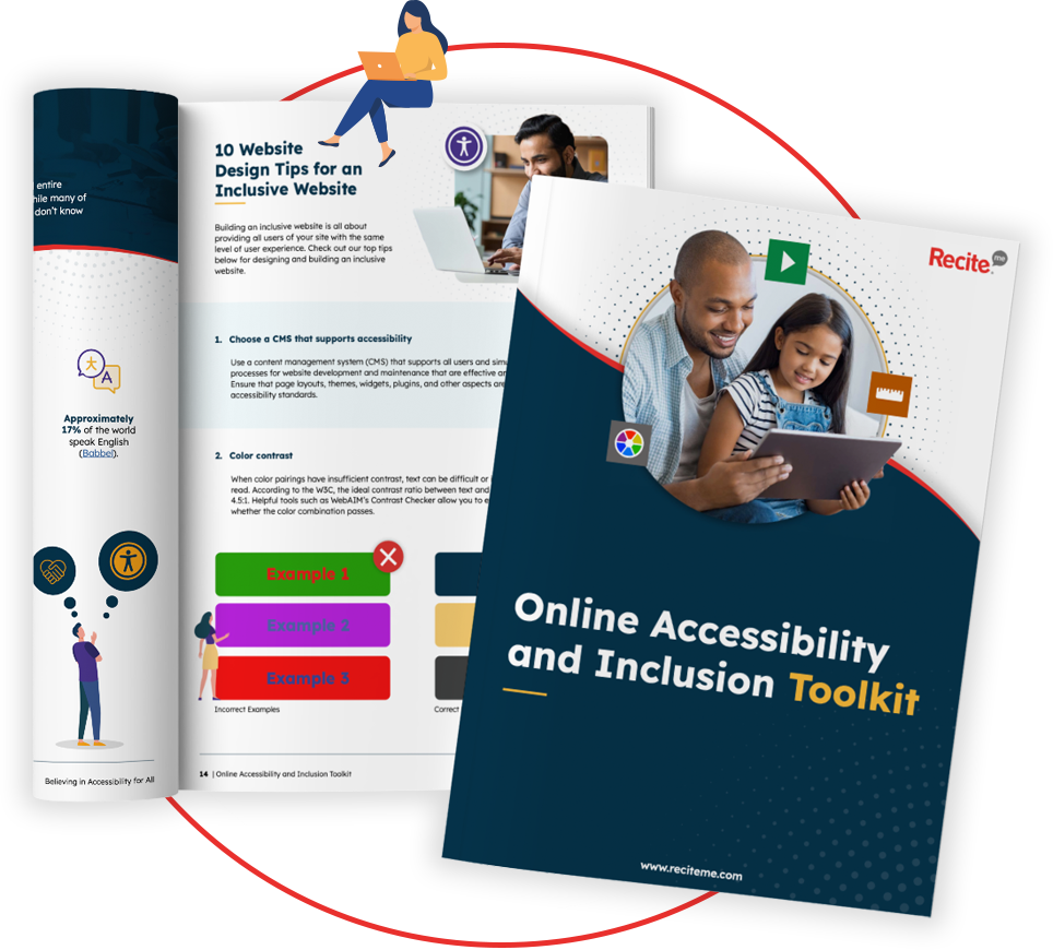
Our 40-page Digital Accessibility & Inclusion Toolkit helps businesses break down online barriers and make a real impact. It offers practical advice on all aspects of digital accessibility, from writing an accessibility statement to accessible website tips and inclusive hiring.

Tools to help resolve WCAG failures
Even with tips and guidance, resolving WCAG failures can seem a daunting prospect to do on your own. Luckily, there are a plethora of different tools and software on the market today which can help you. This includes everything from auditing tools which scan your website for non-compliant features, to customisation tools that make it easier to address WCAG failures.
- Recite Me’s accessibility checker: Our accessibility checker scans your website for any non-compliant features, identifying areas that need improvement and helping you to prioritise your WCAG fixes.
- AXE by Deque Systems: A powerful tool for developers, AXE integrates into your browser to test for accessibility violations during development.
- Recite Me’s assistive toolbar: The Recite Me accessibility toolbar will not help fix accessibility issues at source. But, it can help to mask them, by making your website customisable. This means users can change colour contrasts, adjust font size, use text-to-speech software and much more.


