Get Your Free Accessibility & Inclusion Toolkit
Download NowImagine entering a library where the lights are too dim to read, the doors too narrow to pass, and the signs are in a language you don’t understand. Frustrating right? For many people with disabilities, navigating the digital world can feel just as challenging. This is where the POUR principles come into play.
Originating from the Web Content Accessibility Guidelines (WCAG) – the global standard for online accessibility — the POUR principles are a blueprint for accessible design. They serve a broader purpose beyond mere box ticking and compliance, however —they help open doors, turn on lights, and ensure that every user, regardless of their abilities, can engage fully with your content. Whether you’re an online business owner, content creator, or a software developer, understanding these principles is essential.
What are the four principles of POUR
So, what are these POUR principles? POUR stands for Perceivable, Operable, Understandable, and Robust. Each principle covers a different aspect of accessible design, guiding you in creating content that is not only WCAG-compliant but genuinely inclusive. Let’s take a look at what each principle means in a bit more detail:
- Perceivable: Think of this as making sure everyone can “see” or “hear” what’s on your website, even if they can’t literally see or hear. For example, if someone is visually impaired, they might use a screen reader to “listen” to your content.
- Operable: This means everyone should be able to use your website, regardless of how they interact with it. If someone can’t use a mouse, your site should still be navigable with just a keyboard.
- Understandable: Your content should be clear and easy to follow for everyone, including the language you use and the layout of your site. Clear instructions, error messages, and indicative use of colours help users understand what to do without frustration.
- Robust: Your content must be robust enough to work well with all kinds of devices and tools, both now and in the future. A robust site might, for example, use clean, simple HTML code so it can be reliably interpreted by different web browsers and assistive technologies.

Free WCAG Compliance Check of your Website
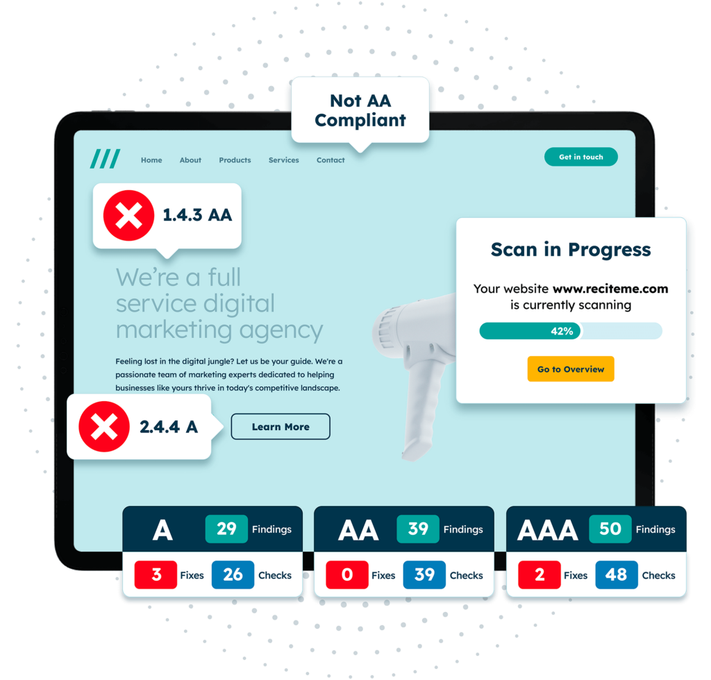
Finding WCAG compliance issues is now easier than ever. Recite Me offers a free automated scan of your website’s homepage to highlight non-compliance. You’ll get recommendations on how to fix them, helping to improve your accessibility score.
Principle 1 – Perceivable
The first POUR principle, “perceivable”, focuses on ensuring that content is presented in ways that can be consumed by all users. This might involve making adjustments to text, images, video, or other multimedia elements to ensure they can be digested even by those with visual, auditory, or cognitive impairments. How exactly do you go about doing this? Let’s take a look.
Text alternatives
Text alternatives attach textual descriptions to visual content, which can then be interpreted by assistive technologies, like screen readers, so that visually impaired users can perceive images. Ideally, image alt text will be descriptive enough to convey the same information as the image itself, without bombarding the user with words and losing clarity as a result.
Below are the steps required to implement text alternatives:
- Identify all non-text content on your website, including images, videos, and icons.
- Write clear and concise alt text that describes the content of each non-text element, without confusing or misleading the reader.
- Use tools like screen readers to test how well your alt text is conveyed to users.
- Ensure that all decorative images have null alt attributes (alt=””), meaning that they will not be announced by screen readers as to avoid unnecessary clutter.
Accessible multimedia
Part of making your online content perceivable is ensuring multimedia content, such as videos and audio files, can be accessed by anyone. Live captions do this by allowing deaf users to follow a video without needing to listen to the dialogue. Similarly, transcripts allow listeners to fully perceive audio content, like podcasts. This is useful for a range of individuals, not just those with hearing impairments; for example, people with cognitive disabilities, non-native English speakers, or just anyone who likes having a written copy to which they can refer back to.
How to make multimedia accessible:
- Add captions to all video content, ensuring they are accurate and synchronised with the audio.
- Provide transcripts for audio content that capture all spoken words and important sounds.
- Use audio descriptions for video content to describe important visual information that isn’t conveyed through the audio track.
- Test your multimedia with disabled users who rely on these features to access your content.

Presenting content in unique ways
Different users have different needs, and presenting the same content in different formats can help accommodate these needs, making your content more perceivable. For example, offering content in both visual and auditory formats can accommodate users with both visual and auditory impairments.
How to present your content in unique ways:
- Provide multiple formats for content, such as text, audio, and video.
- Ensure that visual content is also available in a text format, and vice versa.
- Use contrasting colours and larger text sizes for users with visual impairments.
- Consider offering simplified versions of complex content for users with cognitive disabilities.
Making content easy to see and hear
Ensuring that content is easy to see and hear is crucial for users with auditory or visual impairments. This can be done by ensuring distinct colour contrasts, increasing text size accordingly, and checking audible content for clarity.
How to make content easier to see and hear:
- Use high-contrast colours between text and background to improve readability.
- Allow users to adjust text size and colour schemes according to their needs.
- Ensure that audio content is clear and does not have background noise that could interfere with comprehension.
- Provide volume control for audio content and consider using adjustable playback speeds.
Principle 2 – Operable
The second POUR principle, “operable”, refers to the usability of different website elements. This means, for example, that the interface should be navigable and usable through various input methods, so that users with motor impairments, who cannot use a mouse, are not excluded from accessing your content.
Keyboard accessibility
Many users with mobility issues rely heavily on keyboards to browse online platforms. But for this to be possible keyboard accessibility must be promoted through interactive elements, like buttons, links, and form fields, must be set up to accommodate keyboard navigation.
Steps to ensure keyboard accessibility:
- Ensure all interactive elements (links, buttons, forms) can be accessed and operated via the tab function of a keyboard.
- Use logical tab order to guide users through the content in a predictable manner.
- Provide visible focus indicators, such as bold red outlines, to show which element is currently selected.
- Conduct user tests involving individuals with motor impairments. Allow them sufficient time to browse your site, search for inaccessible elements, and provide relevant feedback.
Provide enough time to digest content
For users to engage with your content effectively, they need sufficient time to read and understand it. This is especially true for those with cognitive disabilities, who may need more time to process information than their peers.
Steps to ensure your users have sufficient time to digest your content:
- Avoid placing automatic timeouts on essential content or interactions.
- Provide options to extend or remove time limits for tasks, such as filling out forms.
- Use clear and simple language to convey information, so that you reduce the cognitive load on users.
- Once you have completed steps 1-3, test your website with users who have cognitive disabilities to gauge whether they have enough time to read and understand the content.
Avoid content that has the potential to cause physical reactions or seizures
Certain content, like flashing images or rapid animations, can trigger seizures or other sharp physical reactions in some users. As well as harm these individuals, it renders the content unusable to them, meaning they have no choice but to disregard your business offerings unless specific steps are taken to avoid this.
Tips to avoid seizure-inducing content:
- Avoid using content that flashes more than three times per second.
- Provide warnings before displaying any content that might trigger seizures.
- Offer alternatives to any potentially triggering content, such as a static image instead of a flashing animation.
- Test your website to ensure it complies with guidelines on seizure-inducing content.
Content is easy to navigate
Perhaps one of the most crucial aspects of operability is navigability, or the ease with which a potential customer can browse your web pages. Navigating content should be straightforward and intuitive; users should be able to find the information they need without confusion or frustration.
Tips to ensure easy navigation of your site:
- Use a consistent layout and structure throughout your website.
- Provide clear and descriptive labels for all navigation links and buttons.
- Implement a site map and breadcrumbs to help users understand their location on the site.
- Test your site’s navigation with users who have disabilities so that you can identify and resolve potential issues.
Compatibility with input modalities
Many users rely on input methods beyond just a keyboard or mouse. These include voice commands, touch screens, adaptive keyboards, and other devices. Ensuring compatibility with these modalities is essential if you don’t want to exclude a large portion of your audience.
Steps to ensuring compatibility with different input modalities:
- Test your website’s functionality with different input methods, including touch screens, voice recognition, and alternative keyboards.
- Provide additional navigation options that are not yet offered on your site, such as voice commands or gesture-based controls.
- Ensure that your website works seamlessly across different devices, including tablets and smartphones.
- Collaborate with users who rely on these modalities and ask them to run manual tests in order to identify any potential issues.
Principle 3 – Understandable
In order for content to be understandable, its user interfaces must be simple and easy to understand. This involves using clear language, providing helpful instructions, and ensuring website functions are predictable. Imagine you find yourself on an e-commerce site searching for shoes. By clicking the “shoes” category, you expect to be taken to a page displaying all the shoes available for purchase, right? If this does not happen, you will likely become frustrated from confusion and leave the site. Although rudimentary, this example indicates how we expect to follow common patterns, and will abandon an endeavour if our expectations are not met.
Input assistance
Input assistance provides users with help when interacting with forms and other input elements. This might involve suggestions, like what to include in a particular field, or offering auto-complete options after the user has completed the initial characters of a field entry. Even error messages act as a form of input assistance, letting users know where they have gone wrong and how to resolve the issue.
How to provide effective input assistance:
- Provide clear instructions for all form fields and input elements.
- Use auto-complete and input suggestions to help users complete forms more efficiently.
- Offer helpful error messages that explain what went wrong and how to fix it.
- Test your input forms with users to ensure they are easy to use and understand.
Predictability
As mentioned earlier, predictable web design is a simple and effective technique when it comes to helping visitors use your site more effectively. But more than that, it also makes your online content easier to understand, as users can better anticipate how certain functions will behave.
Steps to enhance website predictability:
- Maintain a consistent layout and design across all pages.
- Ensure that all interactive elements (like buttons and links) behave in predictable ways.
- Provide clear feedback for user actions, such as confirmation messages after form submissions, or error messages after the user has entered incorrect information.
- Avoid unexpected changes in content or navigation that could confuse users.
Readability
Readability is about using language that is easy to read and comprehend, so that all users, including those with cognitive disabilities, can engage effectively with your content.
Tips to improve readability:
- Use plain language and avoid technical jargon or complex terms.
- Break content into short, manageable sections with clear headings.
- Use bullet points and numbered lists to present information clearly.
- Test your content with readability tools and real users to ensure it is easy to understand.
Principle 4 – Robust
Robust is the fourth and final POUR principle. It refers to how reliably a given piece of content can be interpreted by a wide range of user agents, such as assistive technologies. What does this mean exactly? It means that code should be clean and well-structured, images should contain descriptive alt text, and all website features should be compatible with technologies like screen readers where possible. While this can be a daunting prospect to get right, below are some simple, actionable steps you can use to get started.
Content compatible with current and future tools
For long-term accessibility, you need to ensure that your content is compatible with up-and-coming tools, not just those on the market today. This means staying up to date with web standards and news of technological advancements, taking note of those which are widely supported and likely to remain so.
How to make your content more robust:
- Use semantic HTML to structure your content, making it easier for assistive technologies to interpret.
- Test your website with a variety of browsers, devices, and assistive technologies to ensure compatibility.
- User-test how assistive technologies perform for users with a variety of different conditions such as Dyslexia, ADHD, Autism, Visual Impairment, Hearing Impairment, Physical Disability and more.
- Keep your code clean and well-documented, following accessibility best practices for web development.
- Stay updated on emerging web technologies and standards to ensure your content remains accessible in the future.
Our 40-page Digital Accessibility & Inclusion Toolkit helps businesses break down online barriers and make a real impact. It offers practical advice on all aspects of digital accessibility, from writing an accessibility statement to accessible website tips and inclusive hiring.
Why is it important to follow the principle of POUR accessibility?
Besides the fact that adhering to the POUR principles is a legal requirement set out by the WCAG, it is also a moral obligation. But that doesn’t mean there can’t be anything in it for you, either. Along with building an inclusive environment, comes a plethora of business benefits, which, if harnessed correctly, can grow your business and, subsequently, your bottom line.
The right thing to do
Prioritising the POUR principles reflects you and your company’s commitment to inclusivity. Accessibility aligns with the broader principles of equality and fairness, ensuring that people with disabilities have the same opportunities to engage with digital content as everyone else.
Consider the struggles of a visually impaired student trying to access educational resources online. Without accessible design, they could be excluded from crucial learning opportunities, putting them at a disadvantage compared to their well-sighted peers. By following the POUR principles, you ensure that this student has access to the same knowledge, tools, and resources as everyone around them, contributing directly to a fairer society.
The smart thing to do
From a business perspective, adopting the POUR principles and investing in accessibility is a smart choice. Not only can it significantly enhance your brand reputation, but it also helps broaden your audience by extending your reach to an otherwise excluded portion of the global population, increasing your revenue as a direct result.
A retail website that’s fully accessible, for example, will attract a larger customer base, including people with disabilities, their families, and advocates. More eyes on their products and services means more potential customers and, inevitably, more sales.
This is further supported by the fact that search engines favour accessible websites, meaning the more accessible your website is, the higher it will place in SEO rankings, and thus the more visible it becomes to a broader audience. As you can see, investing in accessibility is essentially the trigger for a domino effect of positive business outcomes.
The thing you must do
Compliance with accessibility guidelines is not optional, it’s a legal requirement in many regions. The Web Content Accessibility Guidelines (WCAG), which the POUR principles are a significant part of, are widely recognised as the standard for digital accessibility. They form the foundations for many other regional regulations, and failure to comply can result in legal consequences, including fines and lawsuits.
For example, in Australia, under the Disability Discrimination Act, businesses can face legal action if their websites are not accessible to people with disabilities. This has led to numerous lawsuits against companies with inaccessible websites. By following the POUR principles, you avoid these legal risks whilst simultaneously demonstrating a proactive approach to meeting the needs of all users and removing accessibility barriers.
Accessibility testing for meeting the POUR principles on your website
So you’ve implemented the POUR principles to the best of your ability. Great. But unfortunately, the work is not done there. Regular accessibility testing is of absolute importance to ensure your website continues to meet standards far into the future. Accessibility audits help identify and rectify issues that may have been overlooked during the design and development process.
Automated tools, like Recite Me’s accessibility checker, scan your website for any non-compliant features, providing detailed reports on areas that need improvement, such as missing alt text, poor colour contrast, or inaccessible forms.
Automated tools are great for catching technical accessibility issues, but they may not detect all usability problems. This is where manual testing comes in. Manual testing involves audits by real users, particularly those with disabilities who rely on assistive technologies for the web browsing experience themselves. Establish an efficient feedback system that allows these users to report on any barriers to accessibility which they may uncover during the audit.
Ultimately, by combining automated and manual audits, you can ensure a comprehensive view of your website’s accessibility, and sustain this far into the future.
