Get Your Free Accessibility & Inclusion Toolkit
Download NowIn today’s modern world, websites serve as gateways to a wealth of information and essential services. That makes designing an accessible website a top priority for every type of business and organisation. At least, it should. After all, what’s the point of providing online information about your products and services without ensuring content and functionality are fully available and navigable by as many people as possible?
In business terms, it’s a no-brainer. However, in practical terms, knowing where to start can be a challenge. With so much information out there, it’s not always easy to get a handle on the basics so you can tackle the challenge of improving your website accessibility score with confidence.
That’s where this handy list of web accessibility best practices comes in. Let’s start with the fundamentals and move on from there.
What is Web Accessibility?
From website visitors with hearing problems and visual impairments to those with neurodivergent traits and motor disabilities, there is a diverse array of individuals who face access barriers online. Web accessibility refers to the practice of designing and implementing digital content that can be easily accessed, navigated, and understood by everyone. An accessible website build ensures that all users, regardless of physical or cognitive limitations, can interact seamlessly with your online content.
Why is Accessibility Important?
First, it’s the right thing to do. The days of an accessible website being a ‘nice-to-have’ feature are long gone. In a society that increasingly values inclusivity, there’s little point in alienating groups of users online when there’s simply no need to do so. But of course, there are more direct business benefits, too.

The disabled community – which includes those with hidden and temporary disabilities – make up the largest minority group in the world, controlling over £6.3 trillion ($8 trillion USD) in annual spending. So, there’s a powerful revenue-driven motive for designing an accessible website that can be accessed, understood, and utilised by everyone.
In our increasingly litigious world, having an inclusive website is also a legal requirement in many countries.
Accessibility Legislation in Australia
Disabilities affect 1 in every 6 Australians. The rights of these individuals are protected under Section 5 of the Disability Discrimination Act (DDA) and the Australian Human Rights Commission Act 1986 (AHRC Act).
These laws state explicitly that inaccessible web content is discriminatory against people with disabilities. Therefore, all individuals and organisations involved in developing websites and website resources must make reasonable adjustments to make websites accessible to people with disabilities, or face potential discrimination penalties.
Find out more about Australian web accessibility legislation.
How Worldwide Web Accessibility Standards Fit In
Country-specific web accessibility standards aside, organisations should also be striving to meet global Web Content Accessibility Guidelines (WCAG). As the gold standard of web accessibility, WCAG forms the basis of many pieces of national legislation, with version 2.1 Level AA being the generally accepted best-practice criterion for ‘making a website accessible’.
Developed by the World Wide Web Consortium (W3C), WCAG provides a roadmap for creating web content that is not only accessible to people with disabilities, but also enhances the overall user experience for everyone. The guidelines are organised around four key principles, often referred to as the POUR principles:

Perceivable – Information and user interface components must be presentable to users in ways everyone can perceive. In other words, websites must accommodate sensory differences in vision and sound.
Operable – User interface components and navigation must be operable by all. That means eliminating general design barriers and functions that limit navigation, input methods, or result in time constraints.
Understandable – Information and the operation of the user interface must be understandable. All page elements must work consistently using various reading methodologies and have input assistance available.
Robust – Content must be robust enough to be interpreted by a wide variety of browsers and devices, including assistive technologies like screen readers.
Learn more about Web Content Accessibility Guidelines.
Free Accessibility Check of your Website
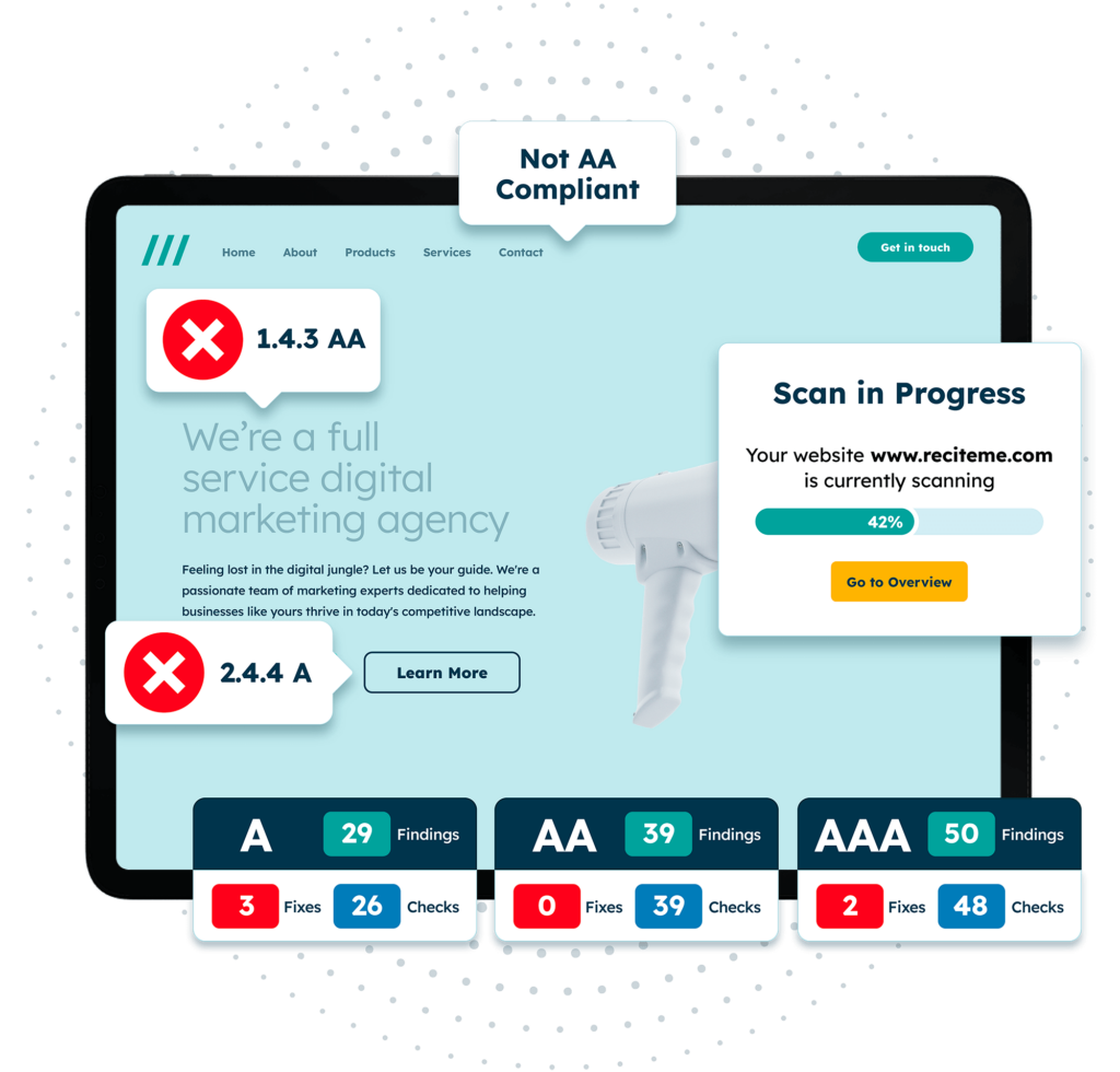
Finding accessibility issues is now easier than ever. Recite Me offers a free automated scan of your website’s homepage to highlight non-compliance. You’ll get recommendations on how to fix them, helping to improve your accessibility score.
Top 10 Best Accessibility Practices
There are numerous strategies you can employ to enhance the inclusivity of your website. However, the following top ten tips stand out as easily actionable changes that can make a substantial impact, especially for organisations just beginning their journey toward improved web accessibility.
1. Use Accessible Colour Contrasts
Low colour contrast between your web copy and the background makes it difficult for readers with vision impairments and neurodivergent traits like dyslexia to distinguish letters and words on each page. When planning your website colour palette, you should:
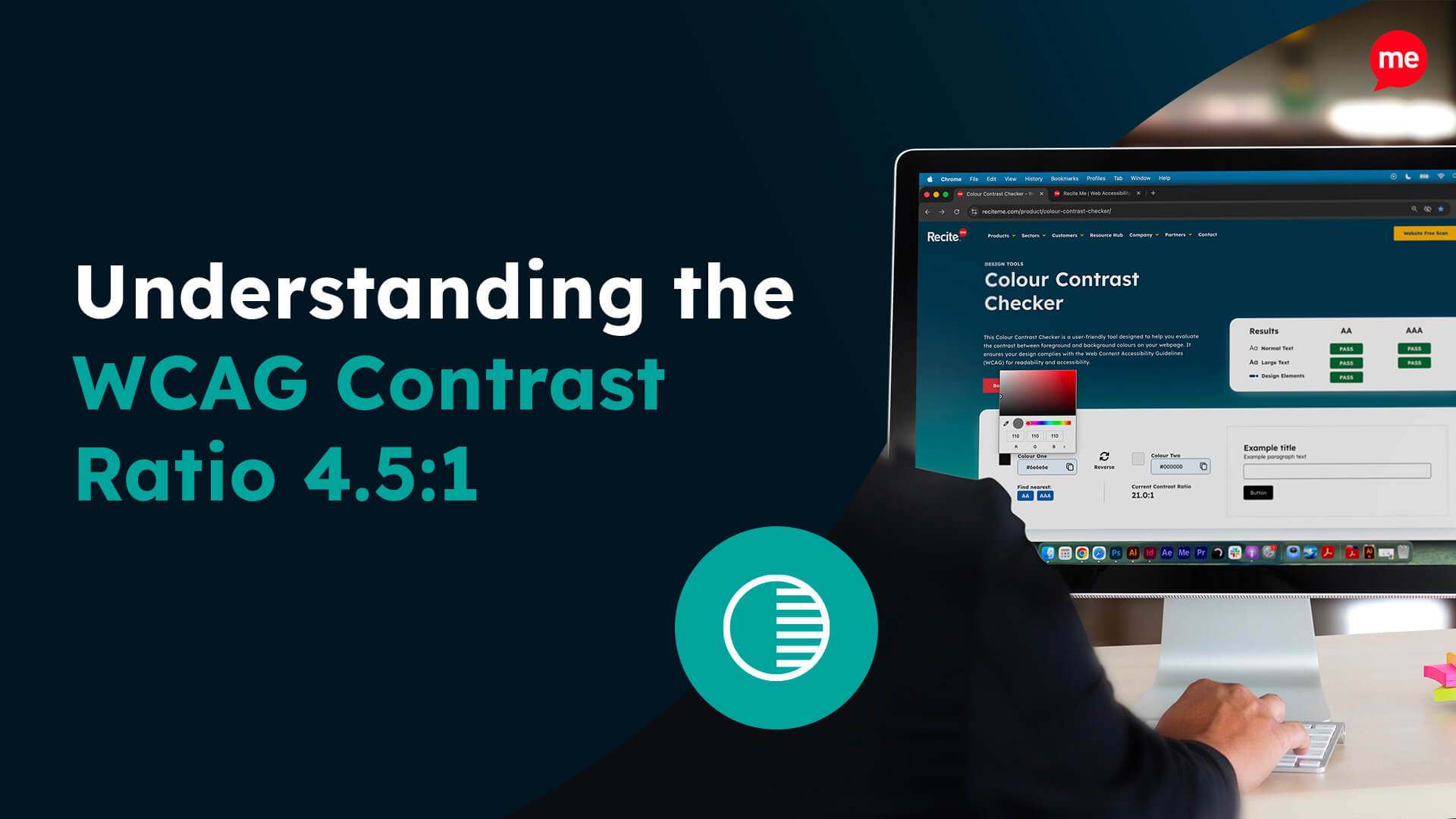
- Aim for a contrast ratio of 4.5:1 for normal text (14 point) and 3:1 for large text (18 point +), as per current WCAG recommendations.
- Utilise online tools like the WebAim Contrast Checker to check colour contrast compliance.
- Avoid grey scaling, even if it’s for a just cause.
2. Avoid Using Colour to Convey Information
Relying on colour alone to indicate meaning excludes users with colour blindness and other vision impairments. Best practices for improved inclusivity include:
- Making links, buttons, and placeholder text easy to identify without relying on colour or having to hover over them with a cursor.
- Using patterns rather than single blocks of colour to denote different sections on visual displays like graphs and colour swatches.
- For images if no suitable alternative can be provided, ensure the image alt text properly describes the differences in colour with context to convey the missing information.
3. Ensure Keyboard Accessibility
Keyboard navigation is vital for users with temporary or long-term motor disabilities who may not be able to use a standard computer mouse or laptop trackpad. To optimise your website for keyboard navigation, you should:
- Ensure all interactive elements are reachable and usable through keyboard input.
- Implement keyboard shortcuts for essential functions like submitting forms and accessing the search bar and settings features.
- Test your website using only a keyboard to identify and resolve any remaining navigation issues.
4. Ensure Form Fields are Accessible
Website visitors using screen readers and other assistive technologies often encounter difficulties with poorly designed web forms. To ensure everyone can understand and submit your online forms, you should:
- Use text or symbols like asterisks to denote required fields.
- Provide clear instructions and error messages to help people correct errors.
- Provide text input alternatives to inaccessible content, such as date pickers.
- Provide options to extend time limits for form completion.
5. Provide Descriptive Anchor Text
Descriptive anchor text is essential as it provides context and aids comprehension for users relying on screen readers and those navigating without visuals. Consider these critical criteria for writing more inclusive descriptive text:
- Use descriptive and concise anchor text that clearly indicates the link’s destination.
- Replace generic phrases like “click here” or “read more” with action-oriented anchor descriptions that describe the user’s next steps, such as “explore our services” or “download the guide.
- Ensure anchor text is unique across your website to avoid confusion that may result from duplication.

6. Provide Alt Text on Images
Images should contain descriptive alt text that provides accurate context for people who cannot see the image clearly – whether due to visual impairments or poor internet connectivity, etc. To improve the calibre of the information that accompanies images, you should:
- Use text that is specific and accurately conveys the content and purpose of each image.
- Avoid ‘stuffing’ alt text with keywords if they do not apply to the image.
- Increase the opacity of images where text is overlaid to make it readable.
7. Use Interactive Elements that are Easy to Identify
Clear and distinguishable interactive elements enhance usability for all users, and particularly those with cognitive or visual impairments. To make your website usable by everyone, you should:
- Ensure status indicators and interactive elements like toggles or checkboxes have clear visual cues aside from colour – like shape or size adjustments.
- Test all interactive elements with keyboard navigation to confirm accessibility.
- Ensure touch-targets are large enough so that they can be easily clicked on all device types.
8. Ensure All Text is Readable
Ensuring readable text is a fundamental aspect of web accessibility. Font size, typeface, and spacing can significantly impact user comprehension. To optimise text readability, you must:
- Use a font size of at least 16px and ensure that text can be zoomed to 200%, as per WCAG recommendations.
- Use dyslexia-friendly fonts like Lexend that reduce visual stress for readers.
- Avoid double spacing that can cause ‘rivers’ of white between words that impact readability for those with neurodivergent brains.
9. Provide Audio Alternatives
Individuals with hearing difficulties and people who visit your website in noisy environments often can’t hear audio elements sufficiently. Plus, many mobile users watch videos on silent mode during their breaks and commutes. So, ensuring alternative formatting on multimedia content is essential for good video accessibility. Make your audio online content accessible by:
- Providing closed captions and transcripts on all videos.
- Ensuring all accompanying text is accurate and well-timed.
- Ensuring sound is easy to turn on and off in-video.

10. Utilise Hierarchal Headings
When webpages are not formatted using proper headings to denote structure, it’s hard for site visitors – especially those using screen readers – to skim/scan each page to gain an overview of the key information. For this reason, and to abide by established SEO best practices, it’s recommended you:
- Use only one H1 per page, usually for the page title.
- Break the rest of the copy up with H2-H6 tags with subheaders that reflect the structure and hierarchical sequence of the content.
- Avoid using headings for formatting purposes. Use appropriate markup instead.
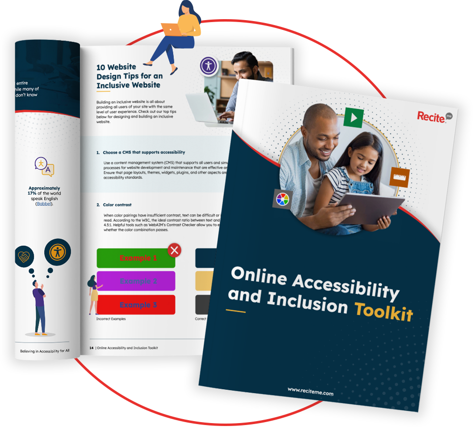
Our 40-page Digital Accessibility & Inclusion Toolkit helps businesses break down online barriers and make a real impact. It offers practical advice on all aspects of digital accessibility, from writing an accessibility statement to accessible website tips and inclusive hiring.
How Recite Me Can Help Your Business Become More Accessible Online
Recite Me has made a global commitment to making the internet a more accessible place for everyone. Our innovative suite of accessibility on-demand tools makes websites accessible and inclusive for a diverse range of people.
The Recite Me Accessibility Checker
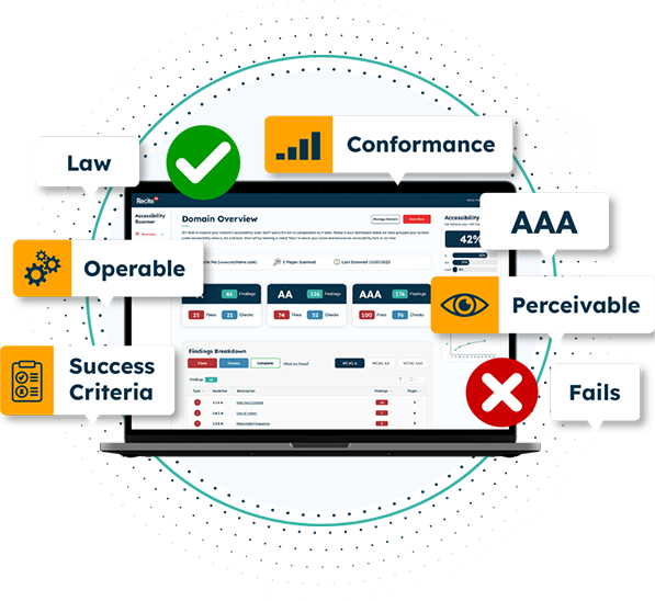
The Recite Me Accessibility Checker audits back-end and front-end web development processes by running 396 separate compliance scans in line with WCAG 2.1 and breaks down the issues you should be working to fix. The methodology follows a simple four-step process to help you increase your accessibility score:
- Step 1: Scan Your Domains
- Step 2: Identify Accessibility Issues
- Step 3: Fix Accessibility Errors
- Step 4: Track Your Progress
The Recite Me Toolbar
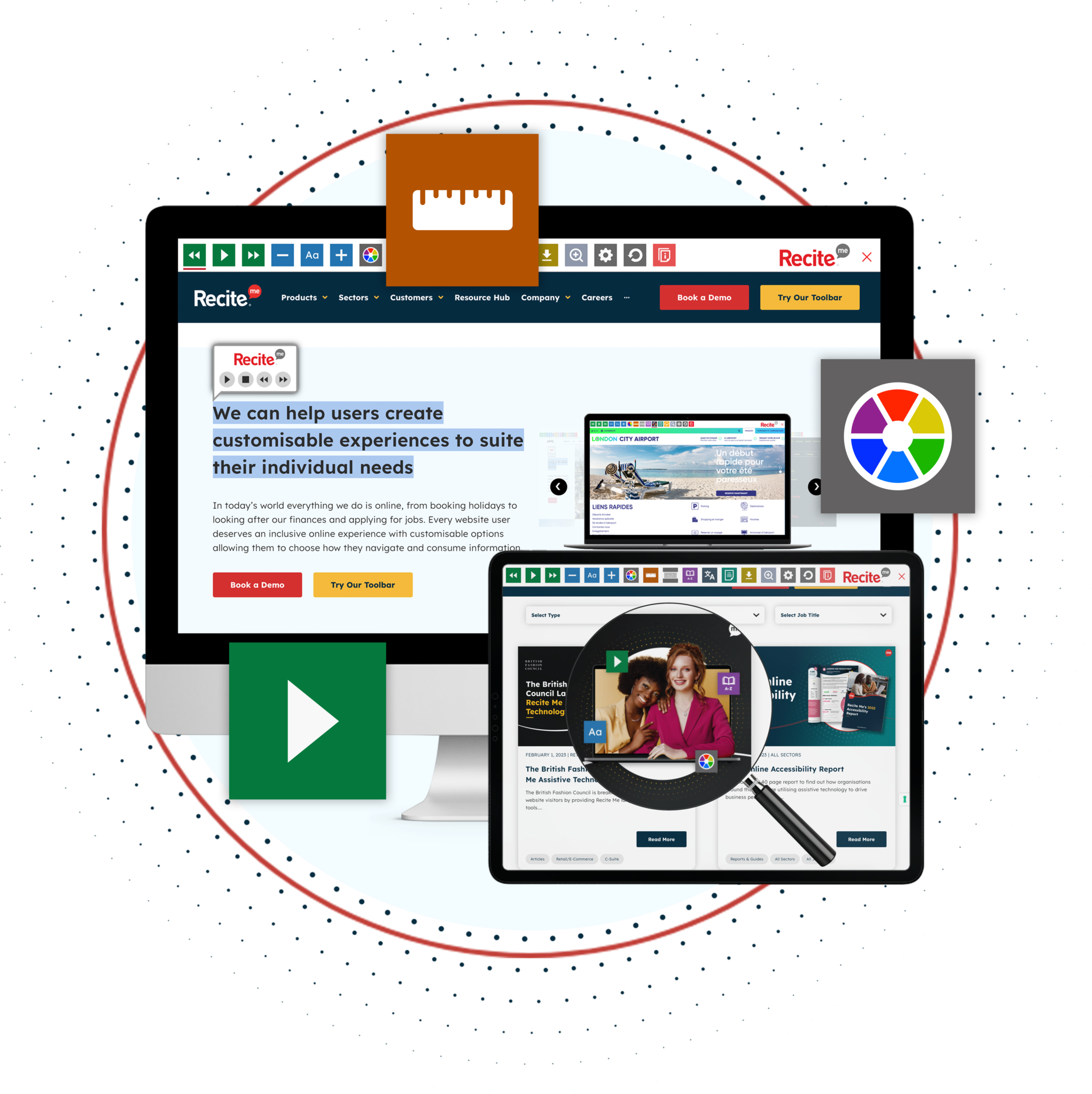
The Recite Me Toolbar tackles individual usability issues by allowing end users to access your website per their unique needs and preferences. Users can make singular or multiple adjustments, including:
- Personalising font size, type, and colour options to make each web page easier to read.
- Utilising the mask screen tool, which isolates parts of the page to help with focus.
- Using the ruler tool to make reading easier.
- Downloading content as an audio file as an alternative to reading.
- Converting page content into over 100 different on-screen languages.
- Having the page read aloud in a choice of 65 different languages.
- Customising PDF documents and have them read aloud or translated.
Want to know more about WCAG standards, web accessibility legislation, or how to best implement this list of website accessibility best practices? The Recite Me team is on hand to help you on your mission to provide more inclusive online experiences.
Contact us for a friendly, informal, and obligation-free consultation today!

