Get A Free Accessibility Test Of Your Website
Download NowWith around 1 in 5 people being classified as disabled, the need for accessible websites remains an important issue. This is where website accessibility testing becomes an important factor for business and website owners. Especially as regulation and accessibility laws continue to advance. This guide aims to teach you exactly how to test a website for accessibility.
Why web accessibility tests are important
At Recite Me we believe web accessibility is important for three core reasons. Firstly, it’s the right thing to do. From a moral and ethical standpoint, accessibility for everyone is the right way to approach web design.
Secondly, it makes business sense, disabled users represent a significant percentage of the population. So, having an inaccessible website means you’d be losing out on potential customers and revenue.
Lastly, making your website accessible is the right thing to do from a legal point of view. With an increasing demand for websites and businesses around the world to meet different accessibility standards, including WCAG.
The best way to test a website for accessibility
Using a website accessibility checker to automatically scan your website for problems, is by far the best way to test your website for accessibility. At Recite Me we have our own accessibility checker that provides useful information. By highlighting accessibility issues and making suggestions on how to resolve them efficiently.
The software is used to evaluate the core principles of the WCAG guidelines and highlight any areas where your website may be in breach. After your first check (and each subsequent scan) the tool will provide you with an accessibility score.
The score can be increased gradually, with each accessibility fix you implement, until you’ve reached 100% web accessibility. All of this data is sharable too, it can be exported into a report and shared with team members, colleagues, customers and friends. Letting you showcase your journey to digital inclusion.
How to manually test a website for accessibility
While a checker is the best tool for assessing web page accessibility, it’s not always everyone’s first choice. Some people prefer to do it the old fashioned way. Below you can see some of the most important tests to run when checking if a website is accessible.
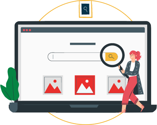
Check Images & non-text multimedia for Alt Text
Alternative text tags or descriptions are an important feature of websites with good web accessibility. They help users with visual impairments as the Alt Text attributes are helpful to understand the context implied by images or non-text media. As the alt text can be read by their screen readers, allowing such assistive technologies to work efficiently to provide context to the reader.
If an image does not have alt tags, then the screen reader will either completely ignore the image or read the file name. This often results in a lot of confusion and/or information and context being lost.

Alt Text is also a ranking factor in search engines such as Google, this makes it a critical aspect of a website’s Search Engine Optimisation strategy. It allows search engines to read and understand the purpose for the image, allowing it to be ranked in result pages accordingly.
Test Colour Contrast Ratios
There are various colour contrast checkers that will allow you to input specific text and background colours to test their contrast ratios. Alternatively, the calculation can be done manually using the following formula: (L1 + 0.05) / (L2 + 0.05), where L1 and L2 represent the relative luminance values of the foreground and background colours, respectively. The contrast ratio should meet or exceed the minimum ratio specified by the accessibility guidelines.
Checking your website has the right colour contrast displayed is important for users who have visual impairments and low vision. When testing colour contrast, it’s essential to consider different scenarios, such as various types of content, different screen sizes, and the use of colour in interactive elements like buttons or links. Aim for a colour palette that ensures readability and accessibility for all users.
Keyboard access
Many users, such as those with visual impairments are not able to use a mouse and rely on using a keyboard to access the web. This accessibility issue also impacts users with who experience mobility challenges such as different types of motor disabilities.
To test if your website is accessible to users who only have access to a keyboard there is a few different checks you can do:
- Test tab navigation, press shift + tab and observe to ensure the focus indicator moves along all interactive elements of the web page. Check that reverse tab navigation is also working correctly.
- When using tab navigation, test that these elements can be activated with the space or enter key. Ensure this triggers the expected outcome, visiting new pages, opening menus, submitting forms, etc.
- Check the navigation is compatible with a screen reader. Does the screen reader actually read out the different elements correctly?
- Test navigating and submitting forms on the website. Check to make sure all elements are fully accessible to the user via keyboard.
Site Zoom Functionality
One of the WCAG requirements is that all websites should be able to zoom to 200% without losing functionality or breaching any of the other accessibility guidelines.
Testing this yourself is very easy, simply hit ctrl and zoom your mouse in or manually select the zoom value from settings in your browser. When you’re zoomed in, ensure that all of the navigation elements and menus still work and provide full functionality. Make sure all tasks can be performed with only a mouse or only a keyboard.
Structured Web Headings
Headings are an important part of any web page, they have a huge impact on both SEO and Accessibility. They provide a structured overview of the article, highlighting sections and subsections to users.
Headings should follow a hierarchy when presented on web pages. There should only ever be one H1, followed by numerous h2, h3 and h4 in that order. An example of how this structure would look in practice can be seen below:
- Heading 1
- Heading 2
- Heading 3
- Heading 3
- Heading 2
- Heading 3
- Heading 4
- Heading 4
- Heading 3
- Heading 2
- Heading 2
To test your headings, simply review each page and ensure it follows a similar structure to the one above. Any text that looks like it forms a heading should be in the appropriate heading style. With only one h1 on the page, which should be the page’s title.
Check for Audio & Video Alternatives
Users who suffer from deafness or are hard of hearing are prevented access to audio based content such as podcasts. In addition to blind users or those who suffer from visual impairments being unable to access visual content such as videos.
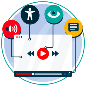
However, with written transcripts and captions, the content can be made accessible again. As blind users can benefit from screen reader accessibility to present the written transcript to them via audio. While the hard of hearing users can read the written transcript themselves to access all of the information.
These checks are relatively simple and self-explanatory. Start by checking if your website has written transcripts and audio descriptions for all videos and other multimedia content. Additionally, ensure the transcripts, captions and audio descriptions can all be accessed via the keyboard. If implemented correctly all of these strategies will boost your video accessibility.
Test for Flashing content
There are a number of different WCAG guidelines and regulations surrounding flashing, moving and blinking content. This is to ensure the safety of users who suffer from photosensitive epilepsy.
When accessing a website for this accessibility guideline, users will want to check for the following cases:
- Is there moving, blinking or scrolling media that automatically starts and is longer than 5 seconds. Ensure there is a way to stop or hide this type of media.
- Is there any automatically updated data such as current price trends? Ensure there is a way to hide, stop or pause this information.
- Is there any content that blinks or flashes more than three times in a single second. If so, consider removing file type or making it WCAG compliant.
Free Accessibility Test of your Website
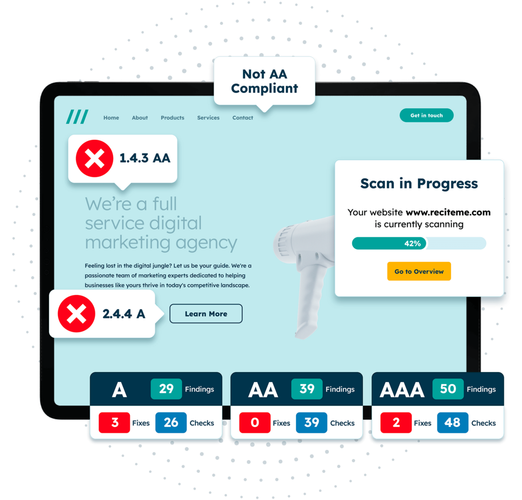
Finding accessibility issues is now easier than ever. Recite Me offers a free automated scan of your website’s homepage to highlight non-compliance. You’ll get recommendations on how to fix them, helping to improve your accessibility score.
A journey to accessibility for all
We hope you’re able to make use of these accessibility tests and use them to make your website more accessible. If you want to go one step further, you can consider adding assistive technology to your website, such as the Recite Me Toolbar. If you’re interested to learn more about how this technology can benefit you, then book a demo today.


