Around 1.3 billion people globally live with a disability, making inclusive design essential for ensuring equal access to online content, services, and experiences. But creating a website that’s accessible to everyone isn’t just the right thing to do. It’s also a legal obligation.
No matter what sector or industry your organisation operates in, following web accessibility best practices helps you reach more users, improve SEO, reduce legal risk, and demonstrate your commitment to social responsibility.
Here’s a list of essential Dos and Don’ts to help get you started.
The Dos: 10 Best Practices for Inclusive Web Design
An inclusive website doesn’t just meet technical standards. It actively supports diverse user needs and preferences. Following these best practices will help ensure your website is usable, perceivable, and operable for everyone.
Do Use Clear and Consistent Navigation
People using screen readers or keyboard navigation rely on predictable structures to understand and move through your site.
- Keep navigation simple, logical, and consistent across all pages.
- Ensure menus are keyboard navigable and compatible with screen readers.
- Use visible focus indicators and breadcrumb trails to highlight precise location.
Do Make All Interactive Elements Keyboard Accessible
Whether due to a motor impairment, lifelong health condition, or temporary injury, some users cannot use a mouse or trackpad and rely entirely on keyboard input.
- Design elements with clear focus indicators that change visibly on hover and focus (e.g., outline, shape, or colour).
- Include a “Skip to main content” link at the top of each page to allow users to bypass repetitive navigation.
- Test that all interactive elements can be reached and operated using only the Tab, Arrow, and Enter keys.
Do Use Semantic HTML and Proper Headings
Semantic structure ensures that content is interpreted correctly by assistive technologies, improving both accessibility and usability.
- Only use one H1 per page (usually the page title).
- Subheadings should follow a descending order with H2 tags, further nested with H3 and H4 tags as needed.
- Follow a logical heading order, apply heading tags for structure, not just visual appearance.
Do Use Plain Language and Easy-to-Read Fonts
Clear, readable content supports users with cognitive disabilities, learning difficulties, or lower literacy levels.
- Choose a dyslexia-friendly font.
- Keep language simple and concise.
- Use a base font size of at least 16px.
Do Provide Clear and Consistent Link Text
Users of screen readers often navigate by jumping from one link to the next — vague or duplicated link text makes this confusing and inefficient.
- Use descriptive link text that clearly indicates the destination or purpose (e.g., “Download our annual report” instead of “Click here”).
- Keep link styling consistent.
- Ensure that links are visually distinct from surrounding text, even when hovered or focused.
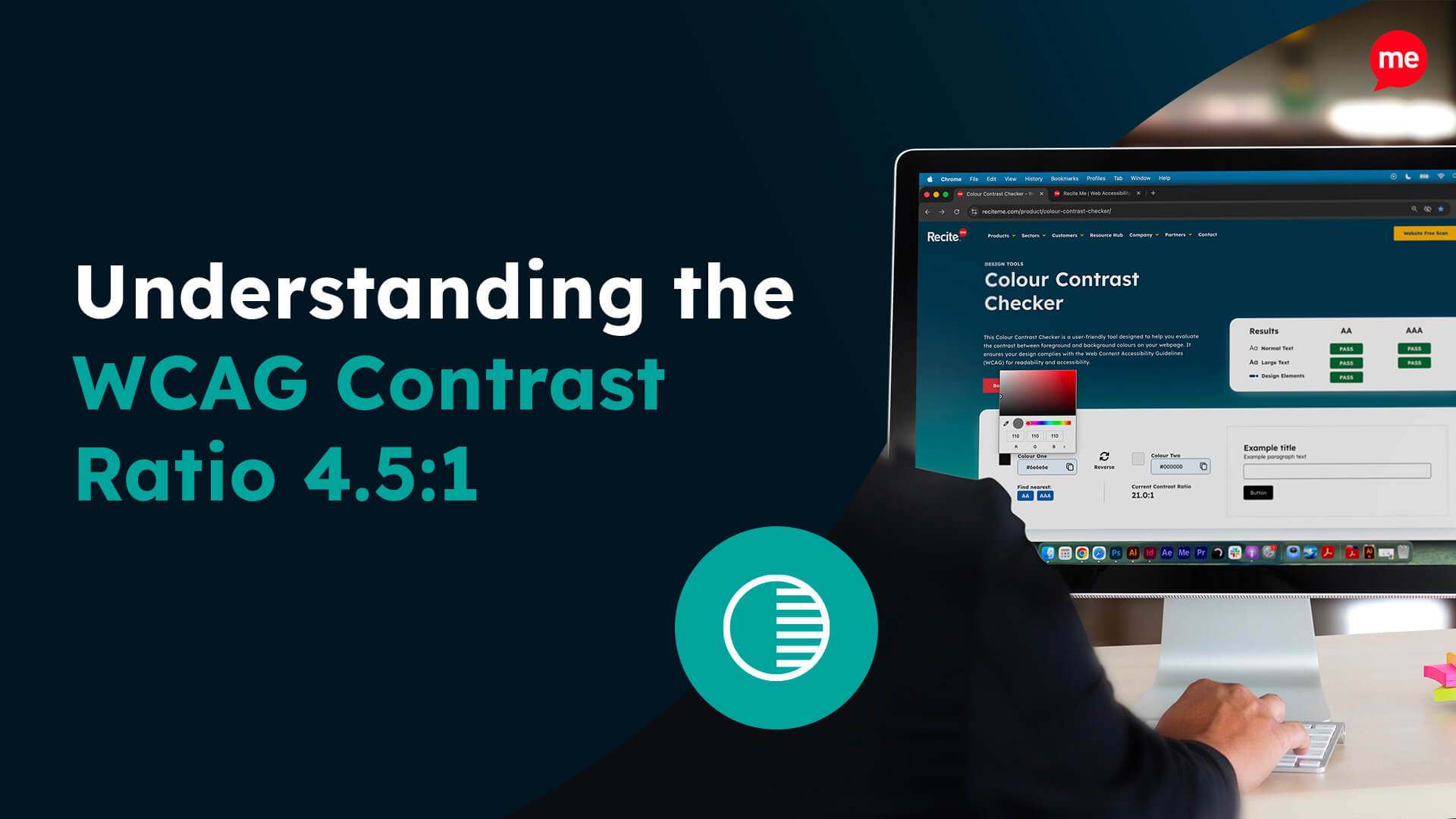
Do Ensure Sufficient Colour Contrast
Low contrast makes content difficult or impossible to read for users with vision impairments, colour blindness, or screen glare.
- Choose a colour palette that is accessible to color blind users.
- Use contrast checkers to meet the minimum WCAG 2.1 AA ratio of 4.5:1 for normal text, and 3:1 for large text (18pt+ or 14pt bold).
- Use a solid background colour or overlay to ensure the text remains legible when placed over images.
Do Provide Meaningful Alternative Text Descriptions
Alternative text allows users who are blind or visually impaired to understand the purpose of visual content.
- Write descriptive alt text for all informative images, icons, and graphics.
- Use empty alt text (alt=””) for purely decorative images so they’re ignored by screen readers.
- Provide text alternatives or summaries for logos, charts, and infographics.
Do Make Multimedia Content Accessible
Audio and video content should be inclusive to users who are deaf, hard of hearing, or have cognitive processing challenges.
- Provide accurate closed captions for all videos.
Offer written transcripts for audio-only content and videos. - Ensure media players include accessible controls for play, pause, volume, and full-screen mode.
Ensure a Responsive and Zoom-Friendly Design
Users with low vision, screen magnification tools, or mobile devices need content that adapts without breaking layout or usability.
- Design layouts that respond fluidly to different screen sizes and orientations.
- Allow users to zoom up to 200% without content clipping, overlapping, or requiring horizontal scrolling.
- Use flexible units (like em, rem, or percentages) for text and layout spacing.
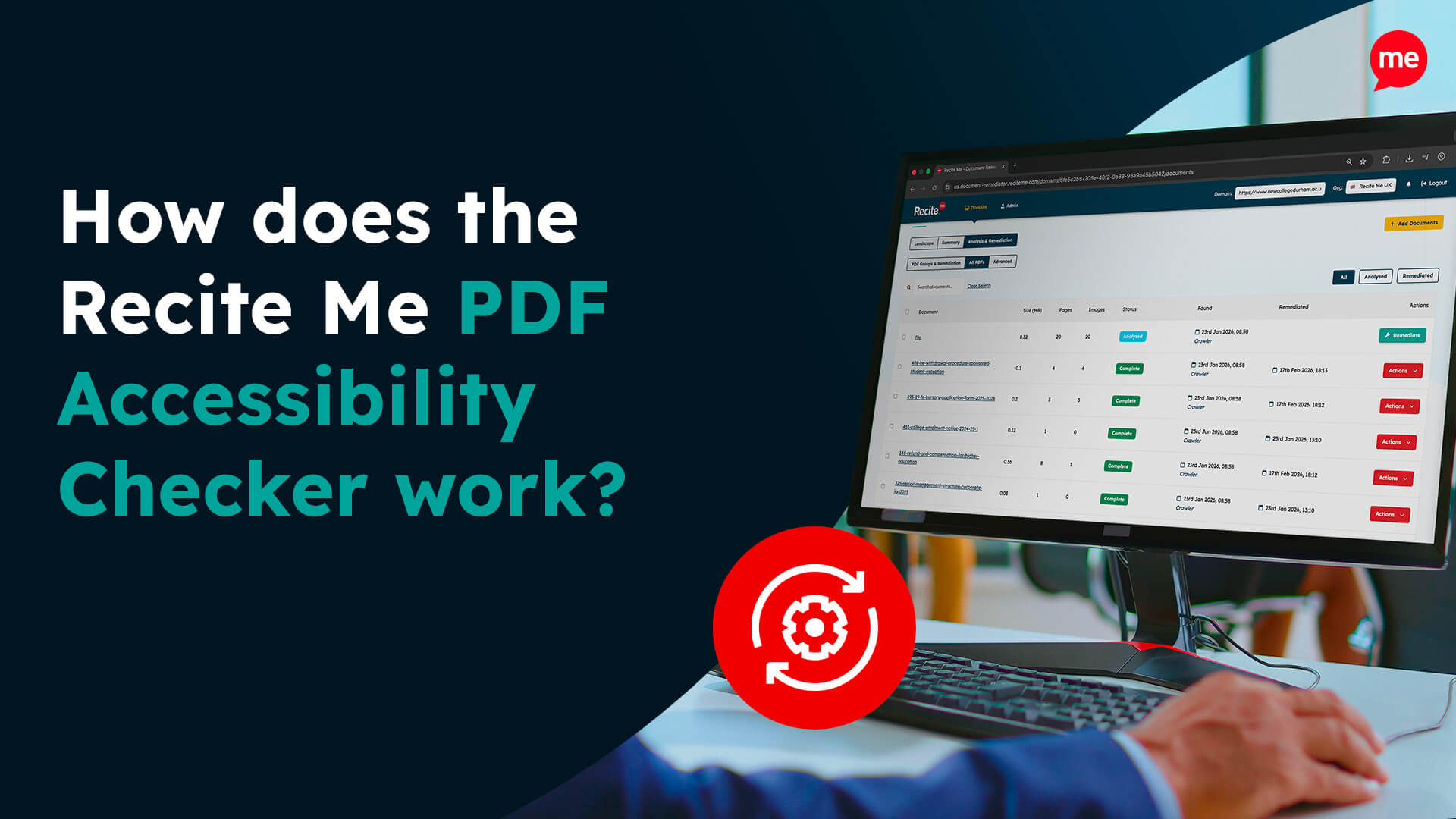
Do Test Accessibility Thoroughly
Thorough testing helps identify issues using a range of techniques, ensuring your website is truly usable for everyone.
- Use both automated tools (like the Recite Me Accessibility Checker) and manual testing.
- Involve users with disabilities in usability testing to uncover real-world usability barriers that may otherwise go unnoticed.
- Test your site using mobile screen readers to ensure compatibility across devices.
The Don’ts: 6 Common Accessibility Mistakes to Avoid
Even with the best intentions, your design and development choices can unintentionally exclude users. Here’s a list of common pitfalls to avoid.
Don’t Rely on Colour Alone to Convey Meaning
Colorblind users may not be able to distinguish between red and green indicators.
- Never use colour as the only indicator for meaning in charts, status messages, or buttons.
- Avoid grey scaling, even if it’s for a just cause.
Don’t Auto-Play Audio or Video
Unexpected audio can confuse, distract, or disorient users, especially those using screen readers or assistive tech.
- Avoid setting media to play automatically when a page loads.
- Never rely on visual elements alone for important information or contextual clues.
Don’t Use Images of Text
Text embedded in images can’t be resized, read aloud, or translated by assistive technology.
- Never use images as a substitute for actual text when conveying important information.
- Avoid decorative banners or buttons with embedded text unless accompanied by accessible alt text.
Don’t Overuse Animations or Moving Content
Flashing, blinking, or constantly moving elements can overwhelm users or even cause physical reactions.
- Avoid using auto-scrolling carousels, background motion, or parallax effects without user control.
- Never include flashing content that could trigger seizures (i.e., more than three flashes per second).
Don’t Block Assistive Technologies
Some overlays or code-level decisions can interfere with screen readers or keyboard access.
- Never use scripts or widgets that override browser or assistive technology behaviour (e.g., disabling zoom, custom focus handling).
- Avoid locking content behind mouse-only interactions or inaccessible modals.
Don’t Forget Form Labels and Error Feedback
Forms that aren’t clearly labelled or validated create barriers to completion.
- Don’t rely solely on placeholder text for instructions that disappear when users type.
- Never omit accessible error messages or visual cues when a form submission fails.
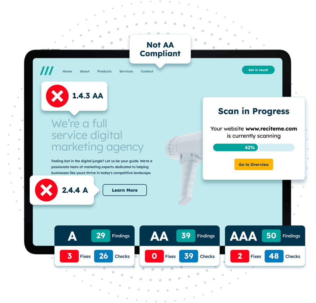
Get a free automated accessibility check of your websites homepage. This will identify and highlight any compliance issues on your website. Followed by recommendations on how to implement the necessary changes to make your website more accessible.
Start Small. Think Big. Stay Inclusive.
By following these simple Dos and Don’ts, you can make significant strides toward building a more inclusive digital space for everyone. But improving accessibility isn’t about achieving overnight perfection. It’s about progress. Every small fix, no matter how minor, can make a difference.
Want to know how your website stacks up? Run a free accessibility check of your site today, or contact our team of experts to find out more about how we can help.