Get A Free Accessibility Check Of Your Website
Download NowWhen designing a website, accessibility should be high on your list of priorities. Not only is it the right thing to do from an ethical standpoint. But, people with disabilities represent around 1 in 5 of the total population.
This shows that if you’re not able to provide accessibility tools for all on your website, you’re going to miss out on a significant chunk of revenue. Despite this, there are still many websites that are neglecting accessibility features. This guide will show you exactly how to make a website accessible.
How to make your website more accessible?
There are a few different methods that can be used when looking at how to make website accessible. All of which can be found here at Recite Me. Let’s take a look at these solutions below.
Accessibility Checker
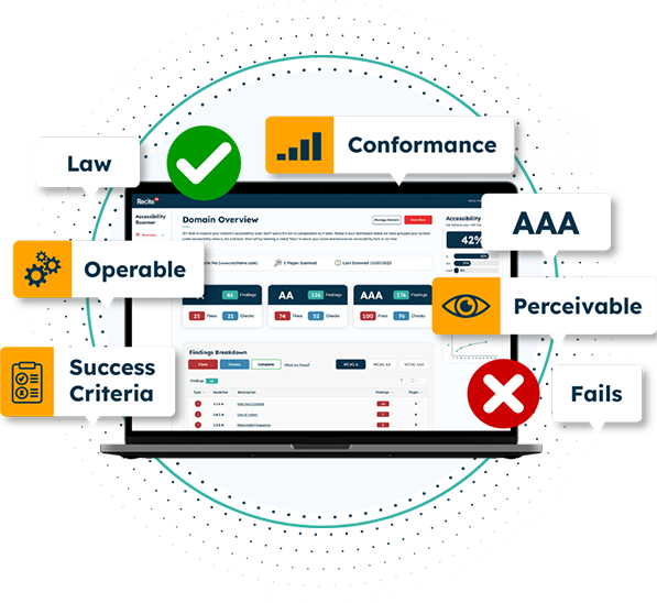
Recite Me offers a free accessibility checker, which can be used to highlight any existing problems with your website.
The software can be used to evaluate a range of different compliance and regulation issues, including WCAG accessibility standards. The tool can be used to pin-point specific on-site accessibility issues and provide an explanation of how to implement the necessary changes to make your website more accessible.
You’re able to see an overall website accessibility score after each check. Which allows you to see a visual representation of the progression your website goes through. This data, along with other information can be exported into a report and shared, letting you showcase your digital inclusion achievements. The perfect tool to use on your way to following web content accessibility guidelines.
Accessibility Toolbar
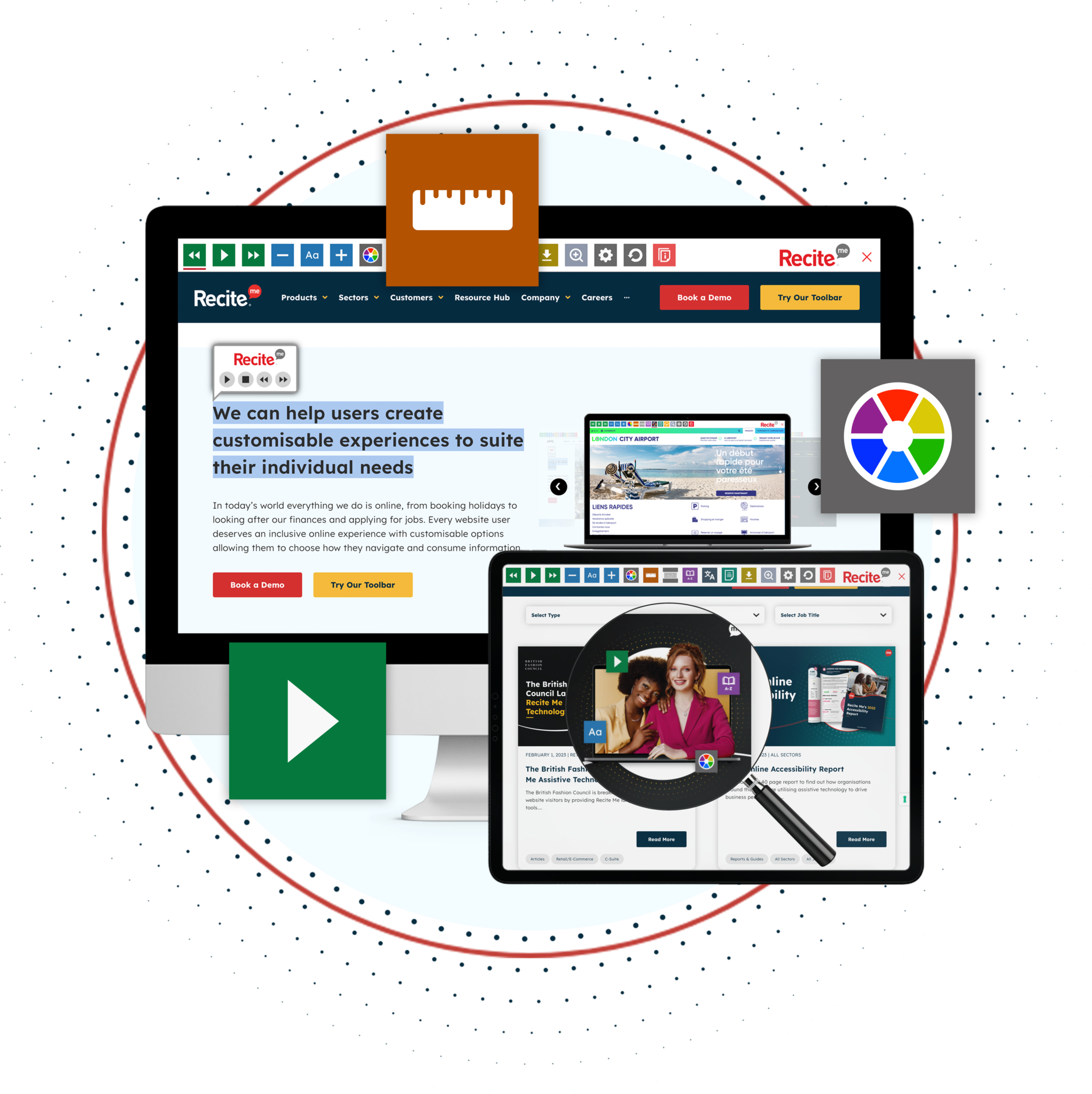
The Recite Me assistive toolbar provides a range of important benefits for users with disabilities. It allows users to fully customise the web page based on their accessibility needs.
Some of the assistive technologies used include an accessible screen reader, language translator, styling & customisation, reading aids and more. Websites with the Recite Me toolbar will also get a monthly report, allowing you to track the usage of the tool and see the impact it’s having.
The Toolbar is available on a variety of website builders. If you’re interested in learning more about our toolbar and how it can help you meet your business goals, then book a demo today.
Guide to creating an accessible website
Having your websites content accessible to everyone, including people who suffer from specific disabilities is becoming increasingly more important. You’re able to do this by implementing assistive technologies and following some very simple steps. Below is a web accessibility checklist of a few important issues to consider when trying to make your website accessible.
Keyboard Navigation
Blindness and visual impairments can prevent users from being able to use a mouse to navigate websites. Therefore, Keyboard Navigation is critical for users that are not able to use a mouse efficiently.
Users should be able to navigate to key areas of the website with just the keyboard, including:
URLs
Menu Items
Anchor Text
Drop-downs
Widgets
Form Fields
Buttons
Dialog Boxes
To test this accessibility standard, hit the tab key on your website. This should allow you to jump to different areas on the page without using the mouse.
High-contrast Colours
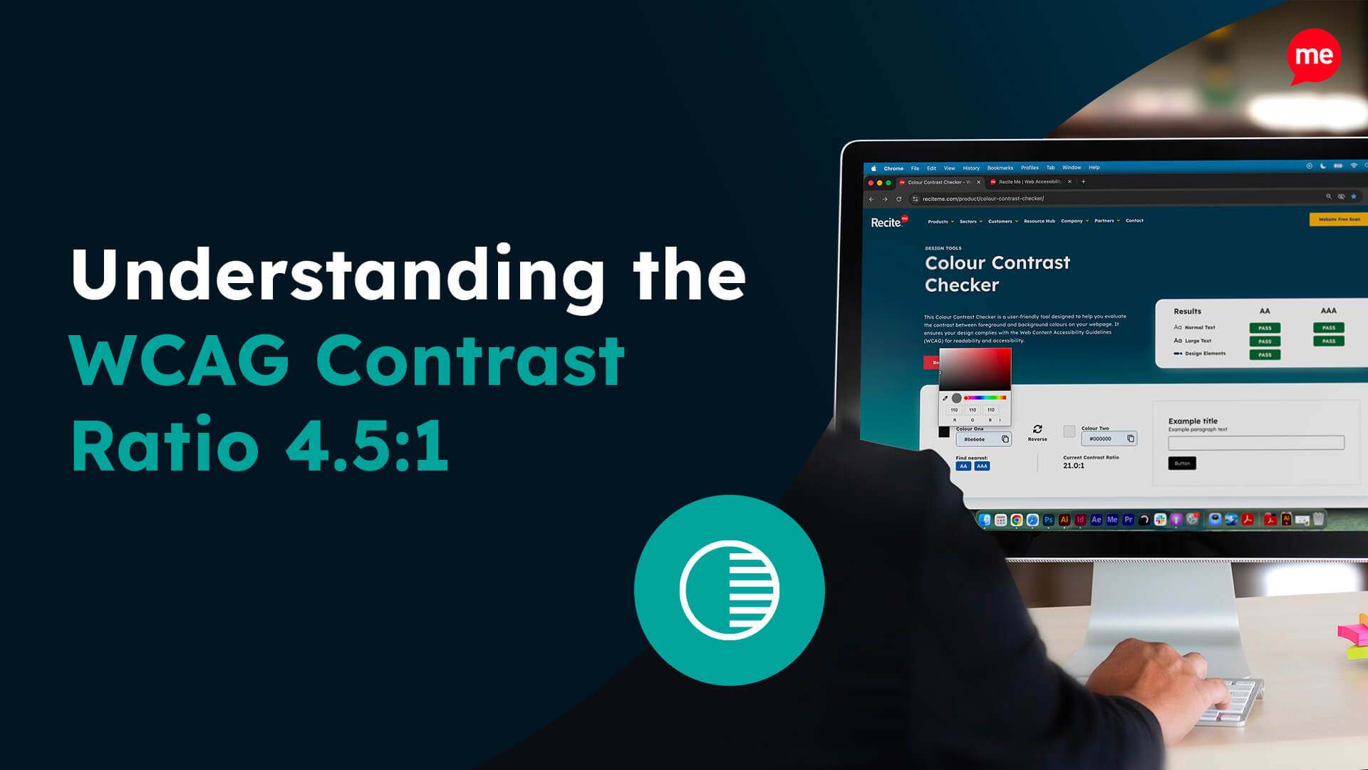
If the colour contrast on the website is low then your users may have a hard time reading text. You should always aim to have your text pop out from the page visually and not blend into the background. This makes it easier for users that suffer with low vision or any type of vision impairments.
Some of the best colour contrasts to use for this include black and white or black and yellow. You want to avoid using hard to read colours such as green text on a red background.
If you have any call to actions on the page, then you’ll likely experience an increase in click-through rate, as a result of maintaining a high colour contrast.
Image Alt Text
Images can often present an issue for blind users or users with visual impairments. As these users will frequently use screen reader software, which does not have the ability to read images or the text in an image.
Instead the screen reader will read out the data assigned to the Image’s Alt Text. If there is nothing added to the Alt Text, then the reader can’t provide the user with the necessary context and information that the image provides.
Additionally, it is important that the Alt Text is added in a descriptive manner. This allows the end user to have as much information as possible about the image. The Alt attribute can be used for brief descriptions, while “longdesc tag” is used for descriptions that are longer in length.
Descriptive URLs
Descriptive URLs are important for screen readers and are beneficial for blind and visually-impaired users. Website owners should ensure the URL describes exactly what the web page is about in a short, clear and concise manner.
Let’s look at the URL for this page and what a bad example would look like.
High Readability: /how-to-make-a-website-accessible
Low Readability: /how-to-make-a-website-accessible-with-a-range-of-different-features-to-try-out-and-implement-on-your-site
The same can be said when looking at anchor text like “read more” or “click here” on the page. It’s better to use anchor text that describes the purpose of the page. For example “making an accessible website” “make a website accessible” “website accessibility checklist” etc.
Additionally, any links found inside of images should have descriptive Alternative Text added.
Provide accessible videos and multimedia
Videos and other visual media present different potential issues for different types of vulnerable users.
For example, users who are deaf or hard of hearing may not be able to enjoy videos in the same way as other users. To make video files more accessible on your website it will be important to add captions and text transcripts. This allows the reader to still have access to the content being spoken about in the video.
Alternatively, users who are blind or experience visual impairment may miss out on visual aspects of video content that provides context. This could be imagery, non-verbal gestures or setting changes. Audio descriptions can be added to describe these different factors, along with other potential scenarios.
However, it’s important to only add audio transcription for essential pieces of information. To ensure the user isn’t overloaded with an endless list of irrelevant information.
Appropriate Headings
Properly structured headings in a hierarchical order is another important accessibility issue. In the back-end of your website these will be classed as H1, H2, H3 and so on.
Using them correctly to structure content makes it easy to digesting each web page easy. Additionally, they allow screen readers to make sense of your web page, by providing navigation and outlining different sections of the content.
There should only ever be one H1 on the page, this represents your title. Other headings should be done in a hierarchy order, so H2s come after the H1, followed by H3 and H4 (if necessary). In general, the bulk of your headings will either be in H2 or H3, with some rare instances where H4 will be appropriate.
Ability to enlarge Font Size
Enlarging font size is crucial for web accessibility as it directly impacts the readability and usability of a website for various users. Many individuals, such as those with visual impairments or age-related vision changes, rely on larger fonts to comfortably read online content.
The most accessible websites will allow users to increase and reduce font size based on their preference. This is possible with specific software such as the Recite Me assistive technologies toolbar. The ability for users to increase the font size on CTAs should also in theory have a positive impact on click-through and conversion rates.
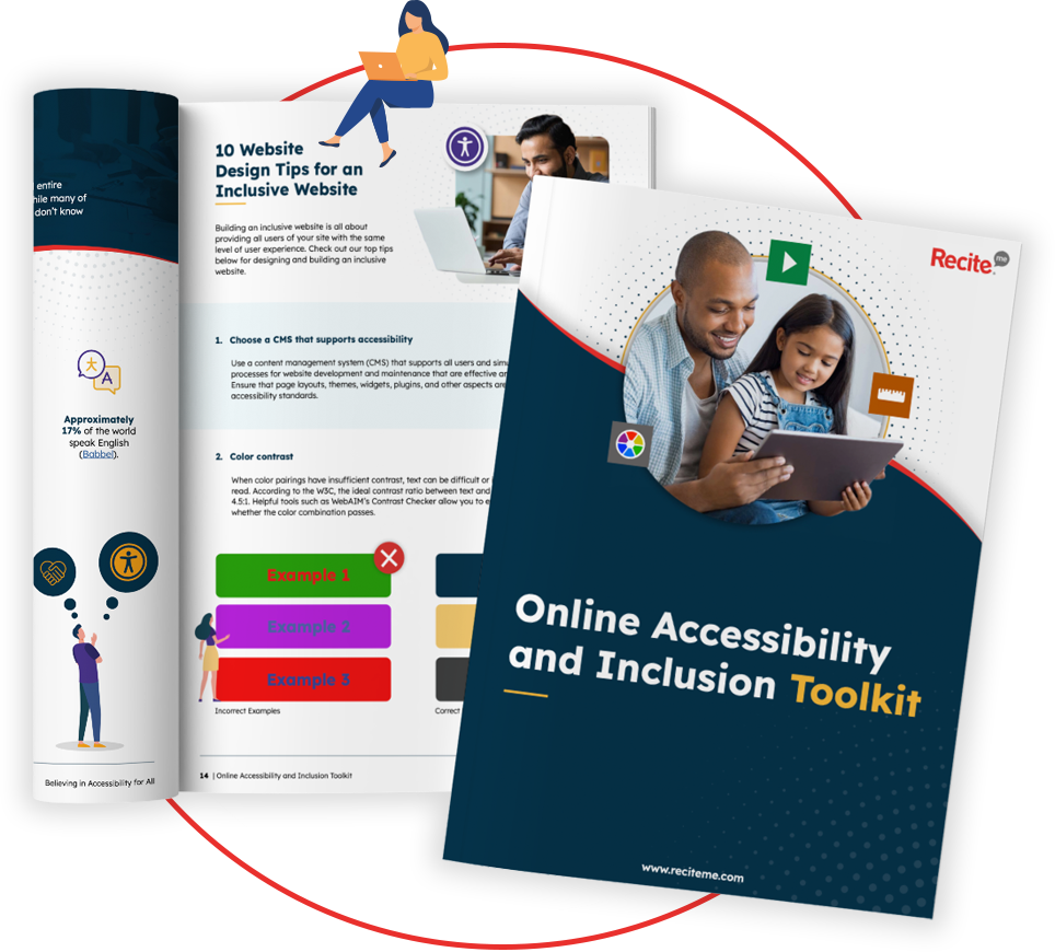
Our 40-page Digital Accessibility & Inclusion Toolkit helps businesses break down online barriers and make a real impact. It offers practical advice on all aspects of digital accessibility, from writing an accessibility statement to accessible website tips and inclusive hiring.
The importance of creating an accessible website
As you can see, building an accessible website is important not only from a moral standpoint, but also from a business perspective. With the online tools and software available in today’s world, it’s becoming easier and easier to implement these accessibility features, providing equal access to all.
This post has discussed just a few of the many important accessibility issues and how you can resolve them on your own websites. The sooner you get actioning them the better, don’t forget to use the Recite Me accessibility checker to help streamline the process.

