In the modern working world, where almost every exchange begins and ends in an inbox, the importance of email accessibility cannot be overstated. Just imagine crafting the perfect email marketing campaign, only to find that a significant portion of your audience are unable to engage with it. This guide will take you through the dos and don’ts of email accessibility so that your written communications are not just visually appealing, but can be read and understood by everyone, regardless of their disabilities or impairments.
Curious to learn how inclusive emailing can help your business succeed? Read on.
What is email accessibility?
Email accessibility refers to the practice of designing and crafting emails such that all recipients, including those with disabilities, can digest and understand the content. It involves reconsidering the way you structure your written content, its layout, text, images, multimedia, or any interactive elements.
Accessible emails take into account the needs of those individuals with visual, auditory, cognitive, or motor impairments by providing alternative ways to interact with and consume the content. The goal, like with all other forms of accessibility, is to ensure that no one is excluded from engaging with the information they wish to consume.

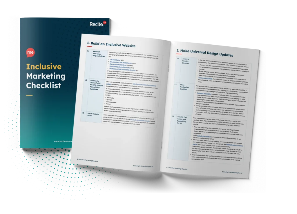
Download our Inclusive Marketing Checklist
Start your journey to inclusive with quick and actionable steps from our checklist!
Inclusive marketing doesn’t have to be complicated. This checklist breaks down everything you need to know to follow inclusive marketing best practices. Download your checklist today and get started right away.
Why is it important to ensure accessibility in email marketing?
Email marketing is a powerful tool for businesses, offering a direct line of communication with clients and prospects. However, if your emails aren’t accessible, you risk alienating a significant portion of your audience. Approximately 15% of the global population experiences some form of disability, and failing to consider their needs can lead to missed opportunities, damaged brand reputation, and even legal consequences.
While this is reason enough to start investing in email accessibility, it is important to remember that accessible emails improve user experience across the board, not just for those with disabilities. An email designed to cater for a range of different needs tends to be clearer, better structured, and easier to interact with, benefiting all recipients. What’s more is that spam filters tend to favour well-structured, accessible content, anyway. So, you can improve your email delivery rates while simultaneously improving the way you interact with your audience.
Top tips for creating accessibility email content
Taking your first steps towards accessible email communication can seem daunting if you don’t know where to start. Let’s simplify it, then. Perhaps the best approach you can take is to put yourself in the shoes of your audience, particularly those who experience some form of disability. What would improve their ability to view, understand, and digest your email content? If you always keep this in the back of your mind, you can never go far wrong. Below, we’ll explore key strategies to make your emails both user-friendly and inclusive.
Structure and content
The structure of your email plays a crucial role in making it accessible. A simple, logical layout with a clear hierarchy helps all users navigate your content more easily. This involves using consistent headings, short paragraphs, and bulleted lists to break up text.
For example, an accessible email might start with a heading, followed by a brief introduction, then a list of key points. Each section should be clearly labelled with headings that use standard HTML tags like <h1>, <h2>, and <h3>. This not only improves readability but also helps screen readers interpret the content correctly.
Descriptive hyperlinks are another important aspect. Rather than using generic terms like “click here”, you must describe the link’s destination or purpose, for instance, “explore our latest offers”. This provides much needed context to users of assistive technologies like screen readers. Without said context, users are left to determine hyperlink destinations from the limited info they have, often resulting in them avoiding clicking on the hyperlink altogether.

Images and graphics
Images and graphics are great for conveying information in a visual way, but they also present a handful of accessibility challenges if not set up correctly. So, how can you embed images in your email body such that they add, rather than detract, from your message?
Firstly, you must include alternative text (alt text) for any visual item. Alt text is a brief description, which is read aloud by screen readers, allowing visually impaired users to perceive the content of the image without needing to view it. However, for this to work effectively, your alt text must strike the balance between being concise and descriptive. Consider, for example, an image of a dog in a park. Alt text reading “Labrador puppy running against wind in open green park” paints a much clearer image than “dog in park”.
Secondly, any text overlaid onto an image should be used with caution. Text in images isn’t accessible to screen readers and can become distorted when scaled on different devices. If text must be used in an image, ensure it’s also included in the alt text so that it can at least be transmitted to the user via different types of assistive technologies.
Finally, keep in mind the importance of responsive design. This means optimising image sizes to display properly on various devices, such as mobile phones, tablets, and desktops. Given that over 36% of all email opens worldwide now take place on mobile phones, ensuring responsive design and strong mobile accessibility is something that cannot go amiss.
Text and typography
Text is the backbone of any email, the bread and butter if you will. So, ensuring it is readable is absolutely crucial. Readable text begins with choosing a clear, legible font, such as Arial, Verdana, or Helvetica, and avoiding overly decorative fonts that might be difficult to read for people with conditions such as dyslexia.
Font size is another key consideration. A minimum of 14px is recommended to ensure readability on various devices. Line height should be set at around 1.5 times the font size to create enough space between lines so that the eye does not have to strain.
Now, while almost every email template comes pre-set with black text and a white background, it is still important to understand the role of colour contrasts and how that plays into email accessibility. High contrast between text and background ensures text is easily distinguishable, so that important information can be perceived without issue. Imagine, for example, trying to read an extract of light grey text on a white background. This would be challenging for anyone, never mind those with severe, or even mild, visual impairments.
Colour and contrast
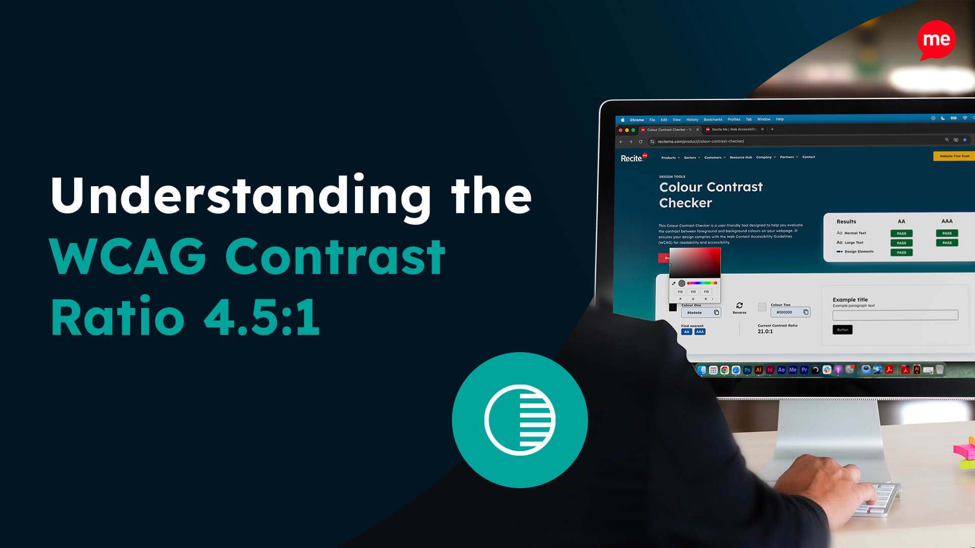
Colour is a powerful tool in design, but as mentioned earlier, when used improperly, it can create additional barriers for users with visual impairments. To ensure accessibility, always maintain a sufficient contrast ratio between text and background colours within your emails. The Web Content Accessibility Guidelines (WCAG) recommend a minimum contrast ratio of 4.5:1 for normal text.
You should also never rely solely on colour to convey a key message. For example, don’t just use red to indicate an error—pair it with an icon or text to ensure the message is clear to those who may not distinguish colours well. For example, highlighting an improperly entered form field in red does not clearly explain where or what the error is that needs to be addressed. Instead, opt for a message to the effect of, “Important action required! Email field missing “@” symbol”.
Multimedia content
Any multimedia content inserted into your emails, such as videos or audio files, must be made accessible. This might mean providing live captions for videos or transcripts for audio content. The purpose of this is to ensure that users with hearing impairments or those using screen readers can still access the information you send them
When embedding multimedia content, ensure that it’s in an accessible format which can be interpreted correctly by assistive technologies. This might involve adhering to HTML5 for videos — the latest version of the HTML standard for structuring online content — which is more universally supported across devices and browsers than previous versions.
Interactive elements
Forms, buttons, and other interactive elements are common in email marketing, but they need to be accessible to everyone. Start by ensuring that form fields are clearly labelled, so users understand what information is required. Labels should be directly associated with their corresponding input fields in the HTML code. For example, an email sign-up form with a “Name” field should, according to HTML5, use the <label> tag to clearly associate the field to its label. This ensures that screen readers can properly interpret the form, making it accessible to users with visual impairments.
Keyboard navigation is another important consideration when it comes to interactive email elements. Every element should be operable using a keyboard only, such that users can tab through various buttons or form fields without requiring a mouse. This is crucial for users with motor impairments who may not be able to use a mouse.

Responsive design
With the increasing use of mobile devices, especially for checking and responding to emails, responsive design is no longer a nice-to-have, but a must-have. A responsive email adjusts its layout and content to display optimally on different screen sizes, including smartphones, tablets, and everything in between.
This means that images need to be scalable and accommodate flexible widths, so that text and other elements resize appropriately according to the device being used at the time. Mobile-optimised emails should have larger buttons and touch-friendly design elements too, to cater for users navigating with their fingers instead of a mouse.
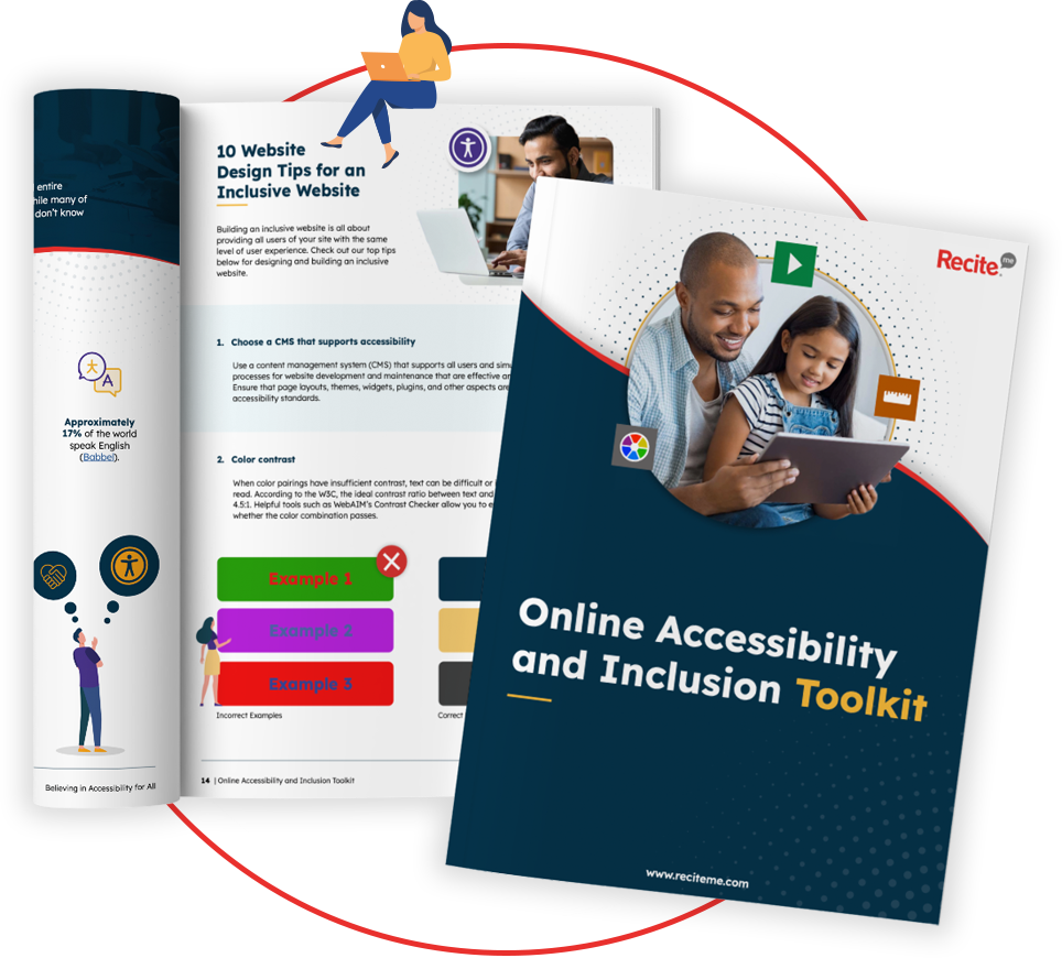
Our 40-page Digital Accessibility & Inclusion Toolkit helps businesses break down online barriers and make a real impact. It offers practical advice on all aspects of digital accessibility, from writing an accessibility statement to accessible website tips and inclusive hiring.

Accessibility legislation to consider in Australia
In Australia, businesses must consider both the WCAG and the Disability Discrimination Act (DDA) when ensuring email accessibility.
As in other regions of the world, the WCAG guidelines serve as the standard for making digital content accessible in Australia. These guidelines address a wide range of accessibility issues, offering corresponding success criteria to use as a benchmark for achieving accessibility.
The Disability Discrimination Act (DDA) is Australia’s primary legislation aimed at preventing discrimination against people with disabilities. Under the DDA, businesses are required to make their services accessible to all individuals, which encompasses email communications.
How can accessible emails benefit your marketing strategy
It is all well and good knowing how to make your emails accessible, or understanding which regulations you must comply with, but there is so much more that email accessibility can offer. Accessibility brings with it numerous business benefits, beyond mere legal compliance, opening up a world of marketing opportunities to you and your organisation:
- Wider audience reach: By making your emails accessible, you ensure that people with disabilities can engage with your content, expanding your potential audience.
- Improved user experience: Accessible emails are typically more user-friendly for everyone due to their clear structure, readable text, and intuitive navigation. This improves user recipients for all email recipients, leading to higher engagement rates.
- Better deliverability: Emails that are well-structured and free from accessibility issues are more likely to be recognised as legitimate by email clients and spam filters. This improves your delivery rates, ensuring that your messages reach their intended inbox.
- Enhanced brand reputation: Demonstrating a commitment to accessibility reflects positively on your brand, showing that your business values inclusivity and cares about the diverse needs of its audience. This ultimately strengthens customer loyalty and trust.
- Increased conversion rates: When users can easily access and understand your content, they are more likely to take the desired action, whether it’s making a purchase, signing up for a service, or engaging with your brand.
Importance of reviewing emails for accessibility before sending them to your outbox
Before hitting the send button, it’s crucial to review your emails for accessibility to ensure they meet the needs of all recipients. Manually checking your emails allows you to catch potential issues that automated tools might miss, such as unclear instructions, improperly labelled images, or content that relies too heavily on colour alone.
While automated tools can be valuable in identifying technical issues like missing alt text or insufficient contrast, they should complement not replace manual accessibility reviews. By combining both approaches, you can create emails that are not only technically accessible but also user-friendly and inclusive.
Taking the time to review your emails for accessibility ensures that your message is clear, comprehensible, and actionable for everyone in your audience. It’s a critical step in delivering high-quality, inclusive email communications.

Kickstart your accessibility journey with Recite Me
Act today to ensure your website is accessible and compliant with the latest WCAG standards. Get started on your website accessibility strategy by working through the following action points:
- Contact our team for more advice about WCAG standards and Accessibility best practices.
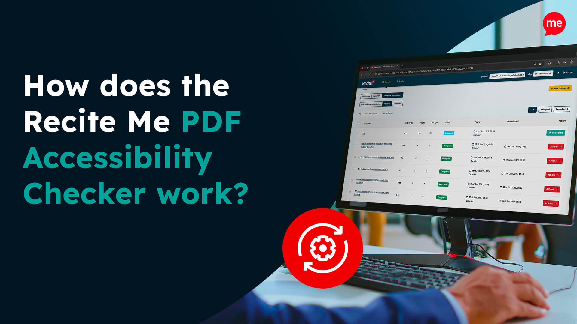
- Find out more about the Recite Me Web Accessibility Checker.
- Schedule a free demonstration to learn how our technology can help you.
- Run a free scan of your website for WCAG 2.1 AA compliance.
- Try our assistive toolbar on your website.


