Get Your Free Accessibility & Inclusion Toolkit
Download NowAttention deficit hyperactivity disorder (ADHD) is a widespread neurodevelopmental condition, affecting over 366 million adults worldwide. With so many people touched by the effects of ADHD, modern day businesses are obligated to accommodate them. While there are many ways to do this, implementing ADHD-friendly fonts throughout your web pages is perhaps the most high-leverage solution you can opt for. These fonts offer a quick win by making impactful, minimal effort adjustments, which reduce cognitive load and help ADHD users relax. In this article, we cover some of the most accessible fonts on the market, what makes them ADHD-friendly, and how to create your own.
What is ADHD?
ADHD impacts a person’s ability to focus, stay organised, and manage impulses. It is not linked to intelligence or cognitive capability but impacts how individuals process information and handle tasks. ADHD is characterised by challenges in sustaining attention, impulsivity, and hyperactivity, all of which can interfere with daily tasks, learning, and working environments.
Some common symptoms of ADHD include:
- Difficulty sustaining focus on tasks or activities.
- Becoming easily distracted by external stimuli or internal thoughts.
- Impulsivity, such as interrupting others or acting without thinking.
- Trouble with organisation, time management, and completing tasks.
- Restlessness or the need to move frequently (often described as fidgeting or feeling “on the go”).
Forgetfulness in daily activities and frequently misplacing items. - Challenges in understanding and remembering sequences of instructions or events.
ADHD is a chronic condition, meaning it is long-lasting and typically persists throughout a person’s life. However, individuals can learn to manage it with strategies, support, and, in some cases, medication. Early identification and tailored coping mechanisms can be highly effective.

It’s important to remember that ADHD symptoms are not due to laziness or lack of motivation, but stem from neurological differences that require understanding and support.
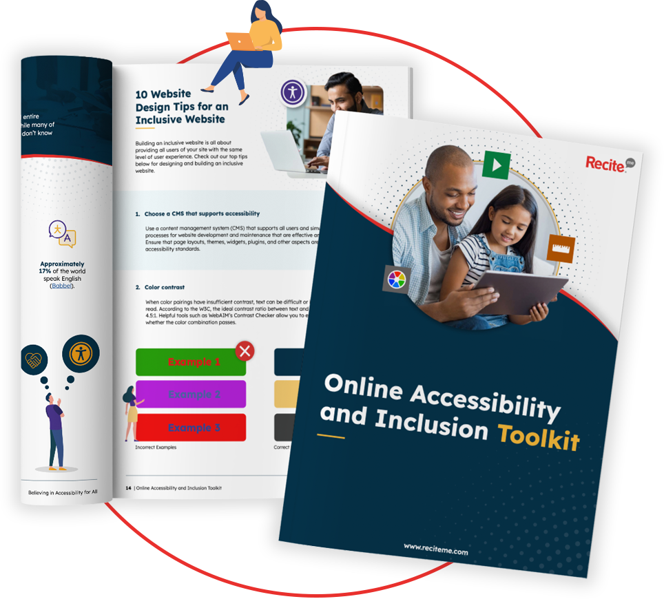
Our 40-page Digital Accessibility & Inclusion Toolkit helps businesses break down online barriers and make a real impact. It offers practical advice on all aspects of digital accessibility, from writing an accessibility statement to accessible website tips and inclusive hiring.
What are ADHD friendly fonts?
ADHD-friendly fonts are typefaces designed to improve readability and reduce distractions for individuals with ADHD. These fonts typically incorporate features that aid focus, reduce visual strain, and improve information processing, which can help people with ADHD concentrate better when reading or browsing online. But what exactly constitutes an ADHD-friendly font?
Common characteristics of ADHD-friendly fonts include:
- Minimalistic Letter Shapes: Fonts with simple, clean letter shapes help reduce visual clutter, making it easier to stay focused on the text.
- Generous Letter and Word Spacing: Increased spacing prevents overcrowding of letters, helping users with ADHD process information more smoothly without feeling overwhelmed by text.
- Clear Ascenders and Descenders: Distinctive height differences between letters (e.g., taller tops for “d” and lower tails for “y”) enhance readability, making it easier to distinguish letters at a glance.
- Consistent Letter Height: Uniform height across letters helps avoid distracting variations, which can disrupt reading flow for ADHD readers.
- Rounded Shapes: Open, rounded letter shapes provide better legibility, making reading less taxing and reducing visual confusion.
- Moderate Weight: Fonts with a balanced, moderately bold appearance are easier to identify and track visually, helping readers maintain focus on text without strain.

ADHD-friendly fonts like OpenDyslexic, Arial, and Comic Sans incorporate these characteristics in their design – but more on that in the next section.
Which fonts are ADHD friendly?
Still struggling with which fonts are ADHD-friendly and which are not? We’ve scoured the internet high and low, and put together this list of ADHD-accessible fonts for you to consider.
1. Lexend
Lexend is readable and accessibile to a wide variety of individuals with disabilities including ADHD. It incorporates clear letter shapes, optimised legibility and consistent spacing through-out. Here at Recite Me all of the content we display on our website uses the Lexend font.

2. Verdana
Designed specifically for digital screens, Verdana has wide letters and generous spacing, which enhances readability.

3. Comic Sans
Often debated in design, Comic Sans has rounded, evenly spaced characters that support reading comfort, especially for ADHD and dyslexic readers.

4. Open Dyslexic
Originally designed for dyslexia, OpenDyslexic’s unique weighted design at the bottom of letters helps prevent “jumping” (the sensation where letters or words on a page appear to move, shift, or float, making it difficult to focus on and follow lines of text).

5. Calibri
The default Microsoft font, Calibri has a rounded, smooth appearance that many find easy to read on screens, especially in smaller text sizes.

6. Arial
A familiar, clean sans-serif font that’s widely accessible and easy to read.

7. Roboto
Designed for digital interfaces, Roboto’s simple, geometric letterforms and balanced spacing make it easy to read on screens, supporting focus and clarity for those with ADHD.

8. Tahoma
Known for its even spacing and clear letter shapes, Tahoma is an accessible option often used in digital applications.

9. Century Gothic
A modern, rounded sans-serif font that is clear and spacious, Century Gothic is easy on the eyes and suitable for both text and headings.

10. Gill Sans
This classic British sans-serif font combines readability with a touch of personality, making it engaging while at the same time accessible.

Each of these fonts prioritises simplicity and legibility, helping reduce cognitive strain for readers with ADHD and allowing them to focus on the task at hand with minimal opportunity for distraction. Consider experimenting with a range of these fonts to find the best fit for your audience and its needs.
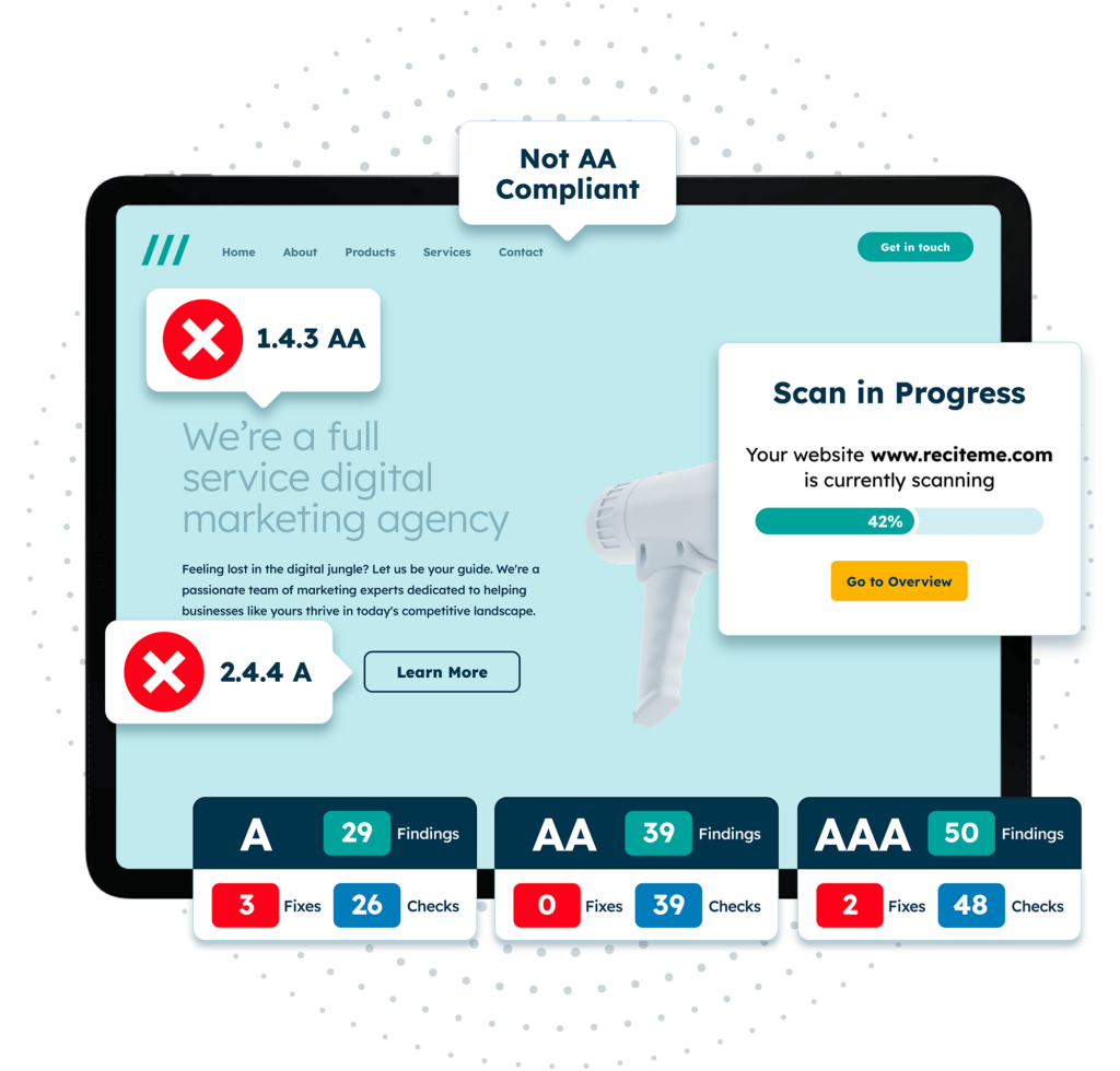
Finding accessibility issues is now easier than ever. Recite Me offers a free automated scan of your website’s homepage to highlight non-compliance. You’ll get recommendations on how to fix them, helping to improve your accessibility score.
What else can be done to create accessible fonts?
Selecting an ADHD-friendly font is just one piece of the puzzle. But even without an ADHD-friendly font, there are several key practices you can put in place to make reading easier for those with ADHD. Let’s unpack a few of them in more detail.
Adjust text spacing and line height
Increasing the space between letters (kerning), words, and lines can significantly improve readability, for individuals with ADHD. Tight text can feel visually overwhelming and make it harder to focus, leading to increased cognitive effort.
Adjusting line height to at least 1.5x the font size helps provide “breathing room” in the text. For instance, an e-commerce website with a dense product description can implement line height adjustments to ensure that users with ADHD do not feel overwhelmed when reading through long paragraphs. Doing so also reduces the likelihood that users abandon a purchase out of frustration.
Provide contrast
A strong contrast between text and background is essential to ensure content is easy to read. For individuals with ADHD, poor colour contrast can create visual noise, making it harder to focus on the content.
If adhering to WCAG 2.1 Level AA standards, text should have a minimum contrast ratio of 4.5:1 for normal-sized text and 3:1 for large text. For instance, black text on a white background meets these standards and is widely used for clarity.
A practical example would be an e-commerce website that uses blue text on a purple background for its call-to-action buttons. While this might look stylish, it fails to provide enough contrast for people with colour blindness or low vision to distinguish between the different elements, reducing the clarity and effectiveness of the button. Instead, using dark blue text on a white or light grey background for buttons or important text ensures it stands out clearly.

Use consistent formatting
Consistency in font choices, text sizes, and styles promotes a sense of structure and reduces the mental effort required to process the layout. Frequent shifts in fonts, excessive italics, or random text size changes can be distracting.
For example, a website might use Arial for body text and Verdana for headings, and maintain this across all web pages. This maintains clarity while allowing some form of differentiation between sections. Consistency can also extend to elements like bullet points or hyperlinks, which should follow a standard format throughout to prevent confusion.
Limit block text
Large blocks of text are intimidating and difficult to navigate. Breaking content into smaller paragraphs (2–3 sentences each) creates manageable chunks that are easier to process. Bullet points, numbered lists, and subheadings provide visual markers, making it simple to scan and locate key information. For instance, product descriptions on e-commerce websites often use bullet points to highlight features, ensuring the text is both engaging and digestible.
Enable Reader-Friendly Modes
Digital platforms can empower users by offering customisation options that cater to individual needs. Reader-friendly modes, such as those found on Kindle devices or browser extensions like Reader View, allow users to adjust text size, font type, and background colours.
Some websites include accessibility widgets that enable these customisations. For example, the “dark mode” option reduces visual strain in low-light environments. Online software products, such as the Recite Me toolbar, can also be integrated into your website, allowing users to choose fonts like OpenDyslexic, as well as adjust text size, colour contrast, and other accessibility features.
Investing in a tool like this is a great way to provide targeted support for neurodivergent readers. This level of flexibility ensures an inclusive experience tailored to diverse preferences.

